The Germania logo reflects the airline’s German heritage and commitment to reliability. It acts as a bridge between different cultures. The logo’s design elements draw on Germany’s reputation for precision and quality, illustrating the airline’s commitment to maintaining high standards in all aspects of service. The logo symbolizes the airline’s goal to facilitate travel and cultural exchange between Germany and other countries.
Germania: Brand overview
Germania’s history begins with Tayyareh Ishi, a German entrepreneur with Turkish roots, establishing Special Air Transport (SAT) in Cologne, Germany. Initially, SAT focused on charter flights and providing wet lease services to other airlines. The company started with a single Sud Aviation Caravelle aircraft, which was common for small airlines then.
In 1986, SAT rebranded as Germania to signify its plans for growth in the German market. The company gradually expanded its fleet with modern aircraft like the Boeing 727. The 1990s brought growth following Germany’s reunification. The company played a key role in connecting the eastern and western parts of the country by air. Additionally, it ventured into scheduled flights alongside its charter services, diversifying its business.
In 2003, the company partnered with tour operator REWE Touristik (later DER Touristik), enhancing its position in the charter market. Fleet modernization began in 2005 by ordering new Boeing 737-700 aircraft for improved efficiency and environmental performance.
In 2009, the company expanded internationally by opening a base in Pristina, Kosovo, marking its ambition to serve Southeastern Europe. Further expansion occurred in 2011 with new bases in Germany, including Berlin Brandenburg Airport, and increased scheduled flights to Mediterranean destinations. A significant order for 25 Airbus A320neo aircraft in 2014 reflected its long-term growth plans. The company’s first long-haul flight to Iran in the same year marked a new chapter in its development. Expansion continued in 2015 with new destinations in North Africa and the Middle East, strengthening its presence in the scheduled flights market.
By 2017, the company achieved a milestone of transporting 3 million passengers in a year, showcasing its substantial growth. The year saw the opening of new bases in Nuremberg and Düsseldorf, solidifying its position in the German market. However, financial challenges arose in 2018 due to rising fuel costs and fierce competition in the European aviation sector.
Despite efforts to secure new investors, the company declared bankruptcy on February 5, 2019, and ceased all operations. This event significantly impacted the European aviation industry, leaving 1,700 employees unemployed and affecting numerous passengers.
Meaning and History
What is Germania?
It was a privately owned German airline that operated scheduled and charter flights. Based in Berlin, it offers services to various destinations in Europe, North Africa, and the Middle East. The company operated an Airbus and Boeing aircraft fleet, serving leisure and business travelers. Despite its popularity, it ran into financial difficulties and ceased operations.
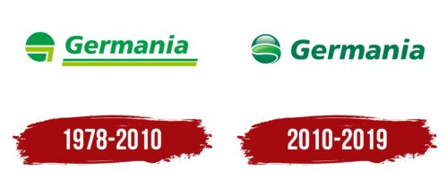
1978 – 2010
The emblem of Germania, an airline operating from 1978 to 2010, was designed to convey the key characteristics of its founding country, Germany. The emblem is characterized by punctuality, precision, and logic, reflecting stereotypical views of the German approach to business and culture.
Initially introduced in 1986, when the airline officially adopted the name “Germania,” the choice of the Latin form of the name was deliberate. It allowed for a clear distinction from the country name Germany while still maintaining a close connection and reflecting national values.
The logo’s design is rich with geometric elements that bring harmony and unique beauty. A key feature is the circular symbol to the left of the name. It holds a dual meaning: on one side, it is a stylized letter “G,” the first in the brand name. Conversely, the symbol resembles a globe, emphasizing the company’s global ambitions and the breadth of its flight destinations. This element eloquently demonstrates the company’s drive for international presence and development.
Above the circular symbol, an angle symbolizes a schematic image of an airplane racing across the planet like a bird. This enhances associations with dynamism and mobility, key characteristics of the aviation industry. The airline’s name is underscored by two even lines resembling a runway, reinforcing associations with aviation and travel.
The logo’s green color palette was chosen intentionally. Green symbolizes prosperity, growth, and environmental care. This shade represents the identity of the North Rhine-Westphalia region, where Germany was originally based, highlighting the company’s regional roots and environmental awareness.
2010 – 2019
The Germania airline logo combines graphic and text elements. On the left, there is a sphere made up of three segments. The top segment looks like a shiny, inverted crescent moon. The two lower segments are drop-shaped and slightly curved. The middle segment is light green and longer, while the adjacent segments are dark green. The right side features the company name in an italic font with flowing, rounded letters spaced loosely apart.
The green shades in the graphic element symbolize growth, freshness, and vitality. This adds depth and energy to the logo. The italic, flowing letters create a sense of smoothness and efficiency. The loose spacing between the letters enhances readability, giving the logo a clean look.
The segmented sphere represents the airline’s dynamic energy and forward movement. The shiny, inverted crescent at the top adds modernity and sophistication. The drop-shaped segments contribute to the logo’s unique appearance, highlighting the brand’s vitality.
The light green middle segment stands out, adding vibrancy. This color combination represents the airline’s commitment to growth and freshness, conveying reliability and trust. The blend of light and dark green shades gives the logo a balanced feel.
With its rounded and streamlined letters, the italic font enhances the aesthetic with a sense of movement and elegance. This choice aligns with the graphic element, creating a cohesive visual identity. The loose letter spacing ensures readability, reinforcing the logo’s clean and professional look.
