


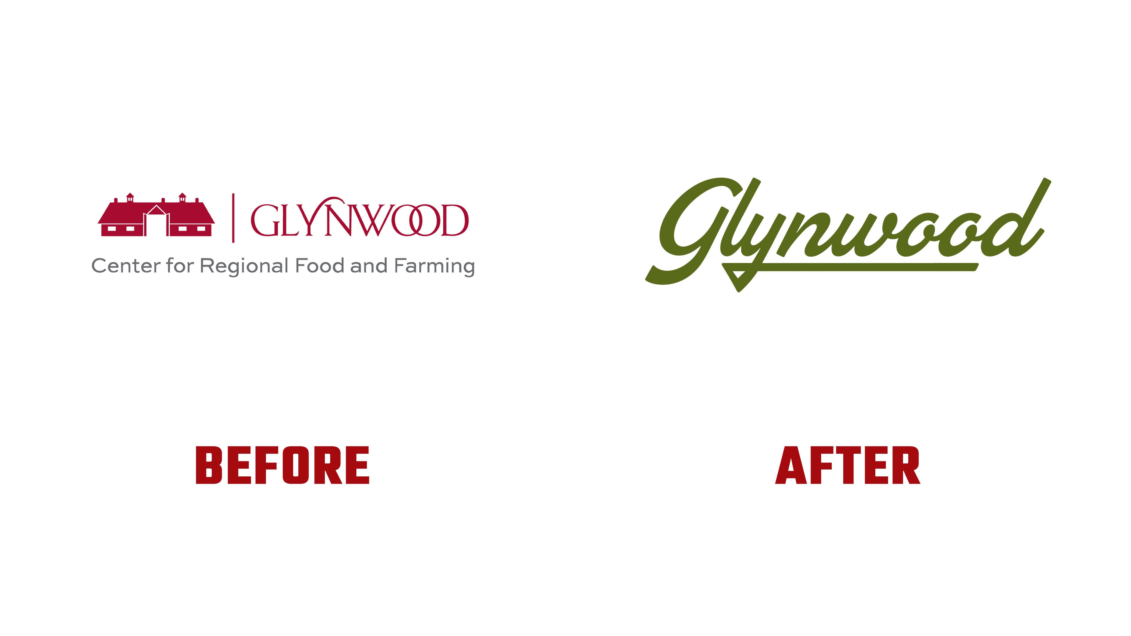
Old milk bottles bearing the words “Glynwood Farm, Cold Spring, N.Y.” inspired Condensed’s new logo for the Glynwood Center for Regional Food and Farming. The designers reworked the archival lettering, replacing the previous barn emblem with a script wordmark. The update draws on the farm’s history in Cold Spring, in New York’s Hudson Valley.
Today, Glynwood combines a working farm with a nonprofit organization. It trains beginning farmers, supports food businesses, strengthens the regional food economy, and improves access to food. Condensed felt the previous identity resembled that of a conservation organization. At the same time, Glynwood’s work called for a story about agriculture, education, and the local community. The client encouraged the team to look beyond the familiar image of a barn. The project also needed to bring consistency to program materials created at different times by different people.
The team reviewed photographs, annual reports, and family records. Brent Lagerman, Teresa Lagerman, and Sam Zhao led the project at Condensed. Among the archival objects, the designers found glass milk bottles bearing a hand-lettered version of the farm’s name. They developed several lettering options from that reference, preserving the original style. They adapted the design to work at different sizes and across applications, from a small icon to lettering on the farm’s gates.
The archival discovery connects to the history of George W. Perkins’s family, which purchased the land in the 1920s. Glynwood operated as a dairy farm for decades. In the 1980s, as development expanded across the Hudson Valley, the family donated 1,700 acres to Fahnestock State Park. The family preserved another 250 acres for agriculture. The farm later became the foundation of the present-day organization, which continued to protect farmland and support farmers.

The new logo features a slanted script with an uppercase “G” and connected lowercase letters. The initial letter has a large lower flourish. The descender of the “y” forms a triangular loop and extends into a long horizontal line beneath the name. This underline is integrated into the lettering itself. The primary logo now consists of the wordmark alone.
The previous burgundy logo combined the silhouette of a farm building, a vertical divider, and GLYNWOOD in thin uppercase serif letters. The two “O” letters overlapped, and curved flourishes decorated the tops of some letters. A gray line below read “Center for Regional Food and Farming.” The organization had also used an earlier orange version with a barn above an uppercase sans-serif wordmark. Adopting the archival lettering connected Glynwood to a specific object from the farm’s history.
In the version presented, the yellow-green logo appears against a dark brown background. The identity’s colors come from Glynwood’s surroundings, including its pastures, hayfields, and seasonal changes across the property. Olive, yellow-green, cream, and chocolate brown appear in program materials, print publications, digital content, signage, and event branding. The same guidelines extend to the farm store and merchandise.
According to the client’s review, the project ran from July 2025 through April 2026. The team prepared condensed identity guidelines for the Glynwood team. Development and Communications Director Suzanna Konecky reported that the update had shortened production time for newsletters, reports, event materials, and social media posts. The identity received positive feedback from the board, donors, partners, and the local community.