![]() Grateful Dead Logo PNG
Grateful Dead Logo PNG
Like the rock band’s performances, the Grateful Dead logo is bright. The emblem demonstrates an attempt to renounce the world, rise above problems, and enter nirvana. The team achieves this effect with the help of psychedelic music and a light show.
Grateful Dead: Brand Overview
Meaning and History
![]()
In 1965, The Warlocks was formed in the United States. But it could not be called that because, at that time, there were other The Warlocks (now the Velvet Underground). Therefore, the creators decided to rename the team and, in order not to repeat themselves, chose a very unusual phrase: Grateful Dead. This is a play on words and a reflection of mystical stories from different cultures. According to legend, if a person buries a deceased, whom everyone refuses to bury, the deceased will help him. In this case, the dead become “grateful dead.”
The group approached the choice of the logo as creatively as the naming. She had rich iconography with different symbols, but the Steal Your Face skull was always considered the main one. It appeared in 1969 and was used until the collective collapsed in 1995.
What is the Grateful Dead?
It is a United States rock band founded in San Francisco in 1965. Loud fame came to her in 1967-1969 after performing at the Monterey International Pop Music Festival and Woodstock Music & Art Fair.
Despite the emblem’s frightening appearance, there is nothing sinister about its history. Bob Thomas, the design author, was hired to guard the warehouse. He knew the sound engineer of the Owsley “Bear” Stanley group, who rose to fame as one of the first mass producers of LSD. It was Owsley who asked him to come up with some symbol to make it easier to distinguish the musical equipment of the Grateful Dead behind the scenes.
The sound engineer already had some ideas. On the side of the road, he saw orange and blue signs divided in two by a white stripe and decided to use that as a basis. Owsley wanted to repaint the orange half-red and replace the crossline with a zigzag zipper. Bob Thomas made a stencil, after which Ernie Fischbach drew the design on the boxes. But after a few days, Owsley thought the symbol could be supplemented. He turned to Bob again for help. During discussions, the concept expanded: it was decided to add a skull, in which, according to Owsley, the group’s name is encrypted. It took Bob several hours to create the new stencil. It was this version that became the logo.
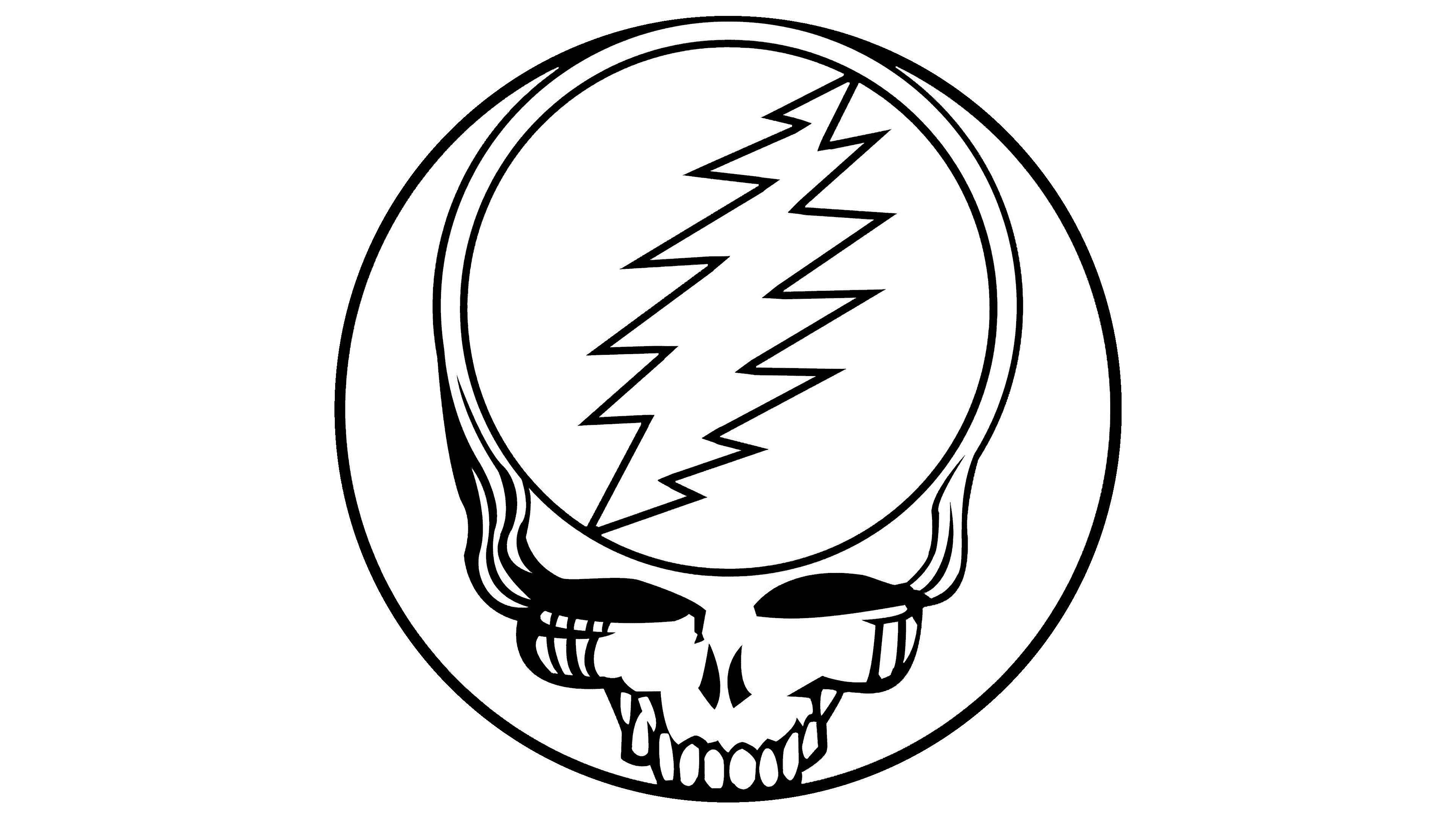
The symbol graced the front of the packaging for History of the Grateful Dead, Volume in 1972. Before that, it was used inside the cover of another album released in 1970. But then, the emblem was not commonly used and had no name. The term Steal Your Face was taken from the song He’s Gone: the musicians recorded it to “glorify” the ex-manager who stole the money they earned from the Grateful Dead. And in 1976, the album Steal Your Face appeared – he gave the logo such an unusual name.
Steal Your Face (abbreviated as Stealie) resembles a human skull with small eye sockets and a wide frontal bone. The top is the base for a red and blue circle with a diagonal white zipper. There is also a circle in the background, but the colors are reversed: the left is blue, and the right is red.
The logo has several meanings. According to one version, it symbolizes the “brain explosion” from listening to music. Others believe that thirteen lightning points represent the US colonies. Still, others are convinced that this is a reference to the thirteen stages of LSD preparation at the Owsley “Bear” Stanley chemical laboratory.
Font and Colors
The Grateful Dead logo has no lettering, and the color scheme is rather poor, albeit bright. It contrasts red and blue. White serves as their neutral “separator.” Owsley chose this palette during the concept development phase. He was inspired by a road sign he saw while driving from Oakland to Novato.
FAQ
What is the Grateful Dead symbol?
The band’s iconic symbol is the Steal Your Face, or “SYF” skull. It depicts a human skull with a jagged lightning bolt against a contrasting background. The design originated in the early 1970s and was created by sound engineer Owsley Stanley and graphic artist Bob Thomas.
The symbol was originally a stencil to indicate the group’s equipment. It quickly became a key emblem of the band and their Deadhead fans. The lightning bolt piercing the skull adds dynamism and hints at themes of transformation and the electrifying nature of the band’s music. Over the years, the SYF logo has appeared on merchandise, album covers, and fan art, making it a cultural icon.
What does the Grateful Dead represent?
It symbolizes freedom, experimentation, and the desire to push boundaries. Founded in the 1960s during the American counterculture movement, the band’s music and lifestyle reflect this spirit. Musically, the group’s style combines rock, jazz, folk, gospel, country, bluegrass, and blues.
Culturally, the band turned rock concerts into an experience and a way of life. Their live performances created a shared atmosphere, attracting a diverse fanbase called Deadheads, forming a vibrant, traveling community. Socially, they rejected accepted norms and challenged the status quo. They prioritized creative integrity over commercial success by allowing fans to record shows and making their music accessible. This fostered a deep and lasting connection with their audience.
Who invented the Steal Your Face logo?
Owsley Stanley and Bob Thomas created the logo. Stanley, known as “The Bear,” was the band’s sound engineer and a prominent figure in the 1960s counterculture scene. He wanted the band’s equipment to be marked with a distinctive symbol so it could be easily identified during live performances and tours. He thought of the skull with the lightning bolt to visually convey the group’s energy.
Bob Thomas, an artist and friend of the group, brought Stanley’s idea to life. He added artistic elements and defined visual details, making the logo memorable. The bright lightning bolt piercing the skull and the circular background enhanced its visual impact and made it recognizable.
What does the Grateful Dead bear symbolize?
The Dancing Bear is a famous symbol associated with the group, created by Owsley “Bear” Stanley. It first appeared as stickers on Stanley’s audio equipment and amplifiers.
Nicknamed “Bear” for his large frame and gray beard, Stanley shaped the band’s unique sound. His audio technology and sound engineering work set new standards for live music. The dancing bear symbolizes his contribution. It represents the joy, freedom, and carefree spirit of the band’s music and is associated with the counterculture of the 1960s.
Why is it called “Steal Your Face”?
The term originated during a difficult historical period and has become an important cultural phrase within the band’s community. The phrase comes from the song “He’s Gone,” written after the band’s former manager, Lenny Hart (father of drummer Mickey Hart), stole a large sum of the band’s money. The lyrics “steal your face right off your head” expressed the band’s feelings of betrayal and loss.
The phrase was originally poetic, describing the group’s anger at being deceived. Over time, fans known as Deadheads adopted “Steal Your Face” to describe the powerful impact of the band’s live performances.