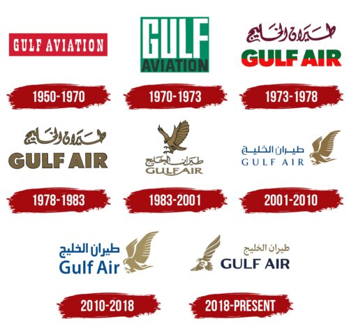
The Gulf Air logo symbolizes the rich history intertwined with the heritage and ambitions of Bahrain, where this flagship carrier is based. Born from the sands and seas of the Persian Gulf, the emblem represents the region’s proud maritime and pearl heritage, which historically shaped its economy and culture. The logo reflects the airline’s commitment to hospitality and high-quality service, which resonate with its homeland’s warm and welcoming nature.
Gulf Air: Brand overview
In 1950, Gulf Air’s history began with the establishment of Gulf Aviation Company Limited by British pilot Freddie Bosworth. Bosworth recognized the potential for air transport development in the Persian Gulf region. Initially, Gulf Aviation operated local flights in Bahrain using small aircraft to connect with other Gulf islands.
The company expanded in 1951 by introducing regular flights to Doha, Qatar, marking a step in its regional network development. Throughout the 1950s, the airline expanded its route network, adding destinations like Dubai and Abu Dhabi to strengthen transportation links between Gulf states.
In 1967, the airline’s ownership shifted to the governments of Bahrain, Qatar, Abu Dhabi, and Oman, transforming it into a state-owned carrier.
In 1973, it was officially renamed Gulf Air, becoming the national carrier of four Gulf states. The company modernized its fleet in the following years, introducing larger aircraft like the Lockheed L-1011 TriStar and Boeing 767 to compete on long-haul routes.
By 1981, Gulf Air became the first Arab airline to operate flights to New York, solidifying its position as a leading carrier in the Middle East. In the 1990s, the airline continued to expand its network and enhance passenger service quality by introducing Airbus A320 and A340 aircraft.
In 2002, Qatar withdrew from ownership to focus on Qatar Airways, followed by the UAE in 2005 to develop Etihad Airways. Eventually, Bahrain became the sole owner in 2007, leading to significant changes in the company’s strategy to focus on serving Bahrain’s interests.
From 2008 to 2012, the company underwent restructuring and optimization, cutting unprofitable routes and updating its fleet with new Airbus and Boeing aircraft. From 2013 to 2018, the airline focused on improving financial performance and operational efficiency by introducing new aircraft like the Boeing 787 Dreamliner and refreshing its brand and services.
Meaning and History
What is Gulf Air?
Bahrain’s national airline, based in Muharraq, operates a network of domestic and international flights connecting Bahrain to destinations in the Middle East, Asia, Europe, and Africa. The company offers service classes, including economy, business, and Falcon Gold (first class). The airline uses modern airplanes and many in-flight amenities for its tourist destinations.
1950 – 1970
From 1950 to 1970, Gulf Air was a key player in the Middle East’s aviation industry. This period was significant for the company, as it was among the pioneers in regional aviation.
The carrier’s first emblem was striking and impressive. It featured a red rectangle with the white text “Gulf Aviation.” The serif font added aesthetic appeal and reflected the formality and seriousness of the company’s intentions. This design became an early symbol of the company’s development.
The choice of red in the logo design was deliberate. It represented speed and dynamism, essential for the company that started as an air taxi. Red symbolized leadership; Gulf Air was recognized as a leader in the industry and one of the oldest carriers in the Middle East. This color highlighted the company’s role in pioneering aviation endeavors in the region.
The white text on the red rectangle background symbolized air travel, opening new possibilities for international and regional passengers. The capital letters in the company name emphasized Gulf Air’s ambitions and drive to expand and strengthen its position in the global aviation arena.
1970 – 1973
When a group of countries acquired the airline, it led to a significant change in its emblem. The new logo featured a green square with the word “Gulf” in large white letters and the word “Aviation” in smaller black letters beneath it. This name immediately indicated the company’s geographical focus on serving the Persian Gulf region.
The choice of green for the logo’s main background had deep symbolic meaning. While green is not commonly associated with the sky, this color holds special significance in Islamic culture. It is associated with paradise gardens and is the color of the Prophet’s clothing, making it particularly meaningful to Muslims. This choice emphasized the luxury and comfort of the airline’s liners and respect for Islamic traditions and believers.
1973 – 1978
In 1973, a new interpretation of the airline’s logo was introduced, marking its name change to Gulf Air. This redesign incorporated a rich cultural and symbolic context, reflecting the company’s roots and values.
At the top of the logo, maroon Arabic calligraphy serves as decoration and a sign of respect for Arab culture. This design element emphasizes the airline’s commitment to its heritage and is associated with the luxury and wealth valued in the region.
Below the Arabic calligraphy, the airline’s name appears in bold English capital letters rendered in green and red. This division of colors symbolizes the equal ownership shares among the member states. It highlights the partnership and collaboration among the countries that own the airline.
This color division suggests the geographical and cultural specifics of the region—flights from countries with non-Muslim majorities to Muslim states, where the Quran plays a central role in daily life. The logo conveys the speed and comfort passengers experience on board and the airline’s ambition to excel both on the ground and in the air.
1978 – 1983
After a significant increase in the number of aircraft and the expansion of its route network, changes were made to the design of the airline’s emblem. Dark gold, which replaced the previous colors in the logo, now dominated the design. This color choice gave the logo a majestic and luxurious appearance, reflecting the airline’s success and prosperity during that period.
Gold became the primary color in the logo, traditionally associated with luxury, high quality, and prestige. In the context of the airline, the gold symbols represented the high standards of service offered to passengers and the company’s commitment to excellence in all aspects of its operations. This was crucial for strengthening the company’s image internationally, where competition with other carriers required continuous affirmation of its status through both visual and quality aspects of the services provided.
1983 – 2001
1983, the airline’s logo underwent another transformation, becoming even more stylized and refined. This time, the company’s English inscription was enhanced with intricate glyph elements. These additions brought a special harmony and beauty to the overall design, making it more expressive and memorable.
The new logo design’s image of a golden falcon poised to capture its prey attracted particular attention. The falcon was chosen as a symbol for a reason. This powerful predator, known for its speed and precision in hunting, perfectly represents the company’s ambitions.
The introduction of this element in the logo responded to the development of competition and the emergence of other Arab carriers. By emphasizing its leadership role in the region, the company made it clear that it was determined to maintain its market position. The image of the falcon became a symbol of excellence and a hint at the company’s unmatched capabilities in aviation transport. Like a king in hunting, the falcon highlighted that the airline surpasses all its competitors in the skies.
2001 – 2010
For its 50th anniversary, the company updated its fleet and revised its logo. The addition of blue inscriptions in Arabic and English linked the emblem’s design closer to the sky. This color, associated with the sky, highlights lightness, freshness, and airiness, symbolizing the domain where Gulf Air maintains a leading position.
The logo continues to feature the image of a golden falcon, which now enhances the regal quality of the refreshed design. The bird’s figure, rendered in a more schematic style with white elements, contributes to a lighter and friendlier image.
2010 – 2018
The new emblem harmoniously combines elements that evoke the blue sky and the golden sun. The logo’s text is larger and richer in color, making it more noticeable and expressive. The image of the falcon, the airline’s symbol, is lighter and simpler, giving it a more elegant and contemporary look.
The close arrangement of the characters in the inscription emphasizes unity under the Falcon Gold concept. This move by the company aims to create a unified premium class that appeals to business travelers and first-class voyagers. This union aims to offer customers a higher level of service at more accessible rates, enabled by the optimization and improvement of internal processes.
The logo’s soft blue color suggests the shades of the bay’s waters and symbolizes journeys to popular resorts offered in the carrier’s expanded route portfolio. This color conveys lightness, freshness, and pleasant moments of relaxation, enhancing the attractiveness of the company’s offerings for vacationers and explorers of exotic destinations.
2018 – today
In 2018, Gulf Air announced a new development strategy focused on three key areas: expanding the route network, modernizing the aircraft fleet, and enhancing passenger service quality. The company’s corporate logo was redesigned in response to these changes to reflect its new direction and ambitions.
The updated emblem features a new depiction of the falcon, which has long been the company’s symbol. The bird now spreads its wings, symbolizing readiness and confidence as it strives for new heights. The falcon’s position has changed; it is now placed at the top left of the emblem, a logical shift considering the Arabic script’s right-to-left reading direction. This placement of the bird at a leading position suggests movement and forward momentum.
The emblem’s gold Arabic script and blue English inscription continue to highlight the harmonious combination and mutual complementarity of the two cultures represented by the airline. These elements visually unite on the aircraft, symbolizing a seamless blend of tradition and modernity.
