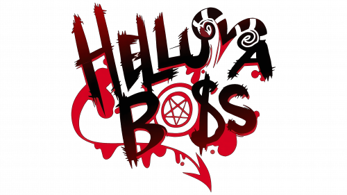
The Helluva Boss logo conveys the scorching atmosphere of hell. Each element reflects evil creatures, bloody crimes, and immoral acts, perfectly aligning with the show’s theme. At the same time, the logo retains elegance—every stroke is executed with precision, showcasing attention to detail and a high level of animation.
The emblem, filled with fiery shades and rough lines, seems to burn, emphasizing the blazing infernal world where the action unfolds. The symbol successfully combines chaos, lawlessness, and aggression inherent in the main characters who exist outside the boundaries of conventional moral norms.
Helluva Boss: Brand overview
The story of Helluva Boss began in 2019 when American animator and artist Vivienne “VivziePop” Medrano announced her new project. Medrano was already well-known in the animation community thanks to her earlier web series Hazbin Hotel, which garnered millions of views on YouTube.
Originally conceived as a spin-off of Hazbin Hotel, this new series featured a different cast of characters and storylines set in the same fictional version of hell. While it shared some thematic elements with Medrano’s previous project, the new show was designed to stand independently as its entity.
Production began alongside the development of Hazbin Hotel. Medrano and her team worked on the script, animation, and character designs for several months. The pilot episode premiered on Medrano’s YouTube channel on October 31, 2019, and was praised for its unique animation style, mature humor, and captivating characters.
The pilot’s success motivated Medrano and her team to continue working on the series. Unlike Hazbin Hotel, which A24 picked up for professional production, the new show remained independent, funded primarily through Patreon and other crowdfunding efforts.
The first official episode was released on October 31, 2020, exactly one year after the pilot. The series was produced without major studio involvement, relying entirely on Medrano’s independent team.
Several episodes were released between 2020 and 2021, garnering millions of views on YouTube. The show’s production and release schedule was unconventional; instead of following a traditional weekly format, episodes were published as completed, leading to varying gaps between releases.
Despite these pauses, new episodes emerged in 2022, and the show’s audience remained loyal. Regular social media and fan platform interactions helped keep viewers engaged and excited about the series.
By 2023, the series had become one of YouTube’s most popular independent animation projects. Its bold storytelling, distinct visual style, and engaging characters captivated a growing global audience. The show’s success demonstrates how modern platforms empower independent creators to produce high-quality content without major studio backing. Fan support and crowdfunding have proven essential in sustaining such creative ventures.
Meaning and History
What is Helluva Boss?
This animated comedy series portrays corporate hell with an irreverent and humorous approach. The plot focuses on the antics of the employees at I.M.P., a demonic assassination firm located in hell. The main character is the impulsive and hot-tempered Blitzo, who runs the team, including weapons expert Moxxie, his energetic wife Millie, and the sarcastic hellhound Loona. The show stands out for its dark comedy, vibrant musical moments, and deep character development. In addition to humorous satire on corporate culture, the series touches on themes of morality, family, and personal identity through the lens of demonic characters.
2019 – today
The cartoon’s emblem consists of a stylized title that stands out with its vibrant and grim design. Every element of the inscription evokes a burning hell. The letters are painted in a black-brown gradient, like flames sliding across their surface. The ends of the glyphs are pointed and resemble jagged shards, creating a sense of pain and roughness.
The inscription rises slightly upwards, symbolizing the inhabitants of hell striving to break out of their world and penetrate the world of the living to achieve their selfish goals. The lines of the letters are uneven and of varying heights, emphasizing the chaotic and disordered nature of the hellish world.
Particular attention is drawn to the letter “S,” transformed into a dollar sign, reflecting the cartoon’s central theme—hellish corporations providing services for money. This references the dominance of business and profit, even in hell.
The letter “V” is shaped like devil horns, enhancing the association with otherworldly forces, while the “O” is turned into a blood-drawn pentagram, alluding to magic, rituals, and spells. Around some of the letters, drops and traces of blood are visible, hinting at the main activity of the characters—contract killings.
The final touch of the emblem is a writhing devil’s tail, also drawn in blood. It wraps around the inscription, turning the logo into something resembling a heart. This symbolizes the unexpected display of human emotions and attachments between the characters despite their dark surroundings and sinful deeds.


