


Family archives provided the foundation for Heyder & Shears’ 40th-anniversary identity update. For the 2026 project, Perth agency Block brought back the company’s historic fruit bowl emblem, refined its wordmark, and introduced an HS monogram. Recipes, notes, and drawings from the company’s past round out the new identity.
Heyder & Shears has provided catering in Perth and Western Australia since 1986. Its team serves weddings, private celebrations, corporate gatherings, gala dinners, festivals, and events for government and cultural organizations. The update coincided with a move to Residence at Langley. It was intended to convey the full scope of the company’s role in an event, from food and drinks to service and the guest experience.
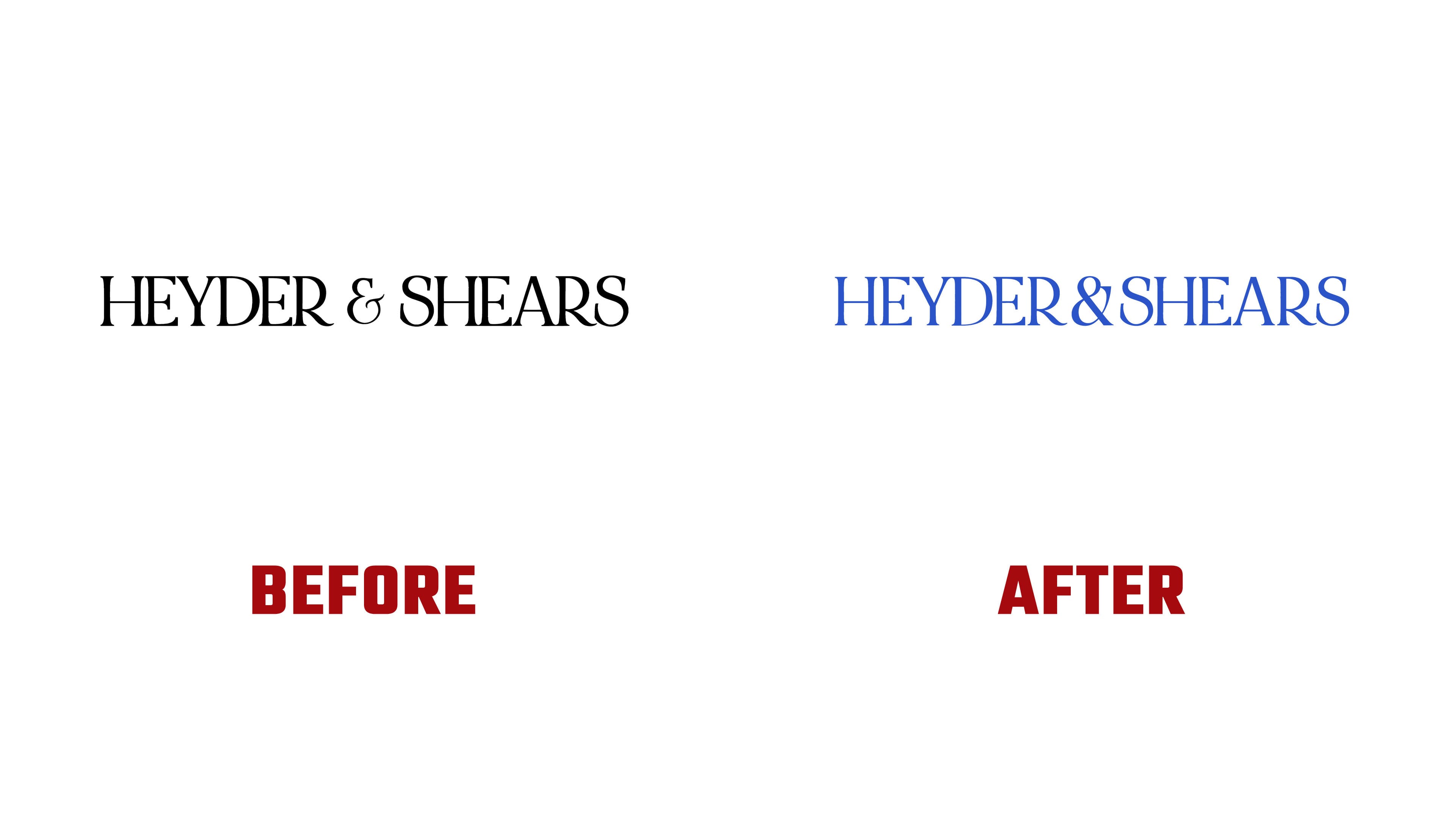
Previously, the identity relied almost entirely on a horizontal logo. The company needed additional marketing assets, alternative logo arrangements, and consistent guidelines for using them. Block retained the wordmark’s foundation, refined the lettering, and added two emblems. The company now has options for different sizes and formats.
The HEYDER&SHEARS wordmark retains its tall serif capitals and contrasting thick and thin strokes. The designers adjusted the spacing while keeping the name compact on a single line. The diagonal leg of the “R” ends in a gentle curve, while thin sections of the “S” flow into heavy rounded strokes. The ampersand has a new looped form, with serifs that complement the surrounding letters. The wordmark appears in blue, black, and white.
The fruit bowl appeared in Heyder & Shears’ early identity. On an old sign, it sat above the name in mixed-case lettering, with “Exclusive Caterers” underneath. The illustration was removed in 2023, and Block brought it back for the anniversary. The footed bowl holds fruit, grape bunches, and leaves. Hatching, irregular outlines, and dark areas preserve its hand-drawn appearance. The image also appears independently of the name, including above the website address.
For the HS monogram, the designers used a thin, vertical oval frame. The initials are offset diagonally and partially overlap. Their slant and flourishes differ from the upright lettering of the main wordmark. The monogram appears on the backs of menus and over photographs.
Block called the project’s guiding idea “Perfect Alchemy.” The phrase describes how an event concept comes together with the team’s expertise, the coordination between the kitchen and service staff, the selection of seasonal ingredients, and the pairing of flavors. Heyder & Shears leader Imogen Mirmikidis connects the update to 40 years of people, recipes, and events.
Supporting materials include archival recipes, handwritten notes, and old sketches. Block Senior Creative Jack McAuliffe worked on the archival content and illustrations. Blue, muted green, and peach complement a cream background. Olivia Pizzale-Bryce contributed documentary-style event photography. The identity appears across menus, signage, advertising, and digital channels.