The Hulu logo promises all new releases, popular TV shows, and top-grossing movies can be watched on the platform. The emblem symbolizes continuous improvement and the use of new technologies, which makes the console as convenient as possible for content management.
Hulu: Brand overview
| Founded: | October 29, 2007 |
| Founder: | The Walt Disney Company |
| Headquarters: | United States |
| Website: | hulu.com |
Meaning and History
The streaming service logo features a green ‘Hulu’ lettering. Unlike other video streaming platforms, the designers felt this was enough to grab users’ attention and make the website recognizable.
The name “Hulu” was taken from an old Chinese proverb referring to a person who hoards jewelry. This word is translated as “pumpkin” because, in ancient times, pumpkins were used to make containers for storing jewelry.
What is Hulu?
Hulu is an American subscription-based streaming service. It features TV series and movies from studios such as FX Networks, Freeform, ABC, Disney Television Studios, Searchlight Pictures, and 20th Century Studios, as well as its own original programming. It was launched in 2007. The majority owner is The Walt Disney Company.
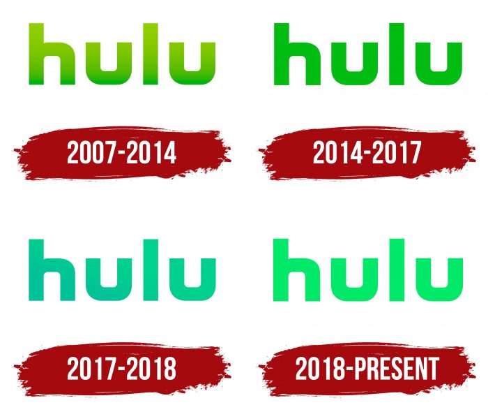
2007 – 2014
The first emblem appeared in the same year the syndication service Hulu was created. It was simply lowercase letters. The color scheme contained several green shades, presented in a gradient from the lightest at the top to the darkest at the bottom.
2014 – 2017
The logo was changed four years after the website was launched. The designers removed the gradient, making the title one color.
2017 – 2018
In the second half of 2016, Time Warner, now known as WarnerMedia, acquired 10% of Hulu. She planned to broadcast live in 2017, so the video service did a small logo redesign. The graphic sign developers returned the gradient but chose a new palette transitioning from turquoise to blue.
2018 – today
In 2018, a simple light green lettering logo became part of Hulu’s visual identity. The gradient disappeared again, as it did in 2014-2017.
Hulu: Interesting Facts
Hulu is a key player in the streaming world, making it easier to enjoy TV shows and movies online. Since its start in 2007, it has grown significantly, adding shows, live TV, and many other movies and series.
- How It Started: Big companies like NBC Universal, News Corporation, and Disney created Hulu. They wanted to offer something to rival Netflix and get into the streaming game.
- What’s In A Name?: “Hulu” comes from Mandarin Chinese, meaning a gourd and interactive recording. It symbolizes Hulu as a place full of content ready to watch whenever you want.
- From Free to Subscription: Hulu was initially free and showed ads. By 2010, it introduced Hulu Plus, a paid subscription that offered more shows and ways to watch.
- Adding Live TV: In 2017, Hulu added live TV to its service, offering over 60 channels alongside its usual content. This move aimed to replace traditional TV subscriptions.
- Creating Original Shows: Hulu has made popular shows like “The Handmaid’s Tale,” marking its place in the industry with award-winning content.
- Becoming Part of Disney: Created by a few companies, Disney eventually took over Hulu in 2019 and plans to become its sole owner by 2024.
- Trying New Things: Hulu has tried interactive shows where you can choose what happens next, making watching TV a more personal experience.
- Going Global: While Hulu was mostly US-based, Disney’s ownership might lead it to reach audiences worldwide by merging it with another service called Star.
- Cutting the Cord: Hulu has become a go-to for people ditching cable TV, offering a mix of new TV shows, a large library of on-demand content, and live TV.
- Deals and Bundles: Hulu often comes bundled with other services like Disney+ and ESPN+, making it a great deal for a wide range of entertainment options.
Hulu has come a long way from aggregating content to being a major service with its shows, live TV, and a huge library. Under Disney, it’s set to grow and innovate even more in the streaming scene.
Font and Colors
The main element of a video streaming service’s identity is its name, so the designers focused on text design. Guided by the basic principles of typography, they made the lettering bright and memorable. Because the logo has no graphic element, all attention is focused on the word “Hulu.”
The logo consists of solid lowercase letters written in a sans-serif font. The typeface vaguely resembles the commercial Futura Md BT. Only the designers have significantly changed the bends “h” and “u”: in the current version, the printed characters have a strict geometric shape.
All versions of Hulu graphic characters are presented in approximately the same palette. However, if they used pronounced shades of green at first, such as American Green (# 3DBB3D), now the preference is given to a lighter shade called Hulu Green (1CE783). The usual gradient is missing: it was only on two emblems used in 2007-2014 and 2017-2018.


