


 Searchlight Pictures Logo PNG
The Searchlight Pictures logo appears monumental and impressive, emphasizing a strong foundation and connection to the renowned legacy of its parent companies. This symbol represents stability and strength, reflecting the brand’s long history and extensive experience. The emblem embodies the brand’s clear positioning, focused direction, and mission.
The logo remains faithful to its roots while demonstrating confidence and readiness for new challenges. Its bold, strong shapes convey stability and reliability, indicating the company’s commitment to steadily moving forward in the future of cinema.
Searchlight Pictures began in 1994 as Fox Searchlight Pictures, a specialty film label created under 20th Century Fox for independent and art-house cinema. Thomas Rothman, the studio’s founder and first president, guided its early direction. Its debut release, Edward Burns’s The Brothers McMullen, was made for $25,000 and won the Grand Jury Prize at Sundance, giving the studio an early link with low-budget filmmaking.
In 1996, The Full Monty became a major commercial success, earning more than $250 million worldwide. By the end of the 1990s, the studio had strengthened its profile with Boys Don’t Cry and Quills, both tied to awards attention and critical recognition. In the 2000s, Sideways won Best Adapted Screenplay, while Little Miss Sunshine earned more than $100 million and won two Academy Awards.
Slumdog Millionaire became a major landmark in 2008, winning eight Oscars, including Best Picture and Best Director. In the 2010s, the studio continued with Black Swan, The Descendants, 12 Years a Slave, Birdman, and The Shape of Water. These releases kept Searchlight closely associated with festival titles, filmmaker-led dramas, and prestige releases with strong awards campaigns.
In 2019, The Walt Disney Company acquired 21st Century Fox, including Fox Searchlight Pictures. The studio was renamed Searchlight Pictures in January 2020, while its focus on independent and art-house films continued. Nomadland later won Best Picture, Best Director, and Best Actress. In 2021 and 2022, selected releases moved through Disney’s streaming platforms, including Hulu and Star. By 2023, Searchlight remained active in independent film production and distribution.
Meaning and History
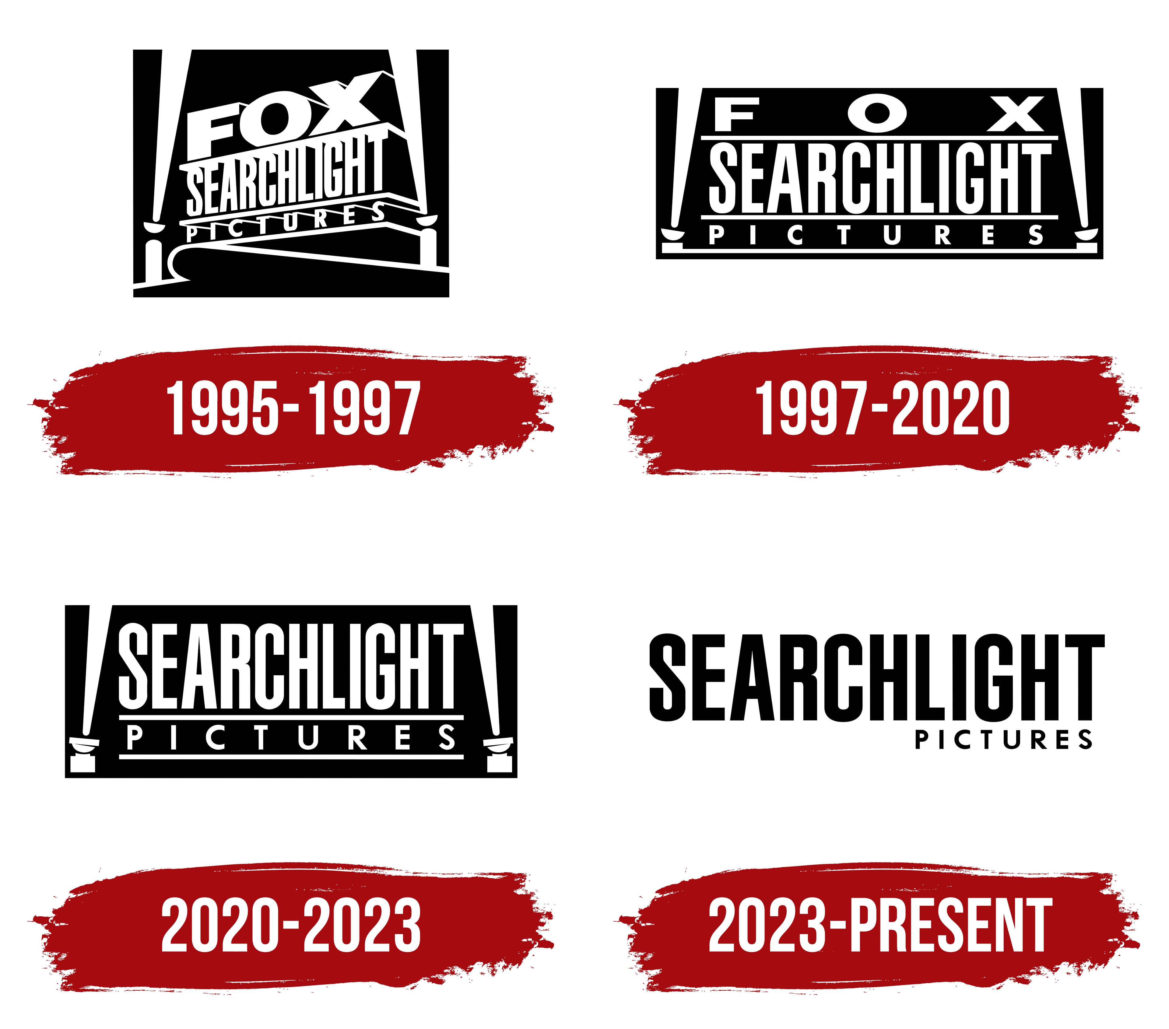
What is Searchlight Pictures?
This film production and distribution company has gained recognition for its commitment to bold and innovative stories. The firm is associated with high-quality indie and arthouse films, representing a wide range of genres, from profound dramas to unconventional comedies, often addressing complex social issues. During awards seasons, the company’s films consistently receive high praise from critics and earn numerous accolades. The company is known for its unique ability to balance creative vision with commercial success, bringing distinctive voices and original narratives to audiences that appeal to both arthouse and mainstream viewers.
1995 – 1997

The film company’s emblem is designed in a monumental, majestic style, characteristic of the Fox studio’s marks. The new brand’s name is placed on a massive pedestal reminiscent of a building. Each word in the logo seems stacked like the floors of a building, adding strength and grandeur.
The black-and-white palette emphasizes the darkness of a movie theater, referencing the classics of black-and-white cinema. This hints at the parent company’s deep roots, which were involved in the early days of filmmaking and helped create many iconic films.
The brand’s name originates from William Fox, who founded the first studio in 1915. Two powerful spotlights shine upward, their beams crossing over the name, creating the effect of a salute. These lights symbolize the name “Searchlight” and embody the company’s mission to find and highlight meaningful, profound themes, producing films that pave a new way in cinema.
The logo is presented in a half-turn, and the viewer sees the pedestal from below. This evokes a sense of grandeur and admiration for the creators of the best modern films.
1997 – 2020

When the company achieved its first major success and received prestigious awards for the film “The Full Monty,” its emblem underwent significant changes. The logo was turned toward the audience as if it had moved closer and lowered to a more accessible level, symbolizing the company’s desire to become closer to its audience. This move emphasizes accessibility, openness, and the desire to engage in direct dialogue with its fans.
The image became simpler yet retained its grandeur, reflecting the studio’s creation of films that resonate with ordinary people’s hearts and address real societal issues. At the same time, the brand’s name was changed to Fox Searchlight Studios, highlighting the company’s expansion. This decision marked the studio’s growth and readiness to create larger projects while still focusing on important, heartfelt themes that resonate with every viewer.
2020 – 2023

After Disney acquired the studio, Fox was removed from the brand’s name and logo, symbolizing a new chapter in its history. Despite this significant change, the emblem’s overall design retained its recognizability and monumentality, maintaining a connection to the past.
The logo remained true to its style, preserving the impressive structure of layered letters that resemble a pedestal or building towering before the viewer. This emphasizes continuity and the unchanged quality of film production despite management changes. The removal of the Fox name also reflected Disney’s desire to adapt the studio to its brand while preserving its traditions and recognizability. This approach respects the studio’s long history and ensures its continued commitment to creating high-quality, unique films.
2023 – today

The Searchlight Pictures logo, introduced in 2023, symbolizes a new beginning for the studio, breaking away from the past and emphasizing its independent status in cinema. Following the company’s changes when Disney acquired 20th Century Fox, this step was logical, but Searchlight retained its autonomy and unique style. The new logo seems to erase the past, removing old elements and traditional visual cues, such as the spotlights that had long been a hallmark of the studio.
The large, vertically stretched black letters in the emblem demonstrate the brand’s strength and influence. They highlight Searchlight Pictures’ prominence and significance in independent film and its commitment to producing quality content. The font is strict and confident, with each letter clearly defined, reflecting the studio’s seriousness, attention to detail, and high professional standards. The upward-stretched style of the letters embodies the pursuit of new heights, constant growth, and ambition.
The small “Pictures” inscription at the bottom is in a thin font, modestly complementing the main name. This emphasizes the studio’s focus on the film industry without being distracted by other media or directions. “Pictures” anchors the design, adding stability and focusing on filmmaking’s primary goal.
The visual symbol’s black-and-white color scheme gives it a minimalist and modern aesthetic. Black represents the studio’s confidence, professionalism, and independence. It also hints at the darker tones and bold themes often found in Searchlight Pictures films, known for their unconventional and profound narratives.