![]() BBC News Logo PNG
BBC News Logo PNG
The BBC News logo conveys seriousness and universality, reflecting its core principle of providing reliable and meaningful information. Since its founding, the media outlet has focused on objective journalism and high standards, which have allowed it to become a key news source.
The history of BBC News began in 1922 when a group of radio equipment manufacturers founded the British Broadcasting Company. Initially established to promote radio broadcasting in Great Britain, the organization soon recognized the importance of news reporting as a key part of its mission. Professional journalism at the BBC officially started on November 14, 1922, with the transmission of its first news bulletin.
In 1927, the company was restructured under a Royal Charter and became the British Broadcasting Corporation. This change ensured the BBC’s independence and laid the foundation for its editorial principles of objectivity and impartiality. During this period, the news division developed its journalism standards, which later became benchmarks for media organizations worldwide.
The 1930s marked the growth of the corporation’s radio coverage with the launch of its first comprehensive, round-the-clock news service. During King Edward VIII’s 1936 abdication crisis, the organization demonstrated its ability to report on complex political events with professionalism and sensitivity, solidifying its reputation as a trusted source of information.
During World War II, the service became an essential source of information for Britain and occupied Europe. Overseas broadcasts expanded significantly, delivering reports in multiple languages to support resistance movements and boost Allied morale.
In 1954, the BBC began regular television news broadcasts, with Richard Baker as the first anchor. This development introduced visuals as a key reporting component, marking a pivotal moment in its history and setting the stage for the modern television format.
The 1960s saw the launch of iconic programs like BBC Two News and the acclaimed Newsnight. During this decade, the network expanded its roster of foreign correspondents, providing more in-depth coverage of international events.
In the 1970s, new technologies enhanced news gathering and analysis, and the organization launched BBC News 24, the first 24-hour news channel in Britain. This initiative set new standards for immediacy in broadcasting, offering continuous coverage of major events.
The 1980s presented challenges to editorial independence, particularly during Margaret Thatcher’s government. Despite these pressures, the corporation successfully upheld its neutrality and objectivity, further strengthening public trust in its reporting.
Digital advancements in the 1990s led to the launch of the BBC News Online website in 1997. This platform quickly became one of the world’s most popular online resources, marking a critical adaptation to the evolving media landscape.
The early 2000s brought significant structural changes, integrating online, radio, and television newsrooms into a centralized hub. This streamlined collaboration between different platforms enhanced the efficiency of its journalism.
Between 2010 and 2015, the organization expanded its reach on social media and mobile platforms, introducing new formats such as short videos and interactive content tailored for digital audiences. This period also saw adaptations to changing consumption patterns through diversified distribution methods.
From 2015 to 2020, investments in innovative technologies like interactive graphics and virtual reality delivered more engaging coverage of complex topics. Continued expansion of digital platforms ensured the organization’s relevance in a rapidly changing media environment.
By 2023, the corporation will remain one of the world’s leading media entities. It upholds the high journalistic standards established over a century ago while growing its digital presence and experimenting with new ways to present information. Its commitment to impartiality and innovation ensures its enduring significance in global journalism.
Meaning and History
![]()
What is BBC News?
This is one of the most well-known news agencies in the world, providing up-to-date information in multiple languages through television, radio, and digital platforms. Its correspondents worldwide cover events in politics, economics, culture, sports, and other areas. The service is distinguished by its objective news coverage and in-depth analysis of current events. The media outlet actively uses modern technology to create accessible content across television broadcasts, online platforms, and mobile applications.
1948 – 1954
![]()
The BBC Television logo of the mid-20th century reflected the style of an era when television was just beginning to develop. Its appearance was simple and functional, matching the capabilities of black-and-white broadcasting, which was standard at the time.
The logo was based on the inscription “B.B.C. TELEVISION” in the form of an arc. The font was bold and serifed, associating the logo with the BBC as the national broadcaster.
Block B.B.C. was on the left and had a compact appearance. The letters end with periods, making the acronym structured and readable.
The word “TELEVISION” was central to the composition. It was written in large, straight print, emphasizing the importance of television broadcasting as an innovative phenomenon.
The white color of the inscription on a dark background was the optimal solution for TVs of that era, providing maximum contrast and image clarity,y given the limited technical capabilities.
1954 – 1955
![]()
The new “BBC NEWS” logo continues the visual style of the previous version, retaining the main details but changing the text. “TELEVISION” has now been replaced by “NEWS,” emphasizing the information focus and reflecting the BBC’s development as a leading news source.
The font remained large and bold, with serifs. The letters “B.B.C.” remain separated by periods, emphasizing the acronym’s importance. The word “NEWS” is rendered in the same style, creating visual harmony with the logo.
The curved inscription retains the feeling of movement, and the central part of the radio mast remains a key symbol. It connects the text and emphasizes the technological basis of broadcasting, illustrating the BBC’s connection with the audience.
The concentric circles extending from the mast symbolize radio waves. The lines add dynamism and highlight the global reach of information and the BBC’s technological advancement in the media industry.
The color palette remained black-and-white due to the technical limitations of television at the time.
1955 – 1963
![]()
The new version of the BBC NEWS logo, which appeared in the mid-1950s, reflected the brand’s development and adaptation to the new times. The combined letters “BBC” without dots create the effect of a single whole, enhancing the logo’s memorability.
The text is now arranged in two lines: at the top, in large letters, “BBC” and below, with a similar accent, “NEWS.” Compared to previous versions, the font has become bolder and more modern, while maintaining the strict serif style associated with the BBC’s authority and professionalism.
1963 – 1964
![]()
The new BBC TV NEWS logo appeared in the 1960s when television was actively developing and becoming an important source of information.
Now, “BBC” is a large letter placed in separate blocks. Each block is a parallelogram with rounded corners, softening the overall geometry. A slight tilt to the right creates a sense of dynamics. The letters’ font is massive and rounded.
“TV” is a new logo fragment that reflects the company’s desire to expand into television. The letters are located next to the “BBC” on the same line and are made in a similar style. An interesting detail is their connection: the letters smoothly transition into each other, showing the integration of ideas and technologies.
“NEWS” is placed under “BBC TV,” separating the top and bottom of the logo. The word is written boldly with rounded edges, maintaining visual harmony with the upper details. The increased distance between the letters gives a feeling of spaciousness.
The logo’s black-and-white palette emphasizes the professionalism characteristic of television of those years. There is an assumption that the logo could have been presented in color, but it has not survived.
The logo reflected the company’s confidence and readiness for the changes characteristic of the 1960s.
1964 – 1972
![]()
Television became a key way of transmitting information in the middle of the 20th century. The “BBC TV NEWS” logo is in the same style, creating a sense of order.
The letters “BBC” are placed inside rectangular blocks highlighted in the background. They are large, fat, and rounded. Blocks look massive and enhance the perception of the company’s credibility.
The ” TV ” inscription is in a separate rectangle, smaller than the “BBC” blocks. The letters’ font is thinner and more compact.
The word “NEWS” is on the logo’s right side. It is written in elongated letters with vertical lines, which give the text structure and continue the overall rhythm of the composition.
The logo’s color palette is black and white. Perhaps there was originally a color version, but this version has come down to us.
1972 – 1974
![]()
The 1972 BBC TV NEWS logo reflects how the company’s style has evolved with technological advances and shifts in viewers’ perceptions. It has become larger and more expressive, maintaining a connection with the past but emphasizing a new level of information presentation.
The first noticeable change is the color transition. Although the image has not been preserved in the best quality, it is already clear that the background has become more complex and complements the inscriptions, and the letters look transparent. The logo has become more modern for its time. White inscriptions are readable against a contrasting background.
The composition has changed. Now “BBC” and “TV” are on the top line. The letters “BBC” are still in separate blocks, but the blocks have become more square, increasing symmetry. The tilt remained, adding dynamics, while the font retained its massiveness and clarity, creating a sense of confidence. The “TV” units look compact, maintaining unity with the rest of the parts, and the letters have become smoother, harmoniously adjacent to the massive “BBC.”
The word “NEWS” is now located on the second line. The letters are large and elongated, with a slight inclination. The font is smooth, with rounded edges, and visually appealing. The logo highlights “news,” signaling the company’s main specialization.
The entire logo has become balanced. The top line, “BBC TV,” forms the base and organizes the space; “NEWS” is highlighted at the center. The slope and size of the letters emphasize their importance, creating a clear hierarchy.
1974 – 1976
![]()
The BBC NEWS logo is significantly different from the previous one. By removing “TV,” the BBC emphasizes its versatility and entry into new media platforms. The service has expanded its capabilities, becoming a full-fledged news resource that supports various media formats.
Visually, the logo has become brighter and more expressive. The main color is golden yellow. It gives the image energy, confidence, and professionalism, and stands out perfectly from the background due to the contrast with the darkening. In the context of viewers’ growing demands for content quality associated with the transition to color television, this event was an important step in the channel’s development.
The logo has two lines: “BBC” at the top and “NEWS” at the bottom. The letters “BBC” are set in a large, bold font, retaining their rounded internal shapes but now look a little more massive. But “NEWS” became the dominant element. The font is even larger, straight lines add rigor, and the large format highlights the word as the logo’s main message. Adding a three-dimensional effect through the shadows on the letters was a novelty.
1976 – 1979
![]()
The next change to the “BBC NEWS” logo retained the two-line structure, but added a rich visual background to the text, emphasizing the scale of the news.
The first line with the lyrics “BBC” is placed at the top of the composition. A serif font adds a classic and authoritative look to the text. The letters harmonize with the bottom line “NEWS”; they are rendered in the same style but take up more space. The proportions between the fragments are built to create a balance without overloading the composition.
The main change is the logo’s background. It consists of the outlines of a world map, set against a bright red circle. A simplified map without clear boundaries symbolizes the global reach of news, which is not limited by geographical boundaries. The red circle behind the text and the map unites all the fragments into a single composition that visually resembles a globe.
The main text color is golden yellow, which complements the red and black background. Color adds brightness and energy to the logo. The dark outlines of the map symbolize the wide coverage of information, and the red circle highlights the logo’s central idea.
Compared to the previous version of the logo, the emphasis on the three-dimensional text has been removed. The focus is shifted to the idea and content of global influence, emphasizing the strengthening of the BBC’s role in the international context.
1979 – 1981
![]()
The company’s logo of the year has become a new chapter in its visual design history. Compared to the previous version, it looks more minimalistic and modern, and meets the changing requirements of TV viewers in the late 1970s.
The text part has retained its usual location. “BBC” is on the top line, and “NEWS” is on the bottom. The font has been changed: it is now large and strict, sans serif. The letters “NEWS” are proportionally enlarged, visually highlighting the logo’s news function. The uniform spacing between the letters creates a sense of order and professionalism.
The logo’s background consists of two superimposed blue circles. They slightly overlap, creating a sense of volume. Inside the circles is an abstract map of the world. The map is made in dark blue and black tones, contrasting with the white text. On the left, the first lap shows the outlines of the Americas; on the right, the second lap shows Europe, Asia, and parts of Africa. The blurred boundaries of continents symbolize the global reach of BBC News and the interconnectedness of our world.
The logo’s color palette has become more restrained. The predominance of blue tones creates a sense of calm and trust, emphasizing the BBC’s role as a source of objective and reliable information. White text on the background is easy to read, and its rigor adds credibility.
1981 – 1988
![]()
The logo design is based on clarity and minimalism. The main element is a stylized globe created from horizontal black lines. Short lines at the top and bottom gradually increase towards the center, forming an abstract spherical silhouette. The logo was given volume but without excessive details. The globe symbolizes coverage of all corners of the world, emphasizing the international importance of news.
Below the spherical symbol is the text “BBC NEWS.” It is written in a strict serif font, adding a classic aesthetic. All letters are in uppercase.
The logo demonstrates a step towards minimalism, removing everything unnecessary and preserving only the key details.
1988 – 1993
![]()
Another logo radically differs from its predecessors, focusing on manufacturability and dynamism. Its visual image has become bolder, richer, and more modern, reflecting the transition to a new level of broadcasting and its wider reach.
In the center of the composition is a vertical symbol resembling a radio mast with a pointed top. It symbolizes the technical basis of television and radio broadcasting, as well as the global transmission of information. The mast is located strictly vertically.
Around the mast are four lightning-like figures diverging to the sides at an angle. The zippers are made in an angular shape. Their symmetrical arrangement emphasizes the uniform distribution of information in all directions, hinting at the BBC’s global reach.
At the intersection of the mast and zippers, there is a ring. It adds completeness to the composition, creating associations with radio waves or orbits, and enhances the logo’s technological subtext. The ring unites graphic fragments.
Below the symbol is the text “BBC NEWS.” The font is classic, with serifs. All letters are in upper case, emphasizing the brand’s importance and authority. The text element is balanced with the graphic element and does not overload the composition.
The logo has become much more energetic and symbolic than in previous versions. It reflects technological advances and the BBC’s willingness to be central to global information flows.
1993 – 1997
![]()
We have changed our approach to the logo’s visual design. Everything has become simpler and more modern, without unnecessary details. There are no longer complex symbols and shapes but a direct, clear design that conveys the main message.
The letters “BBC” are placed in three inclined rectangles that resemble parallelograms. The inclination sets a sense of movement and development. The blocks are dark gray. The letters inside are large, bold, sans serif.
The word “NEWS” is located next to the “BBC” blocks. It is written in an oblique font as if moving forward. Thanks to the elongated shape, the letters seem airier and more elegant. The text lacks backgrounds or frames, nothing superfluous, just information.
Thin colored lines under the “BBC” blocks add an accent. Under the first letter is a blue line, under the second is a red line, and under the third is a green line. The colors are associated with the RGB color palette used on television and digital screens. The thin, clear lines hint at manufacturability and a connection to modern media.
The logo is different from previous versions. He removed all the “superfluous,” leaving only the main thing.
1997 – 2008
![]()
The logo was a new stage in the evolution of the company’s visual style. This time, the designers chose the strictest, most simplified approach, removing unnecessary details and focusing on minimalism.
The “BBC” part looks orderly, with three letters enclosed in separate black squares. Unlike the previous logo, the squares in the new one are no longer tilted. The letters inside the squares are in a modern, bold, sans-serif font. The font looks great in any format and is easy for the viewer to understand. The uniform arrangement of squares on the same line creates balance and symmetry.
The inscription “NEWS” is located to the right of the blocks with “BBC.” It is set in a black sans-serif font, thinner than the letters “BBC,” and visually facilitates composition. All letters are capitalized, and the distance between them slightly increases, adding a sense of spaciousness. Thanks to the white color, the “NEWS” inscription looks elegant and professional, effectively contrasting with the logo’s main element.
The color palette is reduced to black and white, nothing superfluous, just contrast. The logo has become even more restrained and refined.
2008 – 2013
![]()
The BBC NEWS logo was an important change in the brand’s visual presentation. A red background was added to the design for the first time, setting a bright and energetic tone.
The main inscription, “BBC,” remained in the usual white square blocks, lined up in one row. They maintain clarity and order. The font is bold, sans serif. White symbolizes the company’s seriousness and professionalism.
The word “NEWS” is positioned below the “BBC” blocks, creating a vertical structure within the logo. Using a single font combines all the design details into a cohesive whole, creating a sense of completeness. The letters are large and white, with greater spacing between them.
The key innovation was a bright red rectangle that serves as the background for all fragments. The red color strengthens the association with the news’ relevance and urgency. It gives the logo visibility on any medium, from TV to mobile applications.
Compared to previous versions, the new version has abandoned neutral solutions in favor of brightness and confidence. A red background adds emotionality and is associated with action and novelty.
2013 – 2019
![]()
The logo has not changed much compared to the previous version. The main difference is the background color, which has become darker. The changes are so insignificant that they are almost impossible to detect on the surface. The new shade of red is more saturated and deeper, giving the background additional expressiveness.
2019 – 2022
![]()
The logo has undergone several changes, making it more modern and functional. The main change is that the background has become square rather than rectangular. It looks neater and more user-friendly for various screen formats, including TVs and mobile devices.
The background color has become lighter. The internal elements of the logo now look more compact, creating a sense of integrity.
The BBC blocks remained the same. However, reducing their scale relative to the background made it possible to create a more harmonious composition.
The word “NEWS” has changed more noticeably. The font has become thicker, and the letters look more confident. The distance between the letters has been reduced, giving the word more compactness. Reducing the space between BBC and NEWS enhances the sense of balance.
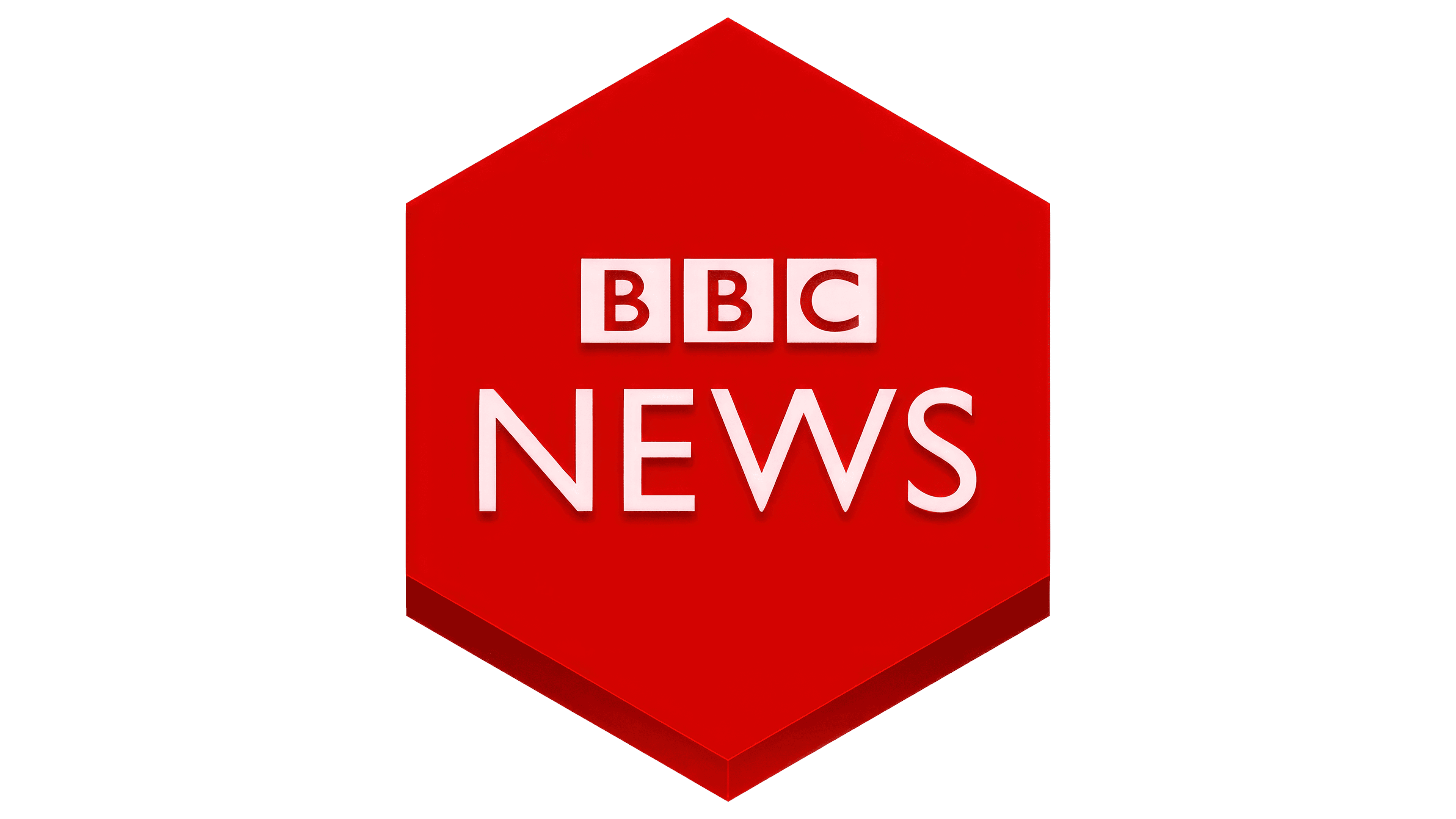
2022 – today
![]()
The updated BBC News logo is simplified, emphasizing clean lines and contrast. Previously, a red square was used, but now the emphasis is on strict geometric shapes.
The letters “BBC” are arranged in separate black squares. The letters stand out, preserving the integrity of the image. White font on a black background looks expressive. The font has been updated: it has become more modern, without decorative details.
Below the squares is the word “NEWS.” It is made in a large red font. The lettering is centered and aligns in width with the row of letters “BBC.”