


Hydraid turned to recreational sports for a brand update unveiled in June 2026. Berlin-based agency LIT Create developed a compact, slanted logo and the tagline “Feel the Hy” for the German electrolyte mix producer. The project drew on the experience of regular training, from exertion and fatigue to recovery and personal accomplishments.
Founded in 2021, the brand makes powdered drink mixes in single-serving stick packs, including its Hydration Helper, Energy, and Immunity lines. By summer 2026, its products were available through its online store and at 4,000 retail locations across Germany. Developing the new positioning and identity took about a year. The team wanted to complement the product’s functional benefits with a connection to the everyday lives of people who enjoy running, cycling, and team sports.
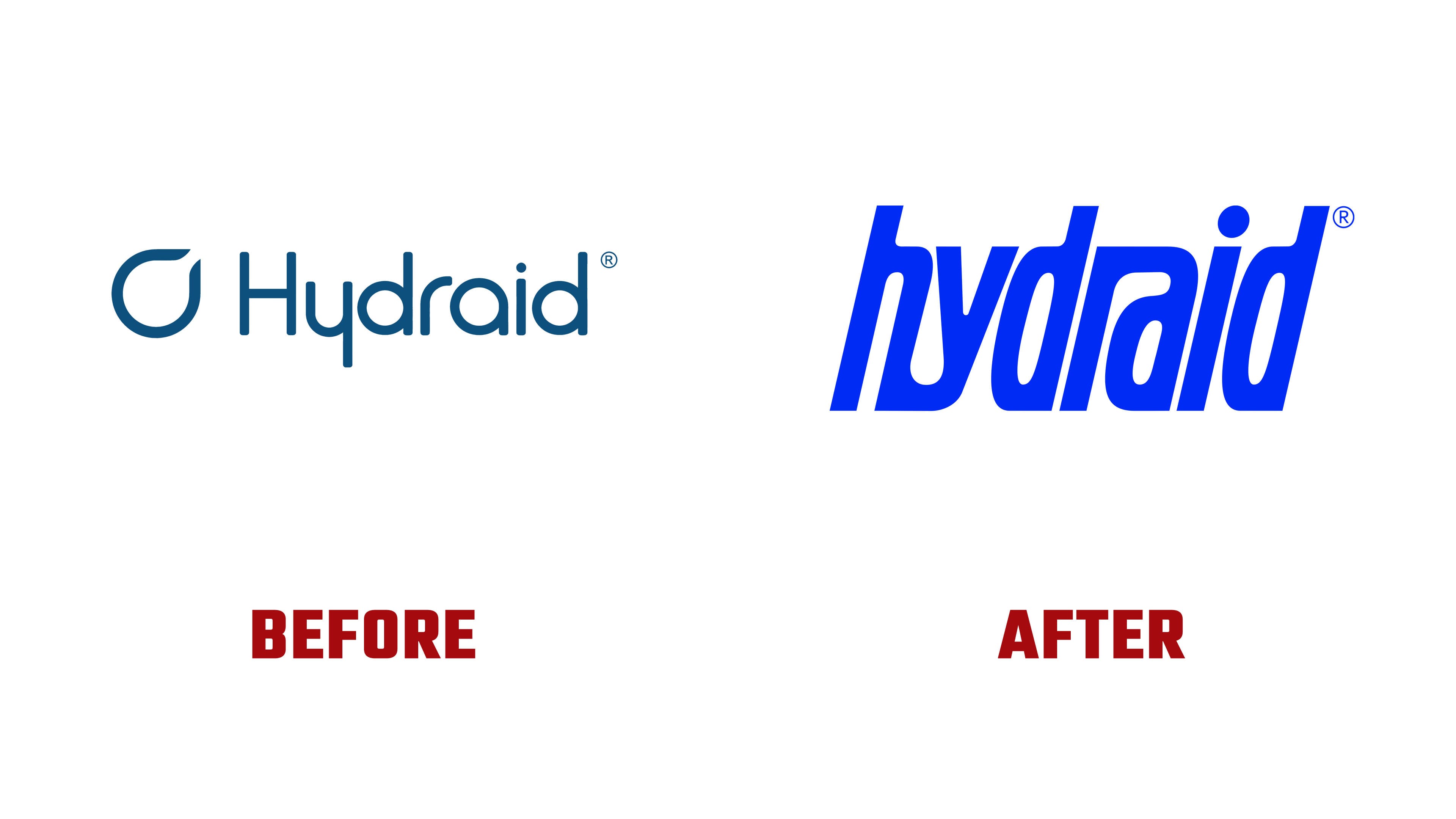
The most substantial changes were to the wordmark. The name “hydraid” shifted to lowercase, with thicker strokes and a pronounced rightward slant. The lowercase letters have a tall x-height, so the ascenders extend only slightly above the rest of the lettering. Narrow counters follow the overall slant, and a large circular dot sits above the “i.” Tight spacing creates a compact block suited to prominent placement on sports gear.
Two ligatures connect letters within the word. At the beginning, the “h” and “y” join at the bottom, where the “y” curve meets the base of its neighbor. In the middle, the upper stroke of the “r” flows into the “a.” These connections unite the wordmark while keeping the individual letters distinguishable. Heavy strokes, elongated proportions, and the slant give the logo a sports-typography feel.

The previous identity communicated the product’s purpose through a droplet to the left of the name. Its outline had a gap in the upper-right section. Beside it, Hydraid appeared with a capital “H” in thin, rounded, upright sans-serif lettering. The white symbol and wordmark sat against a blue background. In the new version, the wordmark becomes the primary brand identifier. A vivid, saturated blue replaces the muted shade, while pale mint replaces white.
The tagline “Feel the Hy” plays on the sound of the name’s opening syllable and the word “high,” suggesting elation. It invites people to experience the surge of energy and joy that follows exercise. “Hy” also appears in short phrases such as “Shop the Hy,” “Sag Hy” (meaning “Say Hy” in German), and “Hy-lights.” The wordplay connects product messaging with the experiences of people who play sports and exercise.
The name occupies much of the surface of the boxes and stick packs. Blue and mint alternate between the background and lettering, while colored sections distinguish the flavors. On bottles, the logo runs lengthwise along the body. The new identity appeared in advertising and on the website, with the product formulas unchanged.
In July 2026, news emerged that the Schwabe Group had acquired a controlling stake in Hydraid. Cofounder Dominik Winter explained that the June rebrand had prepared the brand for further growth with its new partner.