


 Jockey Logo PNG
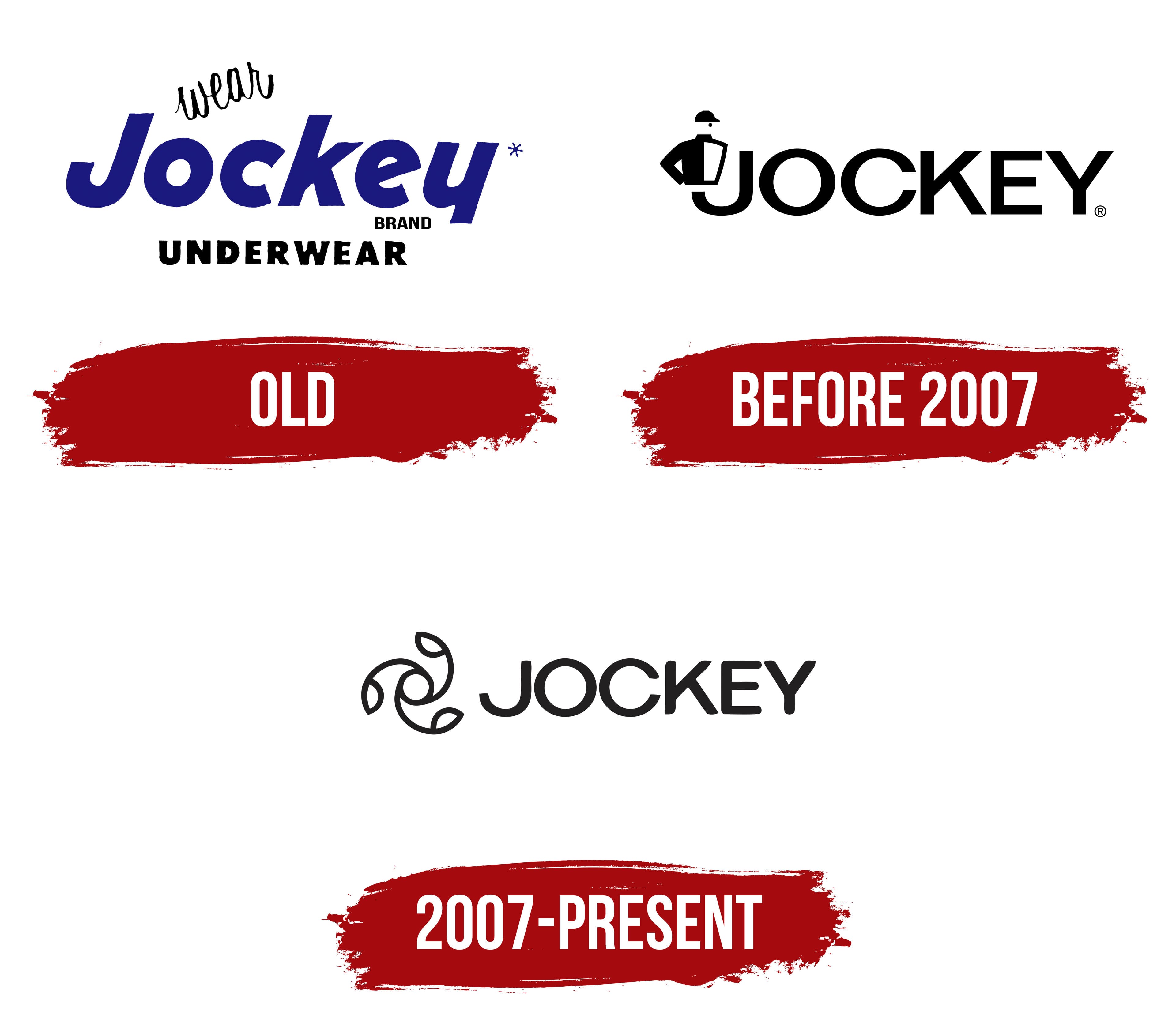
The Jockey logo is distinguished by its refinement and softness, emphasizing the characteristics of products designed for direct body contact. The emblem conveys comfort and lightness, evoking weightlessness and ease. The smooth curves of the visual symbol are reminiscent of how the brand’s products gently envelop and protect, creating a sense of warmth and care. The dynamic nature of the logo suggests freedom and minimalism, reflecting the brand’s core values.
Jockey began in 1876, when Samuel T. Cooper founded S.T. Cooper & Sons in St. Joseph, Michigan. The company first produced wool socks for miners and lumber workers facing severe weather. In 1900, it entered underwear, and the 1912 Kenosha Klosed Krotch helped shape the modern long boxer style.
Arthur Kneibler found inspiration during a 1926 trip to the French Riviera. In 1934, the company introduced Jockey shorts with an elastic waistband and Y-front opening. All 600 pairs sold within hours during a winter launch in Chicago. The business adopted the Jockey name in 1938 as underwear became its main product category.
During World War II, the company supplied specialized underwear to the US military. It opened its first international office in Canada in 1953, followed by an early television advertising campaign. In the 1960s, seamless construction and synthetic fabrics such as polyester and nylon made garments lighter and quicker to dry. Women’s underwear, loungewear, and sleepwear joined the range in the 1970s.
Expansion into Europe and Asia continued during the 1980s, supported by athlete sponsorships and sports events. In the 1990s, Jockey introduced thermal underwear made from newer materials and opened its first online store. Sportswear and casual clothing expanded during the 2000s, while later products added moisture and temperature control. By 2023, the company sold underwear, homewear, sportswear, and casual apparel through stores and online channels worldwide.
Meaning and History
What is Jockey?
This American company is associated with the production of intimate apparel and underwear. The brand is known for its innovative designs, comfort, and high-quality products. The company offers a range of items for men, women, and children, including underwear, loungewear, sleepwear, and activewear. The invention of men’s briefs became one of the brand’s significant achievements, changing the approach to men’s underwear. The company specializes in fit and comfort, using advanced fabric technologies to enhance both.
Old

The underwear emblem includes the brand’s name and clarifies what is sold under this label. Coopers, Inc. founded the brand, and “Jockey” was chosen to reference modern men’s briefs. Originally, the product was positioned as a supportive bandage for the genitals, resembling protective covers used in sports. The name is connected to horseback riding, emphasizing that Jockey briefs are designed for an active lifestyle.
The thin word “wear,” written in cursive, rises above the main name as if sitting in a saddle, hinting at when the product is most in demand. Due to the high popularity of this item, the company eventually changed its name to Jockey Menswear, Inc., reinforcing the connection to the original idea behind the brand.
Before 2007

An elegant, thin, rounded font, executed in capital letters, has a sporty character, creating a sense of lightness and fitness. The logo appears dynamic and modern. Particular attention is drawn to the first letter “J,” on the tip of which a rider in a suit is depicted, visible to the waist. The rider’s figure integrates seamlessly into the design, with the letter becoming a natural extension of his body, subtly hinting at a clothing detail below, giving the logo a stylish, conceptual touch.
2007 – today

The modern Jockey emblem is a unique symbol resembling a flower with three dynamically rotating petals, representing development, constant forward movement, and steady company growth. This design highlights the brand’s connection to its evolution and demonstrates its commitment to quality and tradition. The three petals symbolize the brand’s key areas of focus: the production of underwear for men, women, and children. At the tips of each petal, figures resembling a scoop are depicted, which refer to the company’s first products with supportive effects for men, creating a strong connection to the brand’s historical roots.
The logo, with its smooth symbol and intertwining lines, creates a sense of harmony and movement. These lines represent comfort and flexibility, the products’ main characteristics. The rounded, smooth lines emphasize the softness and comfort that have always been key elements of the brand’s clothing.
The font is large and bold, with rounded letters, most noticeable in the letters “O” and “C.” The font emphasizes softness and ease of perception, avoiding excessive strictness, indicating that the brand is confident in itself and its reputation. The inscription retains a refined style, adding elegance while maintaining the brand’s distinctive identity. The use of capital letters enhances the sense of strength and reliability.
The color is classic black, associated with simplicity, reliability, and durability. Black is a fundamental color, symbolizing practicality, just like the always relevant products that never go out of fashion. The logo’s concise design, without unnecessary details, reflects the stability and comfort the brand has offered its customers for many years.