


 Jpmc Logo PNG
The JPMC logo is a benchmark of seriousness, as it belongs to one of the world’s most successful banks. The emblem reflects its corporate principles and approach to work, where precision is the most important factor. In this way, a simple symbol represents complex financial processes.
JPMorgan Chase & Co. (JPMC) traces its roots to the Bank of the Manhattan Company, founded in 1799 by New York investors including Aaron Burr. The bank combined financial services with a project to supply the city with water. Another predecessor, the New York Chemical Manufacturing Company, opened in 1824 and later expanded retail banking and savings accounts.
In 1871, J. P. Morgan and Anthony Drexel founded Drexel, Morgan & Co. After Drexel died in 1895, the firm became J.P. Morgan & Co. and helped finance American railroads. During the banking panic of 1907, Morgan coordinated support for major banks. The crisis contributed to the creation of the Federal Reserve in 1913. In 1929, the firm merged with Guaranty Trust Company.
A separate branch formed in 1955 when Chase National Bank joined the Bank of the Manhattan Company to create Chase Manhattan Bank. Chemical Bank acquired Chase in 1996 for $10 billion and retained the better-known name. In 2000, the group merged with J.P. Morgan & Co. Bank One followed in a $58 billion deal in 2004, bringing Jamie Dimon into senior management.
During the 2008 financial crisis, the bank acquired Bear Stearns and Washington Mutual at the US government’s request. Losses from the 2012 “London Whale” trades exceeded $6 billion and led to tighter risk controls. From 2015 to 2019, the company invested in fintech, digital banking, and blockchain technology. By 2023, it remained one of the world’s largest financial institutions.
Meaning and History
What is JPMC?
This is one of the world’s leading financial organizations, offering a range of services in asset management, commercial and investment banking, and financial consulting. The company supports millions of clients, including individuals, small businesses, large corporations, and government institutions, with solutions such as credit cards, mortgage loans, investment advice, and financing. It is pivotal in global finance, managing trillions of dollars in assets and leveraging advanced technologies for complex transactions and strategic planning.
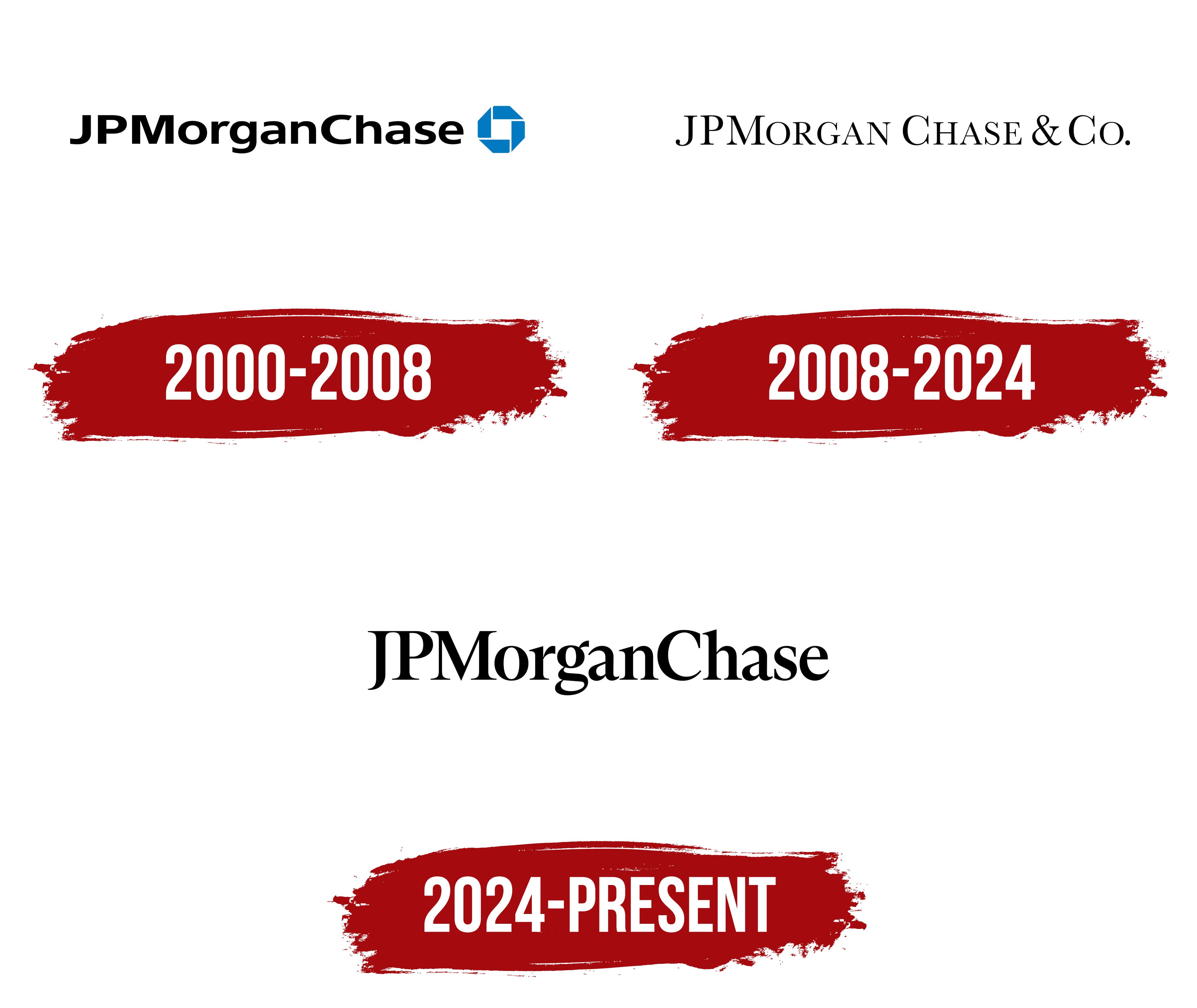
2000 – 2008

The JPMC emblem emerged immediately after the merger of the major financial organizations JPMorgan & Co., Inc. and The Chase Manhattan Corporation. It consists of two parts, each containing key information about the bank: its name, strategy, and concept.
- The first part features the inscription “JPMorganChase,” presented as a single word with no spaces between words. Each part starts with a capital letter, forming the full name of the new bank. It is written in a bold black sans-serif font. The thick glyphs convey the financial institution’s confidence and highlight its stability in the international market.
- The second element is an octagon formed by four rectangular trapezoids arranged in a circular shape. The octagon is an abstract symbol of progress, representing movement, including the circulation of capital. It also signifies the shared interests of all the bank’s structures. In the negative space of the geometric figure, a white square is visible, symbolizing the reliability of the bank’s vault.
The octagon is colored blue, representing hope, stability, reliability, and tranquility. This choice emphasizes that the financial organization operates under vigilant control. The sky-blue hue adds freshness to the logo and balances the density of the black elements.
2008 – 2024

The redesign brought significant changes to the JPMC logo. The most notable change was made to the “JPMorganChase” inscription, now rendered in a different font: thin, sans-serif, and uppercase. Despite the updates, the abbreviations “JPM” and “C” and the letter “C” remain the largest characters. The other glyphs appear smaller in comparison, although they are also in uppercase.
The symbols have become larger, rounded, and expressive, positively impacting text readability. Additionally:
- The spaces within letters have been widened.
- Gaps between words have been introduced.
- A final segment, “& Co,” has been added.
The pointed serifs gave the name an extravagant appearance, making it resemble an old-fashioned inscription. The font now resembles the neoclassical ITC Century Book typeface, which is light and refined. The simplicity of the visual identity prompted designers to abandon the octagonal shape, resulting in a design that conveys responsibility, seriousness, and stability.
With the disappearance of the octagon, the symbolism was lost, and the emblem turned into a sign or an informational label displaying the bank’s name. The color palette also adhered to simplicity: only black remains, commonly associated with formality. However, the monochrome design fits perfectly with the minimalist style and suits a banking company well.
2024 – today
The JPMC logo has become a symbol of striving for perfection. It has become simpler, cleaner, more understandable, and even more historical after its redesign. This is because the designers restored their previous unified writing style. Other important changes were also made:
- A bold font was introduced.
- The ampersand and the “Co” particle were removed.
- The length of the inscription was reduced.
- A different style was applied.
- The glyphs were converted to lowercase.
The emblem allowed the bank to stand out among competitors, emphasize its exclusivity, and delve into its roots. It reflects the values of a major financial holding, which are based on reliability, innovation, and stability. The only aspect preserved in its visual identity is minimalism.
The logo still consists only of text and contains no graphic elements. The font resembles Mandrel Condensed Bold by Insigne Design. It features similarly elegant serifs, a wide loop on the “g,” and a smooth curve at the bottom of the “J” with a sharp tip. These details characterize the company as responsible and attentive to every detail, making it a leader in the financial system.
The classic black-and-white combination emphasizes the bank’s professionalism and deep-rooted history, hinting at the early 20th century. The monochrome palette reflects the institution’s businesslike nature and lack of emotional bias, since money values precision over sentiment.