


![]() Klingspor Logo PNG
Klingspor Logo PNG
The German manufacturer of abrasive tools strives for innovation but appreciates its traditions. That is why the Klingspor logo looks modern while also incorporating heraldic-like elements. It symbolizes strength, confidence, and the company’s huge historical heritage.
Klingspor began in 1893, when Johannes Friedrich Klingspor opened a small glue factory in Siegen, Germany. The company first worked with adhesives, but falling demand pushed it toward a related field: abrasives. Glue became the binding material for sanding paper and grinding cloth, holding mineral grains on paper or textile backing.
In 1899, Klingspor started producing abrasive materials. Its first product was sanding cloth made with Naxos corundum, a mineral from the Greek island of Naxos, known since antiquity as a polishing material. For a time, the company’s name referred to Naxos, and in 1900, it added ground corundum to its product range.
In 1926, Klingspor became the first company in Europe to produce waterproof sandpaper. That enabled use with cooling liquids and made the material useful for automotive paint, lacquer, ceramics, glass, furniture, and construction. In 1950, the company introduced the Kronenflex cutting wheel, designed for speeds up to 80 meters per second. It offered a faster, cleaner way to cut metal than hacksaws or gas cutters. In 1961, Karl Klingspor received the Diesel Gold Medal for the invention.
Klingspor patented the flap wheel in 1954, moved production to Haiger in 1955, and introduced the flat flap disc in 1972. Similar products later appeared from Norton (part of Saint-Gobain) and 3M. International expansion began in 1979 with a site in Hickory, North Carolina. Later, production began in Kozy, Poland (launched in 1997), Bielsko-Biała and Qingdao in 2005, and Velyki Mosty, Ukraine, in 2008. In 2003, the company was reorganized as Klingspor AG.
Meaning and History
![]()
The famous brand has a long history, which includes several important periods. Some of them became pivotal in shaping the brand into what it is today. Modern Klingspor is a brand recognized worldwide. Its visual concept includes vibrant, dynamic coloring and a unique symbol that evokes associations with the company’s products.
1906 – 1960
![]()
The future Klingspor was originally a foundry that operated for several years under Karl Klingspor’s management. But in 1904, it passed to his sons. They modernized production and turned the plant into one of the leading German concerns. The old name was changed to Gebrüder Klingspor. Serious changes led to a change in the concept of identity.
But the management made a non-standard decision. Instead of 1 logo, the company received three different badges. All of them were made in the same style but had different content. This approach was not chosen by chance. Three emblems symbolized the company’s values. The first logo was an oval frame with bold lines.
On the sides were two rectangles bearing the inscription “Schutz Marke”. In the center was a crown drawn in thin black lines. The background was white. The crown symbolized the city in which the concern was located. But after the business spread outside the country, they decided to change it. The reason is that the crown was associated with royalty and did not reflect the brand’s essence.
The second logo had the same design, but it featured a deer in the center. The animal was the family crest of the Klingspor family. Such a performance emphasized family values and the importance of the family. But this option also did not fully characterize the company. For this reason, a third logo appeared. It differed in that the car was located in the center. This showed the focus of Klingspor’s work and described the products.
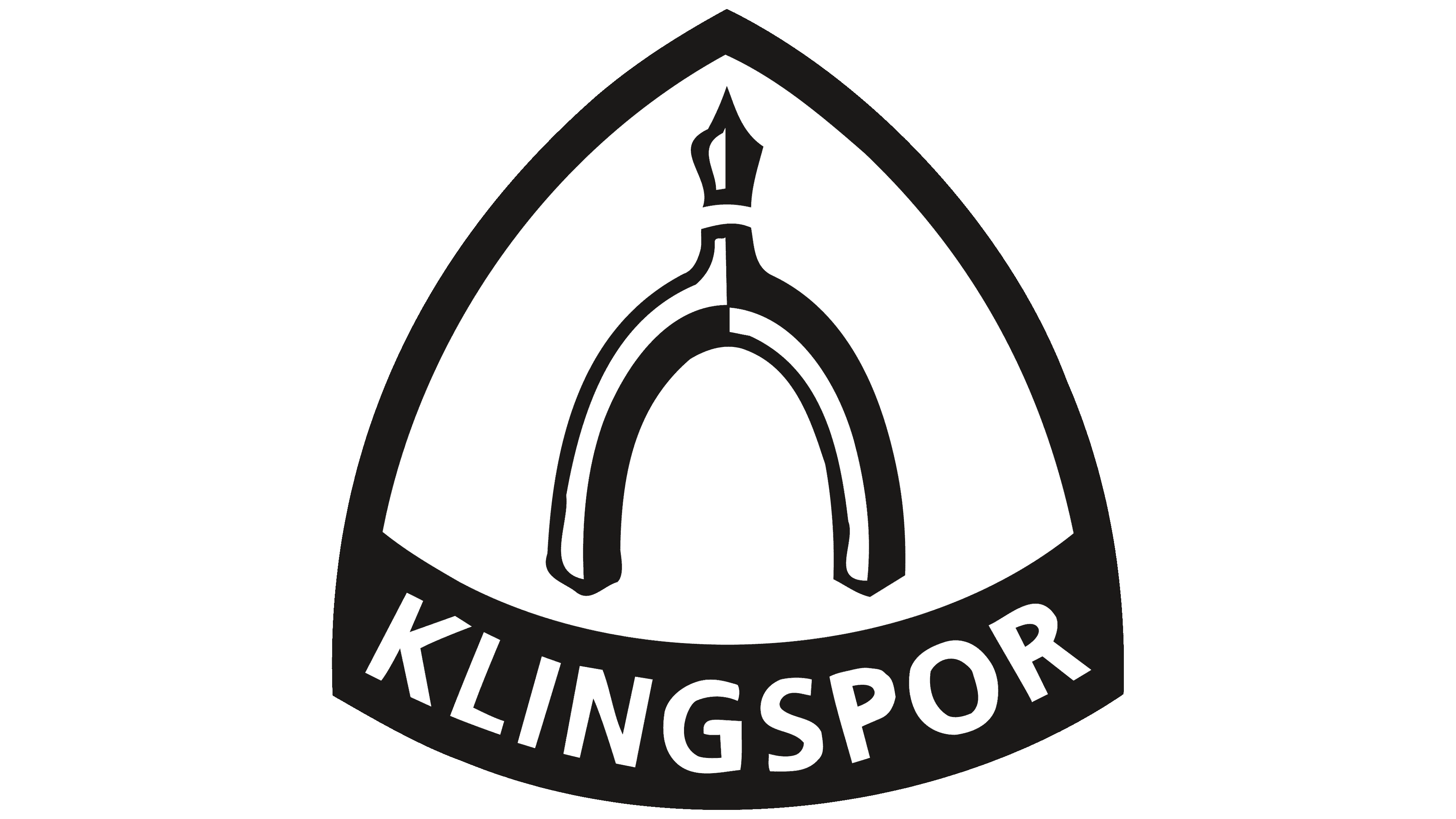
1960 – today
![]()
In the 60s, the company entered a new era of development and decided to radically change its style. As a result of careful research and the work of experienced designer Manfred Birkelbach, a striking modern emblem emerged. The new version had an attractive appearance and was fully aligned with the updated brand’s values.
A feature of the logo was the play on contrasts. Customers could always recognize the brand by its yellow-and-black color scheme. Such a decision symbolized both optimism and rigor. The latter is a characteristic feature of the Germans’ attitude toward work.
This is manifested in strict adherence to rules, production technologies, and established standards. The icon itself consists of a triangular icon, inside which is the image of the tool and the inscription. The tool is black-and-white and set against a yellow background. The Klingspor inscription is located below and effectively emphasizes the overall picture.
Font and Colors
The current Klingspor logo has not changed since 1960. Its expressive execution and contrasting colors are evident. Black, yellow, and white colors are chosen for decoration. Black emphasizes a tribute to tradition and adds rigor. Yellow symbolizes a progressive approach to work and energy, while white serves as the base color, bringing these shades into a harmonious image.
The tool icon symbolizes the company’s activities and the goods it produces. It is made in the original style. Clear lines and black-and-white colors make the instrument stand out against the yellow background. The Klingspor lettering is in a geometric sans-serif, signifying strength and courage.
In addition, the letters are created with clear, simple lines, which emphasize the company’s confidence in the future. An additional characteristic is a perfect balance in everything. Font, colors, and geometric shapes are beautifully combined. It also highlights the brand’s fundamental approach to everything.