 KT Logo PNG
Digital connectivity includes mobile networks, the internet, and data transmission services that enable communications and online services. These systems support everyday tasks ranging from communication to work and entertainment. The KT logo represents a South Korean telecommunications company that provides communication services, internet access, and digital solutions.
KT Corporation was founded on March 10, 1981, as Korea Telecom. The company was created when South Korea’s Ministry of Communications separated the telecommunications division. The new entity’s main goal was to develop a national communications network and prepare the industry for privatization. In 1982, it began digitizing telephone exchanges. In 1984, the company launched the country’s first computer data transmission network.
During the 1988 Olympics, Korea Telecom provided telecommunications infrastructure for broadcasting. In 1993, it became a joint-stock company. In 1994, it introduced the internet service KORNET. After the 1997 crisis, the government reduced its ownership share. The privatization process began.
In 1999, the company implemented ADSL broadband internet. This made South Korea a global leader in high-speed internet penetration. In 2000, Korea Telecom acquired Korea Mobile Telecom, a mobile operator. In 2002, the company renamed itself KT Corporation and began developing new areas, including internet telephony and IPTV.
In 2004, KT launched the WiBro network, a precursor to 4G technology. In 2006, KT acquired Powercomm, strengthening its position in the home internet market. In 2009, KT consolidated all mobile assets under the KT brand.
In 2011, the company introduced the LTE network. In 2013, it began developing cloud technologies and data centers. In 2018, KT became one of the first operators worldwide to launch a commercial 5G network.
In 2020, the company introduced the voice assistant GiGA Genie. In the same year, it announced major investments in 5G, 6G, and quantum communications development. In 2022, KT created a metaverse for corporate and educational services. In 2023, it began exporting 5G technologies to Asian and Middle Eastern countries.
The company ranks second in South Korea’s telecommunications market. It serves tens of millions of subscribers and develops next-generation networks.
Meaning and History
What is KT?
A leading telecommunications corporation in South Korea, headquartered in Seoul, it controls about 90% of the fixed-line market and ranks second in the mobile segment after SK Telecom. It serves over 7 million 5G subscribers and leads in broadband internet, with speeds up to 100 megabits per second over its FTTH network. After merging with KTF, it launched the IPTV service QOOK TV and established subsidiaries KT Capital, KT Commerce, KT Tech, and KT Telecop. It created a blockchain platform for digital identification and energy transactions. Its achievements include the Koreasat satellite and a fiber-optic line between South and North Korea.
1981 – 1991

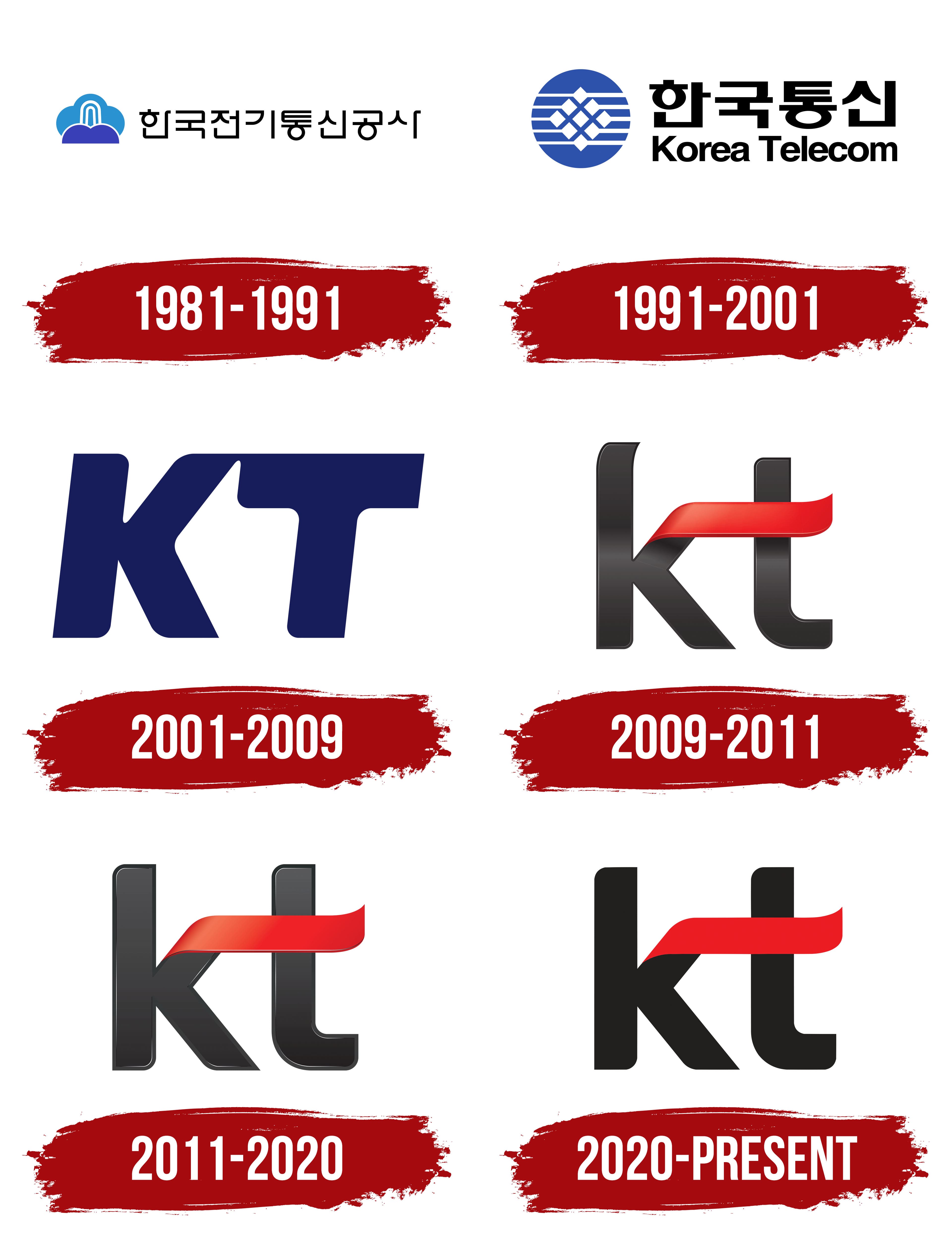
The Korea Telecommunications Authority was established in 1981 as part of South Korea’s telecommunications industry restructuring. During the same period, the organization introduced its first corporate signature. The government agency was established on December 10, 1981, to modernize the telephone network, expand communications access, and develop Korean technology. Operations began on January 1, 1982, after the Ministry of Communications transferred the relevant responsibilities.
In 1984, the Korea Telecommunications Authority introduced the TDX-1 electronic telephone exchange developed in South Korea. By 1987, the organization had automated the long-distance telephone network. The corporate signature represented the authority during the industry’s early transformation. It included the full government name 한국전기통신공사 and remained in use until the identity was updated in 1991.
The logo consisted of a compact two-color emblem on the left and a long Korean inscription on the right. A purple semicircular base resembling a platform or hill occupied the lower portion of the figure. A rounded light-blue dome sat above it. A thin white line separated the colored areas and continued into the internal pattern.
Three white, arch-shaped lines rose through the blue section. The two inner curves had elongated proportions and formed a parallel pair. Together, they created a vertical motif within the dome. The rounded base, light upper section, and white curves gave the emblem a layered structure.
The black name 한국전기통신공사 appeared on the right. The Hangul characters were sans-serif with uniformly thick strokes. Restrained typography kept spacing even along the long line and separated the legal name from the colored emblem. The organization used the 1981 corporate signature until it adopted a new identity in 1991.
1991 – 2001
In January 1991, the Korea Telecommunications Authority replaced its full government designation with the name Korea Telecom and updated its corporate identity. The organization began using the abbreviated Korean name 한국통신 alongside the English name Korea Telecom. The changes took place as South Korea’s telecommunications industry prepared for competition and eventual privatization. The company established a dedicated CI committee to develop and introduce a unified system.
The corporate signature featured a blue circular emblem on the left and two lines of text on the right. The large Korean name 한국통신 occupied the upper line. The smaller English name Korea Telecom appeared below it. The national-language name remained primary, while the Latin-letter version supported international use.
Five straight white stripes crossed the blue circle. Two lines occupied the upper half, two appeared below, and the fifth crossed the figure along its horizontal axis. Nine small white diamonds formed a symmetrical grid in the center. Their sharp corners complemented the straight stripes and rounded outer border. The pattern remained within the circle and filled its interior.
The Korean name used large black Hangul characters with heavy strokes. The English line appeared in a bold sans-serif typeface resembling Helvetica Bold and Arial Black. “Korea” and “Telecom” began with capital letters, followed by lowercase characters. The black lettering appeared beside the blue emblem and supported the logo’s horizontal format. Korea Telecom used the 1991 version through the end of 2001.
2001 – 2009
Korea Telecom’s 20th anniversary coincided with preparations to complete its privatization and provided an opportunity to update the corporate identity. The operator introduced its new branding and adopted the short name KT on December 11, 2001. The rebranding shifted the company’s image from a government telephone service to a private telecommunications business.
The name KT came from two original terms. The letter “K” represented Korea, while “T” came from Telecommunication. The short name followed an international industry practice already used by AT&T, NTT, and BT. The abbreviation suited a company planning to expand beyond its previous role as the national telephone operator.
The Korea Telecom emblem’s blue circle, white stripes, and diamond grid were replaced by two dark blue uppercase letters, “K” and “T.” They joined into a dense, monolithic form. Wide surfaces created heavy letterforms that leaned to the right. The outer corners were rounded, while the inner sections remained rigid and straight.
The space between the “K” and “T” formed an arrow associated with growth and development. Straight edges paired with soft curves connected KT’s technological profile with a friendlier presentation. The two letters formed a single emblem. The short name simultaneously served as the corporate signature.
Shareholders approved the company’s legal renaming to KT in March 2002. Full privatization was completed later that year, making the former government operator a private company. The abbreviated identity appeared in KT’s internal materials and international communications.
2009 – 2011

Combining the landline and mobile businesses required one corporate identity for all KT services. The company merged with its KTF subsidiary on June 1, 2009. Management introduced the “olleh” program and updated branding on July 9. The rebranding brought the services into one system. It replaced the formal image of a telecommunications corporation with a softer, customer-focused presentation.
The blue uppercase letters from the previous logo were replaced by lowercase black “k” and “t” characters. They had heavy sans-serif forms, rounded terminals, subtle tonal transitions, and glossy surfaces. The upper diagonal of the “k” extended upward, curved, and connected with the “t.” A red ribbon crossed both letters from left to right, replacing the conventional crossbar of the “t.”
The red ribbon resembled a waving flag. Transitions from dark to light tones, highlights, and soft shadows gave it depth. KT presented the flag as a global brand expanding beyond Korea. Red represented energy, innovation, youth, and a warm relationship with customers. Black conveyed trust and continuity within the corporate identity.
During the first years, the updated signature appeared in the combined form “olleh KT.” The word “olleh” had several interpretations. It spelled “hello” backward, matched a Korean exclamation of joy, and referenced the Chinese character 來, meaning “to come.” The layered name presented KT as an integrated telecommunications company with a new way of communicating with its audience.
KT’s internal Design Management division worked on the “olleh” project. Design director Lim Jae-hee later discussed her role in developing the “olleh” logo and Olleh Square’s identity. After a period of combined use, the black “kt” with the red flag became the primary corporate signature. The letter construction remained, while flat colors later replaced the dimensional transitions, gloss, and lighting effects.
2011 – 2020

The updated KT logo changed the dimensional treatment of the letters and red ribbon while retaining the established emblem structure. Two lowercase letters, “k” and “t,” remained the basis of the composition. A thin outline and gradients gave them a raised appearance. The revision focused on depth while preserving the previous corporate mark’s contours.
Both letters had dense black fills with tonal transitions. Light and dark stripes along the sides represented edges and separated the front surfaces from the boundaries. Smooth contours and rounded corners softened the heavy letterforms. The internal gradient gave the letters three-dimensional relief.
The red ribbon crossed the upper portion of the logo from the “k” to the “t.” It replaced the ht” as a horizontal crossbar nd passed over both characters. Its curve joined the letters into a single structure, creating a continuous transition between them. The decorative feature remained the logo’s upper component.
The ribbon shifted from dark red to bright scarlet. An adjusted gradient, light highlights, soft shadows, and a glossy finish enhanced its depth. The black letters formed a dark base, while the red ribbon stood apart through its color and lighting transitions. The underlying letter structure remained unchanged.
2020 – today
The current KT version completed the transition from a glossy finish to a flat color system. Two lowercase letters, “kt,” and a red ribbon above them continue to form the composition. Solid fills replaced gradients, highlights, and shadows. The flag’s curves preserve a sense of depth through their shape.
The lettering uses a dark gray shade close to charcoal. Brand standards identify it as Pantone Black C. The red ribbon uses Pantone 1795 C with a uniform fill. The contrast between the two solid colors separates the letters from the flag while maintaining the connection between the “k” and “t.”
KT describes the red form as a global brand flag. It conveys unity and the international reach of the company’s communications. Red represents passion, innovation, and a warm relationship with customers, while black represents trust. The ribbon begins above the “k,” crosses the upper section of the logo, and ends above the “t.” Its curve resembles fabric waving in the wind.
The standard corporate signature consists of the lowercase “kt” and the red flag. The Korea Telecom name is used separately from the primary composition. Some commercials have featured a version with adjusted proportions. In that variation, the “k” is the same height as the “t.” The remaining elements follow the established construction and color combination.
The letter-and-flag structure became the basis of the KT Group identity and continued into subsidiary brands. The corporate system uses the KT Flow motif, derived from the red ribbon’s curves. Arcs with different radii form a shared line system for communication materials, maintaining continuity with the identity introduced in 2009.