 SK Telecom Logo PNG
Mobile communications and data transmission underpin digital services, from phone calls to streaming video and online gaming. Networks enable applications to function and facilitate information exchange in everyday tasks. The SK Telecom logo represents a South Korean telecommunications company that provides mobile services, internet access, and digital solutions.
SK Telecom was founded in March 1984 as Korea Mobile Telecommunications Corporation. It became South Korea’s first mobile operator. The first analog AMPS network covered only Seoul and had just a few thousand subscribers. By the late 1980s, the network had expanded nationwide. This laid the foundation for the company’s future leadership.
In 1991, the government allowed competition in the mobile communications market. By 1994, the company began implementing the digital CDMA standard. In 1996, Korea Mobile Telecommunications became part of the SK Group conglomerate. In 1997, the company was renamed SK Telecom. At the end of the decade, the operator launched SMS and the first mobile internet services.
In 2000, the company opened a third-generation network based on CDMA2000. In 2002, it introduced a mobile TV service using DMB technology. In 2006, it began operating an HSDPA network. In 2009, LTE testing started. In July 2011, the fourth-generation network went live in Seoul. By 2013, it covered almost the entire country.
In 2016, SK Telecom introduced a voice assistant called Nugu. In December 2018, the company became the first in the world to launch a commercial fifth-generation network. In spring 2019, 5G became a mass-market service. The company developed virtual reality, cloud gaming, and the Internet of Things. That same year, the business was split into SK Telecom and SK Square.
In 2020, the company acquired ADT Caps, strengthening its smart home division. In 2021, SK Telecom launched the metaverse “ifland”. In 2022, it announced investments in developing sixth-generation communication technologies. In 2023, it began integrating generative artificial intelligence into mobile services.
The company serves more than thirty million subscribers. It provides almost full coverage of the fifth-generation network and remains South Korea’s leading operator.
Meaning and History
What is SK Telecom?
SK Telecom is a leading mobile operator in South Korea, headquartered in Seoul. It controls more than half of the market and serves about 27 million subscribers. It was founded based on a state organization that later became part of an industrial conglomerate. The company was the first in the world to launch a commercial 5G network covering 85 cities and 34,000 stations with speeds up to 2.4 Gbit/s. Key areas include mobile communications, internet, the Wave Media platform, corporate solutions using blockchain, and the 5G Dynamic Data system. Together with Amazon Web Services, it is building AI data centers with a capacity of 1 GW and more than 60,000 graphics processors.
1984 – 1992
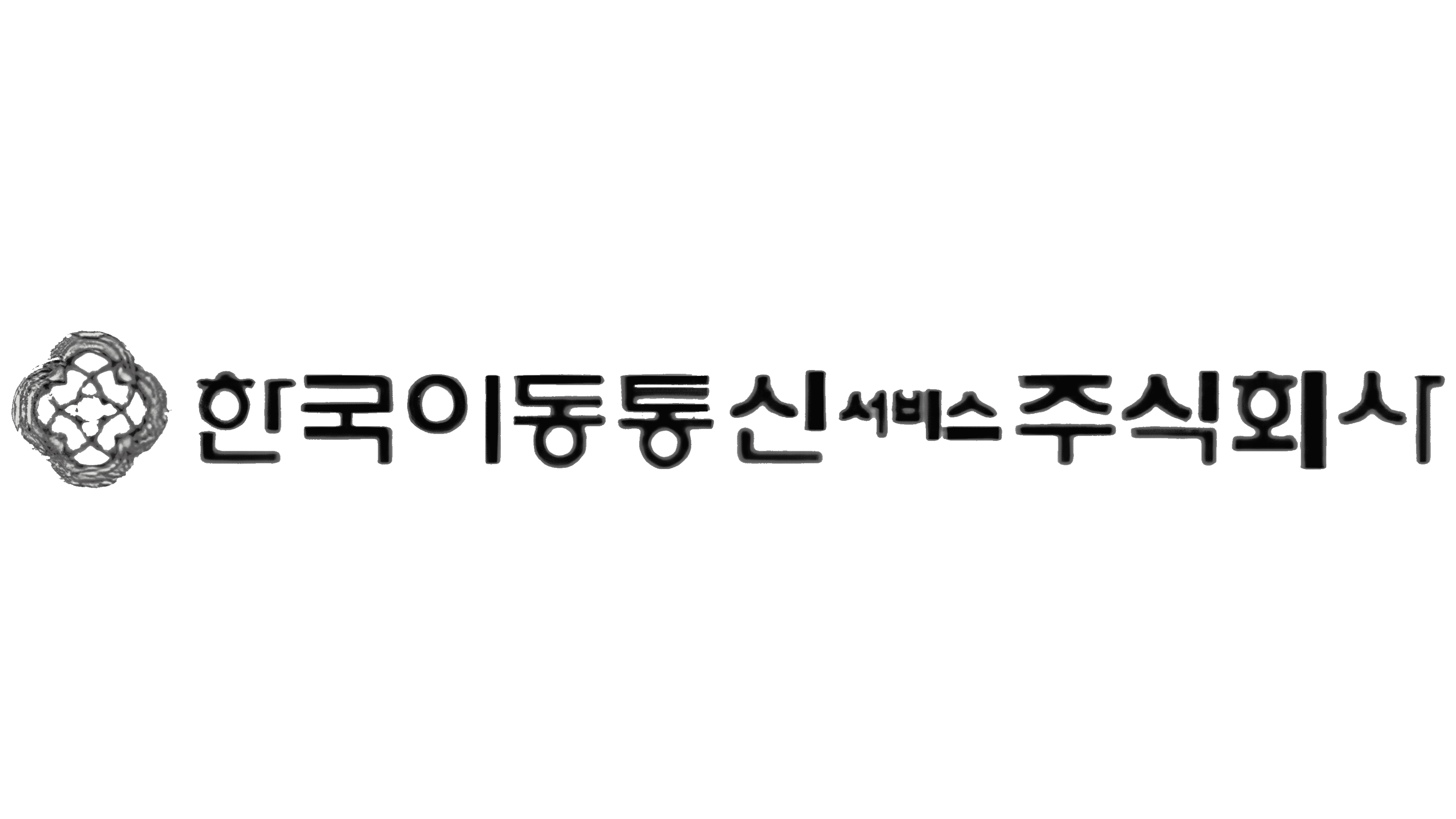
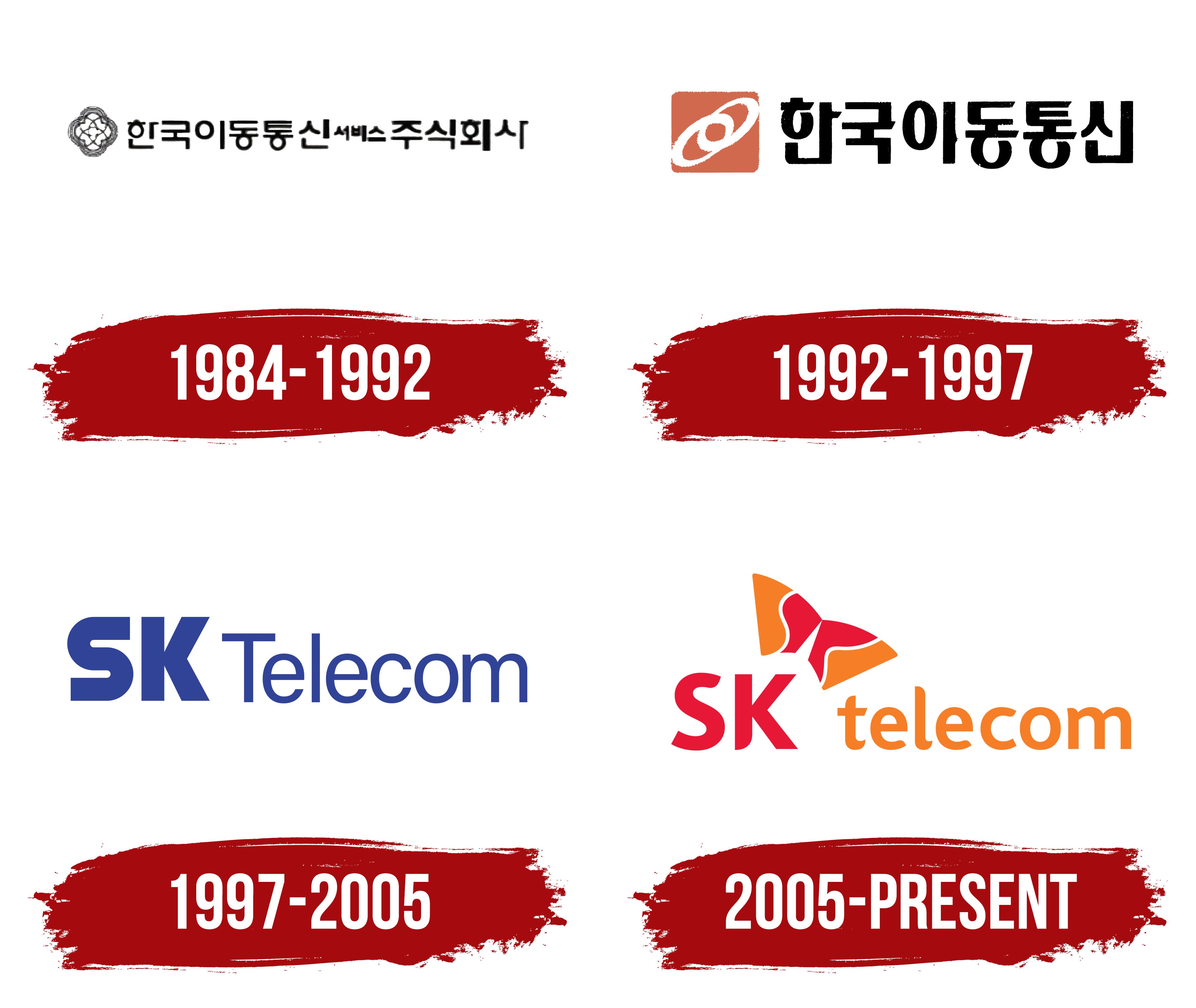
The operator’s long Korean name dominated the early logo of what would become SK Telecom. The company began operating in 1984 as Korea Mobile Telecommunications Services, 한국이동통신서비스, offering car telephone and pager services. The name directly identified its mobile communications business in Korea. In 1988, “Services” was removed, leaving Korea Mobile Telecommunications, 한국이동통신. In 1994, Sunkyong, the group later known as SK, gained control of the operator.
In the version featuring the original name, 한국이동통신서비스 주식회사 appeared to the right of a small emblem. The words 주식회사 identified it as a joint-stock company. The heavy black Hangul characters dominated the horizontal design. The word 서비스, meaning “services,” was smaller and lighter but remained within the same line.
On the left, a black-and-white emblem featured nested, rounded outlines. Curved lines intertwined around the center, forming a four-part pattern. The symbol’s thin strokes contrasted with the heavy Korean lettering, keeping the full company name prominent.
1992 – 1997
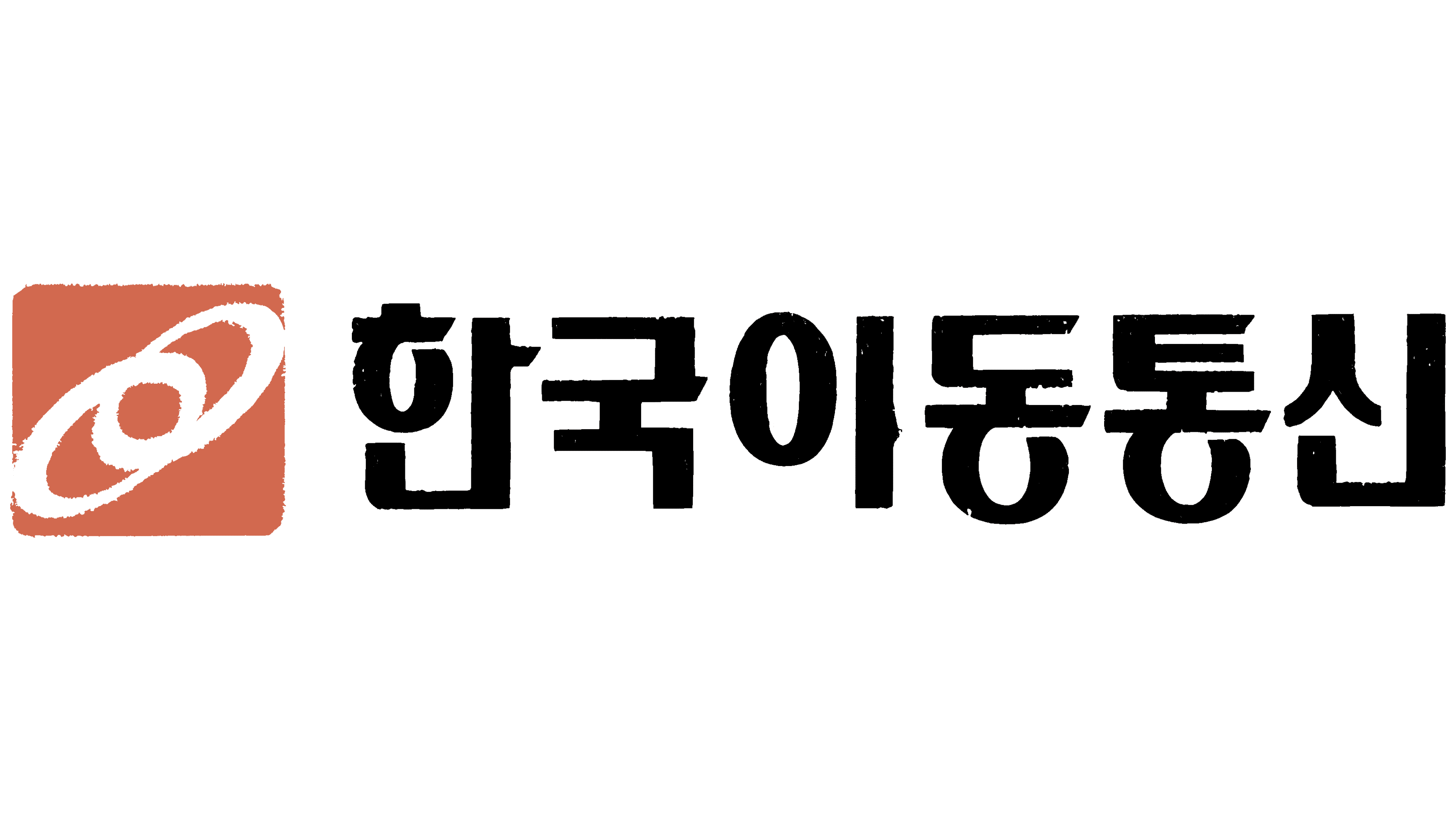
In 1992, Korea Mobile Telecommunications updated its logo ahead of increased competition in the communications market. A terracotta-orange square with rounded corners replaced the earlier, more complex emblem beside the name. White lines inside form two intersecting ellipses tilted diagonally upward. Their outlines resemble orbits. The connection between the two shapes represented employee unity, coordinated work, the operator’s technical capabilities, and communication.
The shortened Korean name 한국이동통신 appeared to the right of the square. The large black Hangul characters used heavy, upright strokes and close spacing. Their uneven texture contrasted with the emblem’s smooth white lines. The horizontal arrangement connected the new colored symbol to the name under which the company was preparing to compete in the opening market.
1997 – 2005
Preparations for the SK Telecom name began before its introduction. In 1996, the company formed an internal identity team and gathered employee suggestions. In 1997, after the operator joined the SK group, the company approved the short Latin-alphabet name. “SK” referred to Sunkyong, while “Telecom” identified telecommunications. The name suited international markets and reflected plans to expand beyond mobile telephony, integrate wired and wireless communications, develop multimedia services, and bring telecommunications and broadcasting closer together.
The name change came with a blue wordmark. The separate symbol was removed, leaving SK Telecom as the logo. The large capital “SK” letters use a heavy sans-serif style with straight-cut ends. In the “S,” broad horizontal sections flow into rounded curves, while the “K” is built from straight diagonals. Smaller lettering for Telecom appears to the right, with a capital “T” followed by thin lowercase letters. A blue-violet shade unifies both parts of the name. The company associated blue with advanced technology, speed, and accurate information transmission.
2005 – today
SK Telecom’s shift from a blue logo to red and orange was part of a broader update across the SK group. In 2005, the group introduced a shared emblem called “Happy Wing,” developed by American agency Lippincott Mercer. Another English name for the symbol, “Wings of Happiness,” conveyed the same meaning. The shared identity connected the group’s businesses as it expanded internationally.
The design drew on images of a kite and a communications satellite. The resulting silhouette resembles a butterfly with two unequal wings, tilted at 29.4 degrees. The wings represented SK’s two business areas: energy and chemicals, and information and telecommunications. They could operate separately or together. Curved white openings divide the red inner sections and orange outer sections, forming the letters “S” and “K.” The tilt makes the figure look like a kite taking flight.
In the operator’s logo, the wings sit above the right side of the red “SK.” Orange lowercase “telecom” appears to the right. Bliss Bold served as the starting point for the “SK” lettering. The ends of both letters were rounded to complement the emblem. Smooth forms replaced the straight-cut ends of the earlier blue wordmark. Red continued the SK group’s branding and expressed enthusiasm for the work and pride in the company. Orange represented warmth and happiness. The Happy Wing name reflected the group’s intention to support the well-being of customers, employees, and other stakeholders.
In 2006, SK Telecom began replacing signs at approximately 2,400 branches and dealerships. The red-and-orange logo replaced the previous blue signage on a white background. The signage project took six months. The team created 52 options, studied customer responses, and approved the highest-rated design.