 LY Corporation Logo PNG
Messaging, news, information search, and online payments have long been integrated into digital services that function as a unified environment. In Japan and South Korea, these platforms cover a range of everyday tasks and let users switch between them within a single service suite. The LY Corporation logo represents a company that develops an ecosystem of messaging, news, search, and payment services.
LY Corporation was established in 2023 through the merger of two leading Japanese internet companies, LINE Corporation and Z Holdings. The history dates back to 2000, when NHN Japan was founded. In 2011, it developed the LINE messenger after the earthquake and tsunami. The company created the app as an internal communication tool for employees.
The messenger became popular thanks to free messaging and its signature stickers. By 2016, LINE held an initial public offering in Tokyo and New York, raising about $ 1.3 billion. The number of users worldwide exceeded two hundred million.
At the same time, Yahoo Japan was developing. This project was launched in 1996, with participation from SoftBank and the American company Yahoo. The platform strengthened its position in the Japanese search, auction, and e-commerce markets. In 2019, SoftBank consolidated its internet assets into a holding company called Z Holdings, which included Yahoo Japan.
In November 2019, LINE and Z Holdings announced a merger. The deal was valued at about $30 billion. The merger was completed in 2021. In 2023, the company received a new name, LY Corporation. It reflected the combination of the two brands into a single structure.
After the rebranding, the company focused on integrating the LINE and Yahoo Japan ecosystems. In 2024, it launched a unified loyalty program and an integrated digital services platform.
The company manages several key products, including LINE messenger, the Yahoo Japan portal, the PayPay payment system, and online commerce services. It serves tens of millions of users and is one of Japan’s largest digital ecosystems.
Meaning and History
What is LY Corporation?
A major Japanese digital holding company that brings together leading internet brands, including LINE, Yahoo! Japan, Z Holdings, LINE Pay, and PayPay. The ecosystem covers messaging, e-commerce, fintech, digital advertising, and mobile payments. LINE is the core, with hundreds of millions of users in Japan, Taiwan, and Thailand. Around it, it develops projects such as LINE Games, LINE Taxi, LINE Pay, LINE News, and LINE Shopping. Yahoo! Japan remains a leader in search and news. Revenue comes from commissions, advertising, subscriptions, and digital content, while it offers cloud solutions, analytics, and CRM services for businesses.
2019 – 2023

The history of the future LY Corporation is connected with Yahoo Japan Corporation, established by SoftBank and Yahoo on January 31, 1996. In 2019, the company converted into a holding company, separating group management from online service operations. The parent organization became Z Holdings and adopted a new wordmark. The Yahoo! JAPAN brand remained with its consumer services.
Preparations for the restructuring began in April 2019. Z Holdings unveiled its logo on August 30, and the former Yahoo Japan Corporation was renamed Z Holdings Corporation on October 1. Yahoo! JAPAN services moved to a new subsidiary that retained the previous Japanese name. The subsidiary took over the search portal, e-commerce, advertising, and financial services. At the same time, the holding company became responsible for managing the group.
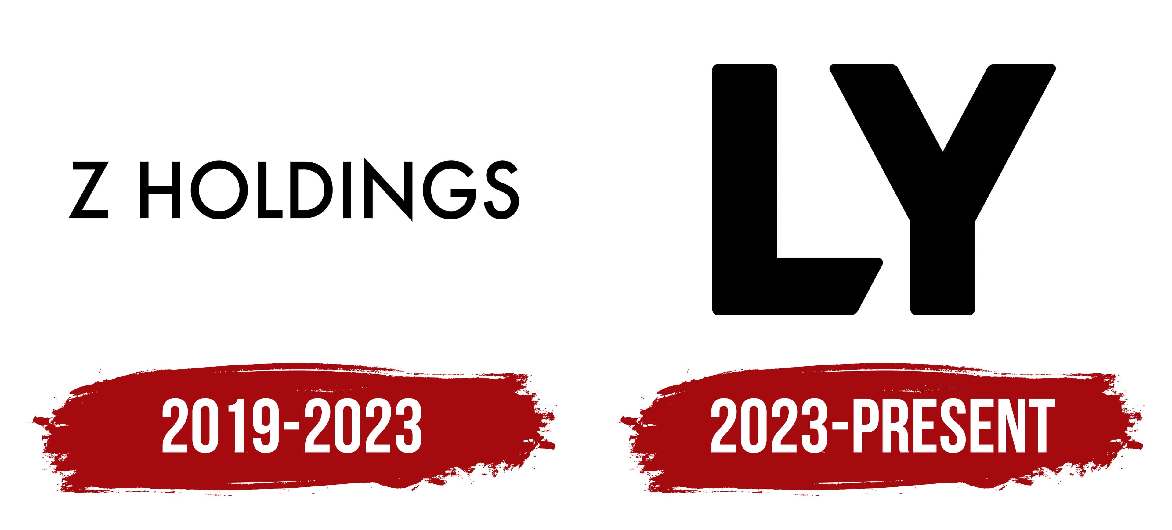
The logo used from 2019 through 2023 was based on the Futura typeface. The black words “Z HOLDINGS” appeared in one horizontal line. A large uppercase “Z” stood separately from the second word and served as the company’s abbreviated identifier. “HOLDINGS” used a thin geometric sans-serif typeface with wider letter spacing. The size difference separated the name from the reference to the holding structure, while the shared color united both parts.
The black wordmark differed from the red Yahoo! JAPAN identity. A single letter and the word “HOLDINGS” replaced the Yahoo name and its exclamation point. The entire composition consisted of text. The elongated horizontal logo appeared in corporate documents in English and Japanese. It represented the parent group, while its services retained separate brands.
Another part of the future LY Corporation’s history is connected with LINE. Its origins date back to Hangame Japan, founded in September 2000 and later renamed NHN Japan. A company division launched the LINE messaging service in June 2011. The business became LINE Corporation on April 1, 2013. The LINE business dates back to NHN Japan. In contrast, the publicly traded company’s legal continuity dates back to Yahoo Japan, established in 1996.
The integration of LINE and Z Holdings in March 2021 brought both businesses under the holding company’s management. Z Holdings retained its public status and its existing “Z HOLDINGS” logo. LINE and Yahoo! JAPAN continued operating under separate names with their familiar colors and logos.
2023 – today

The creation of LY Corporation marked the next stage in combining LINE and Yahoo! JAPAN. Following the 2021 integration, information, communication, and payment services operated within one group. Z Holdings, LINE Corporation, and Yahoo Japan Corporation remained separate entities. SoftBank and NAVER each owned an equal interest in A Holdings, which held a controlling stake in Z Holdings. Several layers of management complicated the group’s operations. The company announced an internal reorganization in February 2023, and the future name was approved on April 28.
In Japan, the company received the name LINEヤフー株式会社, corresponding to LINE Yahoo Corporation. The international name LY Corporation was formed from the initial letters of LINE and Yahoo. The short form maintained a connection with the two familiar services. The merger of Z Holdings, LINE Corporation, Yahoo Japan Corporation, Z Entertainment, and Z Data was completed on October 1, 2023. The consumer brands LINE, Yahoo! JAPAN, PayPay, and ZOZOTOWN continued operating under their existing names.
Identity development began in April 2023 and took about six months. An internal team of about 30 designers from LINE, Yahoo Japan, and South Korea’s LINE Plus worked on the project. Participants included Yoon Yeo-jin from LINE’s visual experience team. She joined LINE Corporation in 2019 and worked on corporate brands and identity guidelines. Her sketch became one of the final proposals and formed the basis of the future logo. The options were presented to management in June. The project team then refined the proportions, letter spacing, colors, and usage rules.
The project was based on the themes “Technology” and “Friendly,” connecting technology with a friendly attitude toward users. The statement “Stay Closer, Go Further” added the ideas of closeness to people and technological development. The designers studied LINE’s and Yahoo’s heritage, experimenting with neutral lettering and separate symbols. The corporate brand ultimately centered on the name. It connected the new company with services already familiar to the public.
The team created two versions for Japan and international use. In the “LINEヤフー” wordmark, Latin letters were combined with katakana. The international logo featured large black letters spelling “LY,” which filled the entire composition. Both versions were unveiled on October 1, 2023, the date LY Corporation was legally launched.
The “LY” design combined features from both predecessors’ wordmarks. It inherited soft corners and heavy strokes from LINE’s rounded lettering. The rounded forms were named “Harmony Roundness” and associated with closeness to users. The exclamation point in the Yahoo! JAPAN logo inspired the 62-degree angle. It was named “Innovation Edge” and referred to technological innovation. The diagonal cut at the bottom of the “L” and the diagonals of the “Y” follow this angle. Rounded sections appear beside sharp cuts in the extra-bold sans-serif letters.
The team drew the katakana for the Japanese version separately. The team adjusted the thickness of vertical and horizontal strokes, character spacing, curves, and line endings. Native Japanese speakers reviewed it to ensure the Latin letters and katakana fit naturally within a single wordmark. The completed “LINEヤフー” received custom lettering.
Both versions were rendered in black, giving equal weight to LINE’s green heritage and Yahoo! JAPAN’s red. The “LINEヤフー” wordmark was intended for materials used within Japan. Meanwhile, the abbreviation “LY” represented the company internationally.