


 SoftBank Logo PNG
The SoftBank logo embodies an era that began in the last century and became modern through minimalist design. The simple emblem conveys the complex concept of the Japanese holding company, which is focused on the successful development of advanced technologies.
SoftBank began in autumn 1981, when Masayoshi Son founded SOFTBANK Corp. in Tokyo after studying economics and computer science at the University of California, Berkeley. The company first distributed software in Japan and built ties with publishers and developers. In 1990, it launched the personal-computer magazine Oh! PC, one of its first moves beyond distribution.
In 1994, SoftBank bought control of U.S. computer-magazine publisher Ziff-Davis for $2.1 billion, moving into the global technology market. In 1995, it invested $2 million in Yahoo!, followed by a Japanese internet venture in 1996. During the late 1990s and early 2000s, Son backed online businesses, including Alibaba and E*Trade. At the same time, Yahoo! BB brought SoftBank into the Japanese broadband market in 2001.
Telecom became a core business in 2006 after SoftBank paid $15.1 billion for Vodafone’s Japanese mobile unit. The company expanded its mobile position further in 2010 as Japan’s exclusive iPhone distributor. In 2013, it bought control of Sprint for $21.6 billion, and in 2016 it acquired ARM Holdings for $32 billion to deepen its role in chips, AI, and connected devices.
In 2017, SoftBank created the $93 billion Vision Fund to invest in robotics, IoT, and artificial intelligence. In 2018, it invested in GM Cruise and listed SoftBank Corp. on the Tokyo Stock Exchange. In 2019, it planned Vision Fund 2 and a merger with T-Mobile US. In 2020, losses tied to WeWork and other bets led to a $41 billion asset-sale plan. In 2021, profits recovered, and by 2022 and 2023 SoftBank had shifted toward a more cautious investment stance and a stronger focus on AI.
Meaning and History
What is SoftBank?
It is a Japanese multinational conglomerate holding company known for its technology, telecommunications, and finance investments. Founded by Masayoshi Son, it operates a range of businesses, including mobile telecommunications, internet services, and e-commerce. The company is perhaps best known for its Vision Fund, one of the world’s largest technology-focused venture capital funds, which invests in high-growth technology companies worldwide. The brand’s portfolio includes stakes in companies such as Alibaba, Arm Holdings, Sprint (now part of T-Mobile US), and various startups in artificial intelligence, robotics, and renewable energy sectors.
1981 – 2006

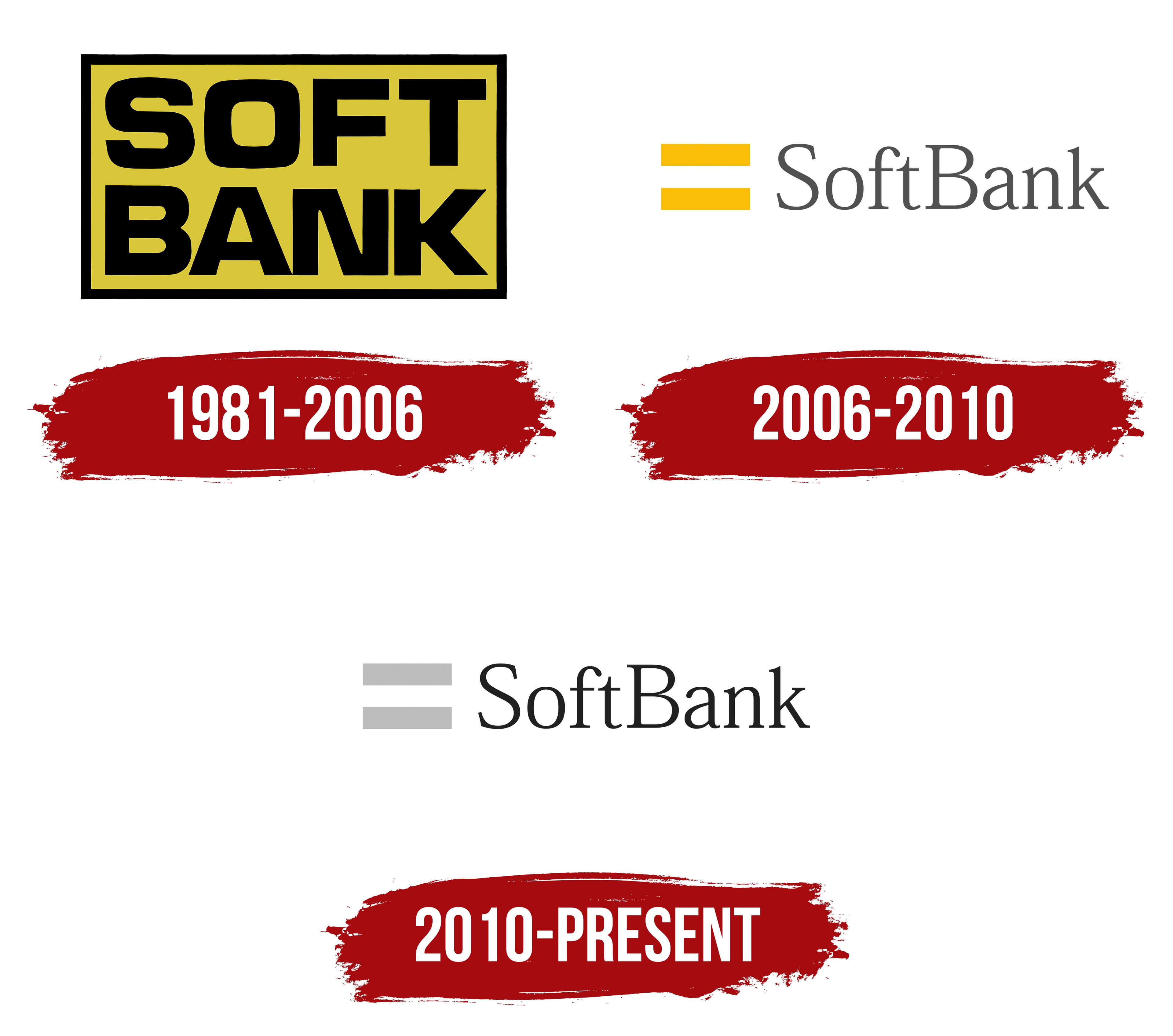
The SoftBank emblem is simple, unpretentious, but highly readable. This focus was chosen by the founders of the holding company, as a new face in the specialized market needs to be memorable to most clients. As a result, designers proposed a version with a prominent name to maintain optimal informativeness. At first glance, the logo gives a clear understanding of the organization and makes its name easy to remember.
Thus, the emblem consists of a single element: a wordmark set within a horizontal rectangle. Despite the lack of creativity in its visual identity, the company conveys the most important message to consumers: a business approach, strictness, responsibility, and safety. These principles are characteristic not only of the identity but also of the holding itself. Symbolism and other allegories are foreign to the founders, as their work is based on clear thinking, a well-thought-out strategy, and a practical approach. Consequently, the logo is not metaphorical.
The emblem features two-tiered text in large, monoblock-style letters. They are so large that they occupy the entire inner space, leaving no room for other elements, which aligns well with the company’s business approach. At the same time, this structure does not turn the logo into a “block of stone”; it effectively emphasizes safety and even introduces visual rhythm, as the position of each upper glyph corresponds to that of the lower one. The lines are aligned on both sides.
The predominant letter configuration is square. That is, the letters have a square shape, including the “O,” which is typically round. However, the designers made it square by rounding the corners, thus creating an original glyph. As a result, the geometric symbols fit harmoniously within the rectangle, matching perfectly with the neat, thin frame.
The SoftBank logo’s color scheme includes black and yellow. This combination is unobtrusive because it is natural. These colors are typically seen in hardworking bees, suggesting a hardworking investor helping firms enter markets to make profits and increase them. This attractive palette is often used in various signs and notices for emergency attention.
2006 – 2010

The emblem received an entirely new design, simpler and more minimalist. However, a reference to the original version is still visible, though the style of Kaientai banners now dominates. The concept dictates this choice, as the prototype belongs to a trading and naval company that was not afraid of turbulent waters and confidently “sailed” toward desired goals from the start. It played a significant role in transforming Japan into the country it is today. Thus, the SoftBank emblem embodies an allegory of determination, tireless effort, and persistent development despite obstacles.
Instead of a bulky rectangle, an equal sign “=” is used. Typically, it precedes the correct answer in any mathematical equation. Consequently, the SoftBank logo suggests that the holding company has the solution (answer) to the problems of those who seek its help. It also symbolizes interactive communication and equal footing with clients, grounded in mutual respect and adherence to requirements.
The yellow color remains and now highlights the mathematical equal sign, continuing to draw attention, fostering business cooperation, identifying problems, and helping diligently resolve them. The inscriptions, on the other hand, have changed dramatically. They are now extra-thin, elegant, and light. The refined serif font inspires trust and hints at simple solutions. This is the Japanese Mincho font, emphasizing the company’s authenticity.
Although the name SoftBank is placed in a single line, it takes up little space as the two words are now written together, with each word starting with an uppercase glyph. The letters appear airier than the adjacent massive “=” symbol. The gray color, which replaces black, adds to their lightness.
2010 – today
The changes made were quite minor, as the holding company only altered the color of the equal sign “=.” The broad yellow stripes were changed to gray. Designers named it “shining silver” for its ability to gleam regardless of the surrounding shades and background. It essentially became a precursor to the “information revolution” initiated by the Japanese organization SoftBank. With this change, the pair of parallel lines turned into a timeless value.

The light font suggests simple answers for those seeking solutions to problems and elevates the company’s image. The elegant glyphs feature tiny serifs that harmonize with the thin strokes. The capital “S” and “B,” and the lowercase “f” and “k,” are the same height as the equal sign, creating a sense of meticulousness and attention to detail. This approach characterizes the holding company as an experienced, professional, and rigorous representative of the investment sector.