


 La Escuela es Nuestra Logo PNG
The La Escuela es Nuestra logo reflects a commitment to improving education and creating equal opportunities for students. It symbolizes collaborative efforts to transform schools into places where every child feels valued and safe. The initiative focuses on enhancing infrastructure and supporting schools, uniting communities, teachers, and parents to help children reach their potential and work toward a bright future.
President Andrés Manuel López Obrador’s government launched La Escuela es Nuestra in Mexico in 2019. The program targeted long-standing problems in public education, mainly in low-income, rural and Indigenous communities where many schools lacked funding and adequate facilities. At launch, more than 103,000 public primary and secondary schools received direct support for infrastructure improvements.
In 2020, coverage expanded to additional institutions. The government introduced school management committees made up of community members, teachers, and parents. These groups could allocate funds based on local needs, giving schools direct control over repairs, equipment, and basic services instead of relying on a uniform national distribution model.
Funding increased in 2021, when the initiative added learning materials and support for school meals. Priorities included reconstruction, building repairs, sanitation upgrades, and better classroom conditions. By 2022, thousands of schools had received funding for renovations, new equipment, and improved learning spaces, while local participation in school management and infrastructure planning continued to grow.
In 2023, the program focused on extending coverage, monitoring how funds were used, and assessing changes in supported schools. The government continued the community-based management model and worked to preserve earlier improvements in buildings, services, and access to educational resources.
Meaning and History
What is La Escuela es Nuestra?
This revolutionary educational initiative in Mexico enables local communities to directly influence the development and modernization of school infrastructure. This innovative approach transforms traditional educational support by empowering parents, educators, and residents to decide how best to improve resources, buildings, and the learning environment of their schools. The program spans urban centers and remote rural areas, funding essential upgrades, including classroom renovations, the provision of learning materials, and basic infrastructure improvements. It also encourages community members to actively participate in school management, fostering a sense of ownership and responsibility.
2019 – today
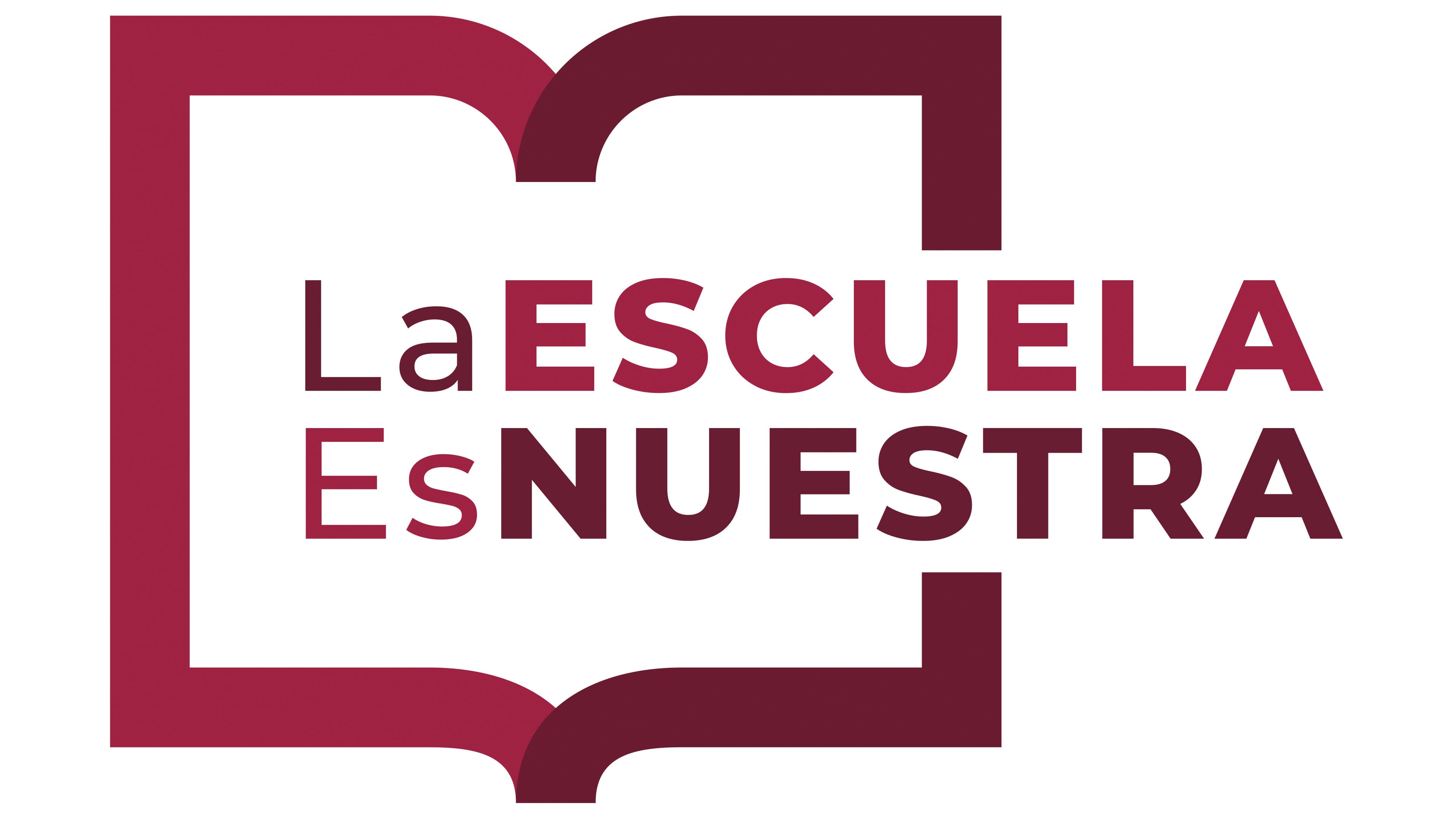
The emblem of the La Escuela es Nuestra program conveys the idea that school is a space belonging to everyone. At its center is an image resembling an open book. This symbolism emphasizes a connection to education, knowledge accessibility, and shared care for the school.
The open book in the visual mark symbolizes knowledge. Its outline resembles open arms, conveying a sense of accessibility, friendliness, and openness. This image reinforces the idea that a school is where everyone can come for knowledge and is respected and welcomed into the community. This symbol reflects the program’s goal of involving students, parents, and teachers in the joint development of the educational space.
The phrase “La Escuela Es Nuestra” (translated as “The School Is Ours”) is highlighted in large letters, emphasizing the slogan’s importance. The words “Escuela” and “Nuestra” are larger and rendered in darker tones, drawing attention to the core idea of belonging. The typography conveys a sense of confidence and collective responsibility for the school.
The logo uses shades of red and burgundy. Red is associated with energy, passion, and the desire to make the world a better place. Burgundy adds stability and depth, hinting at strong traditions and respect for the educational process. Together, these colors create a feeling of confidence, enthusiasm, and responsibility for a shared future.
The font is simple and modern, without unnecessary embellishments, emphasizing clarity and accessibility. Uppercase and lowercase letters add rhythm, making the text appear livelier and more dynamic while giving it a friendly, informal look.
The La Escuela es Nuestra logo visually communicates that the school is a shared asset to which everyone can contribute. The image of the open book invites everyone to participate in the process, while the bright and warm colors highlight the energy and enthusiasm of those involved in the program.