 Randstad NV Logo PNG
The labor market involves employee recruitment and job matching, where companies and candidates interact through an intermediary. Recruitment services help fill positions and find jobs across various industries. The Randstad logo is associated with a company that specializes in recruitment and employment services for businesses and job seekers.
Randstad was founded in 1960 in the Netherlands by entrepreneur Frits Goldschmeding. He opened a temporary employment agency in Amstelveen. The idea of flexible employment was innovative for Europe. The company’s name is linked to the Randstad region, the country’s economic core.
In the 1960s, Randstad expanded and opened branches throughout the Netherlands. In 1970, the company was listed on the Amsterdam Stock Exchange. In the 1970s, it entered the markets of Belgium, Germany, and the United Kingdom. In the 1980s, the company entered the French market and adapted its business model to the country’s complex labor regulations.
In 1990, the company entered the U.S. market by acquiring an Atlanta-based agency. During the 1990s, Randstad completed a series of deals in Europe and the Americas, strengthening its position. In 1999, the company bought its competitor, Tempo-Team, for 700 million euros, becoming the market leader in the Netherlands.
In 2008, Randstad acquired Vedior for 3.9 billion euros, becoming the second-largest staffing agency in the world. The 2008 and 2009 crises led to a drop in revenue, but by 2010, the company had resumed growth. In 2011, it acquired the U.S. agency SFN Group for 740 million euros.
Since 2015, the company has been investing in digital technologies and artificial intelligence. It launched mobile services and talent-matching algorithms. In 2017, it acquired Monster Worldwide for $ 429 million and integrated the asset into its digital strategy.
In 2022 and 2023, the company developed educational programs and expanded its presence in Asia. In 2024, it launched a platform for the short-term employment segment.
The company remains the second-largest staffing agency in the world. It operates in forty countries and continues to implement innovative solutions in the labor market.
Meaning and History
What is Randstad NV?
An international company from the Netherlands, founded by Gerrit Daleboudt and Frits Goldschmeding, operating in 39 countries and managing a network of 4600 branches. The organization specializes in recruiting temporary and permanent staff, HR process outsourcing, and payroll management. It carries out about 2,800 projects for 1,800 clients across logistics, the food industry, automotive, finance, IT, and engineering. The company owns the Monster Worldwide platform and collaborated with Google on a Pixel 4 project.
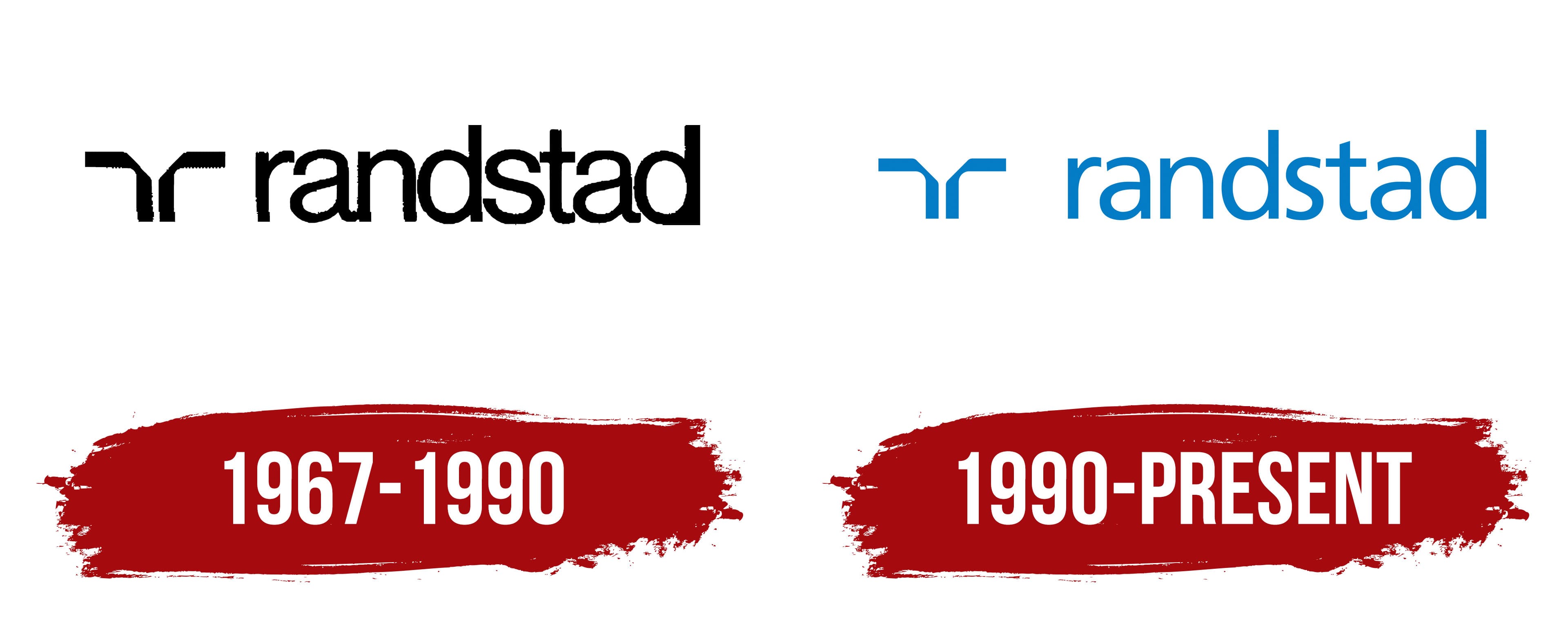
1967 – 1990
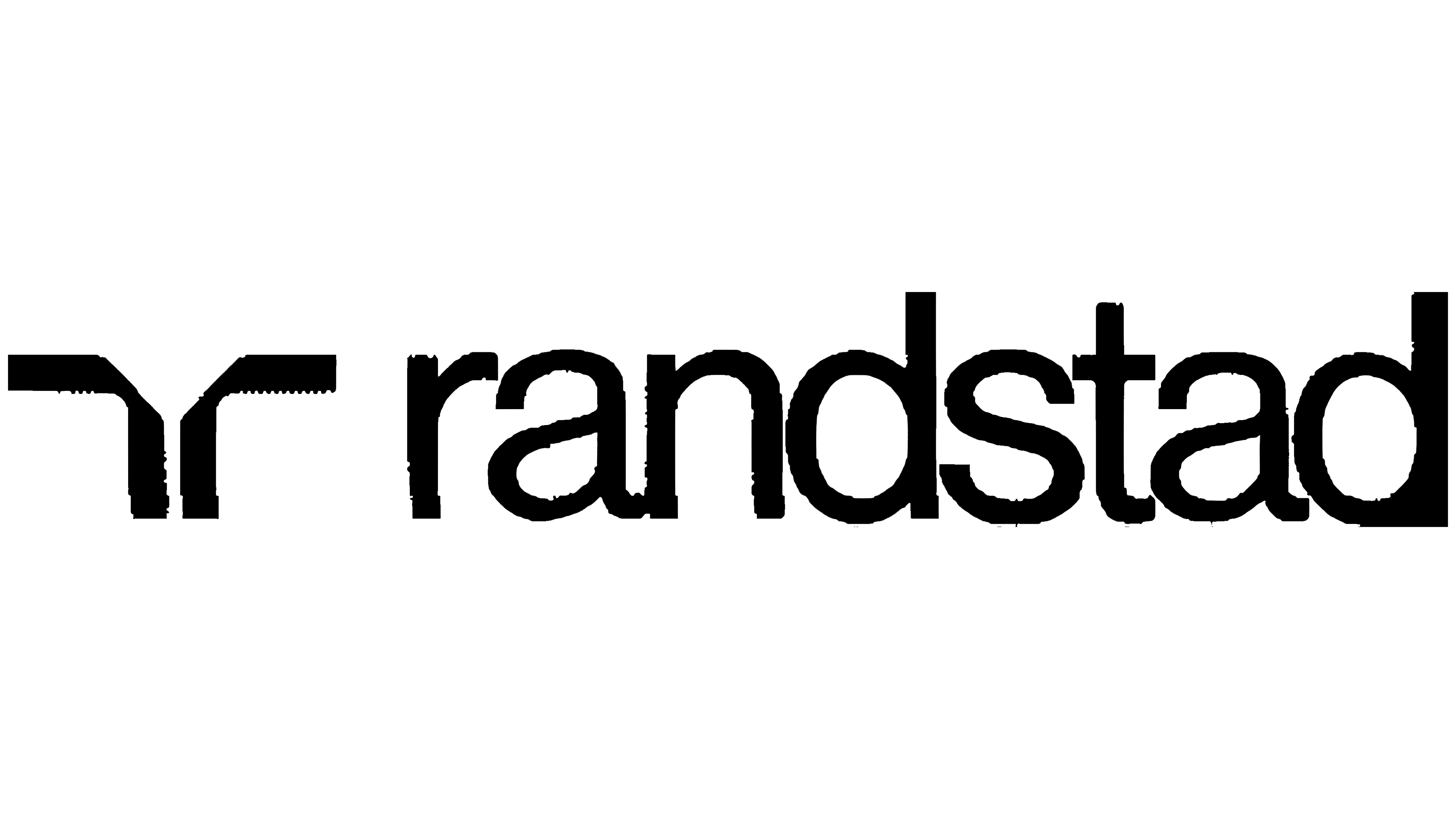
The Randstad logo is built around the company name and a formal abstract form. Ben Bos of Total Design created it, and the wordmark was set in Helvetica. The black color, simple symbol on the left, and lowercase Randstad name gave the brand a professional appearance with minimal ornamentation.
The company began as Uitzendbureau Amstelveen. Frits Goldschmeding and Ger Daleboudt founded the temporary employment agency. The Randstad name appeared in 1964 and refers to the urban region of the Netherlands that includes Amsterdam, Rotterdam, The Hague, and Utrecht. For the early business, the name represented the geographic area it served.
An abstract symbol resembling a T-shaped structure appears on the left. It consists of two parallel vertical strokes and two upper horizontal lines extending in opposite directions. A thin diagonal line connects the wider sections, making the form resemble a set of engineered components.
The lowercase Randstad wordmark appears on the right. Helvetica gives the name an even, neutral appearance. Rounded letters soften the formal black composition, while the company name remains the main foundation of the logo.
1990 – today
In the updated Randstad version, the main change involved the tone of the identity. Light blue replaced black, giving the formal layout a softer presentation. For a service company working with people and the labor market, the updated version created a closer connection to its field.
The symbol on the left retained its previous construction. The abstract T-shaped form, with two vertical strokes, upper lines extending in opposite directions, and a thin diagonal connector, remained the foundation of the emblem. Its outline stayed unchanged, while the light blue color shifted the emphasis toward openness and a composed professional tone.
The Randstad wordmark received a unified appearance through the use of Frutiger. Adrian Frutiger’s humanist sans-serif typeface made the lowercase letters softer and more approachable. The typography retained a professional structure, while its rounded forms suited the staffing industry.