 Volcano Bay Logo PNG
The Volcano Bay logo represents the amusement park’s world of wonder, where everyone finds something interesting to do. The emblem subtly conveys the extraordinary joy of water slides, artificial waterfalls, attraction pools, and cozy cabins that any visitor can rent.
Volcano Bay was planned in 2011, when the Universal Creative team began developing a water park built around technology, themed areas, and classic attractions. In 2014, 53 acres beside Cabana Bay Beach Resort were acquired, and construction began in 2015. The estimated $600 million project centered on Krakatau, a 200-foot artificial volcano housing several slides.
Plans were announced in May 2015, while details released in 2016 divided the park into Wave Village, River Village, Rainforest Village, and Krakatau. The setting drew on a tropical island and Polynesian culture. TapuTapu wristbands introduced virtual queues, allowing guests to reserve rides without waiting in physical lines. Volcano Bay opened on May 25, 2017, with 18 attractions, including wave pools, lazy rivers, and water slides.
Its first year brought overcrowding and TapuTapu failures, leading to operational changes. In 2018, Volcano Bay became North America’s most visited water park. A revised virtual queue system followed in 2019, and Volcano Nights added music, themed pool parties, and illuminated evening events in 2020.
Tsunami Surf debuted in 2021 with virtual-reality elements. In 2022, the park installed a filtration system designed to reduce water and chemical use, along with solar panels. Calm Lagoon opened in 2023 with heated mineral pools, massage jets, and private cabanas. Volcano Bay After Dark followed in 2024 with night swimming, underwater light shows, and themed pool events.
Meaning and History
What is Volcano Bay?
It is an aquatic theme park at Universal Orlando Resort in Orlando, Florida. The park’s theme is a tropical island paradise centered on the massive volcano Krakatau, which serves as its iconic center. The park features a variety of water attractions, including water slides, a lazy river, a wave pool, and a Krakatau Aqua Coaster. It also features interactive play areas for children and utilizes the TapuTapu virtual queue system, allowing guests to reserve ride times and enjoy other rides while waiting.
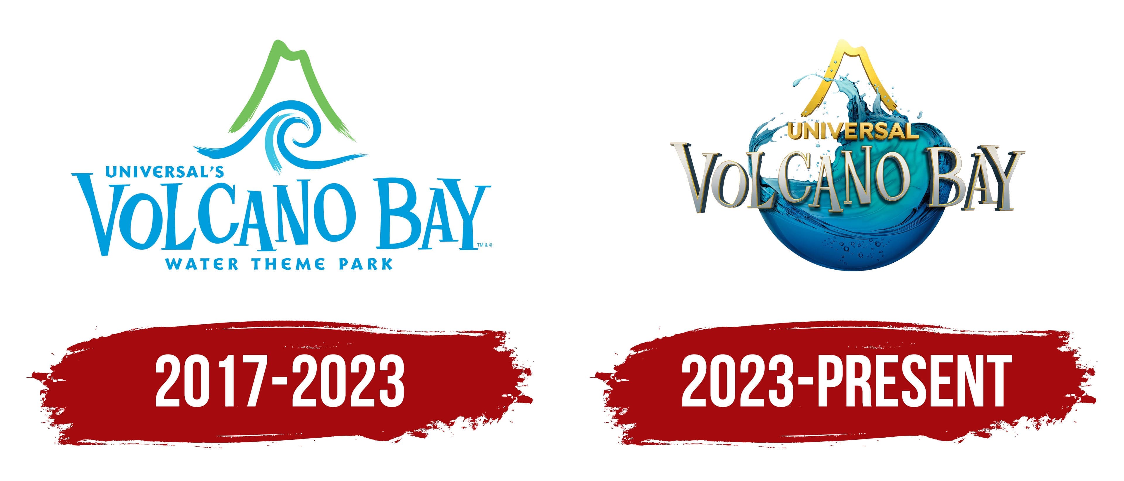
2017 – 2023
The key element of the Volcano Bay emblem is an artificial volcano standing 61 meters tall, modeled after the real Krakatau volcano, located between the islands of Java and Sumatra. The creators of the water park used the image of a tall mountain with a river flowing from it, but they avoided the theme of dangerous eruptions. They aimed to infuse as much joy into it as possible to demonstrate the park’s carefree nature, as reflected in the logo.
The giant volcano stands at the center of the amusement park, intriguing visitors, which is why the designers chose it for its visual identity. All the attractions and water slides, bringing the joy of sliding through bursts of spray, are built around it. This feeling is reflected in the logo. Carefreeness, happiness, gentle waves, and inviting height are the key elements of the emblem.
Krakatau has rivers and a waterfall, which are presented here as attractions. Therefore, the mountain in the logo is surrounded by a steep wave. It shows that the water is not static but dynamic, constantly in motion. After all, the park doesn’t just feature a pool but also turbulent streams that appeal to those who enjoy a fun-filled experience. The spiral-shaped wave conveys a sense of excitement and immense pleasure.
Above the wave rises the tall mountain with a hollow in the middle, making it immediately clear that it’s a volcano. The wave and the mountain are drawn with bold, confident brushstrokes reminiscent of green and blue paintbrush strokes. This combination evokes positivity, as it appears natural and instills a feeling of friendliness, reliability, and fun. This makes the emblem pleasant and modern.
Below the image is the text. It extends beyond the badge and is not connected to it by any strokes, yet it looks harmonious. The designers achieved this effect through color: the text is light blue, just like the wave, which feels like a continuation of it. The largest phrase is “Volcano Bay,” written in a bouncing serif font, similar to Screwby Extra Condensed Bold. However, the serif type doesn’t spoil the carefree and fun atmosphere; on the contrary, it adds a playful element, as the letters seem to come from the logo of a children’s show.
The strokes are uneven, with a slight curve, not wavy and smooth, but straight and firm. The narrowest point is in the middle, and the widest is at the ends, making the serifs on these glyphs feel balanced. For the inscription “Universal’s Water Theme Park,” a completely different font is used, small, sans-serif, and squat. The grotesque font is softened with rounded corners, making the letters chubby. However, even here, the tendency toward fun is noticeable.
2023 – today
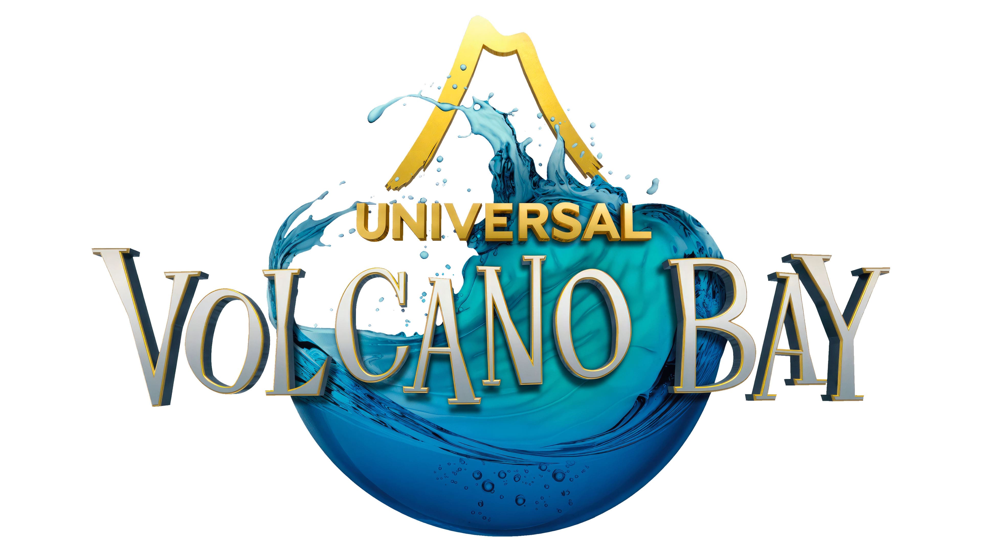
The famous water park, Volcano Bay, envisioned its emblem as brighter and more realistic. The goal was to fill it with as much positive energy as possible, touch emotional chords, spark the desire to enjoy the attractions and slides, and evoke the joy of visiting. In other words, the company decided to stir the souls of potential customers and refine its marketing tool, its logo.
They simply enhanced the visual identity to achieve this, replacing outlines with full-fledged natural objects. The only exception was the improvised mountain: the Krakatau volcano is depicted simply. It is drawn with a single curved line, matching the gentle slopes and crater. Yet, the strict outline didn’t diminish the mountain’s charm but highlighted it against the realistic waves. First, a wide band rises above the water and then smoothly descends, ending with uneven, slightly torn edges. This image has its charm.
The remaining graphics show water in its many forms, as if in motion, making it seem as if the tall wave is about to break out. There is a sense of dynamics, tension, and heightened emotion. The water environment is one of the key elements of Volcano Bay, which is why it received much attention and is drawn in detail.
Droplets, small bubbles, splashes, and swirls all effectively convey the non-static nature of water. The azure tint shows the flow’s movement and varying depth. It visually illustrates that the park offers something for everyone, from slides to pools. Additionally, the many shades of blue combined with white suggest our planet, as hinted by the semicircular background. The light blue also reflects the park’s focus on water-based entertainment.
Meanwhile, the logo has far fewer inscriptions, making the text part visually lighter. It’s now clear and simple, which is a major plus. The name still takes up one line, set horizontally in an energetic uppercase font. Designers added one-sided shadows, a thin yellow outline, and a silver-gray gradient to make the text eye-catching. This turned the two-dimensional text into a progressive 3D sign.
The company only kept the first word from the long phrase “Universal’s Water Theme Park”. This shows that the water park is a unique world with its features, where people of all ages can have a great time. The word “Universal” is in capital letters without serifs but with shadows. The letters are straight and smooth, reflecting the serious nature of the business. They are painted yellow, the color of the sun, warmth, and friendliness.