 Lake Elsinore Storm Logo PNG
The Lake Elsinore Storm logo represents the baseball team in a vivid, recognizable style. The emblem’s graphics convey the club’s energy and emotionality, emphasizing sports entertainment and audience interaction.
Lake Elsinore Storm trace their history to 1979, when the franchise played as the Santa Clara Padres in California. It moved to Rohnert Park in 1980 and became the Redwood Pioneers, reflecting relocations common in Minor League Baseball. Another move followed in 1986, when the club settled in Palm Springs as the Palm Springs Angels and joined the California Angels system.
In 1994, the franchise relocated to Lake Elsinore, about 100 kilometers southeast of Los Angeles, and adopted the Storm name, linked to the region’s changing weather and its lake. The newly built Lake Elsinore Diamond became its home, with the field named for local benefactor Pete Lehr, who helped finance the venue. The first season in the city ended with a California League championship. Through the late 1990s, the team remained linked to the Anaheim Angels.
A new affiliation began in 2001 with the San Diego Padres, the nearest Major League organization. The same year brought a second league title. Future Major League players associated with the franchise included Jake Peavy, Corey Kluber, and John Lackey. David Freese later became known for his 2011 World Series performances with the St. Louis Cardinals.
Lake Elsinore won another California League championship in 2011 and added a fourth title in 2022. The club remained in place through the 2021 reorganization, when the league temporarily became Low-A West before returning to the California League name, while its affiliation and local fan base continued.
Meaning and History
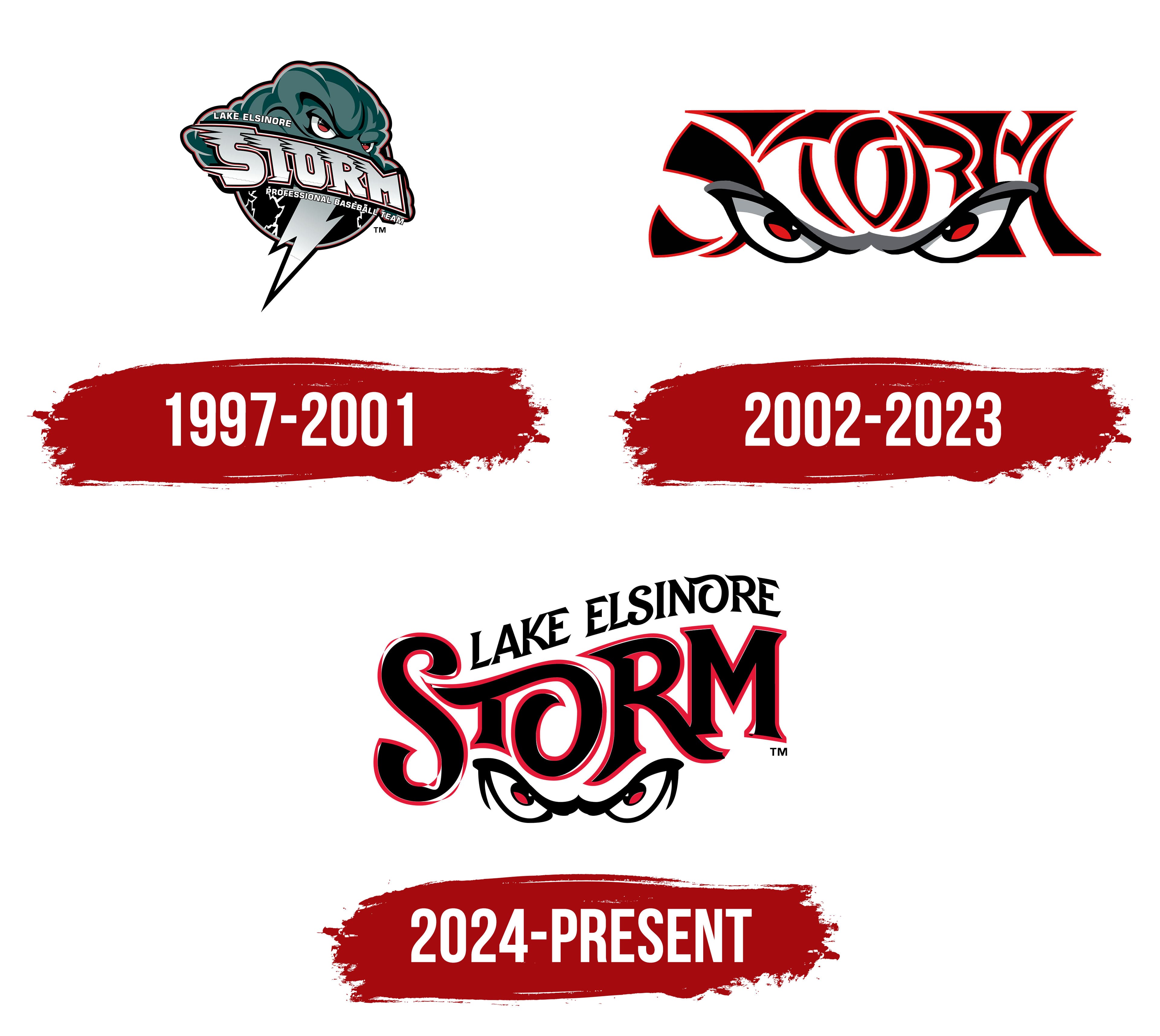
What is Lake Elsinore Storm?
It is a Single-A Advanced baseball club from California, affiliated with the San Diego Padres. The team was formed after relocating from Palm Springs, where it had previously played. Its name reflects local weather conditions marked by sudden storms and strong winds. The club’s mascot is Thunder, a friendly dragon. It has won the California League championship multiple times.
1997 – 2001
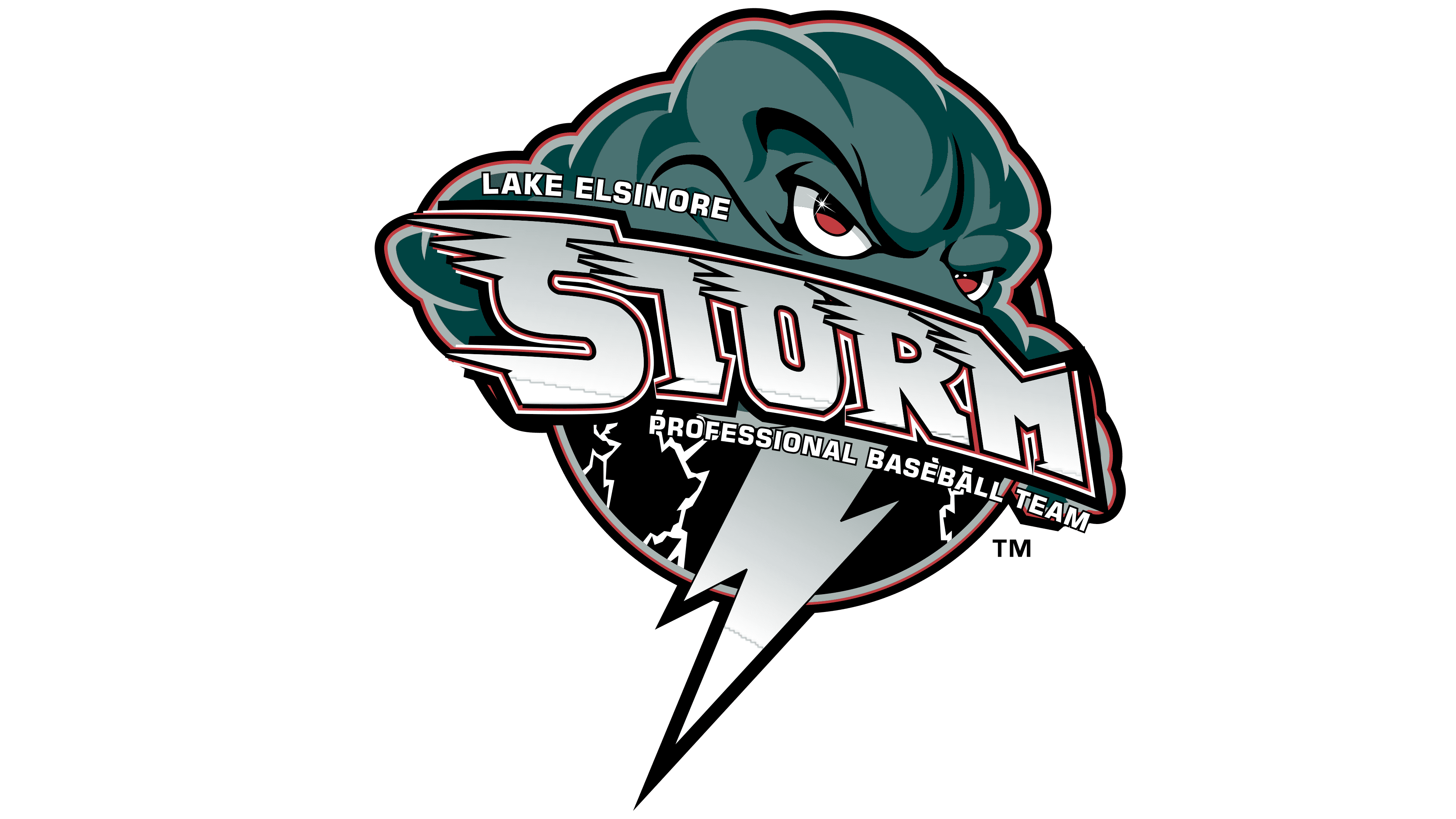
The emblem of the Lake Elsinore Storm baseball team presents the club through a powerful metaphor of a natural disaster. A personified storm cloud, depicted in a dark green shade, is shown with an aggressive, animated form reminiscent of a comic book character. The eyes convey hostility and determination. At the center of the composition, a stylized lightning bolt pierces the lower portion of the emblem, creating tension and underscoring nature’s force as a symbol of strength and the uncompromising nature of competition on the field.
The team name, “STORM,” is rendered in a custom dynamic typeface with a wind effect. The letterforms appear stretched and distorted, as if being swept by gusts of wind, enhancing the overall atmosphere of motion and turbulence. The font is predominantly white and gray with a multilayered outline that includes thin red and black borders. Additional text elements, “Lake Elsinore” and “Professional Baseball Team,” are set in simple white all-caps sans serif type, complementing the composition and emphasizing the team’s official status.
The color palette includes green, white, gray, black, and red. The dark green of the cloud conveys the power and threatening atmosphere of a storm. The white of the letters and lightning highlights the symbol of energy and speed. Gray in the lightning and shadows adds depth, creating a sense of dimension, while red in the thin outline adds an extra visual accent and intensity. Black outlines enhance contrast, increasing the emblem’s aggressive and dramatic effect.
The creation of the emblem is tied to the historical period when the new baseball franchise was founded in 1994 and acquired its stadium, the Lake Elsinore Diamond. The likely designer was the San Diego–based studio Brandiose, known for working with minor league baseball teams, although this has not been officially confirmed. The logo’s popularity was so great that a separate element, the eyes without the cloud, was used on team caps.
Over time, the Lake Elsinore Storm logo came to be seen not just as a sports emblem but as a significant symbol of the club’s formative era. Its emotional expressiveness, unusual style, and deep metaphorical meaning gave it longevity in the baseball community and lasting appeal among sports design fans.
2002 – 2023

The presented Lake Elsinore Storm baseball team logo marks a transformation of the club’s visual identity. This period saw a shift from a detailed, symbol-rich composition to a minimalist, stylized design built on only two elements: the stylized word “Storm” and the striking “eyes of the storm.”
The composition centers on an intense gaze formed by a pair of sharply narrowed eyes and a fierce, furrowed brow. The image conveys tension and readiness for confrontation, retaining the connection to the previous concept in which the eyes were part of a more complex storm metaphor. Thanks to the strong impact of this gaze, it became a standalone, recognizable brand icon used on uniforms, merchandise, and youth Little League team gear. As a result, the logo gained popularity among younger audiences and became a distinctive visual symbol of baseball subculture.
The “Storm” wordmark is rendered in a complex, almost abstract style, with black letterforms outlined in thin red. The glyphs are elongated and distorted, with lines forming intricate shapes that resemble abstract patterns or elements of Eastern calligraphy. Due to the complexity of the forms, the name can be difficult to read without prior familiarity with the brand, but this adds a sense of mystery and uniqueness to the sports design.
In color, the visual concept is limited to a strict palette of black, red, and white. Black symbolizes strength, aggression, and competitive seriousness, while red emphasizes emotional intensity and the team’s fighting spirit. White is used sparingly but effectively, enhancing the contrast and expression in the eyes. The combination of these colors creates a sharp, memorable visual effect, heightening the logo’s emotional impact.
2024 – today
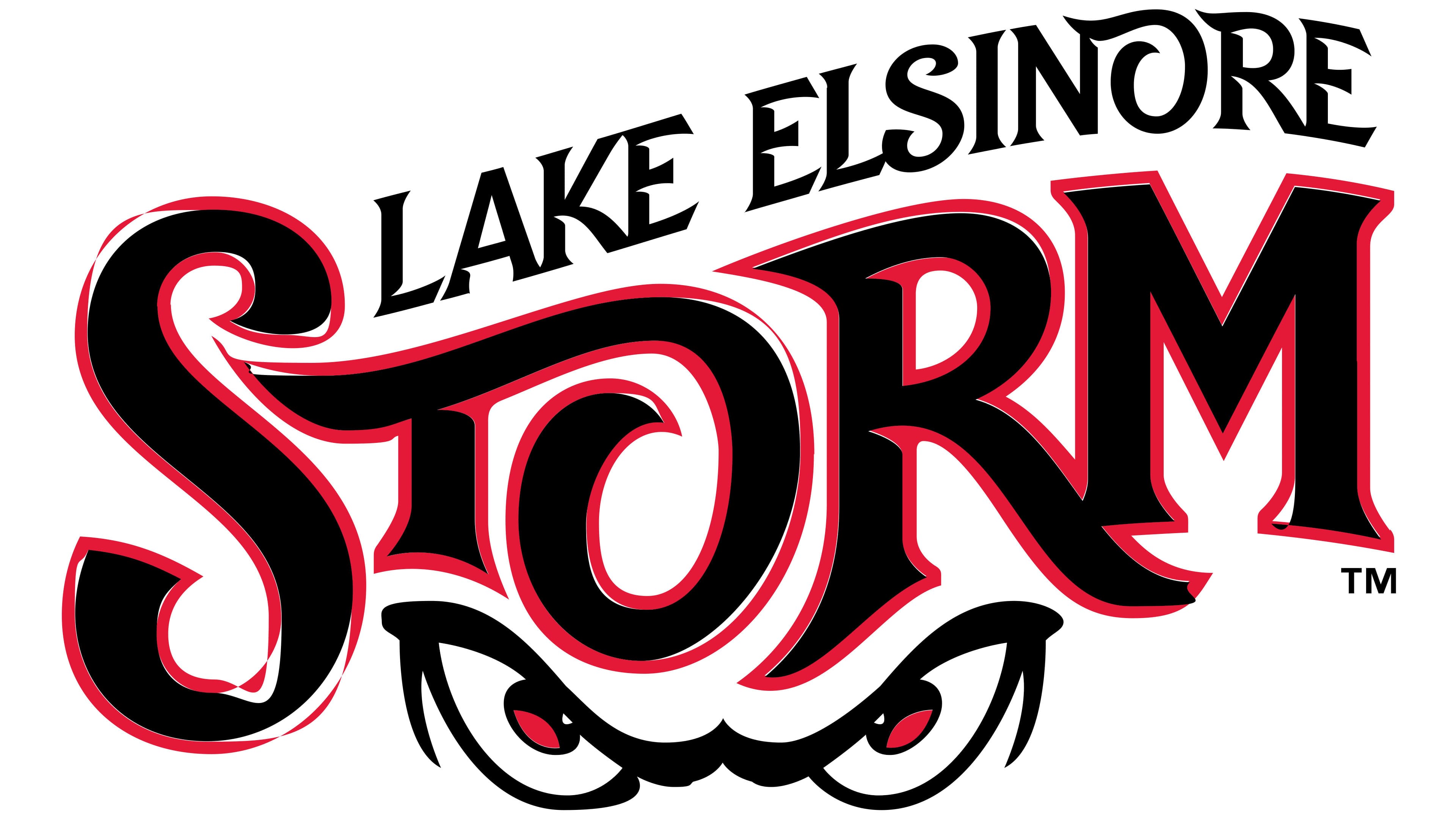
The new Lake Elsinore Storm baseball club logo, unveiled on November 17, 2023, and adopted as the official identity for the 2024 season, marked the end of 22 years using the previous visual concept. The update primarily focused on the “STORM” wordmark, which underwent a noticeable stylistic revision: the letters became more uniform and proportional, and the earlier calligraphic flourishes and line complexity were removed. The club’s historic color palette, black as the primary color with a bold red outline, was retained, emphasizing continuity in its visual tradition.
The letterforms in “STORM” are characterized by bold outlines and smooth curves that convey the effect of wind-driven motion. However, the lines are now sharper, more orderly, and more geometric. The typeface appears more legible and confident, thereby improving visual recognition on team merchandise such as T-shirts, caps, and sweaters.
A key emotional element of the team, the “storm eyes” icon, remains unchanged. This symbol has been part of every club logo since 2002. The eyes are a minimalist depiction of an aggressive gaze, characterized by distinctive curved lines, rendered in black with red pupils. Graphic refinements were minimal, with only slight adjustments to strokes and proportions, preserving both recognizability and brand continuity.
An additional “Lake Elsinore” inscription, placed above the main word, is set in uppercase letters of a custom font with elements of handwritten styling. It has compact proportions and small serifs, giving it a distinctive character and a link to the club’s local identity. The inscription is integrated harmoniously into the composition, maintaining balance and visual completeness.
The emblem’s color palette retains the classic combination of black, red, and white, with black symbolizing the team’s power and aggression, red representing emotional intensity and competitive spirit, and white serving as a background and accent that creates contrast and enhances the impact of the other colors.
The current Lake Elsinore Storm design represents a logical stage in the evolution of the team’s visual identity, moving from complex forms to a simplified, clear style that meets the modern demands of sports branding and merchandising.