


 Linktree Logo PNG
The Linktree logo illustrates how the service works in a single image. The emblem demonstrates how easy it is to create and manage a page. Elements are collected in a single pattern, just like user links are concentrated in one place. The startup logo has already changed once, reflecting Linktree’s growth and development.
Linktree was founded in Melbourne, Australia, in 2016 by brothers Alex and Anthony Zaccaria and their friend Nick Humphreys. Before launching the service, they had spent eight years running Bolster, a digital agency focused on music and entertainment. The agency worked with festivals, labels, artists, event companies, and brands, helping them grow their online audiences.
The idea came from a problem the Bolster team faced every day. Instagram allowed only one link per profile, while clients often needed to promote new tracks, concert tickets, merchandise, and other updates simultaneously. The founders asked their developer to create a tool for multiple links, and the prototype was built in about six hours. Humphreys gave the service its name: Linktree.
At first, Linktree was an internal tool for Bolster and a side project handled outside regular agency work. Very quickly, it became clear that the same problem affected millions of creators, businesses, and public figures. In 2018, the company faced an early crisis when Instagram temporarily blocked Linktree over community guideline concerns. The service survived, even though Instagram remained its main source of organic traffic.
In 2019, CNBC included Linktree in its “Upstart 100” list. In 2020, Fast Company named it one of the ten most innovative companies. By March 2020, the company still had only seven employees. In 2021, Linktree raised $45 million in Series B funding and added 24 million users. In March 2022, it raised $110 million from Index Ventures, Coatue Management, and AirTree Ventures, reaching a $1.3 billion valuation. Later that year, Google and IMG invested $10.5 million. At the same time, Instagram’s support for five profile links put Linktree and rivals such as Lnk.Bio and Beacons under new pressure.
Meaning and History
What is LinkTree?
An ever-growing part-paid multi-link service with over 23 million pages of self-reported users. The Zaccaria brothers own it. Fifty employees are working on the project at the headquarters in Melbourne.
2016 – 2022
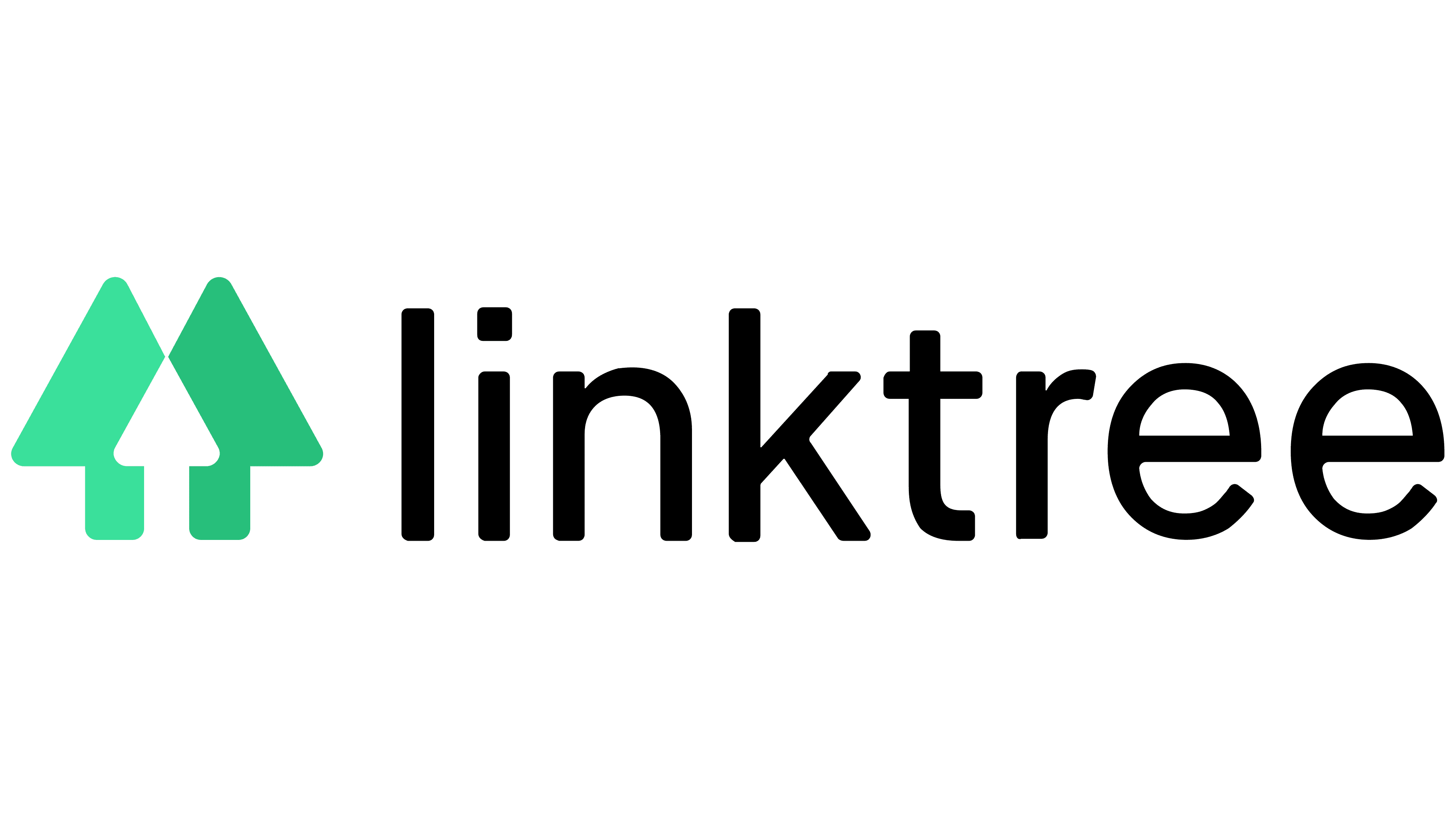
The first logo is an image of two intersecting arrows or trees pointing upwards. They personified links to individual social networks. The place of their intersection formed the third arrow. It was she who symbolized Linktree. A service is a place that unites all links to the platforms where the user is registered. The light green color indicates development, a more successful presentation of oneself in the Internet space, thanks to the new site.
Next to the composition is the title, displayed in a thin, lowercase font. The absence of a capital letter indicates that Linktree is a supporting service role. A page without user-posted content is irrelevant. It is the owner and his personality that make the linked site interesting. The profile helps the owner manage all networks and notify subscribers on all platforms about news and promotions.
Thin letters show that the project is a startup, little known, and only gaining momentum.
2022 – today
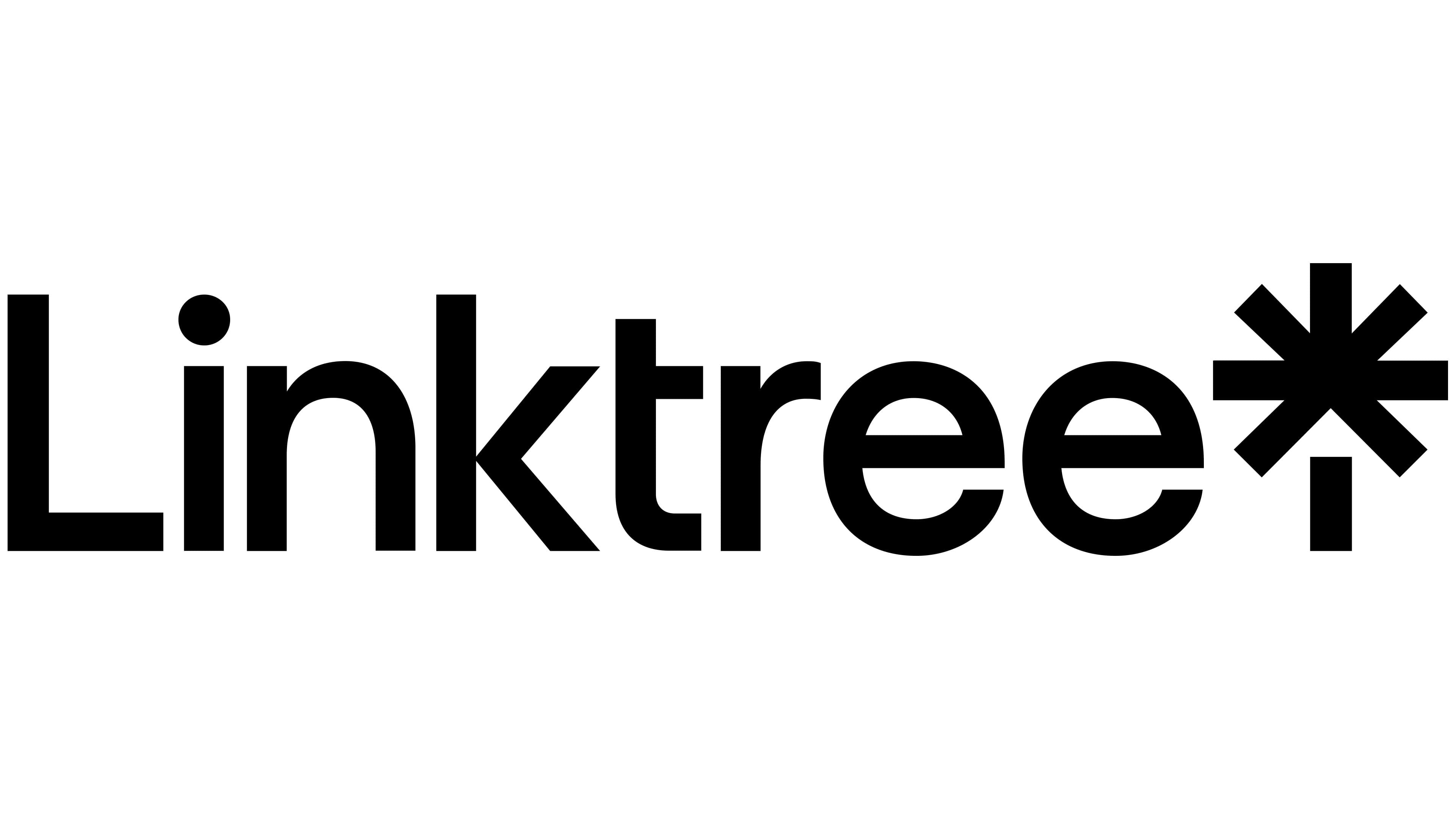
The new logo was designed by American designer Brian Collins, who runs the branding company of the same name. It was part of the process, along with one of the startup’s co-founders, Nick Humphreys, a designer by profession. The resulting composition perfectly conveys the service’s meaning.
The emblem features black rectangles arranged to form a tree. The trunk represents the person or company for which the profile is being created. The schematic branches extending in different directions link to pages dedicated to him. The branches converge at one point towards the center, indicating the concentration of all information on the Linktree page. The design puts the user first: he alone decides how his tree will look.
Before the image, the service name is rendered in thin, elegant letters. In translation, it means “Link” (links) and “tree” (tree). Therefore, the picture next to the company’s name is symbolic, depicting this “reference tree.”
Often, the picture is used in light green, for example, on the site’s favicon, which demonstrates a tree’s ability to grow, thereby conveying more information.
Font and Colors
The main colors of the logo are black and green. Initially, green shades prevailed, representing a young startup’s growth and development. The use of black indicates the scale to which the service has grown. The neutral tone invites the user’s imagination, allowing them to choose their page’s design from a range of shades.
Although the individual font, Link Sans, was developed for the program during the redesign, it is not used in the logo. For the inscription, they used Neue Plak Extended SemiBold, with a truncated letter ‘t’ that added individuality to the image.