 Looka Logo PNG
The Looka logo conveys the nature of the service, making corporate identity creation accessible. The platform grew out of efforts to simplify logo design and, over time, was supplemented with tools for full brand design, including colors, fonts, and graphics.
Logojoy launched on November 22, 2016, when Canadian designer Dawson Whitfield introduced the platform on Product Hunt. After nearly ten years of creating logos for clients, he wanted to cut down on repeated revisions, approval delays, and communication problems. The AI-based service allowed entrepreneurs without design training to generate logos online. Early attention from Product Hunt and Indie Hackers brought hundreds of daily requests, leading Whitfield to hire staff and add co-founder Rares Crisan.
In November 2018, Logojoy raised C$6 million in a Series A round led by Real Ventures. The money supported machine learning, product expansion, and team growth. By then, the platform served millions of users in Canada, the United States, the United Kingdom, and Australia. At the same time, logo sales reached C$8.1 million during the previous 12 months.
Research showed that customers wanted business cards, brand guidelines, social media graphics, and document templates. Since the Logojoy name tied the company to one service, it became Looka on April 2, 2019. The relaunch introduced a name, logo, website, and branding packages priced below US$100. A partnership with Weebly added website-building tools.
Looka employed 37 people and planned an 8,500-square-foot Toronto office for May 2019. It competed with Canva and Wix while keeping automated logo creation at the center of its offer. The rebrand temporarily cut revenue by about half because Logojoy’s organic traffic did not transfer to the new domain.
Meaning and History

What is Looka?
It is an online service that uses artificial intelligence to help businesses create logos and corporate identities. The platform allows entrepreneurs to develop a visual identity without special design skills. In addition to logos, ready-made templates are available for business cards, letterheads, marketing materials, and social media design. The system analyzes user preferences and offers personalized options, allowing businesses to get a professional design quickly and conveniently.
2016 – 2019

Logojoy is a platform that creates logos using artificial intelligence. Instead of a traditional design agency, the developers introduced an automated service to simplify the creation of visual identities.
The Logojoy emblem is based on a hand-painted circle with uneven edges and a slightly unfinished look. The style of the symbol resembles the Japanese painting technique “enso,” where a brush-painted circle symbolizes the creative process, intuition, and openness.
The name is set in a rounded, simple sans-serif font. The text begins with a capitalized letter “L,” with the remaining letters lowercase, smooth, and consistent, reflecting the platform’s modern character. Letter proportions are balanced, neither too narrow nor overly elongated, which maintains natural readability.
The logo’s color palette consists of a single deep gray-blue used for the text and the circular symbol. It appears professional and calm, which is associated with the platform’s technical approach to design and its emphasis on automating logo creation.
Through this design, the creators emphasized the combination of creative freedom and technology underlying the service.
2019 – today
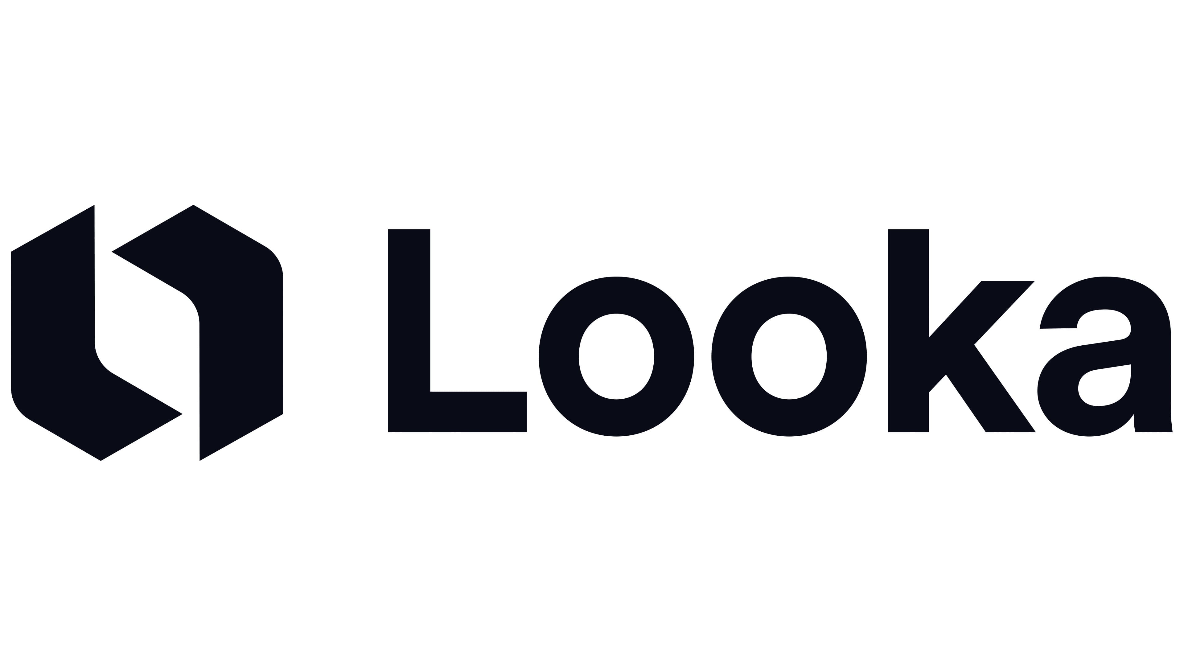
In 2019, Logojoy rebranded as Looka. Along with the name, its visual identity also changed.
Unlike the previous soft circle, the new symbolism is built on strict geometric lines. A black symbol occupies the left side of the logo with sharp edges and angles. Within it is a stylized “L” combined with its inverted mirror image, forming a distinctive closed sign that suggests a new letter or subtly references the preexisting circle.
The name is written as a single word beginning with a capital “L.” The font is smooth, simple, and sans-serif. The letters are evenly spaced, with consistent spacing and moderate thickness, contributing to clear visual perception.
The black color scheme highlights the company’s business-oriented and reserved character.