


![]() Mailchimp Logo PNG
Mailchimp Logo PNG
“Can I visit you?” asks the Mailchimp logo. The emblem promises interesting news and offers that you want to take advantage of. The sign symbolizes a non-standard approach to doing business.
Ben Chestnut grew up in Augusta, Georgia, in a mixed American-Thai family. After graduating from Georgia Tech, he worked at Cox Interactive Media, where he hired Dan Kurzius. Their MP3 project was shut down, but they continued collaborating on side ideas, including an e-card site with a popular mascot named Freddie.
In 2001, Chestnut, Kurzius, and Mark Armstrong launched Rocket Science Group in Atlanta. Mailchimp started as an internal tool for clients who needed email campaigns. The founders relied on their own funds and client revenue, avoiding outside investment. Early years were unstable. The dot-com crash reduced demand, the 2001 attacks affected aviation clients, and the 2008 crisis hit real estate projects. Mailchimp remained a side product that gradually gained traction.
By 2007, the service reached about 10,000 users and $500,000 in annual revenue. In 2008, Chestnut and Kurzius bought out Armstrong’s stake. A key shift came in 2009 with the introduction of a free plan, driving growth from 85,000 to 450,000 users within a year.
The model attracted small businesses and bloggers priced out of platforms like Constant Contact. By 2012, the user base exceeded 2 million, and revenue exceeded $30 million. The founders continued to reject venture funding and shared profits internally. By 2020, revenue reached $800 million. On September 13, 2021, Intuit agreed to acquire Mailchimp for $12 billion, completing the deal on November 1. At that point, the service had 13 million users worldwide, with about 2.4 million active monthly.
Meaning and History
![]()
More than a billion emails pass through the Mailchimp platform every day. It helps millions of people worldwide with a wide range of marketing automation features. Quite unnoticed, the internet startup has evolved into a global email provider. Moreover, the corporate identity developed alongside the brand, as Dan and Ben sought to create a holistic visual identity and never limited themselves to a framework.
The Mailchimp identity epitomizes creativity. It combines unusual author’s fonts, moving illustrations, and a playful mood. Therefore, all of the service’s trademarks in use since 2001 are catchy, bright, and attractive.
What is Mailchimp?
It is a popular email marketing promotion service operated by Rocket Science Group, a US company.
2001 – 2013
![]()
The name Mailchimp was written with two capital letters: “M” and “C.” In this form, it was presented as part of the primary logo. The designers used a font that imitates handwritten handwriting as a basis. Its main drawback was the illegibility of the letters when resizing.
2013 – 2018
![]()
At some point, the owners grew tired of the inscription looking sloppy and turned to Jessica Hische for help. This is the first time a freelance designer who has recently graduated from art school has got such a responsible job. She faced a difficult task: keeping the old font while making it more readable.
To do this, Jessica has separated the words “Mail” and “Chimp,” reduced the line thickness, widened the narrow areas at the joints, and slightly aligned the letters. The changes were minimal, but they made it possible to use the logo at any scale.
Simultaneously, the Mailchimp platform acquired an emblem with the head of the cartoon monkey, Freddie. This funny and friendly chimpanzee is the company’s iconic mascot, which matches its name. The artists made the badge colored and uneven in texture: thanks to graphic techniques, the fur looks thick, the skin is smooth, and the blue stripe on the cap looks shiny.
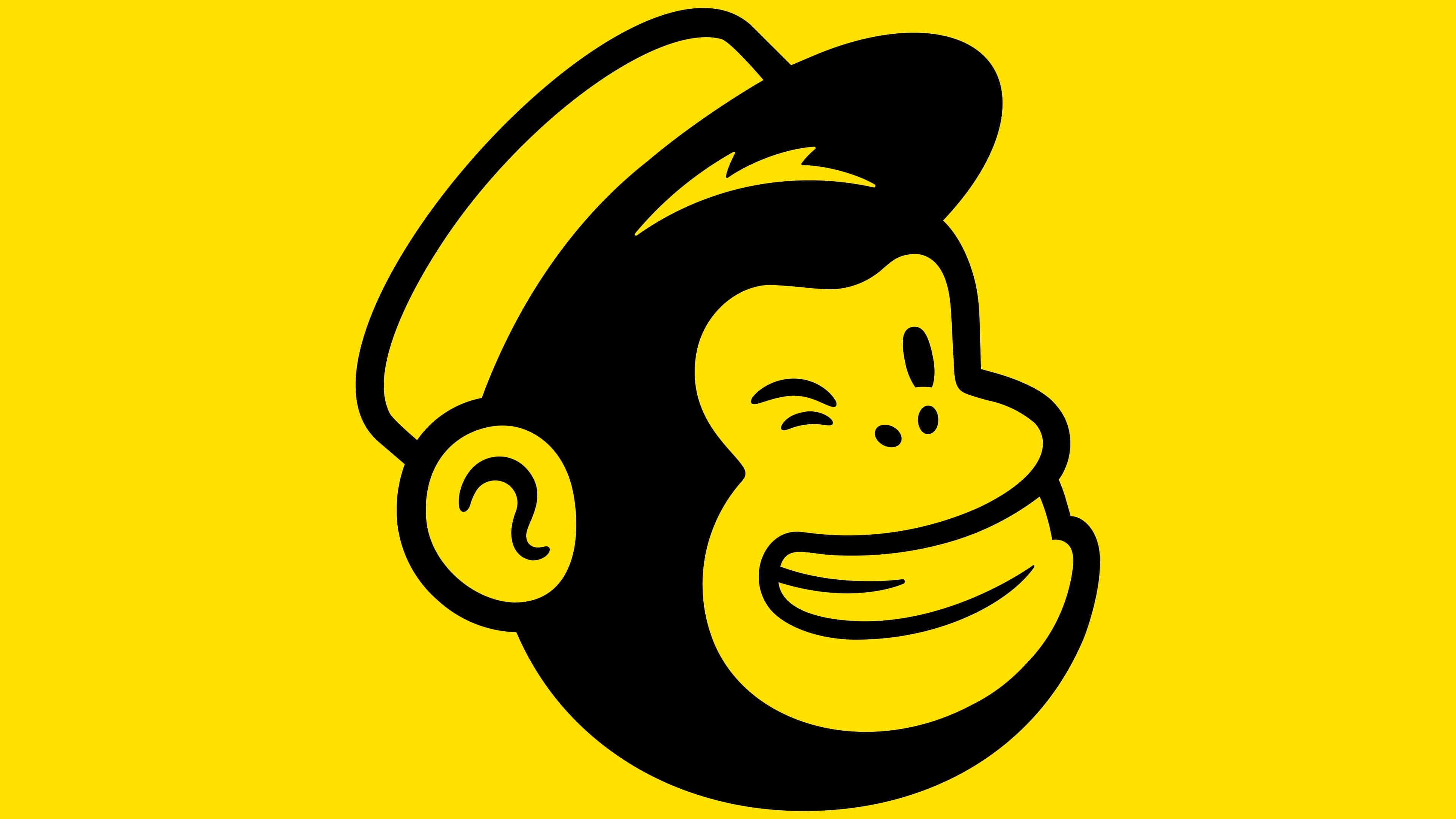
2018 – today
![]()
The current logo came about when the email marketing service decided to reflect its development strategy in the new branding. The designers had to combine the mascot and the name “Mailchimp” into a single entity. The word “trademark” and the mascot “Freddie” once had compatibility issues, so the chimpanzee head was always used separately and not directly associated with the internet platform.
First of all, the developers changed the font and put all the letters in lowercase. It no longer made sense to split the name into two words because the service stopped handling email alone and began providing a full package of marketing services for small businesses. The monkey’s head also began to look different: the designers made it black-and-white, reduced it, and placed it to the left of the inscription. COLLINS and R/GA took part in the development of the new brand style.
Freddie is not just a chimpanzee. This is a postman monkey, as can be judged by the characteristic cap of a newspaper peddler. Directly above the visor is a gold-colored “M” that hints at Mailchimp. In this context, the email marketing service is presented as a letter-delivery service, and the monkey as its friendly, cheerful courier.
The Freddie icon has been the company’s main sign since 2013. However, its current version differs markedly from the previous one. In 2018, the designers simplified the drawing by changing some details. Now the monkey winks happily because she is always in a great mood.
Font and Colors
To be original in everything, the company uses its signature font, Cooper Light. It seems sloppy, but in reality, each letter is thought out to the smallest detail: the developers made the lines of different thicknesses yet perfectly symmetrical. The owners of Mailchimp do not rule out the possibility that a similar font may be found on old vinyl records.
The color choices are interesting: the old Freddie badge contained several shades of brown, beige, and blue. The cap’s visor was black, and the letter “M” was yellow. By the way, the latter color is very similar to banana yellow, but Mailchimp calls it Cavendish Yellow (#FFE01B). The current version is not as colorful: the designers have made it black-and-white. Moreover, when placing the logo on a dark background, a white line should surround the chimpanzee’s head.
FAQ
What is the mascot of Mailchimp?
The company’s mascot is Freddie, a character representing the brand. Freddie is always winking, symbolizing a positive and friendly attitude. This playful and approachable mascot is a key part of the brand’s identity, showing its commitment to making marketing easy and fun.
Freddie appears next to the brand name in various materials, ensuring a consistent look. The winking gesture adds personality and warmth, making the brand more relatable and engaging.
How do I insert an icon in Mailchimp?
To insert an icon in Mailchimp, follow these steps:
- Go to Settings: Open your Mailchimp account, then navigate to Settings to customize your landing page.
- Edit Title and Icon: Click “Edit Title And Icon” to change the page title and add a site icon (favicon).
- Upload Image:
- Click “Upload Image” in the “Choose a custom site icon for your landing page” section.
- Select an image from the content studio or upload a new one from your computer.
- Insert the Image: After selecting your image, click “Insert” to set it as your site icon.
- Check Requirements: Ensure your favicon image meets Mailchimp’s size and format requirements.
These steps will help you easily add a custom icon to your Mailchimp landing page, enhancing your site’s branding.
Who designed the Mailchimp logo?
Two agencies, Collins and R/GA, created the new logo. They worked together to develop a modern and fresh visual identity for the brand. The design team included Barry Lee, Alice Meteignier, Franz Lang, and Sarah Watts. These designers created additional icons to complement the new logo.
The goal was to make the logo simple, approachable, and easy to recognize, reflecting the brand’s focus on user-friendly marketing solutions. The collaboration united diverse creative minds, resulting in a cohesive, versatile logo that aligns with the brand’s mission and values.
How do I remove the Mailchimp logo at the bottom of my email?
You need a paid Mailchimp account to remove the logo at the bottom of your email. The logo cannot be removed on free accounts, but it can be moved.
If you have a paid account, follow these steps:
- Log in to your Mailchimp Account: Use a paid plan.
- Go to Campaigns: Click the Campaigns tab to find the email you want to edit.
- Edit the Email: Select the email campaign you want to modify and click “Edit Design.”
- Scroll to the Footer: Go down to the bottom of the email where the Mailchimp logo is located.
- Remove the Logo: Click on the section with the Mailchimp logo. There should be an option to remove or hide the logo, usually a toggle switch or a checkbox.
- Save Changes: After removing the logo, save your changes and proceed with your email campaign.
The logo can only be repositioned in the email with a free account. You need to upgrade to a paid plan to remove the branding completely.
What is Mailchimp custom branding?
Mailchimp’s custom branding includes several key elements that make it easily recognizable.
- Freddie the Chimpanzee: The mascot, Freddie, is a friendly chimpanzee winking. Freddie adds a playful and approachable touch to the brand.
- Cavendish #FFE01B Banana Yellow: This bright yellow gives the brand a vibrant and cheerful look, making its marketing materials stand out.
- Cooper Light Font: The brand uses the Cooper Light font for its text. This font choice gives the brand a friendly and approachable feel, making its communications more personal and less formal.
- Lowercase “c” in “Mailchimp”: Writing “Mailchimp” with a lowercase “c” conveys a casual, approachable tone, sets the brand apart, and makes it more memorable.
These elements create a cohesive and distinctive brand identity for Mailchimp. They ensure the brand is easily recognizable and convey a sense of friendliness and approachability, aligning with the company’s goal of making marketing easier and more enjoyable.
What size should a logo be in Mailchimp?
Your logo should be no more than 600 pixels wide to fit the email template properly. If the image is wider, Mailchimp will resize it to the correct width. There are no strict height limits, so you can choose any height that fits your design.
To ensure your logo looks its best:
- Keep the width at or below 600 pixels to ensure the logo fits well within the email template without causing layout issues.
- Height is flexible: Choose any height that looks good and fits your branding needs.
Following these guidelines will help your logo display correctly and maintain its visual quality in Mailchimp emails.