


McLaren has unveiled a new logo, bringing its road car and racing operations together under a shared wordmark. The logo traces its roots to Les and Ruth McLaren’s auto repair shop in Remuera, an Auckland neighborhood. Bruce McLaren learned mechanics in his parents’ workshop and prepared the car he drove to his first racing victory there. The hand-painted lettering on the family business’s sign inspired the updated wordmark.
Thin, upright sans-serif letters replace the tightly spaced, right-slanting lettering. The previous logo combined uppercase “M” and “L” with lowercase letters, rounded contours, and narrow spacing. The new version introduces different letterforms and proportions. A short horizontal line beneath the “C” echoes a detail from the original shop sign, connecting the logo to the founder’s surname and the family business that preceded the racing team.
The workshop lettering also inspired McLaren Sans. The logo and typeface were developed as part of the same identity update, drawing on a shared historical reference. The line beneath the “C” resembles a cedilla. In the McLaren name, it serves as a decorative detail that preserves the connection to the shop sign. The pronunciation remains unchanged.
Work began in the McLaren Racing and McLaren Automotive archives, where the teams examined early lettering, emblems, and milestones in Bruce’s life. The update involved David Woodhouse, chief creative officer at McLaren Automotive, and Lou McEwen, chief marketing officer at McLaren Racing. Former global head of brand Tom Foulkes, who left the company in late 2025, also contributed to the identity.
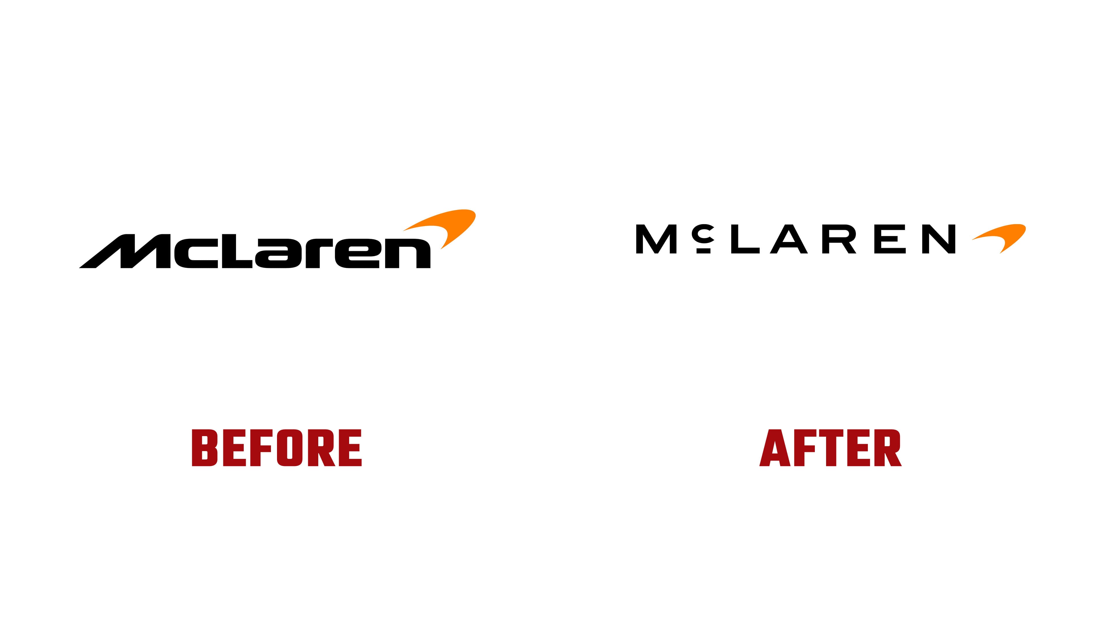
That shared history is intended to connect McLaren’s various business operations. The company is expanding its vehicle personalization offerings, hosting owner events, and developing fan programs. The unified identity is designed to reach road car buyers, racing fans, partners, and employees, bringing McLaren Automotive and McLaren Racing together under one name.
The curved Speedmark emblem remains. In the versions shown for McLaren Racing and McLaren Golf, it appears alongside the new wordmark. The McLaren name can also stand alone. The company attributes its decision to retain the Speedmark to its heritage and its importance to fans. The identity also includes the historic McLaren Heritage Shield and the Speedy Kiwi. The shield references the company’s early years and Bruce’s New Zealand roots, while the Speedy Kiwi is associated with the team’s success in the Can-Am series.
McLaren’s emblem history began with the kiwi, New Zealand’s national symbol. In 1964, artist Michael Turner, a friend of Bruce McLaren, incorporated the bird into the team’s crest. In 1971, Doug Eyre created the Speedy Kiwi, an elongated bird silhouette intended to convey the speed of the race cars. A checkered flag motif followed. In 1981, Raymond Loewy designed the McLaren International logo with chevrons. In 1991, the three chevrons were reduced to one, and the Speedmark replaced it in 1997.
McLaren links the Speedmark’s shape to the vortices trailing a race car’s rear wing. When placed on the sidepods, the curve evoked markings found on predatory animals and insects. Later updates changed the emblem’s color and finish, along with the lettering. The 2007 version accompanied the race cars’ switch to a chrome livery. In 2017, a black Speedmark helped unify the group’s businesses. The 2021 McLaren Racing identity introduced an orange emblem and thinner lettering for digital applications.
Papaya orange remains the primary color, supported by Ember, Midnight, Black, Anthracite, Colnbrook, and Mist. An archival photograph of Bruce sitting on a race car’s wheel served as the starting point for the color selection. The reddish-orange Ember references racing suits, while Midnight blue draws on the brand’s early history. Black and Anthracite reference automotive materials and engineering. The silver shade Colnbrook is named after the place where Bruce began building cars. Mist white is linked to Muriwai Beach, where he won his first victory at age 15.
The founder’s legacy runs through several McLaren projects in 2026. The company revisited the M6GT, an early expression of Bruce’s vision for a road car, before introducing the McL 6GT. The new lettering first appeared on the McL 6GT during Monterey Car Week in August 2026, with “McL 6GT” positioned between the taillights. In materials released for the September unveiling, the full McLaren name appeared there instead.
McLaren Automotive also confirmed a £500 million investment program to expand its manufacturing and engineering operations in the United Kingdom. Plans include a high-performance SUV to complement its lineup of two-seat supercars. The updated identity will gradually appear on future production vehicles, merchandise, and digital platforms. McLaren Racing plans to begin its rollout in 2027.