


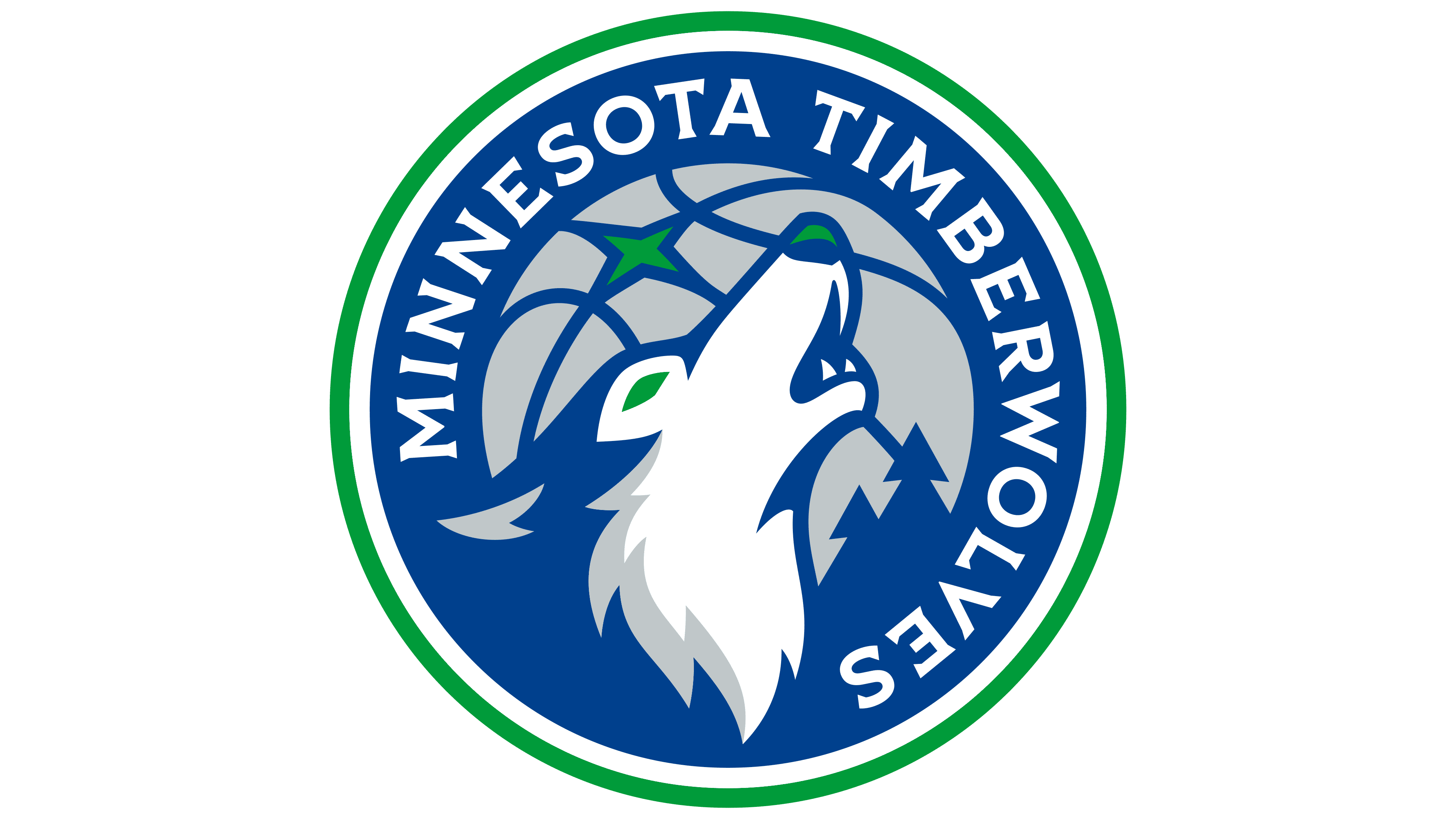
The Minnesota Timberwolves have blended several eras of Minnesota basketball history into a new identity for the 2026/27 season. Unveiled on June 7, 2026, the update restores pine trees to the emblem, while blue, green, and white recall the team’s earliest Minneapolis seasons. The howling wolf remains at the center of the logo.
The club drew on fan feedback collected over many years. Different generations associated the team with different logos and uniforms. Hence, the designers brought those historical references together in a shared identity. According to Timberwolves and Lynx CEO Matt Caldwell, the process began with Minnesota and its basketball heritage. The update covers the team’s logos, uniforms, and home court.
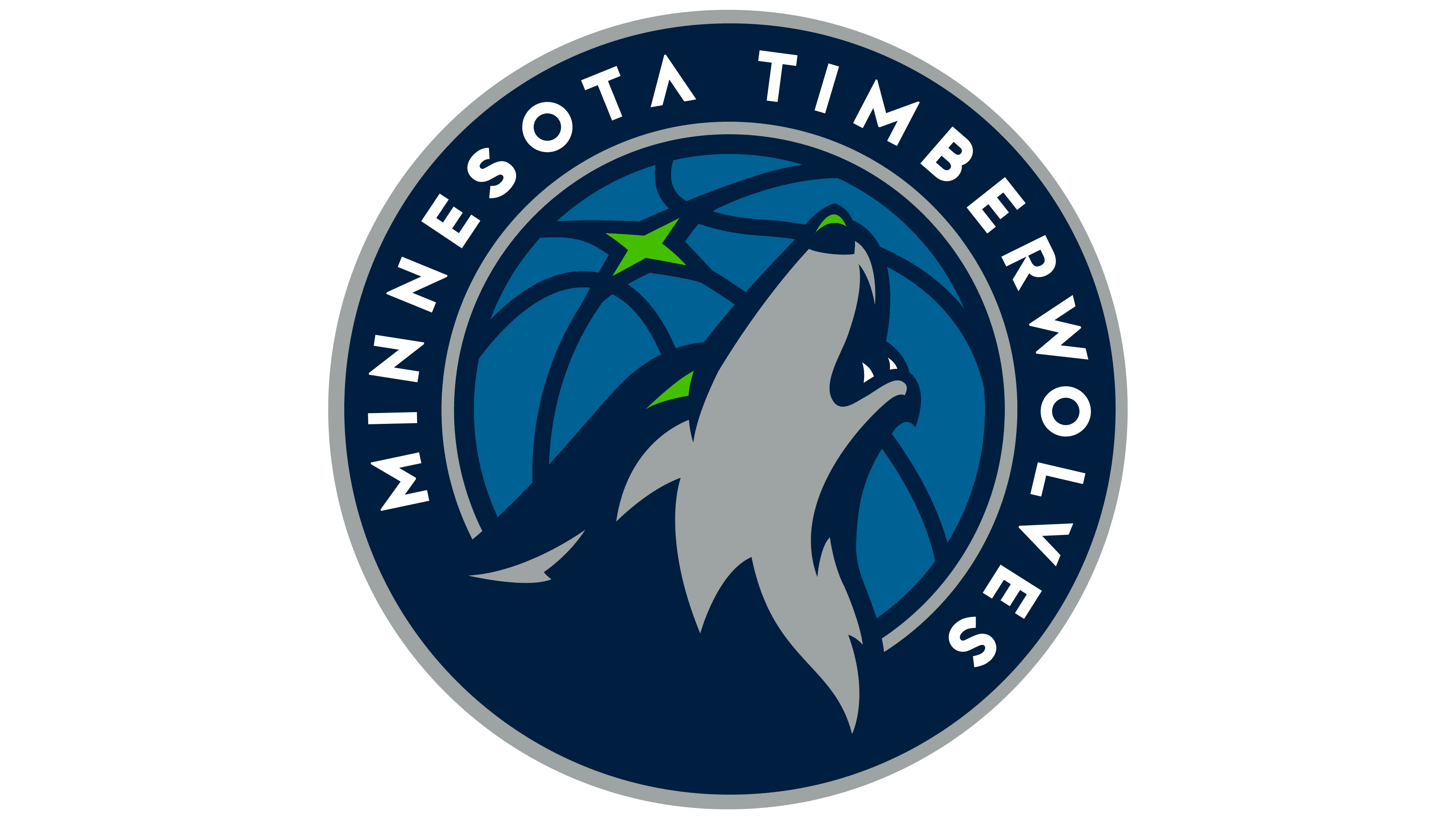
The starting point was the circular emblem Rodney Richardson and RARE Design created in 2017. The designers developed it over five months of research and conversations with team staff and fans, exploring numerous options. That process produced the wolf with its head raised, the basketball, and the green North Star. The 2026 version adds trees from a secondary emblem used from 2008 to 2017.
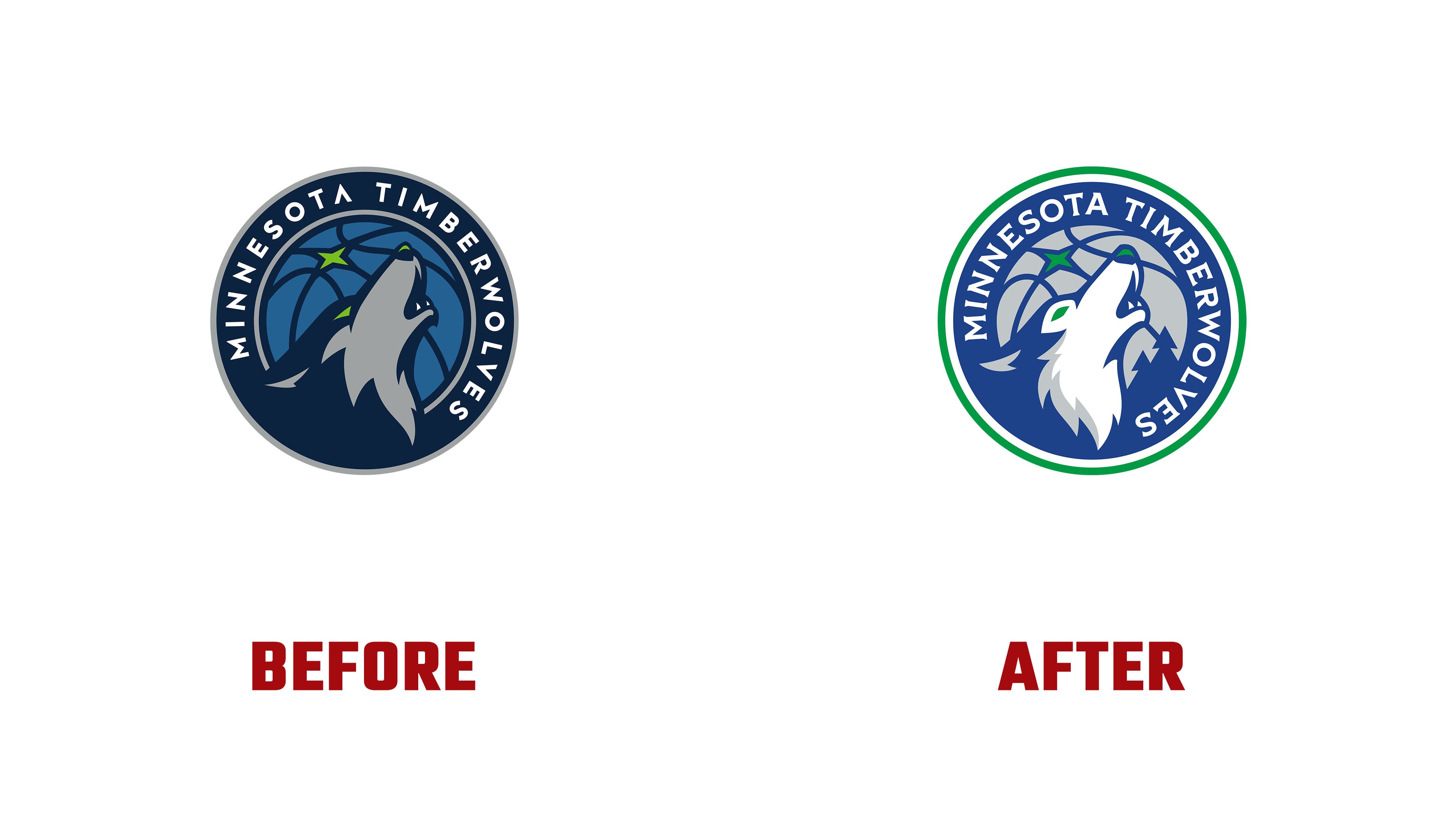
The wolf’s head and neck have been redrawn. The front is now white, with gray reserved for fur shading. Large, pointed tufts extend from the bottom. Green highlights the eye and a small section of the nose. Silhouettes of evergreen trees rise behind the wolf on the right. A rich blue replaces the previous dark background, and the basketball is now light gray. The North Star remains in its upper-left section. A green outer ring and a white dividing stripe replace the gray border.
The Minnesota Timberwolves lettering around the circle has also been redesigned. The previous version used widely spaced capital letters. The new letters are larger and more tightly spaced, with short, angular serifs at their ends. The name follows a long arc that extends farther down the right side. Its pointed terminals echo the tufts of fur and the outlines of the pine branches. Shapes resembling wolf fangs appear in the standalone Wolves wordmark and uniform numbers.
The club developed several logo variations for different uses. One features the wolf without the outer ring and team name. Another pairs the abbreviation MINN with the basketball, trees, and North Star. A further emblem, called Tree-M, combines the letter “M” with a pine tree motif. It appears at the front of the shorts waistband on all three new uniforms.
The white Association and blue Icon uniforms reference the team’s inaugural 1989/90 season, borrowing its three-stripe trim. The black Statement uniform builds on the look of the late 1990s and early 2000s, with pine trees along the edges. Blue outlines around the trees reference Minnesota’s lakes. All three uniforms carry the Wolves wordmark across the chest, with five trees above the lower jock tag representing the starting five.
The team developed two court designs for the home arena. The primary version places the wolf at center court, with trees and MINN along the blue perimeter. The Statement version puts the Wolves wordmark at center court. The painted areas beneath the baskets and the court borders are black, with wider bands of pine trees along the edges.