


![]() Monopoly Logo PNG
Monopoly Logo PNG
The monopoly logo is simple and memorable. The emblem resembles a nameplate on a company director’s office door, which every participant strives for. The symbol represents a game that teaches how to increase one’s wealth through simple steps.
Monopoly is a mega-popular economic board game, available in 37 languages and distributed in 103 countries. To date, around 300 million copies have been sold. Hasbro has been the official owner since 1991. The Monopoly logo adorns 1,144 different versions of the game.
The Monopoly game was first released by American toy manufacturer Parker Brothers in 1935. However, the board game had a predecessor. American game designer Elizabeth Magie developed the initial principles that laid the foundation for Monopoly. Her version promoted the idea of a single tax (Georgism) and was called The Landlord’s Game. Charles Darrow based his game on Magie’s and sold it to Parker Brothers, who later bought out Elizabeth’s patent to become the sole owner.
Meaning and History
![]()
What is Monopoly?
Monopoly is a board game with 40 spaces and 28 real estate properties. Players move around the game board by rolling dice, paying taxes, buy and selling property. The main objective of the game is to bankrupt opponents.
1935 – 1985
![]()
The first Monopoly emblem featured black capital letters on a red background. The red color was used to draw attention to the issue of monopolism and the unfair enrichment of some at the expense of others. This color also symbolizes leadership and the superiority of the rich over the poor. The black letters served as a symbol of stability and capital, which all game participants strive for.
1985 – 2008
![]()
After lengthy court battles with Ralph Anspach, Parker Brothers confirmed their exclusive rights to the Monopoly trademark in 1984. The emblem was improved and made more attractive. The red background became lighter, its corners were smoothed, and a light border was added. The letters changed color to white, and from the central letter “O,” capitalism peeks out as if inviting visitors to a new attraction.
The emblem reflects the shift in focus from promoting the idea of anti-monopoly to entertainment and enjoyable pastime with the help of a board game. The image suggests trying one’s luck safely and experiencing the role of a respectable magnate.
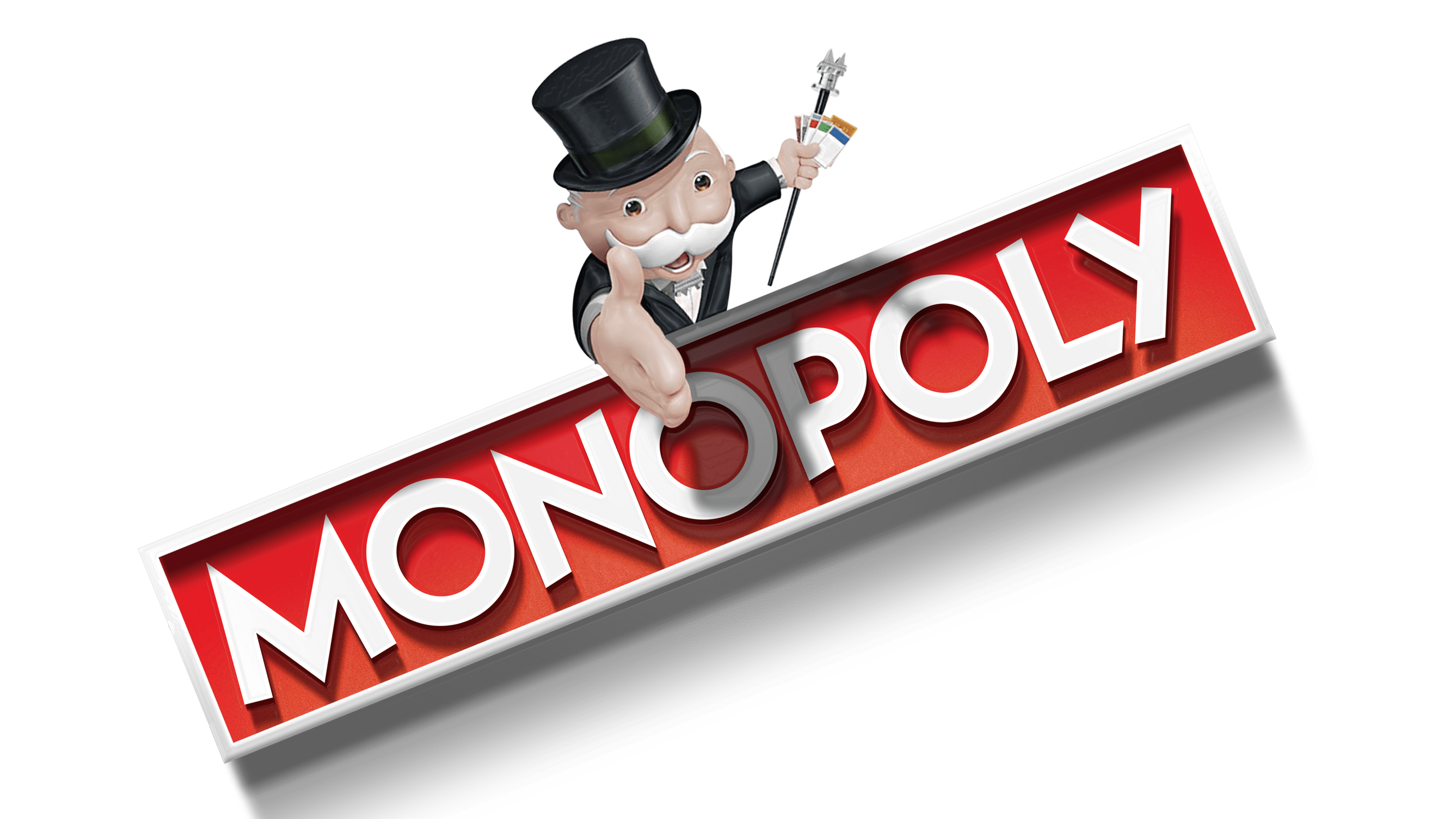
2008 – 2013
![]()
A speed die was added to the standard game variant. The emblem itself transformed, becoming more modern and three-dimensional. The red background is designed like an entrance sign. The monopolist now looks directly at the player, extending his hand and inviting them into a world of wealth, competition, and opportunities. He meets the players on equal terms, as everyone can prove themselves and achieve a high position in the game.
Behind the capitalist, American multi-story buildings are visible. The streets of Atlantic City served as the basis for the game, and they are likely depicted in the logo.
2013 – 2017
![]()
Hasbro conducted a poll among social media followers and made changes to the game’s rules. In the updated logo version, the image of the skyscrapers was removed, leaving only the monopolist and the inscription. By the 2000s, numerous game variations had emerged. Each country used its own streets and locations, and it was not always American skyscrapers, so their presence on the logo became irrelevant.
2017 – today
![]()
In 2017, a new set of game pieces was introduced, which fans voted for in a survey. However, the capitalist was removed from the logo, as his appearance is considered outdated. Wealthy people no longer wear top hats, tailcoats, and canes. The inscription’s font rises slightly above the red background and resembles finely carved ice figures, symbolizing the fragility of wealth.
Font and Colors
The logo’s primary colors are red and white.
- Red symbolizes excitement, danger, rapid developments, fierce competition, and confrontations in which the strongest prevail.
- White represents the possibility of starting from scratch and achieving a high position, while also hinting at the risk of losing everything again.
The inscription’s font is Kabel Heavy, designed in 1927 in Germany.