


 Mr. Clean Logo PNG
The Mr. Clean logo is designed consistently with other Procter & Gamble cleaning products, creating a visual connection between the company’s offerings. The emblem uses shades associated with cleanliness, highlighting the effect customers can expect after using the product. The logo visualizes the product’s core quality: its ability to work quickly and efficiently, a crucial consumer factor.
Mr. Clean began in 1958, when Procter & Gamble (P&G) launched a new household cleaner in the United States. The product came from research into home cleaning chemicals. It was created as a multi-purpose liquid cleaner for different surfaces. Its formula was promoted through the idea of “liquid power,” focused on removing dirt from kitchens, bathrooms, and other areas of the home.
The brand image was built around a bald, muscular man in a white shirt and earrings. Richard Black designed the mascot and became linked with strength and cleanliness. In its first year, Mr. Clean reached the top of the U.S. household cleaner market. Advertising in print and on television helped the product become familiar to American consumers.
International expansion followed in the 1960s. The cleaner was sold in Canada under the same name. In contrast, regional names appeared elsewhere, including Flash in the United Kingdom, Meister Proper in Germany, and Monsieur Propre in France. In the 1970s and 1980s, the line expanded with products for specific rooms and surfaces, along with aerosols and sprays.
The 1990s brought Magic Eraser in Japan, later introduced in the United States in the 2000s. AutoDry appeared in 2003 for car washing, followed by a multi-purpose cleaner in 2009 and Magic Eraser Extra Power in 2012. Liquid Muscle launched in 2016, and the brand refreshed its logo and packaging in 2018. Later releases included Clean Freak in 2020, Natural products in 2021, Magic Eraser Sheets and the Home Assistant app in 2022, and Power Duo refill cartridges in 2023.
Meaning and History
What is Mr. Clean?
It is a household cleaning brand owned by Procter & Gamble, known for its wide range of powerful cleaning products and its distinctive mascot, a muscular bald man with a gold earring. The brand offers a wide range of cleaning products, including all-purpose cleaners, floor cleaners, bathroom cleaners, and cleaning tools such as Magic Erasers and mops. The company’s products are known for their effectiveness in removing tough dirt, grime, and stains from various home surfaces. The brand goes beyond traditional liquid cleaners to include products such as Magic Eraser, which has gained popularity for its ability to remove marks and stains from walls and other surfaces. Its strong brand identity and reputation as a powerful cleaning product have made it a well-known brand in the United States and many other countries.
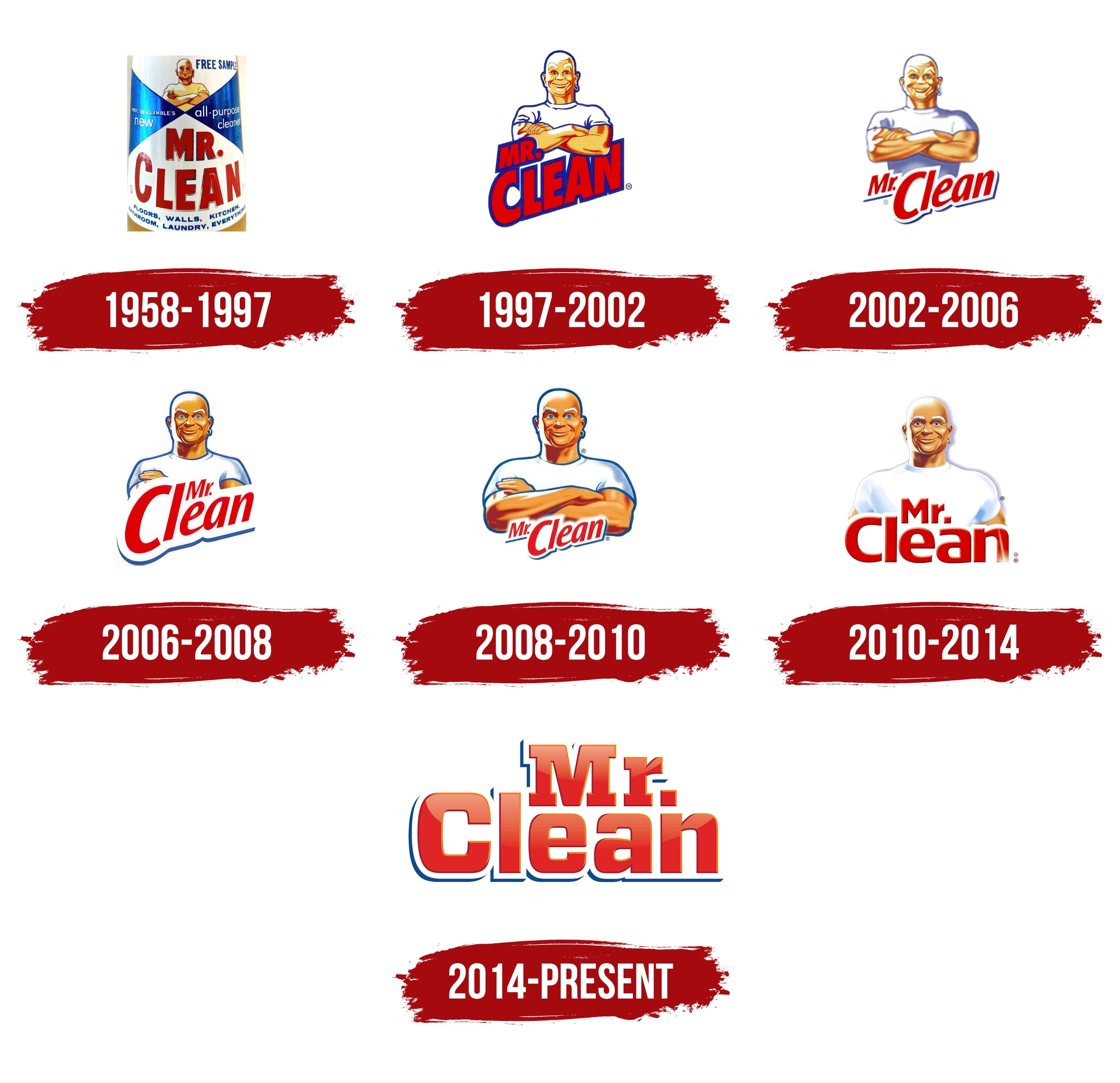
1958 – 1997
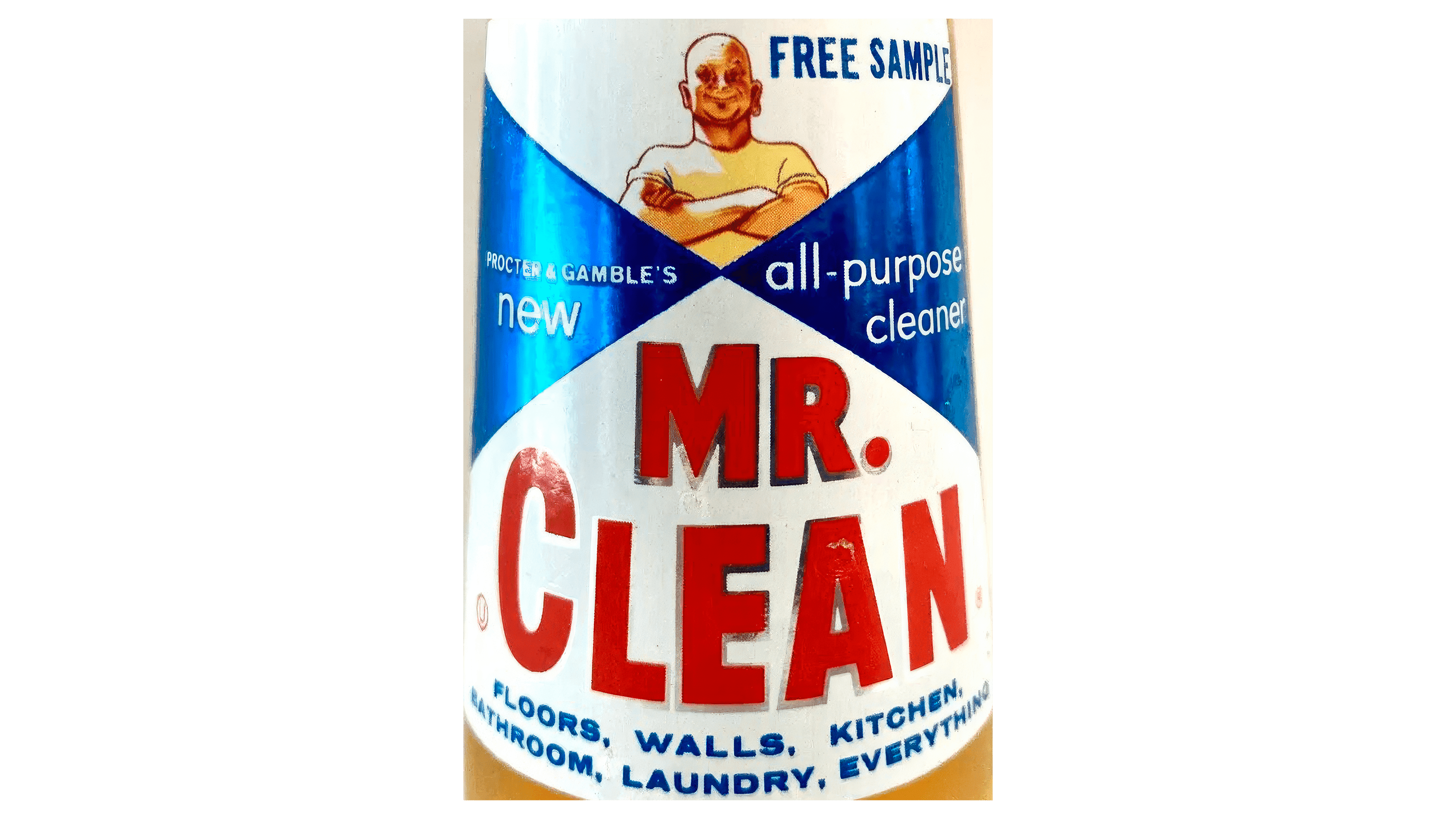
The helpful genie image, present in the brand’s name and design from the beginning, was inspired by an idea from Harry Barnhart and brought to life by artist Ernest Allen of the Tatham-Laird & Kudner design agency. The character, who has accompanied the cleaning product’s logos over the years, was originally conceived as a sailor because the product was initially developed for deck scrubbing. However, consumers perceived him as a genie, and that image became firmly established.
The original logo was divided into two white halves with wedge-shaped inserts, creating an hourglass effect. This design symbolizes the acceleration of the cleaning process and the product’s quick effectiveness in tackling dirt. Visually, the design resembled an elegant bow tie, commonly worn by servants, reinforcing the association of Mr. Clean with a dutiful butler ready to achieve perfect cleanliness swiftly.
At the top of the logo, Mr. Clean is depicted as a strong and quick character. The bottom half features his name in red letters. Along the lower edge of the logo, all the areas suitable for cleaning with the product are listed, demonstrating its versatility and wide range of applications.
1997 – 2002
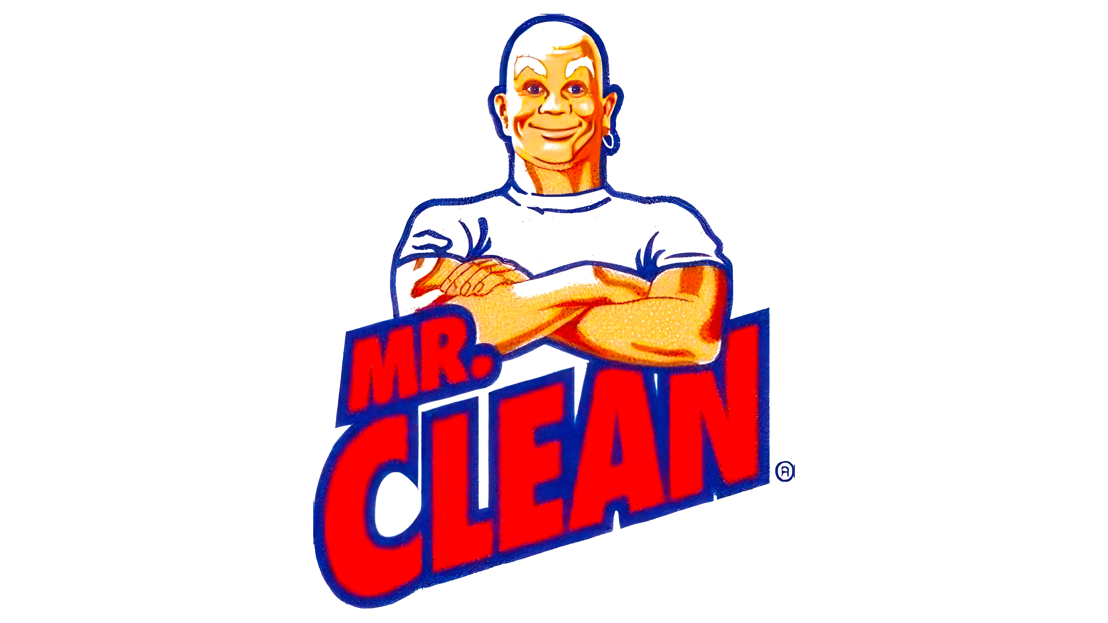
The emblem focuses on the image of Mr. Clean. Confident, positive, and strong, he gazes calmly at the customer, conveying a sense of reliability. The genie is ready to fulfill any wish in just seconds. The character leans on the name, with letters that rise smoothly upward, symbolizing the product’s growing popularity. The red hue emphasizes its effectiveness.
2002 – 2006
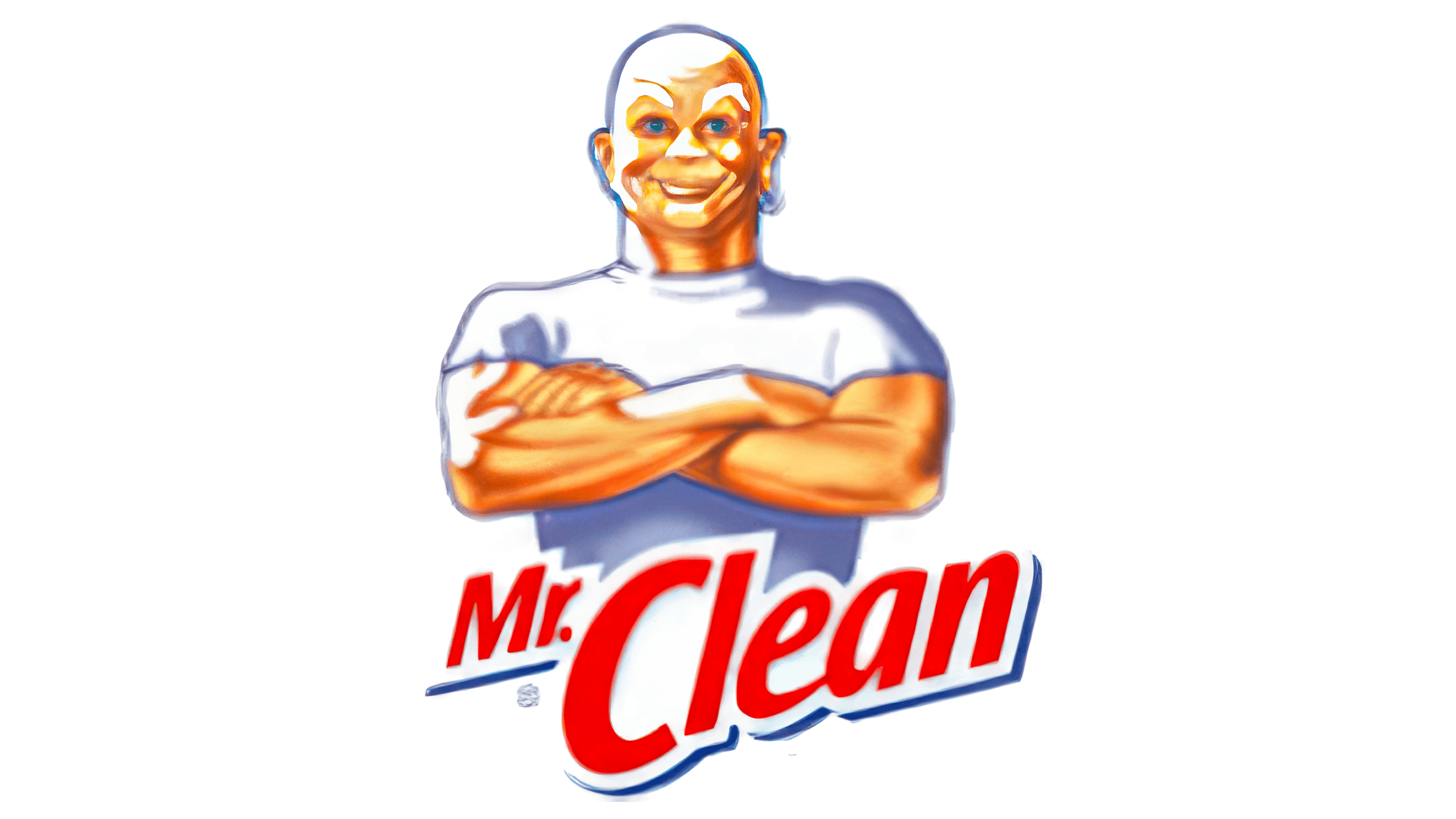
During this period, Mr. Clean took center stage on the logo. The character’s size was increased, now visible from the waist up, as if he were rising above the bottle, ready for action. All that’s left is to give the command. The character’s name is placed diagonally on a white background, emphasizing the focus on cleanliness and the product’s speed of action.
2006 – 2008
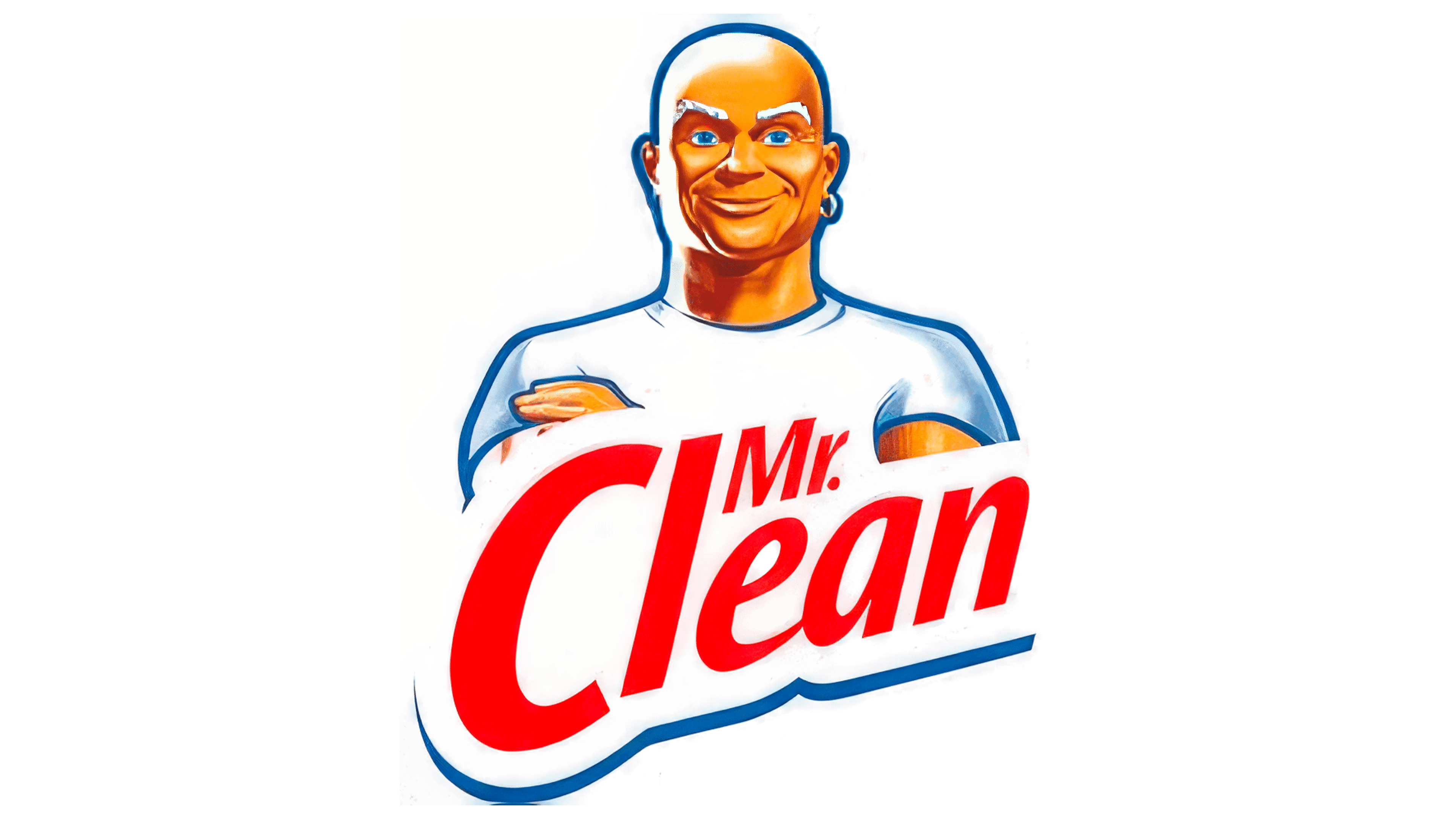
The contours of the genie were outlined in blue, adding clarity and expressiveness to the image. This same color was used for the text at the bottom of the logo, tying all the elements into a cohesive composition. The product name was enlarged and placed on a white background, partially covering Mr. Clean’s famous muscles and drawing attention to his eyes. The genie’s gaze radiates friendliness and confidence, creating the impression that the customer is looking at a reliable helper rather than a chemical product. Blue symbolizes the cleaning agent and water, emphasizing the connection to successful cleaning.
2008 – 2010
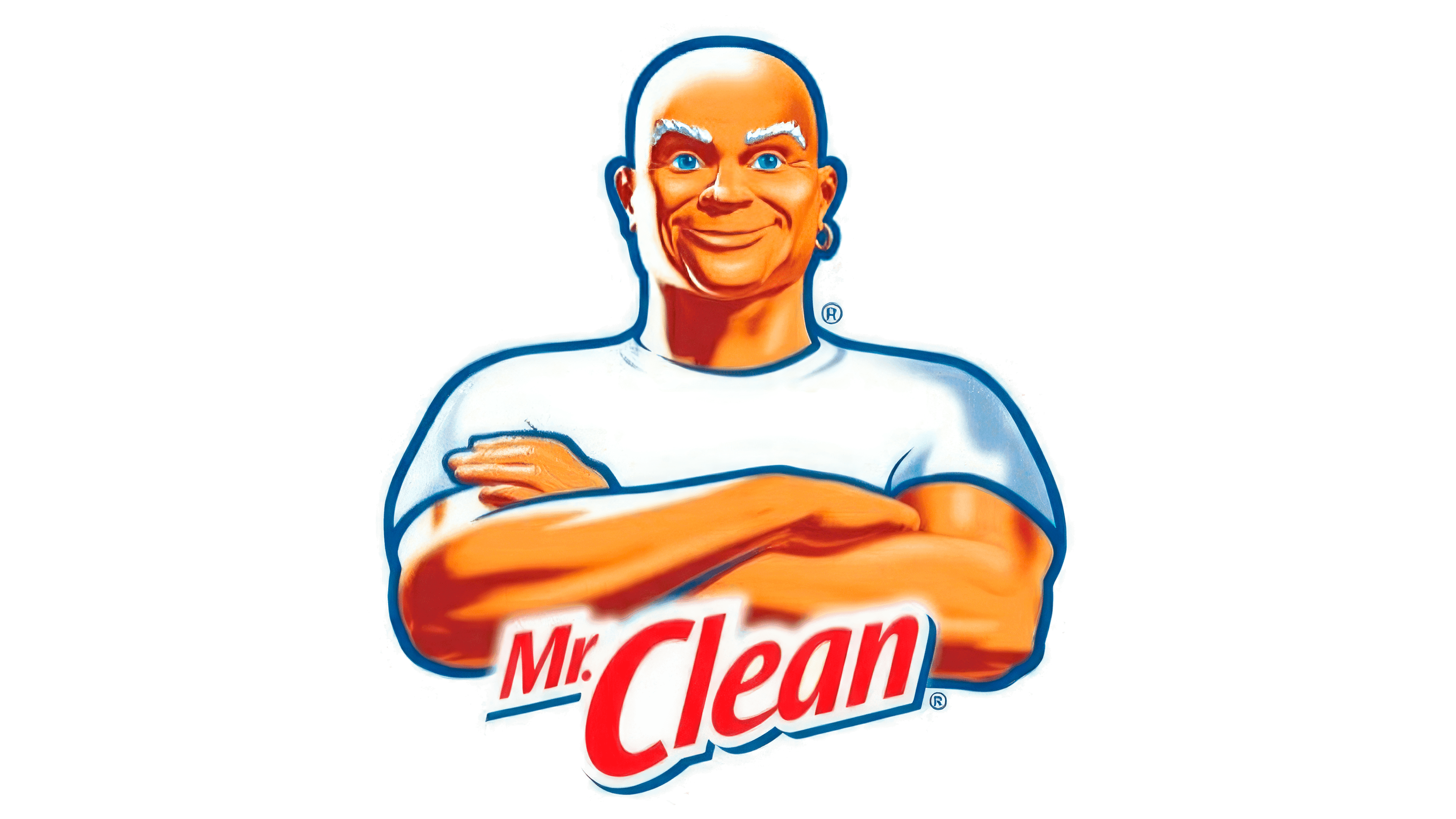
The emblem retained its recognizable image, but the altered thickness of the blue outline gave the picture a more natural appearance. The character’s strong arms reappeared, enhancing the sense of protection and reliability that Mr. Clean offers its users. At the bottom of the logo, the border was removed below the name, and a slogan was added: “There is no clean like Mr. Clean.” The elimination of the border reinforced the impression of absolute cleanliness achieved when using this product.
2010 – 2014
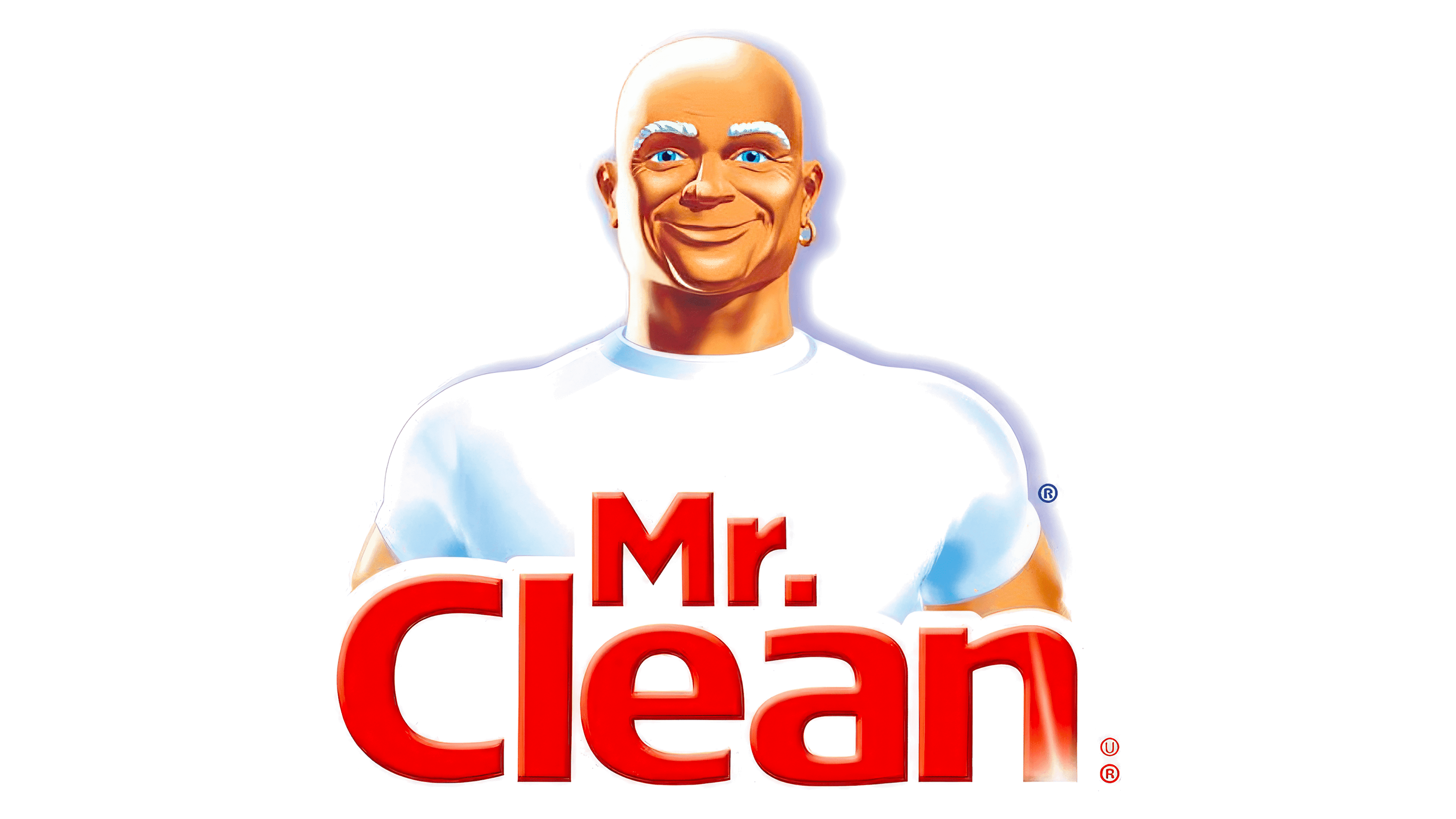
The element of overconfidence was removed from the helper’s image, evident in his previous pose with crossed arms. Now, Mr. Clean stands upright, showing openness and readiness for work. The character appears ready to move forward, taking on any challenge. Instead of the previous blue outline, a shadow appears behind him, giving the genie a lifelike appearance while his bright white shirt stands out against the background.
The letters of the name have become significantly larger and bolder, giving the text a sense of confidence and reliability. The name is aligned straight, emphasizing the brand’s stability and strength. White and red remain the primary colors, with white symbolizing cleanliness and red representing strength and effectiveness.
2014 – today
The Mr. Clean logo captures attention with its powerful visual energy. Although the emblem no longer features the iconic character, Mr. Clean, it still conveys his essence and strength. The massive letters, rendered in bright red, appear like giants against the backdrop of a three-dimensional white base. This design suggests the product can tackle dirt, bringing immaculate order and freshness to the home.
The blue shadow accompanying each letter adds depth and dimension to the emblem. This choice creates a three-dimensional effect, enhancing the sense of solidity and reliability. The blue shadow is associated with cleanliness and freshness, the core qualities that Mr. Clean promises. It highlights attention to detail, a key characteristic of the brand.
Interestingly, the letters’ cleanliness is so pronounced that they appear to shine, as if the brand’s logo had just emerged from a soapy bath. This visual element reinforces the association with the pristine cleanliness this product can achieve. The logo invites the consumer into a world of cleanliness and order, where everything gleams with purity.
The red color used in the emblem symbolizes energy and activity. It emphasizes the product’s power and effectiveness, which make it easy to handle any cleaning task. Red is the color of action, and it perfectly suits a brand that is always ready to work and provides its users with the tools to achieve maximum results.