![]() Napoli Logo PNG
Napoli Logo PNG
The Napoli football club logo expresses the team’s strong connection with its home city, Naples. Its minimalist design reflects stability, clarity, and club traditions, emphasizing its significance to the local community and sporting identity.
SSC Napoli was founded on August 25, 1926, following the merger of two local clubs to form Internaples. Early years were challenging, and the club received the nickname “I ciucci” (“little donkeys”), which later became its official mascot.
A significant moment came in the early 1930s when the club participated in the inaugural Serie A season. In 1962, Napoli won its first Coppa Italia, becoming the first Serie B club to achieve this.
The team’s true golden era began in 1984 with the signing of Argentine star Diego Maradona. Under his leadership, Napoli won its first Serie A title in the 1986-87 season and the UEFA Cup two years later.
In 1990, Napoli claimed a second Serie A title and the Italian Supercup. Maradona’s departure marked the start of a financial crisis that peaked in 2004, when the club declared bankruptcy. Film producer Aurelio De Laurentiis subsequently revived it.
After revival, Napoli gradually returned to prominence, regularly competing in European tournaments and winning the Coppa Italia again in 2012 and 2014. In 2023, under Luciano Spalletti, Napoli earned its third Serie A title, and in 2025, it won a fourth under Antonio Conte.
The team plays home matches at Stadio Diego Armando Maradona, named in honor of the legendary player.
Meaning and History
![]()
What is Napoli?
It is a soccer club from Naples, one of the leading teams in Italy’s Serie A and a two-time Italian champion. The club gained widespread recognition through legendary player Diego Maradona, who led the team to its first major trophies and became its main symbol. The club’s home stadium is named after Maradona.
1905 – 1922
![]()
The creation of the first club emblem for the Neapolitan team is linked to its founding in 1905. The Englishman William Poths, together with sailors from Great Britain and Argentina, formed the group, and the lineup’s cosmopolitan nature determined the artistic direction. In the early emblems, this was expressed through decorative techniques of the early 20th century and the attempt to unite different cultural codes in a single visual field.
The basis was a composition with a vertical arrangement of light blue stripes in two shades, separated by thin golden lines. The rhythm created the impression of a textile structure with a regular alternation of elements, visually connecting the club with Argentine football tradition. The biographies of the first players with South American roots confirm that this detail could have been a reference to their cultural memory.
In the center was a monogram made of the initials N, F, B, and C, executed in gold. The letters were united by a circular frame of the same shade, and the symbol looked cohesive and complete. The classic Victorian ornamental style of the typeface is evident in the complex curves of the strokes and refined serifs, lending plastic richness. The typography resembled heraldic aesthetics, with decorativeness balanced with legibility.
The color scheme combined two shades of blue and gold. The contrast between cold and warm tones establishes a perceptual hierarchy: the background provides the foundation, while the details highlight the emblem against the overall field. The palette linked the emblem to artistic movements of the time, in which the refined combination of metallic tones and cold colors was considered a sign of elegance.
The emblem conveyed the club’s dual origins, uniting English tradition, Argentine roots, and the Neapolitan environment into a single symbol. The sign was perceived as refined and expressive, reflecting the cultural diversity from which the future SSC Napoli emerged.
1911 – 1926
![]()
The split within Naples Football Club in 1911 marked the emergence of a new team. Italian players, eager to break free from foreign dominance and assert their own identity, formed Unione Sportiva Internazionale Napoli. The first club symbol secured the course toward a national accent and visually marked the distance from the Anglo-Argentine past.
The emblem was built on a circular composition. The letters I and N are intertwined to form a monogram constructed on the principle of symmetry and balance. The proportions of the strokes appeared calculated, and the lines interacted within the circle without excessive decoration. The composition resembled a stamp impression, concise and assembled.
The monogram’s font lacked ornamentation; straight strokes and connections formed a structure closely resembling architectural logic. In contrast to the ornamental style of Naples FBC, the new club demonstrated a drive toward clarity of forms and a restrained expressive language.
The palette was based on the contrast between a dark blue field and white lines. The color combination enhanced the legibility of the symbol. It formed a strict hierarchy of perception: the dark background absorbed space, while the light elements came forward, creating a rhythm akin to the marks of a print or a stamp.
The emblem’s semantic weight lay in its demonstration of independence and its emphasis on Italian affiliation. While its predecessor relied on the decorative aesthetics of an international character, Internazionale Napoli opted for a simpler form, seeking to underscore its new direction and local identity.
1922 – 1926
![]()
The rivalry between Naples Foot-Ball Club and Internazionale Napoli lasted for several years, until competition for players and fans led to a merger. The creation of a unified team became a necessary condition for Naples to represent the country at a more serious level in national football. Thus, in 1922, a structure called Internaples appeared, whose name preserved references to both predecessors.
The emblem of the new organization featured a rhombus shape. Inside was a complex monogram made of the interlacing letters USIN. The linear plasticity was based on smooth transitions, creating the impression of a pattern that connected the club’s past and present. The monogram was placed on a deep blue field, evoking the Neapolitan tradition and continuity with the city’s first teams.
Along the white border around the perimeter of the rhombus was the inscription “UNIONE SPORTIVA INTERNAPLES.” The inscription was executed in a grotesque typeface with geometrically precise outlines. The contours of the letters reflected the Art Deco aesthetics that developed in the 1920s in industrial and applied art. In the corners of the composition were laurel leaves, a symbol of victory and sporting glory, deeply rooted in ancient tradition.
The color palette was built on the contrast of a blue background and white details. This combination ensured legibility and visual hierarchy. The deep background tone emphasized the lightness and expressiveness of the monogram and the frame text.
1926 – 1927
![]()
The establishment of Associazione Calcio Napoli in August 1926 was the result of transformations based on Internaples. The initiator was the industrialist Giorgio Ascarelli, and with his involvement, the club’s official history began, which later became SSC Napoli. From the very first days, the organization received a new emblem that combined sporting ambitions and cultural references to the city.
The emblem was oval, framed by a golden border. Inside was a sky-blue field. The composition was built on two images: a white rearing horse and a golden leather ball on which the animal’s hind legs rested. The image emphasized dynamism and energy, and the interaction of the horse and ball was interpreted as a symbol of the game itself.
The plasticity of the horse figure can be traced back to academic heraldry. The visual manner relied on detailed rendering: the curve of the neck, the movement of the mane, the tension in the muscles.
Around the perimeter of the oval were the abbreviations A, C, and N. It used an Antiqua-style typeface, characterized by its contrast in stroke weight and serifs. The geometry of the letters preserved solemnity.
The color palette consisted of sky blue, white, and gold. The contrast between cold and warm tones establishes a perceptual hierarchy: the background serves as the basis, while the golden and white elements move to the foreground. The color scheme underscored the team’s sporting status and its cultural connection to Naples’ historical heritage.
The figure of the horse, complemented by the ball, carried symbolic meaning. It was associated with the city’s ancient traditions and was perceived as an allusion to the heraldic system.
1927 – 1940
![]()
Following the crest, which features a horse, the club adopted a more concise approach to symbolism. The new emblem is a circular design with a sky-blue field, a thin yellow outline, and a monogram in the shape of the letter “N”. The letter was interpreted as an abbreviation of the city and the team name, emphasizing the club’s connection to its place of origin.
The circular shape provided symmetry and versatility. Unlike the illustrative coats of arms of its predecessors, the composition appeared balanced and complete, in line with the growing trend of minimalism in sports symbolism in the mid-20th century.
The typographic part was based on serif type. The letter had massive serifs, strict stroke proportions, and conveyed a sense of monumentality. The glyph’s structure expressed solidity.
The palette was based on the combination of blue and yellow. Blue was established as the key color of the club’s identity, while yellow enhanced contrast and added a shade of solemnity. The associations of the palette connected it with the sea and sunlight, characteristic of the Mediterranean region.
1940 – 1945
![]()
At the beginning of the 1940s, Napoli’s club symbolism shifted from a circular to a shield format. The transition reflected the heraldic tendencies of Europe at the time, in which sports organizations borrowed forms from military and state visual culture. The crest’s contour gave the emblem a more official character.
The composition was built from three elements: a blue background, the white letter N, and a golden outline. The palette transformed. The white monogram replaced the golden one, increasing contrast and giving the image a more restrained look. The shade of blue became darker, enhancing the impression of seriousness.
The letter N preserved continuity with the previous emblem and continued to denote the city’s name. Executed in classical serif type, it had strong serifs and balanced proportions.
The yellow frame surrounding the shield visually connected the new version to earlier emblems, in which the color had already been used as an accent. The contrast between the warm outline and the cool field established a clear perceptual hierarchy.
1945 – 1946
![]()
After the war, the club abandoned its saturated heraldic imagery and adopted a maximally simplified structure. The symbol retained the elongated shield with a pointed base, but inside the form became minimal: a white field and a single mark, the letter N, colored bright blue.
The main focus shifted to the monogram. The typeface was sans serif, with uniformly thick lines. This gave the emblem a modern, functional character, in line with the pragmatics of the club’s postwar reconstruction.
The color system was limited to two tones. Blue, established for Napoli in the prewar years, gained a new role: when combined with white, it created an impression of freshness and lightness. The pair of shades maintained continuity and highlighted the beginning of a new stage.
The shield connected the club with the heraldic tradition, but in the new version, its functions were reduced to the essentials: a surface and a letter.
1959 – 1961
![]()
At the end of the 1950s, the club abandoned its previous circular and shield formats and began searching for a new form. The visual concept acquired a trapezoidal contour with smoothly curved sides. The format stood out among the usual schemes of sports symbolism, giving the emblem a more modern character.
Inside the figure, a blue field was outlined with a yellow frame. In the center was the letter N, executed in the same shade of yellow. The structure’s conciseness emphasized the monogram and maintained a balance between form and content.
The typography was based on serif type. The letter had serifs and proportions reminiscent of Roman inscriptions. This gave the emblem a sense of monumentality while simultaneously connecting it to classical typographic traditions, thereby providing cultural continuity.
The palette was built on the pair familiar to Napoli: blue and yellow. However, in this variation, the colors appeared more intense. Dark blue enhanced the contrast with golden yellow, creating an effect of brightness and richness.
1962 – 1964
![]()
In Napoli’s history, there was a stage when the club emblem combined several layers of meaning in a single image. On a shield with a golden frame, a horse was depicted in gold. The figure occupied the entire field and retained a stylized, anatomical, and dynamic form. It traced back to the city’s heraldic traditions and continued the line begun with the 1926 emblem.
Above the animal were five interlaced Olympic rings. For the club identity of those years, such a motif was rare. Their appearance was associated with ideas of sporting universalism and international unity promoted in postwar Europe.
At the bottom of the shield, the inscription “NAPOLI” was written in white capital letters. The typeface had the form of a condensed serif, and the lines followed the curves of the shield along the edge. In the upper corners were the letters A and C, abbreviations for Associazione Calcio.
Under the horse’s hooves, there was a circle in the colors of the Italian tricolor. The element resembled a cockade and added a national accent, connecting the club not only with Naples but with Italy as a whole.
The color system included a blue field, golden details, and white elements. Unlike the minimalist emblems of previous years, the composition contained numerous symbols and appeared rich.
This version became the last one to feature the horse image. Later, Napoli adopted a simplified structure with the letter N as its main emblem.
1964 – 1965
![]()
The mid-1960s brought Napoli an emblem that reflected a desire for order and system. Unlike the previous concise versions, the symbol acquired a more complex structure, combining several levels of elements.
The base was a shield with a blue field. Its contour was framed by a white border, supplemented by a golden line along the edge. In the upper corners were the letters S and S, an abbreviation of Società Sportiva, the club’s official name.
A white oval occupied the center of the composition, featuring a large blue letter “N”. In form, the oval resembled a soccer ball or the signs of European sports federations of the mid-century, where similar figures served as carriers of monograms. The monogram was linked to both international practice and the local tradition of Napoli.
At the bottom of the shield was the inscription “CALCIO NAPOLI.” The sans serif typeface had restrained proportions, wide strokes, and a straight vertical axis. The lines followed the contour, creating a unified composition and a functional rhythm.
The palette was based on the club’s familiar color scheme: a blue background, white elements, and golden accents. The combination maintained continuity while appearing more organized and systematically arranged.
The emblem’s semantic core remained the letter N, but it was embedded in a composition in which all elements worked as a unified structure. As a result, the symbol affirmed local identity while reflecting a modern sports style consistent with the European context of the mid-20th century.
1965 – 1967
![]()
In 1965, the club introduced an emblem that marked the beginning of the tradition of using round team symbols. The new composition differed from the complex heraldic structures of previous years: it was built on minimalism and universality.
The format consisted of a white circle with a double blue outline. In the center was a large N in a saturated shade of blue. The structure provided completeness and symmetry, while the circular form allowed the emblem to adapt to any medium. The double frame created a sense of layering, increasing the depth of perception.
The monogram was executed in a sans-serif design. Solid strokes and strict geometry formed an image of reliability and austerity. The emphasis on verticality and proportionality reinforced the impression of simplicity and stability.
The color system was reduced to a single blue in the frame and in the letter. The background color was white.
The Napoli emblem adopted the letter N as its main symbol. The circle with the monogram became the basis for all subsequent identity and defined the direction of the club’s visual language for decades to come.
1965 – 1969
![]()
In the mid-1960s, Napoli introduced a circular emblem that combined club tradition with national symbolism. The composition was built on a blue field, encircled by a golden rim with a thin black line. This gave the emblem a medal-like appearance and a sense of completeness.
In the center of the circle was a golden letter N. It was executed in a serif style, featuring a clear vertical axis and serifs that traced their origins to classical European typefaces. The inscription along the lower arc, “S.S.C. Napoli,” repeated the circle’s form. The text was also colored gold and outlined in black, preserving the structure’s balance.
The lower part of the outer ring contained three segments: green, black, and red. The segments were interpreted in two ways. On one hand, they were seen as a reference to the Italian national tricolor. On the other hand, the individual shades had their own cultural and local associations. Green was linked to the organization’s roots, red to the symbolism of struggle, and black to memory.
The palette included the blue background, golden accents, and additional segments of three colors. The composition appeared richer, combining several layers of symbolism.
1969 – 1973
![]()
In 1969, Napoli introduced an emblem that came as close as possible to the canons of classical heraldry. The format was executed as a shield with a blue background and gold outlining. In the center was the letter N. It had a serif design with elongated proportions and serifs. The style, associated with serif typefaces, gave the symbol a sense of monumentality.
The composition was not limited to the monogram. Three fleurs-de-lis were used, arranged symmetrically: two at the top and one at the bottom. Their origin was connected to the symbolism of Naples during the Angevin dynasty, when the fleur-de-lis was incorporated into both civic and dynastic heraldry.
Visual balance was achieved through the interaction of letter and ornamental elements. This created a strict, orderly structure that resembled European aristocratic coats of arms and emphasized the composition’s official nature.
The emblem retained the palette familiar to Napoli: blue background and golden accents. Unlike the minimalist interpretations of the mid-1960s, the new version emphasized historical and symbolic codes, integrating the N monogram into a system with heraldic elements.
1971 – 1972
![]()
In Napoli’s history, there was a case in which the club emblem served as a testing ground for experimenting with heraldic codes. A round format was filled with diverse elements drawn from the arsenal of European dynasties. The surface was covered with heraldic fragments: lions and towers stood alongside crosses and stripes, griffins and fleurs-de-lis. The impression was enhanced by a mosaic effect, reminiscent of a museum panel, in which each symbol had a historical origin.
The main focus was a blue shield with three golden fleurs-de-lis, to which another shield bearing the letter N was added. The combination linked the club with Neapolitan symbolism. Within the composition, the signs of Anjou, the Bourbons, Aragon, Castile, León, and Sicily can be recognized, suggesting that the emblem is an attempt to embed the club in the city’s historical context and its political traditions.
The emblem was circular, with the coats of arms filling all available space. The proportions were arranged so that the individual fragments appeared as a single, collage-like construction.
The color scheme followed heraldic logic. Blue predominated, contrasted with golden elements. Red and white fragments, along with black lines, inside the coats of arms enhanced decorative richness and maintained the hierarchy of symbols.
The semantic content was built on references to dynastic symbols. The club served as an intermediary between the city’s past and modern sport, which explains the attempt to incorporate as many references to dynasties and their heraldry as possible into the emblem.
However, practical use proved difficult: the composition was deemed too heavy for mass media and sports applications. As a result, the emblem did not last long. Nevertheless, it remained an example of a football team adopting monarchical symbolism and presenting an emblem comparable to a museum artifact.
1973 – 1974
![]()
The visual novelty of the new emblem was expressed through its shape. The club abandoned the familiar circles and shields, introducing a square with rounded corners and elongated vertical outlines. The geometry resembled a hybrid of an oval and a square, giving the emblem a distinctive silhouette and reflecting the intention to depart from the traditional canon.
The base was a deep blue background, bordered by a wide yellow frame. In the center was the letter N in a golden shade. It appeared expanded, with an inclined axis and thin serifs. The style was reminiscent of classical serif typefaces, such as Garamond or Sabon, lending the emblem an academic quality and continuity with typographic tradition.
The visual field was dedicated to a single letter, which strengthened its role as the sole identifier. The proportions were arranged so that the emblem retained monumentality through the thick frame, while the glyph’s inclination and expansion added dynamism.
The color palette was limited to two tones: blue and warm yellow. The contrast between them made the emblem appear richer compared to previous versions. The golden tone of the letter reinforced the sense of solemnity and highlighted associations with academic tradition.
1974 – 1982
![]()
The return to a concise circle marked a period of change for Napoli. Against a deep blue background, a large golden letter “N” appeared. The circle’s contour was complemented by a thin outline in the same color as the monogram, which enhanced the sense of completeness.
The letter N was executed in a serif design. Verticals and diagonals were arranged strictly, and the serifs were crafted with precision. Thin strokes and classical proportions linked it to typefaces such as Trajan or Times Roman, though its form was adapted to the circular composition. This allowed the glyph to preserve its Roman roots while acquiring an institutional character appropriate for an official symbol.
The palette was reduced to blue and gold. The first was associated with the sea and the city, while the second added solemnity, elevating the symbolism to a level of status. The blue background served as the foundation, while the golden monogram and outline added a visual accent.
1980 – 2002
![]()
The emblem that appeared during Napoli’s period of sporting success became established as the symbol of the “golden era.” It accompanied the team during seasons of triumph: the Italian championships of 1986/87 and 1989/90, the UEFA Cup victory in 1988/89, and national Cup and Supercup trophies. To this day, the emblem remains associated with the Maradona era and the club’s peak achievements on the European stage.
The form was based on a circle. Inside was a blue disk with a large white letter “N” as its main element. Along the perimeter of the ring was the inscription SOCIETA SPORTIVA CALCIO NAPOLI, set in uppercase dark blue letters. A white outline framed the composition, reinforcing the contrast.
The typography was rooted in the serif tradition. The letter N had articulated serifs, contrasting strokes, and slender proportions. In character, it was reminiscent of classical typefaces such as Trajan or Caslon, though adapted to the circular form and versatile for use.
The color system was reduced to a duet of blue and white. The blue disk served as the foundation of perception, while the white monogram and outline ensured legibility, creating clarity in the composition. The additional dark blue of the inscription reinforced hierarchy and added depth.
1982 – 1984
![]()
The image of the donkey in Napoli’s culture has a long history: as early as the 1920s, it was used in satirical drawings and newspaper materials as a symbol of stubbornness and local identity. Later, the animal became part of fan culture, appearing on banners, in graffiti, and in unofficial merchandise. Even Maradona, in interviews, called the donkey “the spirit of the club.” It was this heritage that a Neapolitan animalist artist drew upon when creating an experimental emblem.
The emblem depicted a donkey’s silhouette in a simplified flat style, colored light blue. The composition was designed so that the animal’s body formed the letter N, the traditional monogram of Napoli. The profile featured a caricatured expression with long ears, a closed eye, and a distinctive look.
The graphic design omitted decorative details and contour lines, resulting in a minimalist emblem. The color system was limited to a single shade of blue, historically associated with the club. This gave the emblem a unified look, though it lacked the usual tonal hierarchy.
The symbolism of the image was based on irony and references to Neapolitan cultural codes. The donkey embodied the team’s stubbornness and independent spirit while transforming its silhouette into the letter N, linking the humorous image to its official identity.
1984 – 1985
![]()
Before the Maradona era, Napoli’s club symbolism underwent another phase of experimentation. At that time, a new emblem emerged, reverting to a circular form while updating its geometry and proportions. The composition was built around a blue disk with a white letter “N” in the center. Around it ran a triple outline: first white, then blue, and white again. The structure enhanced depth and contrast, creating a sense of completeness.
The monogram featured elegant serifs and elongated proportions, closely resembling the Trajan typeface. In this version, the upper-left serif was softened, introducing individuality and distinguishing the letter from earlier variants.
The palette was limited to two tones: blue and white. Their combination emphasized the club’s tradition and gave the design a lighter character in line with the spirit of the time.
1985 – 2002
![]()
During that period, the club introduced an emblem that focused on the relationship between tradition and modernity. Inside a blue circle was a white letter N, and around it ran a white ring with the inscription SOCIETA’ SPORTIVA CALCIO NAPOLI. The text was set in uppercase black characters, which increased legibility and created a strict contour for the entire composition.
The structure was built on the contrast of two levels: the inner monogram and the outer inscription. The blue field functioned as the background, the white disk created optical separation, and the black text established rhythm along the circumference. The proportions were arranged so that the emblem appeared balanced.
The typographic system was resolved through contrast. The letter N was rooted in the serif tradition, with proportions and serifs similar to those of Trajan or Garamond. Its strokes had an elegant character, giving the monogram an academic quality. The text of the outer ring, by contrast, was based on a geometric grotesque style similar to Helvetica or Futura, characterized by straight lines and a neutral tone. This combined historical foundation with the pragmatics of modernity.
The palette included three colors: sky blue, white, and black. The first connected the emblem to club tradition, the second provided the basis of perception, and the third ensured contrast and clear readability of the text. The color relationship worked toward clarity and functionality.
The emblem’s symbolism relied on duality. The serif letter maintained continuity, while the grotesque text conveyed a modern approach to identification.
1997 – 2002
![]()
Before the early 2000s crisis, Napoli used an emblem that would become the club’s last before its bankruptcy and the subsequent 2004 reorganization. It accompanied the team through a period of financial difficulties, preserving continuity in their visual identity and emphasizing their commitment to tradition even amid instability.
The form remained circular, but the structure was reinforced through an updated palette and revised proportions. The outer ring took on a saturated medium blue shade, while the inner disk became darker than in previous versions. The white letter N placed in the center retained its role as the main mark.
The monogram retained its serif style, characterized by thin serifs and a strict axis. It referred to classical models, continuing the line of previous versions. A new emphasis was placed on the text ring: the inscription SOCIETA’ SPORTIVA CALCIO NAPOLI was for the first time executed in a serif typeface, which harmonized with the character of the central letter. The use of Roman uppercase and the even distribution of text along the circle created a composition with academic expressiveness. The interletter spacing was carefully adjusted, which strengthened neatness and visual precision.
The color system was built on three levels: sky blue filled the central field, saturated blue gave density to the outer ring, and white ensured clarity of the monogram and text. The combination appeared more contrasting and balanced than in earlier versions, thereby emphasizing the emblem’s institutional character.
2002 – 2003
![]()
The final stage of Società Sportiva Calcio Napoli was marked by an emblem that highlighted the club’s administrative status. For the first time, the legal designation “S.p.A.” appeared in its design, indicating that it was a joint-stock company. The inclusion of the abbreviation in the inscription reflected an attempt to institutionalize the image and define the organization’s official character in the face of an approaching crisis.
The structure was built on a blue circle with a white “N” in the center. Contrasting strokes and refined serifs linked it to the Roman serif tradition, visually recalling typefaces such as Trajan or Garamond. The proportions of the monogram were carefully adjusted in relation to the circle.
Around the disk was a massive blue frame. On it, the full name SOCIETÀ SPORTIVA CALCIO NAPOLI S.p.A. was written in white. Compared to previous versions, the inscription became more compact but retained density, while the ring appeared saturated and precise.
The palette included three colors: blue for the central field, white for the letter and text, and dark blue for the outer ring. The combination created a strict visual order, emphasizing the symbol’s official character.
2004 – 2005
![]()
Following the bankruptcy of the old structure, the club was forced to operate under the name Napoli Soccer, which required a new logo. Legal restrictions prevented the use of SSC Napoli’s previous name and official symbols. Hence, the emblem became a compromise intended to emphasize the team’s rebirth and distance itself from its past.
The composition retained the traditional circle. Inside the dark blue outer ring was a white border, and in the center was a light blue field with a white letter N. The structure visually recalled historical emblems, but the darker shades of the outer circle emphasized the distance from the former organization.
The monogram was executed in classical serif type with thin serifs and strict proportions. In style, it referred to the historical versions of SSC Napoli, ensuring continuity. The contrast between dark and light blue reinforced the composition’s visual balance.
The palette was built on three colors: dark blue for the outer ring, light blue for the inner field, and white for the letter and border. Stylistically, the emblem was perceived as a simplified interpretation of the classic Napoli image. It is assumed to have been created in collaboration with Aurelio De Laurentiis and his team.
The emblem was used for only one season, when the team played in Serie C1. Despite its short life, it has symbolic significance: it became the embodiment of a new start for football in Naples and a bridge to the return of the SSC Napoli name and traditional identity in 2006.
2005 – 2006
![]()
After the first season under the name Napoli Soccer, the club refined the emblem, making it more orderly. The circular construction was preserved, featuring a dark blue outer border, a thin white frame, and a light blue center field. The white letter N, executed in a serif style with classical proportions and elegant serifs, continued to reference the tradition of the old SSC Napoli.
The key change concerned the text. In the lower sector of the ring appeared the inscription “NAPOLI SOCCER,” set in white uppercase serif letters. It followed the arc, creating visual balance and a sense of completeness. Unlike the previous year’s version, the Napoli logo appeared more official and structured.
The palette remained three-colored: light blue for the inner disk, white for the monogram and text, and dark blue for the outer ring. The distribution of colors preserved continuity and emphasized the difference between the new organization and the liquidated SSC Napoli. A legal distinction was mandatory, but the visual logic was constructed to maintain a link with history.
2006 – 2007
![]()
The return to the name Società Sportiva Calcio Napoli was accompanied by a new emblem, which abandoned the more complex structure of previous versions. The form remained circular, but the design was pared down to a minimum: a bright blue background with no outer text ring or ornaments.
In the center was a white letter N. Its construction was based on serif type with elongated proportions and thin serifs. In character, it was reminiscent of classical typefaces, such as Trajan.
The color palette was limited to two basic tones: blue and white. The combination ensured lightness and universal appeal, emphasized the continuity of club symbolism, and made the emblem suitable for various applications.
2007 – 2024
![]()
After the renewal of Napoli’s visual system, the club received an emblem that represented the most technologically advanced interpretation of the traditional circle. Unlike the previous flat versions, the composition acquired a three-dimensional effect, resembling a glass medallion.
The inner field was designed with a gradient, from a light blue to the center to a more saturated shade toward the edges. The white letter N, executed in a serif style with elegant serifs and classical proportions, received a light gradient, creating a highlight effect and visual depth.
The framing consisted of a narrow white stripe and a wide blue band. The outer contour was created with smooth color transitions, giving it a massive, stable appearance. The addition of light accents and soft shadows enhanced the impression of volume and reinforced the association with a modern coat of arms.
The palette was built on three tones: light blue transitioning into a more saturated shade, white, and blue. Their combination created contrast, giving the composition expressiveness and a modern character.
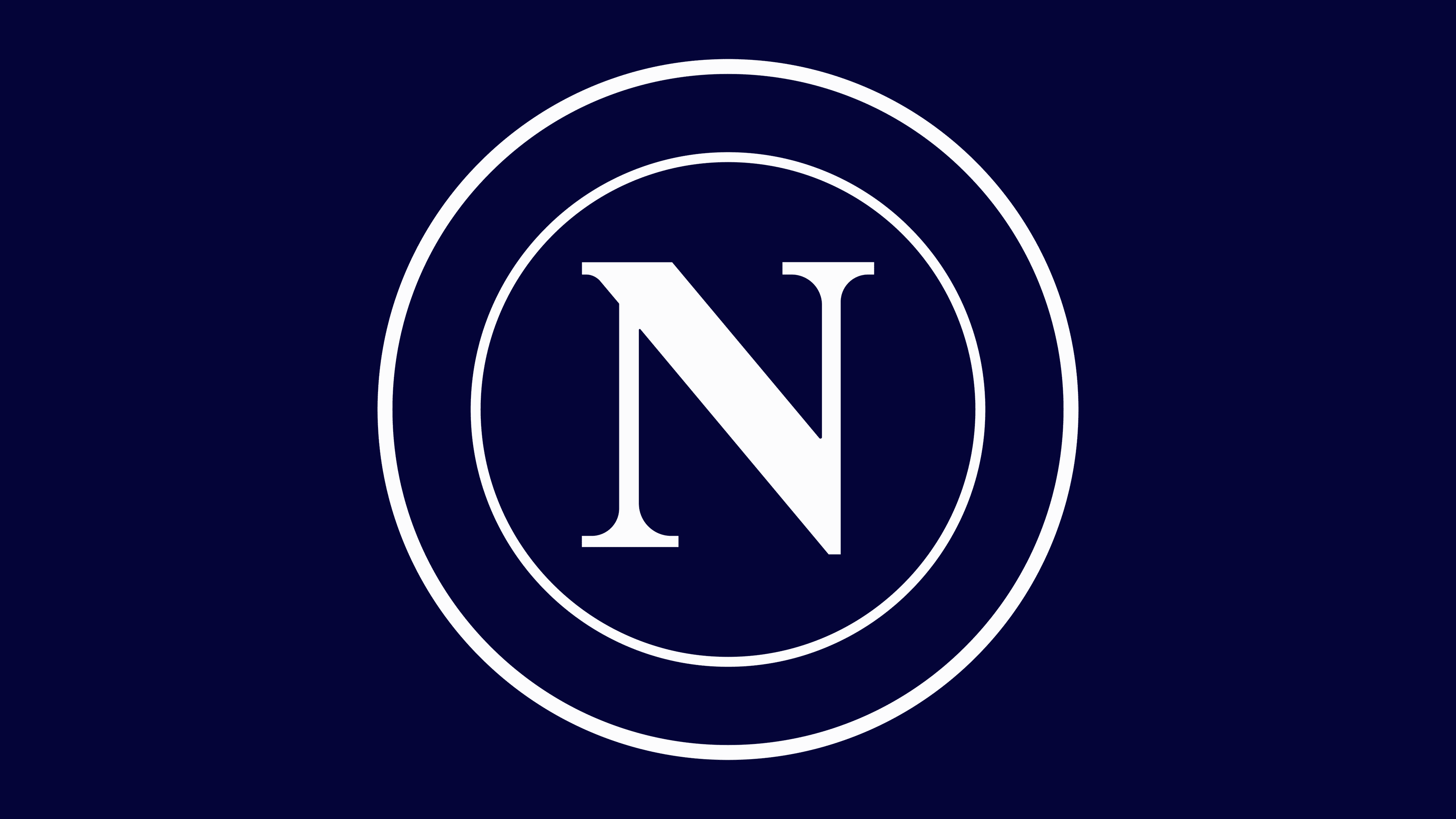
2024 – today
![]()
The current Napoli logo demonstrates a shift to strict minimalism. The base features a white background with two concentric rings and a large letter “N”. The monogram’s color is a deep blue that, under certain lighting, appears almost black.
Compared with the previous version, which used gradients, highlights, and the imitation of a glass medallion, the new composition is flat and devoid of decorative effects. Depth is achieved through the use of lines and space. The concentric circles form rhythm and maintain compositional balance.
The typographic part uses a serif typeface. The letter N has a vertical axis, refined serifs, and measured proportions. A slight narrowing of the strokes makes the glyph more elegant and visually stable.
The symbolism is based on the combination of the historical code of Naples (the letter N and the circle) with the aesthetics of 21st-century minimalism. The composition is perceived as an update of the club’s identity, where the classical foundation is preserved but expressed in a modern language of form.