


 NBAbite Logo PNG
A website that hosts National Basketball League games may feature only a sports logo. Therefore, the NBAbite logo highlights the close connection between the online platform and basketball, as dynamic as a flying ball.
NBAbite traces its origins to 2013, when the platform launched online from the same community behind Reddit’s r/NBAStreams. The context became clearer by the 2016-2017 NBA season, when r/NBAStreams had just over 45,000 subscribers. In the following years, it grew to nearly 400,000 as users shared free live links to NBA games every matchday.
The NBA had known about the subreddit for several seasons and initially filed limited copyright complaints, mostly around the All-Star Game and playoffs. As traffic grew, Reddit faced increased pressure. By the time r/NBAStreams was removed, complaints numbered in the thousands, with a heavy wave around Game 6 of the NBA Finals. Reddit officially banned the community on June 19, 2019, for repeated copyright violations.
NBAbite then became the main fallback for users left without r/NBAStreams. The site had been prepared as an alternative by people connected to the earlier Reddit community. Its system worked similarly: streamers posted links via the NBAbite plugin, and the platform generated game threads about an hour before regular-season matches.
The site operated as a catalog rather than an official NBA service, collecting third-party links to live games and replays. It later added information for NCAA men’s and women’s basketball and the NBA Gatorade League. It made money through advertising, while access remained free and required no registration. By December 2024, Similarweb listed 1stream.eu and “nbastreamlinks.live” among its main competitors, while NBAbite maintained its position as a recognizable name in online basketball streaming.
Meaning and History of the NBAbite Logo
The resource’s reliability is also evident in its special design. Its sporty color scheme and thematic name make it easy to recognize. Basketball competitions often use red, blue, and white in their designs.
The NBAbite website was created in 2010 as a useful resource and community for basketball fans. It has become a unique resource and has been recognized by many users. Over time, its functionality improved, but the design stayed the same.
What is NBAbite?
The NBAbite website operates continuously, providing uninterrupted viewing of National Basketball League games. It delivers broadcasts without interruption and in high quality. The platform also offers key statistics and the latest global basketball news. Thanks to its extensive functionality and reliable operation, the online resource has earned the trust of millions of users worldwide.
The NBAbite logo’s stylish design and visual concept remain relevant today. The traditional colors still evoke basketball, and the wordmark continues to reflect the portal’s essence. The emblem’s lack of change is not evidence of stagnation. Instead, it emphasizes the site’s strength and stability.
Today, NBAbite delivers the same quality game streams it did ten years ago, and the NBAbite emblem symbolizes values that every fan knows. It consists of several elements:
- an inscription related to the games (the very name of the site, NBAbite);
- basketball icon;
- appropriate colors (blue, white, and red).
Each part directly evokes the sport. The name contains a symbol indicating a streaming data byte. Overall, the identity’s graphic component appears simple.
It can even be called universal, since users can decipher its meaning in almost any country. This also supports the site’s broad reach. It works without territorial restrictions and is available worldwide.
Font and Colors
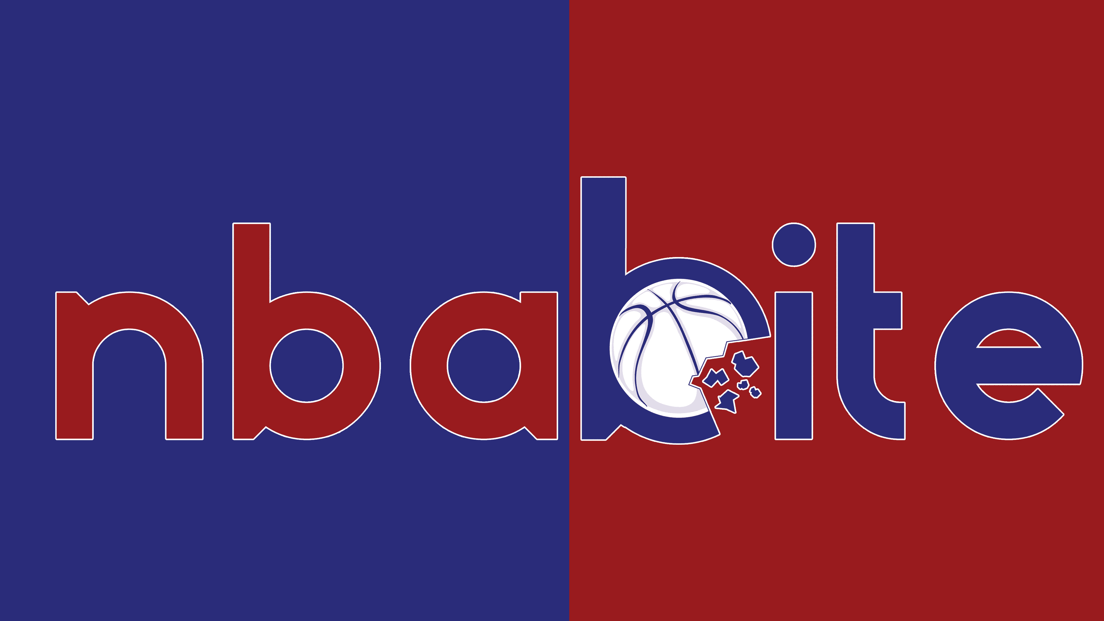
The Internet resource’s visual identity is based on an iconic color palette used in the National Basketball Association’s emblem. It consists of only three shades: blue, red, and white. The badge is red on the left and blue on the right. White serves as the background and adds decoration to the icon, which depicts a basketball.
The streaming service’s color scheme effectively emphasizes its connection to the sport, making the logo especially recognizable. The inscription itself is fully consistent with the name of the “nbabite” website. It has no spaces, but the two parts are still traced.
This effect is achieved by capitalizing the first letter of “bite.” This is done to highlight the game’s symbol, the ball, which is located inside the first letter. A simple font with smooth corners and thin lines complements the stylish design.