


 New England Patriots Logo PNG
The city where the American Revolution began gave the New England Patriots their name. The logo and name reflect respect for the region’s history and serve as a patriotic emblem that embodies the team’s spirit.
The New England Patriots are a professional football team in the USA. In the 60s, the team joined the AFL, and in 1970, the NFL (after the merger of the American Football League and the National Football League). The team is in the Eastern Division and is based in Boston, Massachusetts. The club was established in 1959.
Although the franchise was founded in 1960, that year is considered its official founding year, as it began play in its debut season. The team has had two names: the first, Boston Patriots (the name it received at the beginning of its sports career), and the second, its current name (received after moving to another city).
The team chose its name through a contest. Boston’s management group organized the event in 1960. The name “Patriots” won, suggested by seventy-four fans. The name reflects the region’s legacy as the birthplace of the American Revolution. After rebranding, the name stayed the same, with only a new location added.
Billy Sullivan was the club’s first owner. He owned it until 1987, when he sold it to Victor Kiam. Kiam then sold it to James Orthwein for a substantial sum. He managed the club for just two years. In 1994, Robert Kraft bought the franchise for $172 million, setting a record, as no team had been valued so highly at the time.
Meaning and History
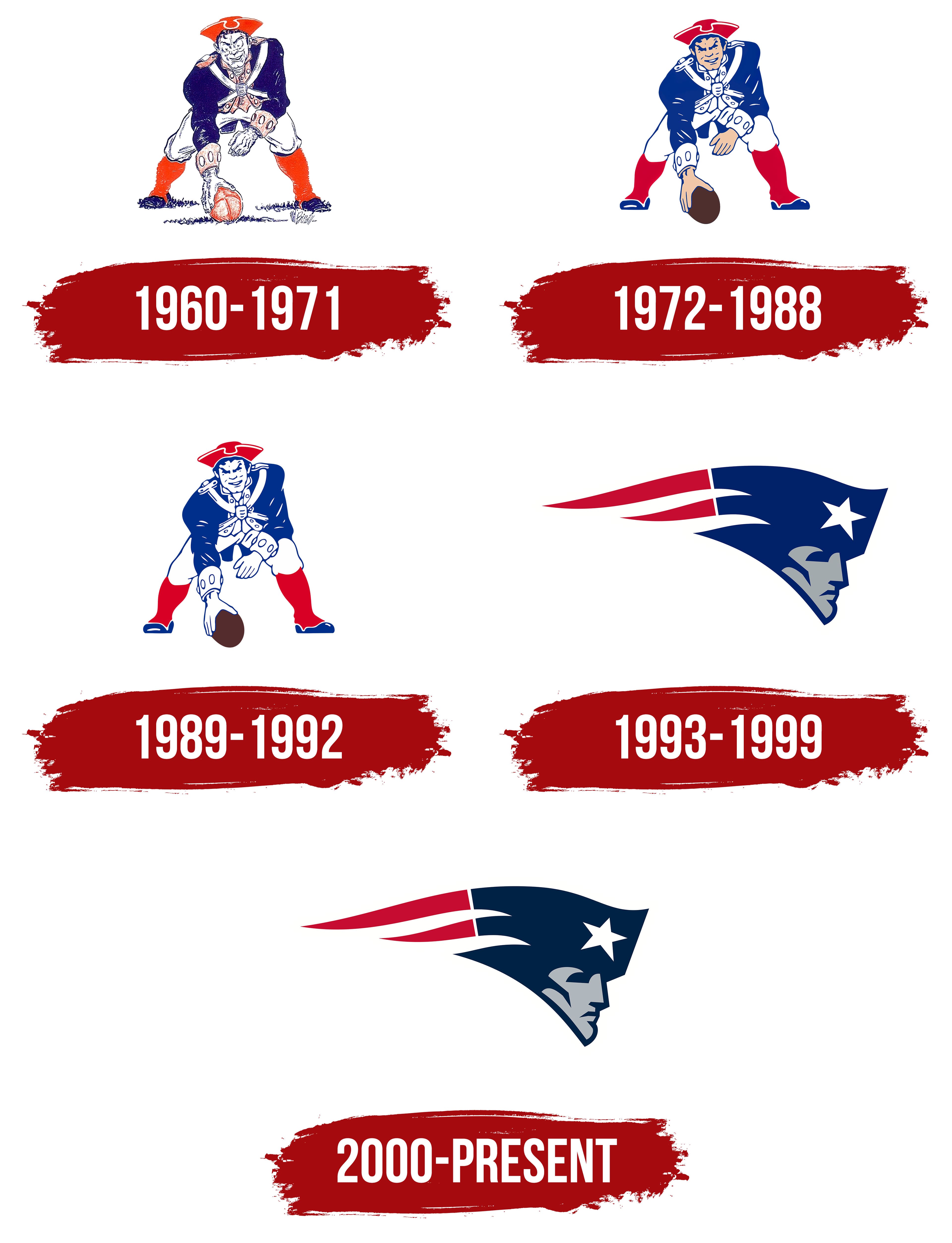
The first logo was a dark blue cap with a white brim. It was later replaced by Pat Patriot, who became the team’s mascot and wore that same cap with a rooster on it. However, over time, the cartoonish image was replaced by the stern face of Flying Elvis, which was easier to adapt to modern advertising because of its compactness. The New England Patriots logo’s color palette hasn’t changed: it remains a combination of blue, white, and red hues in various shades.
What is New England Patriots?
The New England Patriots are a team in the National Football League that has broken several records. Among their achievements are:
- The most post-season victories.
- The most successful consecutive seasons.
- The longest playoff winning streak.
- Six Super Bowl championships.
- The franchise was established in 1959 under the name Boston Patriots.
1960 – 1971
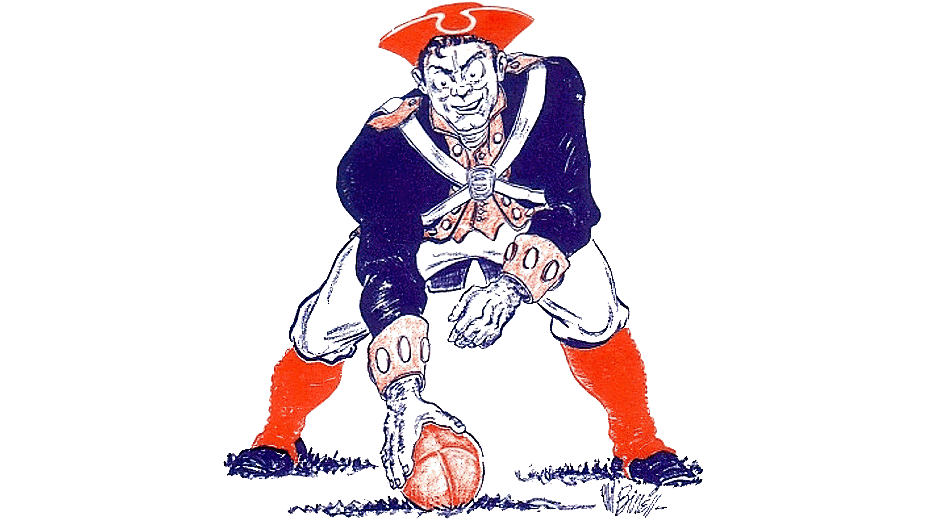
In the early years of its sports career, the “Boston Patriots” used a traditional cap with a rooster logo for a year. It was a simplified version of the so-called patriot, a participant in the American Revolution. Initially opting for a minimalist logo after observing other teams’ complex logos, managers used only some parts of the soldier’s gear. The attribute was drawn face-forward entirely in black, correctly complemented by white.
Phil Bissell, a satirical cartoonist from the Boston Globe, drew this version. He drew the Patriots logo in just 45 minutes and earned $100. Sports editor Jerry Nason ordered it. Billy Sullivan (the club owner) planned to use it only domestically, but the logo later became widely popular. The logo depicted a revolutionary in sports attire in an athletic stance, grabbing the ball. The image was drawn in a cartoonish manner and was named Pat Patriot. This version had a red cap with a cockade.
1972 – 1988
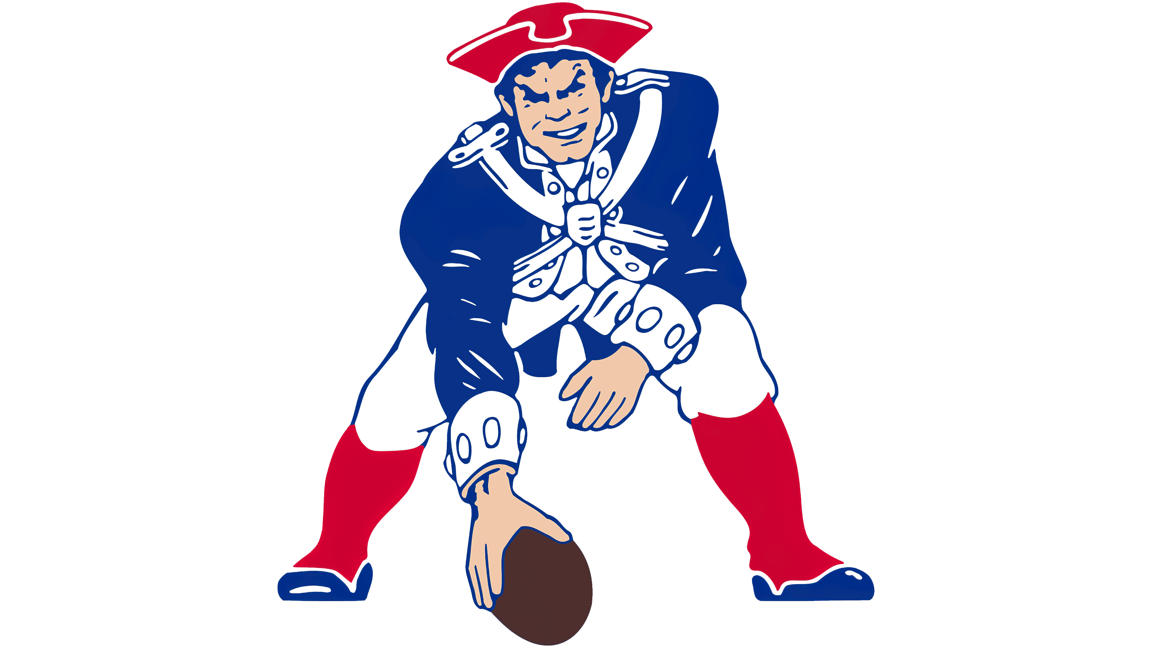
Changing the location and name did not change the franchise’s logo; it only updated it. The new New England Patriots logo’s central character remained the same, but the design became more realistic. Animated strokes were removed, and all elements became clearer. Pat Patriot became more solemn, his skin more pinkish, and his smile more sincere. The warrior was still drawn in full gear, standing in an attacking position and grabbing the ball off the ground. The ball became entirely brown.
1989 – 1992
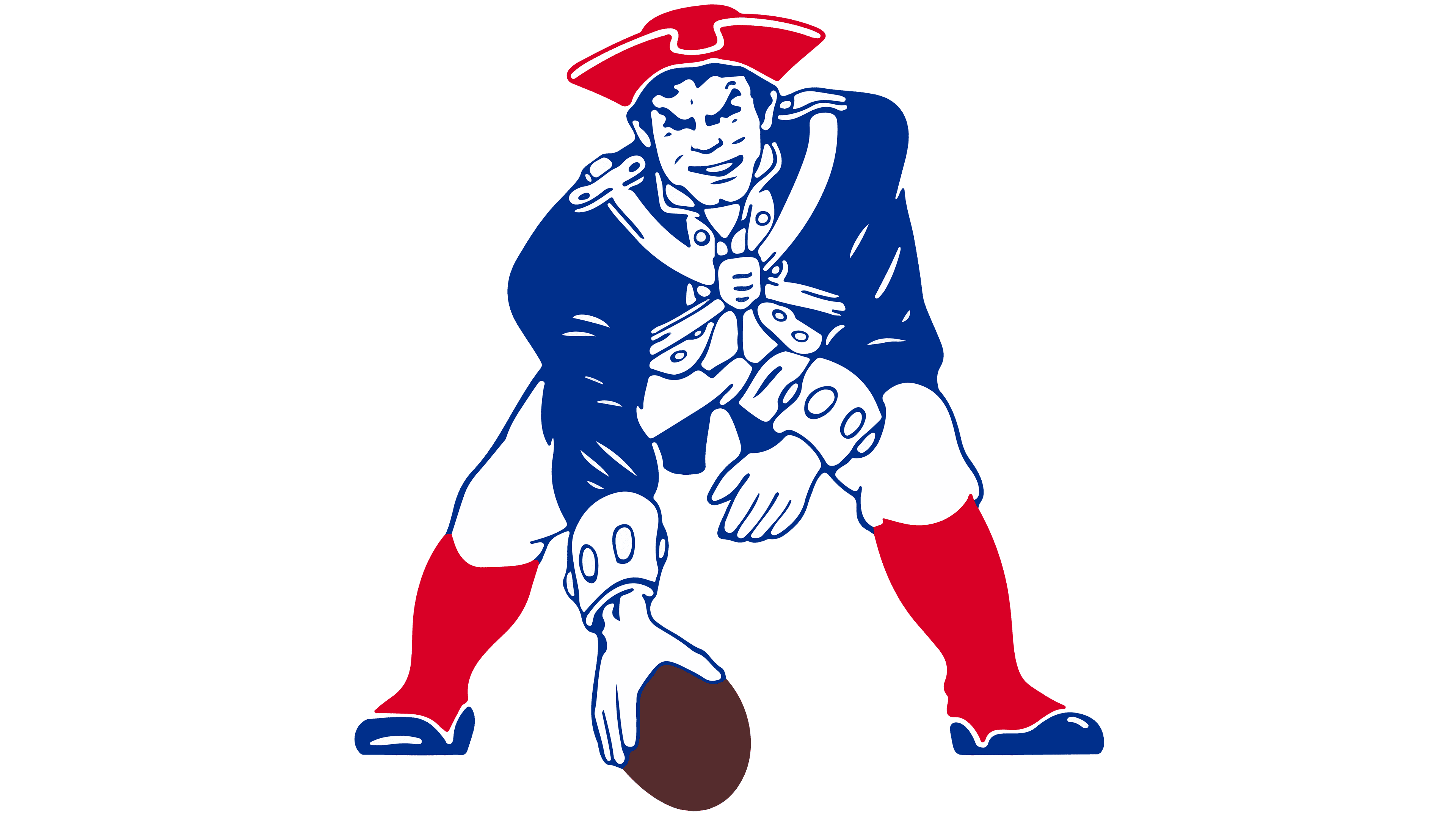
During this period, the logo depicted the team’s mascot (Pat Patriot) in a Revolutionary-era costume, a cockaded cap, and full military gear. The only difference from the previous logo was the main character’s skin color, which they made white. Otherwise, everything was the same as in the previous version.
1993 – 1999

In 1993, the focus was on simplifying the New England Patriots logo for advertising across various media. Because reproducing the beloved image was difficult, the team updated it. Only Pat Patriot’s head remained in a stylish revolutionary cap with a cockade. It fits well for the banner format. A gray profile face, complemented by a blue-and-white cap, fit into a waving banner. A star shone on the main character’s head.
2000 – today
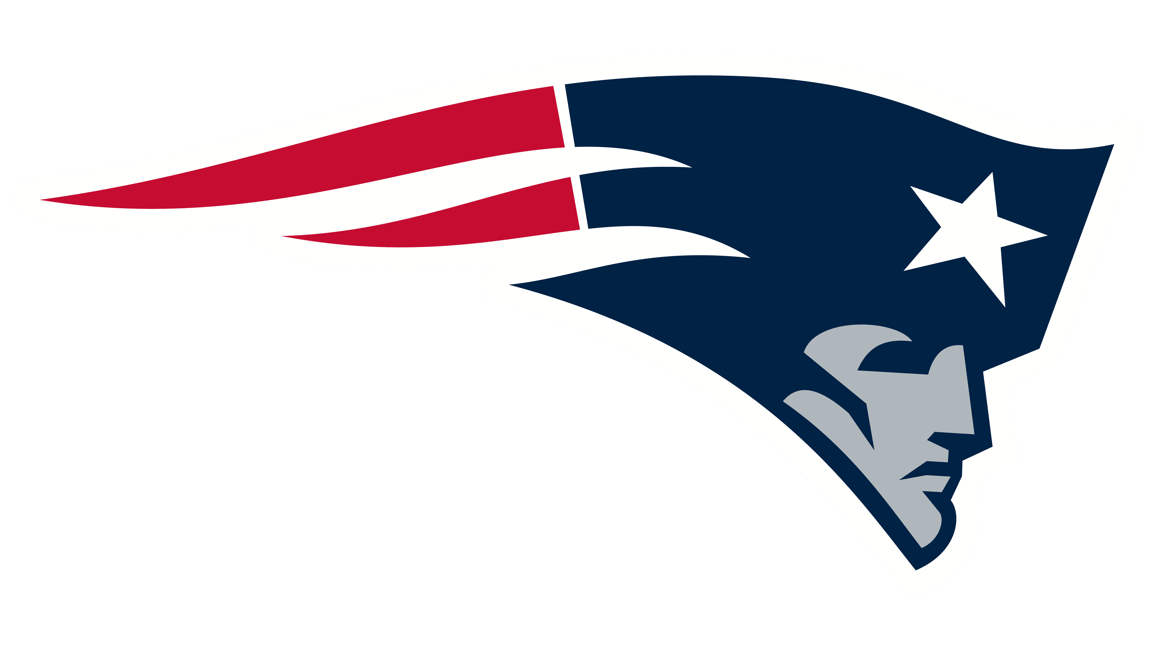
A quarter of a century later, the New England Patriots’ emblem needed an update for modern use. So, the logo, called Flying Elvis, was slightly changed; the blue shade was darkened. The other colors and the design remained unchanged; the Patriots logo still mirrors the original.
Font and Colors

The current New England Patriots emblem depicts Flying Elvis. This version was adapted for advertising materials, so it looks good in both digital and print. Artists drew a human head in a blue cap with a rooster. A white star sits in front, and two red, wavy stripes behind it stretch from the headgear, creating a sense of motion. Facial features are not detailed; broad, rough lines define the mouth, nose, and eyes.
This image is borrowed from the three previous New England Patriots logos. They depicted the team’s mascot, the so-called Pat Patriot. He was drawn full-length to show him playing American football. Cartoonist Phil Bissell created the original version.
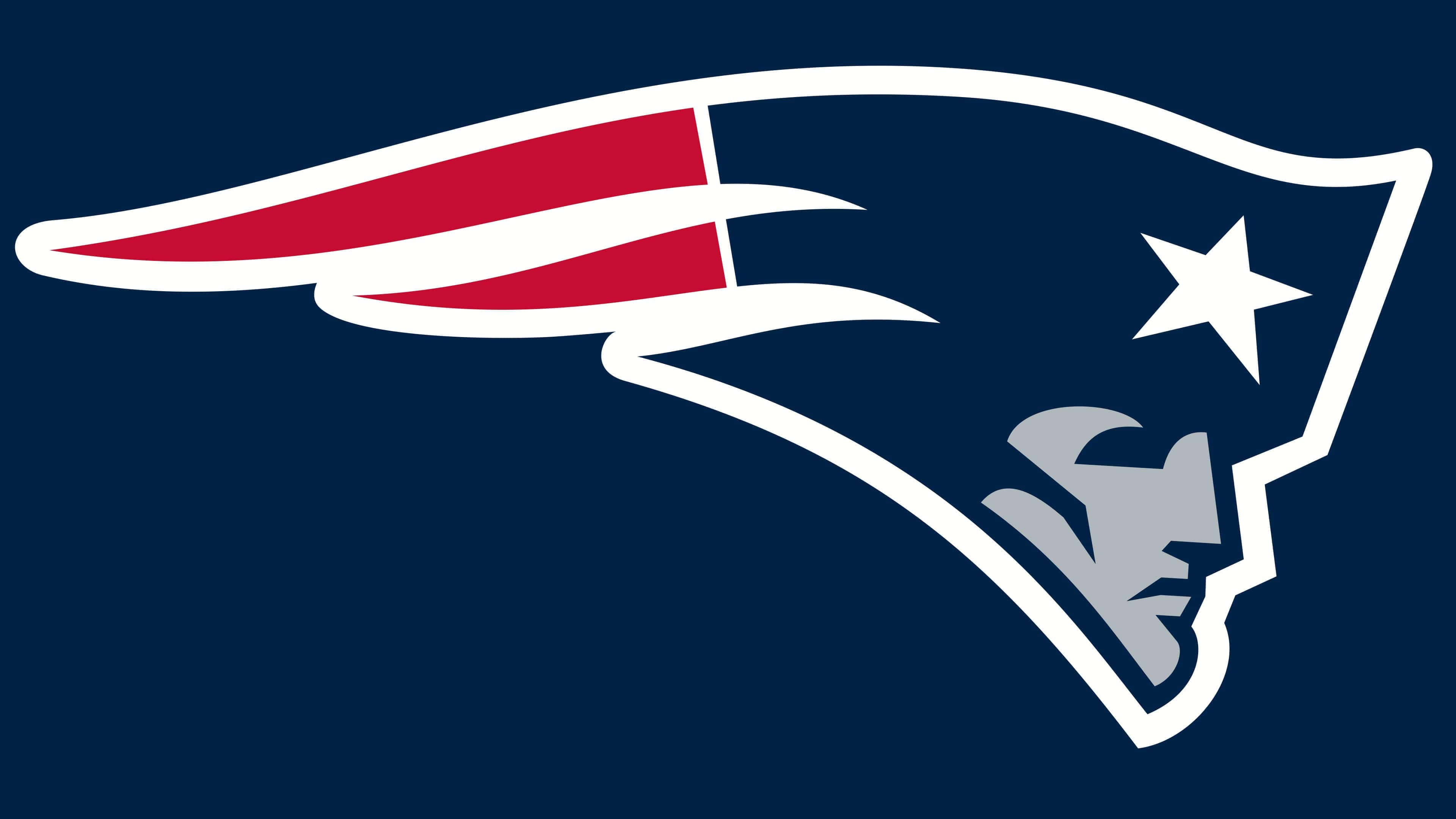
Later, the team reworked the original design and abandoned it, using the head now known as Flying Elvis as the basis. This emblem symbolizes the team’s patriotic spirit, as shown by the white five-pointed star, a key element of the American flag. The drawn person isn’t random; it represents the revolutionary mentioned in the club’s name.
This inscription does not appear on any of the New England Patriots’ old or new logos. Instead of working on fonts, designers focused on graphics. As a result, Pat Patriot looks stylish and modern, largely because of the careful color selection. The face and main part of the cockade are dark blue, the star is traditionally white, and the two wavy lines behind are red. This combination matches the US flag’s palette, underscoring the team’s patriotic title.
FAQ
What should the Patriots logo be like?
The logo, Flying Elvis, depicts the head of a character stylized as a Revolutionary War warrior. He wears a blue hat with a white five-pointed star and two fluttering red lines resembling the edge of a flag or flames. The face is not detailed and is colored in two shades: dark blue and light gray.
Who is the mascot of the New England Patriots?
The New England Patriots’ mascot is Pat Patriot, a soldier from the American Revolution. He wears the official team attire and a rooster cap. Previously, he appeared on the football club’s logo, but because it had too many details, they abandoned the design. Pat Patriot has been a live mascot since the early 1990s.
When did the New England Patriots change their logo?
The New England Patriots introduced their current logo in 2000. They slightly modified the previous version created in 1993.
Who created the New England Patriots logo?
Stephen Evenson and intern Ken Loh designed the original “Flying Elvis” logo in the early 1990s.