


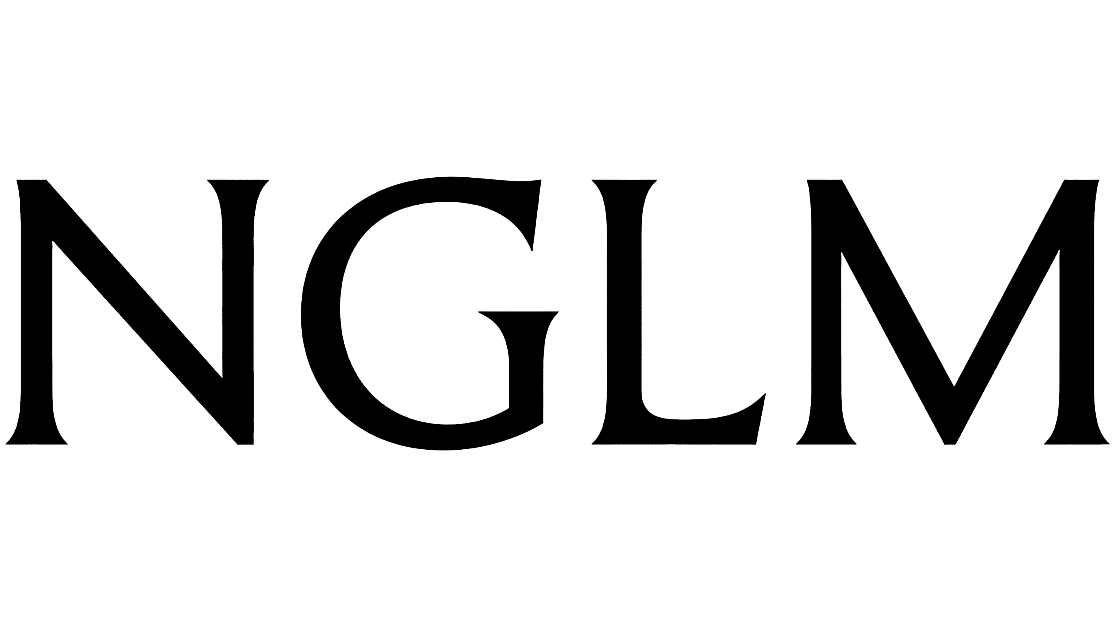
NGLM Group is building its image around design that values long service life, quality of execution, and precise form. In 2026, the group received a new identity from Gärde Design. The logo became the main mark, bringing together brands with different histories, including Nordiska Galleriet, Länna Möbler, YLLW, and KA YO.
NGLM brought Swedish companies from the design and furniture sectors together under a single name. The group plans to take a strong position in the global market. It needed a mark with a clean form and a clear presentation. The logo is built from four uppercase letters, NGLM. There is no separate symbol next to them. All the work is done through the type.
The letters are set in the custom typeface GD Trio. Its forms refer to the lettering on Trajan’s Column in Rome, created more than two thousand years ago. Gärde Design used the historical basis to create a sense of craft, cultural connection, and lasting form.
The logo shows broad proportions, varied stroke weight, and open spacing between the letters. The black color gives the logo a calm, restrained character. The brand comes through the name, the letterforms, and the overall level of typographic work.
In mood, the mark is close to cultural institutions, fashion houses, publishing projects, and high-end product design. In brands like these, visual strength comes from restraint, proportion, and careful attention to detail.
For the company, the new logo helps bring the group’s different businesses into a single system. Nordiska Galleriet and Länna Möbler are connected with the history of Swedish design. YLLW and KA YO add a younger perspective. The new logo gives them a shared level of perception, preserves the differences between the brands, and looks calm, premium, and composed.