


![]() Norfolk Tides Logo PNG
Norfolk Tides Logo PNG
The Norfolk Tides logo represents the baseball club’s connection to the coastal city of Norfolk. The emblem’s graphic style emphasizes the team’s regional identity and its professional, hardworking approach to the game.
The history of the Norfolk Tides baseball club dates back to 1961, when professional baseball returned to the Tidewater region. Initially independent, the club soon became an affiliate of the St. Louis Cardinals. In 1969, the team joined the Triple-A International League as part of the New York Mets organization.
The Tides won five Governors’ Cup championships (1972, 1975, 1982, 1983, 1985). Many players successfully transitioned to Major League Baseball clubs, including the Chicago White Sox and Philadelphia Phillies.
In 1992, an investment group led by Ken Young purchased the club, renaming it the Norfolk Tides. The following year, the team moved to Harbor Park, which quickly became a major regional baseball venue.
After ending its long-standing affiliation with the Mets in 2006, the Norfolk Tides signed a new partnership with the Baltimore Orioles.
In September 2023, the Tides won the International League championship for the first time in 38 years. They later captured the Triple-A National Championship, defeating the Oklahoma City Dodgers in the final.
Meaning and History
![]()
What is Norfolk Tides?
It is a Triple-A baseball club based in Virginia that competes in the International League. Over the years, it served as a farm team for the Philadelphia Phillies, New York Mets, and Baltimore Orioles. Previously based in Portsmouth, the club relocated to Norfolk, where it plays at Harbor Park Stadium along the Elizabeth River. Notable former players include Cal Ripken Jr., Dwight Gooden, and Darryl Strawberry.
1993 – 2015
![]()
The Norfolk Tides logo became a visual milestone in the team’s history, marking the name change from Tidewater Tides to Norfolk Tides and the opening of the new home stadium, Harbor Park. At the same time, the club adopted a new visual language developed by Sean Michael Edwards Design. The logo’s construction is based on a dynamic diagonal “TIDES” wordmark, rendered in custom typography created specifically for the composition’s design.
The main visual motif is a descending wave that smoothly transitions into the upper curve of the first letter. This element, serving as both a metaphor for the ocean tide and a graphic accent, organizes the logo’s composition from left to right and visually emphasizes movement. The wave is executed in a swoosh style, a characteristic symbol of sports brands that connects the team’s identity with its athletic heritage and the spirit of competition. The design has repeatedly drawn comparisons to the Nike logo and the “T” of the Texas Rangers, which in some cases even led to legal cautions over the similarity.
The letterforms have a strong geometric foundation, enhanced by dimensional detailing, shadows, and outlines. The structure features emphasized verticals and precise proportions; serifs are minimal but present as accents on the upper and lower areas of the glyphs, especially on the “I” and “S.” The shape of the “T” sets the diagonal motion for the entire wordmark, reinforcing the aquatic theme through its integration with the wave element.
A double blue gradient transitions from deep marine to lighter aquamarine, with a neutral gray underlayer that creates a pseudo-dimensional effect and separates the letters from the background. The palette improves legibility while reflecting the region’s maritime theme, reinforcing the team’s territorial identity.
The logo served as the team’s primary identifier for over two decades, accompanying it through a period of new athletic achievements and the establishment of Harbor Park as its home stadium.
2016 – today
![]()
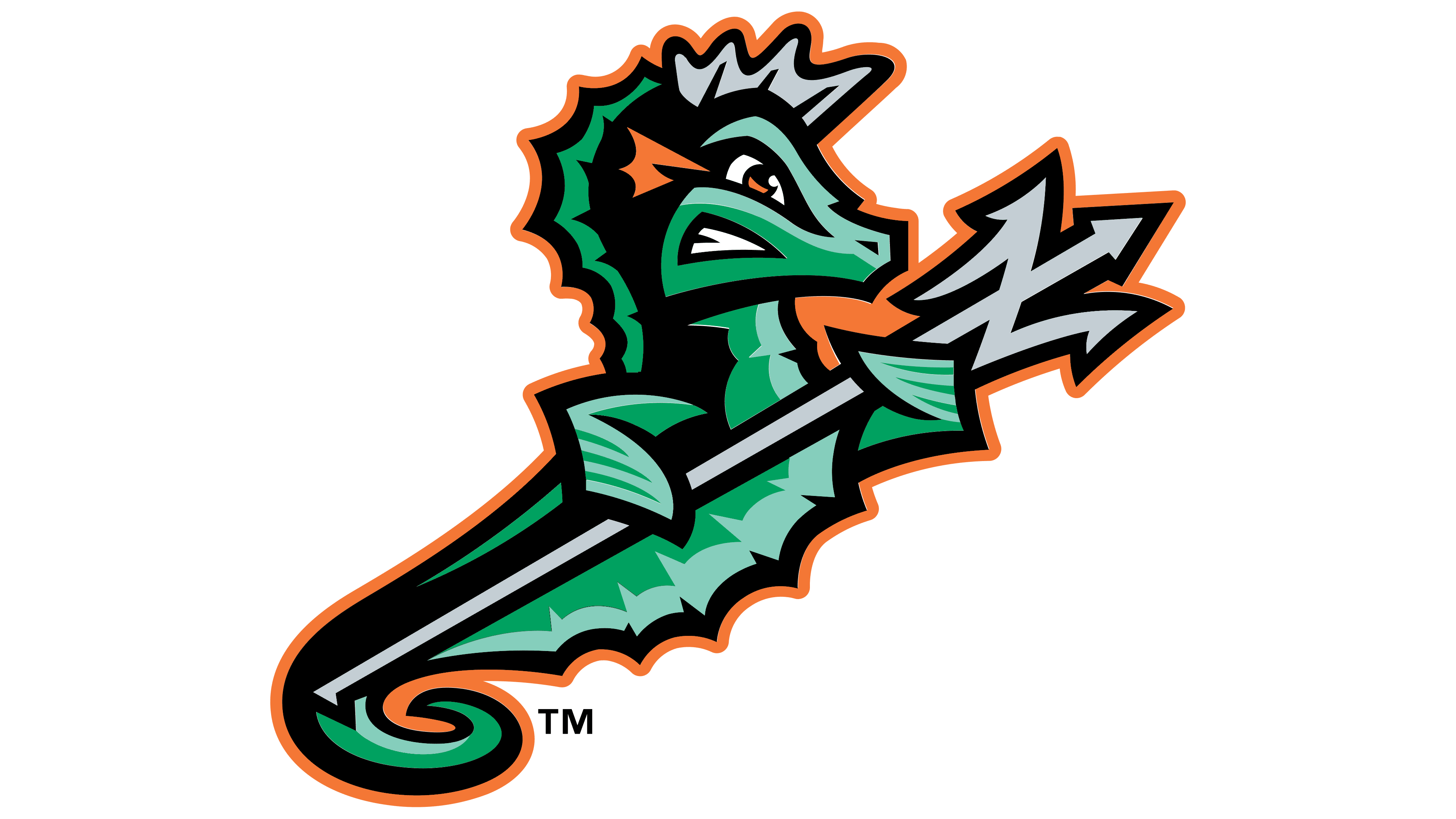
The official presentation of the Norfolk Tides emblem took place on December 2, 2015. Starting with the 2016 season, the club adopted a new visual style developed by Brandiose, a San Diego-based studio known for its work in baseball branding. The logo’s creation was led by Jason Klein and Casey White, who worked closely with the team’s general manager, Joe Gregory.
At the center of the composition is a stylized seahorse holding a trident. The figure is rendered in a geometric style with sharp outlines and angular lines, emphasizing an aggressive, athletic character. The seahorse’s tail and the trident form a hidden letter “N,” symbolizing the city of Norfolk and referencing maritime myths about Poseidon.
The typography on the emblem is custom-built from scratch, inspired by typefaces from the era of the U.S. Navy. The letters are massive, with a distinct athletic feel, a pronounced slant, serifs, and multilayered outlines that create a sense of depth and motion. The “TIDES” wordmark is especially emphasized, with the letterforms outlined in bright orange. At the same time, the interior is filled with shades of green featuring soft, wave-like gradients that symbolically highlight the team’s connection to the sea.
The color palette is carefully curated with several layers of meaning. Battleship Gray references the region’s naval history and shipbuilding traditions, while Sea Foam and Tidal Green evoke the ocean and Norfolk’s natural surroundings. The team’s orange and Black visually signify its affiliation with the Baltimore Orioles. The combination of colors established a strong regional connection and created a solid visual bridge to the parent club.
Despite initial criticism from traditional fans, the new style gained popularity and proved highly successful commercially, driving a notable increase in the team’s merchandise sales. The logo is integrated into the team’s uniforms: the home kit features green accents and the seahorse on the cap. In contrast, the away kit is adorned with a symbolic letter “N” incorporating an anchor detail.
Font and Colors
The Norfolk Tides logo palette shows a deliberate design approach. It includes two shades of green: the deeper Tidal Green and the lighter, softer Sea Foam. Their combination creates a volumetric effect, emphasizing the emblem’s dynamism and evoking the waves and aquatic environment of the Hampton Roads region. The presence of the vivid Orioles Orange is important, as this color outlines and accents the lettering and symbols, creating a striking contrast and visually linking the team to its main partner, the Baltimore Orioles. The final accents come from the shades Battleship Gray and Black, which provide detail, crisp outlines, and evoke the region’s naval aesthetics and industrial heritage.
The typeface aligns with the brand concept, drawing on historical motifs of naval lettering. The letters have a slant, solid strokes with pronounced weight, and serifs. The structure of the glyphs is carefully refined: the massiveness and dynamism of the letterforms, combined with outlined elements, create a visual rhythm and athletic energy characteristic of baseball’s identity. This typeface reinforces the club’s identity, making the “TIDES” name visually memorable and easily recognizable.