The NSU logo reflects the unique experience of a company that produced cars, motorcycles, scooters, and bicycles for decades. The emblem showcases the brand’s constant pursuit of excellence and innovation. Although the brand is long gone, its symbol inspires speed enthusiasts.
NSU: Brand overview
NSU’s history started in 1873 in the German town of Riedlingen. The company’s original name was “Mechanische Werkstätte zur Herstellung von Strickmaschinen,” which produced knitting machines. Heinrich Stoll and Christian Schmidt founded the business. The town of Neckarsulm, where the company relocated in 1880, is represented by the acronym NSU, which first surfaced subsequently.
The company started manufacturing bicycles in 1886, a significant turning point in its growth. These bicycles quickly became well-known because of their high quality and creative solutions. Later, this knowledge of two-wheeled vehicle manufacturing proved crucial to the company’s expansion.
The manufacturer underwent a sea change in 1901 when it began manufacturing motorcycles. These were just regular bicycles with a single-cylinder engine produced in Switzerland attached. The popularity of this model prompted the company to begin working on its engine development.
The company debuted the NSU-Pipe, its first automobile, in 1905. Developed in partnership with Belgian engineer Joseph Pipe, it was a compact car powered by a single-cylinder engine. Although few cars were produced then, it set the stage for later growth in the company’s automotive branch.
Like many other German businesses, the manufacturer turned to military hardware during World War I. The company could sustain and grow its production capacity by producing trucks and motorbikes for the army.
The company actively developed its motorcycle manufacturing during the 1920s and 1930s. It successfully managed motorcycle racing and manufactured various motorcycles in different classes. In 1929, the world speed record for a motorcycle made by the manufacturer was 216 km/h.
Once more active in manufacturing military hardware during World War II, the company made engines for the military, motorcycles, and half-track vehicles. Numerous industrial sites were demolished or destroyed as part of the war reparations after the conflict.
During the post-war era, manufacturers concentrated on making mopeds and motorbikes. In 1953, the company introduced the NSU Max, one of the most popular motorcycles in the brand’s history. Motorcycle racing also succeeded significantly, especially in the 125cc and 250cc classifications.
The company returned to making cars in 1957 when the NSU Prinz was introduced. Small and inexpensive, this car became popular in post-war Germany quite rapidly.
The manufacturer started experimenting with the Wankel rotary engine in the early 1960s. 1964, the company unveiled the first rotary-engine production car in history, the NSU Spider. The NSU Ro 80, a ground-breaking sedan with a rotary engine and a futuristic appearance, followed in 1967.
Even with technological advances, creating and manufacturing rotary engines proved quite expensive. The engines’ reliability problems made the company’s financial issues worse.
After purchasing the manufacturer in 1969, Volkswagen combined it with the previously purchased Auto Union to become Audi NSU Auto Union AG. This incident essentially signaled the end of the brand’s autonomous existence.
Following the merger, the production of branded automobiles gradually ceased. The Ro 80, the final vehicle from the brand, was manufactured in 1977. The brand was phased out to make room for the growing Audi brand.
Meaning and History
What is NSU?
It was a German automobile and motorcycle manufacturer from Neckarsulm that started as a manufacturer of knitting machines. Models such as the Prinz and the revolutionary Wankel rotary-engined Ro 80 were among the company’s popular cars, renowned for their cutting-edge engineering, unique styling, and powerful performance. In the late 1960s, the company encountered financial difficulties. As a result, Volkswagen bought the company, which subsequently merged with Auto Union to become the current Audi brand.
1892 – 1913
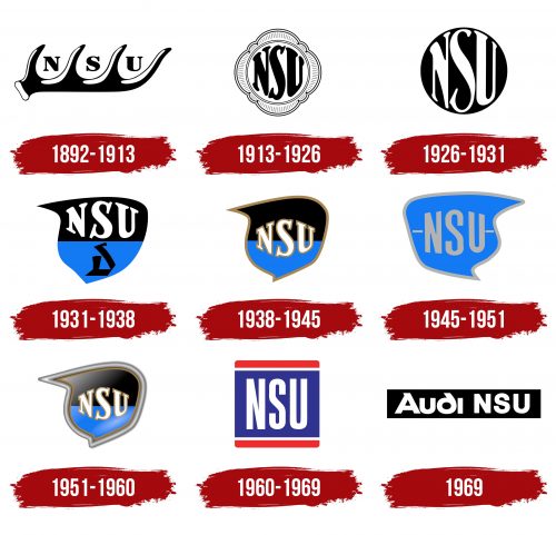
This logo emerged in 1892 when the company stopped producing knitting machines and fully transitioned to bicycle manufacturing. Around the same time, its old name, Neckarsulmer Strickmachinenfabrik AG, was shortened to NSU (derived from NeckarSUlm). The brand’s visual identity pays homage to its hometown, where the Neckar and Sulm rivers meet.
Stylish black letters “N,” “S,” and “U” are intertwined with branches of a large stag’s antler, a symbol of Württemberg. Through this heraldic figure, the company aimed to showcase its connection to the historical region in northwest Germany. Culturally, the stag’s antler is associated with strength, power, longevity, and wealth.
The black-and-white logo conveys a sense of seriousness and professionalism. However, this limited color scheme was due to the black-and-white printing technology available in the late 19th century. Despite the simple texture, the antler appears three-dimensional because of light spots on its curves. Designers added these highlights to reflect NSU’s commitment to progress.
The brand name is presented in an elegant font with noticeable serifs. The strokes of the letters vary significantly in thickness, giving them a dynamic look. The energy expressed through the extravagant lettering style conveys the bicycle manufacturer’s active stance.
1913 – 1926
The updated logo resembles an elegant medallion, emphasizing the company’s uniqueness and inventive approach to vehicle manufacturing. The black “NSU” inscription is placed within a white circle, outlined by a thin ring. The abbreviation appears convex, with letters curved outward to fill the entire space. This creates the impression that the brand name is on the side of a spherical object, reminiscent of an image produced by a fisheye lens.
The specific shape of the letters makes it difficult to identify the font, but it is a bold serif typeface with rounded corners and varying stroke thickness. The softened edges make the inscription appear light and safe while adding a sense of dynamism.
The circle has a decorative border, resembling an eight-petal flower. It is covered with thin stripes like rays radiating from the center to the edges. This evokes the image of the sun, a symbol of joy, optimism, and vitality. Thus, the name NSU is portrayed as the sun brightly illuminating the way, harmoniously complementing the ornate frame.
1926 – 1931
The company changed its logo in the mid-1920s amid its merger with Carosseriewerke Schebera AG and rebranding to NSU Vereinigte Fahrzeugwerke AG. These significant events prompted a reevaluation of its visual identity to highlight a new chapter in its history.
Designers simplified the emblem by removing the decorative floral border. Without the ornate frame, the badge looks more austere, aligning with the brand’s serious approach to vehicle manufacturing. The three-dimensional “NSU” abbreviation remains in the circle, but now its colors are inverted: the letters are white, and the background is black. This change made the logo more noticeable and suitable for use on light surfaces.
The large circle symbolizes the globe, suggesting the omnipresence of NSU motorcycles, bicycles, and cars. The vintage font style adds elegance and charm to the logo, fostering trust in the brand. The smooth curves of the letters have a strong visual impact, as the rounded lines create a sense of gliding motion. This aligns with the company’s concept of helping people cover long distances quickly.
1931 – 1938
In the 1930s, NSU introduced a logo shaped like an ornate heraldic shield. The upper left corner features a long, pointed edge, while the right side is rounded. This unique shape transforms the simple two-dimensional figure into a dynamic one, giving the impression of rapid movement with trailing speed lines. The emblem’s visual dynamism reflects the German manufacturer’s connection to the automotive and motorcycle industries, where speed is paramount.
The brand name is rendered in the same uneven font as before, but the letters are more compact, no longer needing to fill the entire space within a circle. The “N,” “S,” and “U” still feature large serifs with rounded corners, conveying a sense of safety—an essential factor in choosing vehicles.
The abbreviation occupies the upper part of the shield, while the lower half contains a mysterious symbol resembling the letter “D” written in old English script. It consists of several elongated polygons forming an abstract geometric structure. This symbol likely references the brand name, as the shape loosely resembles a “U,” an inverted “N,” and hints at an “S” within its curves.
The logo uses an appealing color combination: the white “NSU” inscription on a black background and the black abstract symbol on a blue field. The blue color impacts the emotional perception of the emblem, and it is associated with calmness, serenity, and stability. Combined with white and black, it creates a sense of harmony, reflecting the impeccable appearance of the vehicles.
1938 – 1945
This logo is similar to the previous one but has several distinctive features that make it unique.
- The shield’s corners have become sharper, and the curves smoother, enhancing visual dynamism and highlighting the company’s drive to move forward and develop continually. A protrusion at the top gives a sense of lightness. The “soaring” emblem symbolizes the flight of imagination and the dream of owning a car or motorcycle.
- The abstract symbol is gone, and the brand name is placed in the center for maximum visibility. This positioning underscores NSU’s importance and prominence.
- The letters remain unevenly inflated and curved to give the abbreviation a three-dimensional appearance. However, the new font has angular serifs without rounded ends, making the inscription look more serious and solid. This conveys the company’s businesslike attitude.
- The shield and letters have a brown outline with a shade of dark gold. This creates a sense of wealth and luxury, appealing to connoisseurs of elegance. At the same time, the frame suggests limitations crucial for an automaker striving for high quality and safety standards.
The shield is still divided into two halves—black and blue. This feature allowed NSU to remain recognizable for several years until it decided to simplify its logo’s color scheme.
1945 – 1951
In the post-war period, the company used a reversed emblem. Designers mirrored the shield so that the sharp corners pointed to the right, making it seem like it was flying backward. It is unclear why this change was made, as backward movement is typically associated with regression.
One possibility is that the brand wanted to look back to its past, to the era when it produced knitting machines and began its journey into bicycle manufacturing. This could be a tribute to NSU’s historical heritage. Another interpretation is that moving backward symbolizes the company’s desire to innovate, not simply follow the mainstream, invent new technologies, experiment with design, and redefine conventional views on vehicles.
The shield’s interior is blue, symbolizing freshness, reliability, and innovation. A wide gray line borders the edges, highlighting the shield’s unique shape. The gray resembles silver, evoking a sense of luxury and elegance. Although it lacks a metallic texture, it reflects the company’s technical focus and professional approach to automobile manufacturing.
The brand name is also gray, even though this color does not stand out well against the blue background. A new font is used for the abbreviation but is not immediately noticeable due to the emblem’s visual ambiguity. It would be a simple, bold sans-serif if not for the angled cuts on the letters, making the inscription wider toward the center. These diagonal cuts give the word “NSU” a dynamic feel, emphasizing the company’s drive to keep moving forward.
Although the shield is now monochromatic, it is divided into two parts. Short dividing lines are drawn between the upper and lower halves on either side of the inscription. These gray stripes adorn the abbreviation and give it a sense of lightness and flight.
1951 – 1960
In the 1950s, NSU motorcycles began to win races actively, solidifying the company’s reputation as one of the best manufacturers of two-wheeled transport. This winning streak motivated the brand to update its logo to mark the series of successes. However, changes were made cautiously, as maintaining a recognizable brand style was crucial for NSU.
Designers revitalized the emblem initially developed in 1938, modernizing it with a broad silver frame and varied textures.
- A gradient runs through the entire interior of the shield, touching both color zones (black and blue) without blending them. The smooth transitions between shades create a sense of depth and enhance the three-dimensional effect of the inscription, which appears convex due to the shape of the letters.
- The outer silver frame has a shiny metallic texture associated with modern technologies and materials used in vehicle production. The darkened edges and light center give the stripe a three-dimensional appearance, further emphasized by a barely noticeable translucent shadow.
Thus, the NSU logo retains its recognizable shape, while bold color choices add a sense of novelty and modernity, reflecting the company’s commitment to progress.
1960 – 1969
In the 1960s, the company departed from its traditions and adopted a rectangular logo with no trace of the previous shield design. The rectangle has three elements: a large blue square and two red stripes above and below it. A small gap between the shapes creates a sense of lightness, preventing the emblem from appearing too heavy. The rounded corners of the stripes evoke smooth gliding, and combined with the red color, they convey the powerful energy of the manufacturer of cars, bicycles, and motorcycles.
The simple geometric style reflects the brand’s pursuit of practical and efficient solutions. At the same time, it has a modern look, as its simplicity and precision align with minimalist principles. This reflects the progress that helped NSU develop fast and agile vehicles.
The company name looks unusually flat, as it had spent years trying to make the inscription appear convex by changing the proportions of the letters. The abbreviation is rendered in a simple, bold, sans-serif font. The only notable feature is the shape of the glyphs: they are vertically elongated, counterbalancing the two horizontal stripes above and below. This visual balance symbolizes the brand’s reliability, stability, and professionalism.
Moreover, harmony exists not only in the geometry of the logo but also in its colors. Designers intentionally placed the white inscription on a dark blue background to make it more noticeable. The two red lines infuse the emblem with a sense of movement and drive, as a vehicle manufacturer should be associated with speed. Conversely, the blue color calms and instills confidence in the safety of motorcycles and cars.
1969
In 1969, NSU was absorbed by the German conglomerate Volkswagen AG and briefly became part of Auto Union. The new company, Audi NSU Auto Union, existed for only a few months, so its logo did not gain much fame. However, it still holds a place in automotive history as a symbol of the collaboration between two renowned brands.
Designers chose not to use the manufacturer’s full name in the emblem, opting instead for the concise inscription “Audi NSU.” This text is set within a large black rectangle, a simple and versatile shape. This geometric figure is associated with strength, stability, and reliability. Straight lines and sharp angles give the logo a stern appearance, reflecting the company’s high professionalism and the technical perfection of its vehicles.
The wordmark uses two similar fonts. Both are modern, minimalist, and geometric and have sufficiently thick lines, making the inscription bold and noticeable. Rounded corners give a sense of friendliness, which fosters trust in the logo. However, there are slight differences between the fonts used.
- The lowercase “d” in “Audi” has an unconventional shape: its upper part leans to the left, resembling a mirrored “6.” This adds softness without compromising the geometric clarity of the text. The capital “A” features a triangular serif, matching the width and angle of the “d” extension. This detail does not distort the letter’s proportions but complements it, creating an original visual effect.
- The abbreviation “NSU” conveys a sense of strictness and straightforwardness. All glyphs are uppercase, giving them a more substantial appearance. The straight strokes emphasize the company’s strength, and the absence of decorative elements conveys seriousness and professionalism.
The use of two different fonts helps the brand stand out among competitors. One font symbolizes innovation and a non-traditional approach, while the other embodies long-standing traditions. Both aspects are crucial for an automotive manufacturer.
The logo was chosen using classic black and white colors. These colors ensure ease of perception, with the light text standing out well against the dark background. This color combination creates a strong visual contrast and evokes positive associations, with black symbolizing authority, elegance, and strength and white representing purity and perfection.
