On the social network, the Odnoklassniki logo happily waves its “arms” and seems to bounce, showing its desire to communicate. The emblem looks positive because it aims to attract new users to the website.
Odnoklassniki: Brand overview
Odnoklassniki is a well-known social network, also known as Odnoklassniki and OK.ru. The project belongs to the large Russian technology corporation VK. A web developer, Albert Popkov, created a successful platform. According to 2020 data, the Internet resource’s monthly attendance was about 45 million users. The rapid increase in the audience and constant development of the site have made it one of the most popular. In the popular ranking, she takes 30th place. The modern service logo is simple and expressive. An inscription in a base shade complements a bright, upside-down OK icon.
The social network Odnoklassniki was created in 2006 by Russian web developer Albert Popkov, who aimed to help users reconnect with former classmates and friends. Popkov conceived the idea while working in the UK, where he was exposed to foreign social networks.
The website was officially launched on March 4, 2006. Initially, it was a basic social networking site where users could create profiles and search for classmates. Despite its limited features, the platform quickly became popular among Russian-speaking users.
Without significant investment in promotion, the network grew organically during its first year. Word-of-mouth was the primary growth driver, as users encouraged friends and acquaintances to join the platform.
2007, the service experienced rapid expansion, with several million users signing up. User engagement increased significantly as new features, such as photo uploading and album creation, were introduced.
In 2008, major investors took an interest in the platform. Digital Sky Technologies, which later became Mail.ru Group, acquired a majority stake in the network. This investment provided substantial financial resources to continue growing and improving its functionality.
Between 2009 and 2010, the platform underwent significant development, adding features like games, video chats, and virtual gifts. In response to the growing popularity of mobile social networking, a mobile version of the website was also launched.
In 2011, the service introduced the OK micropayment system, enabling in-app purchases for games and applications. This was a crucial step in monetizing the platform and attracting game developers.
During 2012–2013, the network underwent major updates in functionality and design. The homepage and user profiles were redesigned, and the system for recommending friends and content was improved. New options were also introduced for business users, including creating groups and marketing campaigns.
In 2014, the platform became one of the first social networks in the post-Soviet region to develop its online broadcasting platform. This attracted a new audience and provided more opportunities for user engagement.
The platform’s mobile aspect saw significant advancements in 2015–2016. The iOS and Android versions were improved, and new features like Stories and an enhanced messenger were added. The OK Video service was also introduced, offering users access to licensed content.
In 2017, the platform introduced several machine learning and artificial intelligence innovations. Face recognition for photos was implemented, and algorithms for recommending friends and content were further refined.
From 2018 to 2019, the focus was on expanding video content. New formats, such as interactive broadcasts and vertical videos, were introduced. Integration with other Mail.ru Group services was also strengthened, enhancing overall functionality.
The platform continued to expand its technological capabilities in 2020–2021. E-commerce features were enhanced, the news feed algorithm was improved, and new tools for content creators were introduced.
In 2022, the focus shifted to the growth of communities and groups. The content moderation system was enhanced, new tools for group administrators were added, and opportunities for community engagement were increased.
As of 2023, the service remains one of the largest social networks in the post-Soviet region, with tens of millions active users. The platform continues to evolve, adapting to new technological developments and changing user needs.
Over the years, the platform has faced challenges such as competition from other social networks, shifts in user preferences, and technological advancements. However, the service has remained relevant and maintained its user base through continuous innovation and the ability to adapt to changing circumstances.
Meaning and History
In the history of the Odnoklassniki service, many significant events influenced its functionality and the concept of identity. The project was started in 2006. But for the first few months, A. Popkov considered it exclusively a hobby and invested in its development himself.
The number of users grew rapidly, so he created a legal entity. At the initial stage, Dmitry Utkin handled the design. The logo was brightly colored and consisted of different shapes. It was later replaced with a more modern and stylish version.
What is Odnoklassniki?
This popular social networking platform is used in Russia and other former Soviet republics. Users can stay in touch with friends, colleagues, and old classmates through the site. They can send messages, join interest groups, and share images and videos. With features like virtual gifts, games, and status updates, the platform attracts a diverse user base, especially an older demographic who wants to connect with old-school friends separated by a great distance.
2006 – 2011
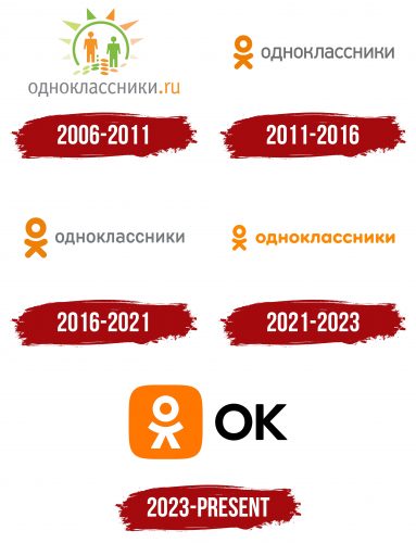
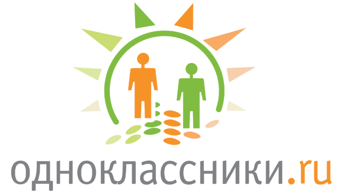
At first, the Odnoklassniki logo was multicolored: orange, gray, and green prevailed, the calm colors of the pastel spectrum. The basis of the composition was the sun, depicted in the form of an arch through which two figures passed. The little men were geometric and looked more like puppets than real people. Under their feet were ovals of several colors.
Triangles with sharp ends were located on the outer side of the arc. They symbolized the sun’s rays: the central ones were elongated and large, and the sides were short and small. At the bottom, the designers placed the social network’s name with a domain name. The silver word “odnoklassniki” was typed in Cyrillic. It was intricate and grotesque. At the same time, the orange “.ru” domain had English spelling.
2011 – 2016
The social network Odnoklassniki expanded rapidly. In 2011, the number of registered users reached 70 million and then grew exponentially. The growth in popularity prompted the management to think about changing the corporate identity. The logo needed a major update to keep up with the trends of the time.
After some discussion, it was decided to update the logo design. The new badge was a new version that compared favorably with its predecessor. It was much simpler, clearer, and more meaningful. In addition, the bright icon has become more recognizable. The quality of the performance was much better than in the previous version.
This approach emphasized the company’s values and direction of activity. In addition, changes in design testified to the social network’s desire to remain on the same wavelength as its users. The stylized word OK became the visual basis. The letters resembled a small man with a large head; after them was the network’s name, made in a simple font.
A feature of the logo was that the letters OK had a special meaning. If you turn them at a right angle, they mean the generally accepted abbreviation of the network. In the standard form, the letters symbolized a little man – a user of Odnoklassniki.
2016 – 2021
In 2016, the popularity of the service continued to grow. Odnoklassniki was in second place in terms of video views, according to Runet. During this period, there were small changes in the design of the logo:
- updated color palette;
- the font has changed.
The colors became lighter, which added lightness and freshness to the logo. In the context of identity, such changes personified the desire for something new, the opening of wide opportunities for users, and the development of the service. The font has changed within the same group. In addition, according to the 2016 rules, it was forbidden to rotate the image at a right angle.
2021 – 2023
The modern logo is simple. The designers changed the typeface to use low-rise, bold glyphs with rounded ends for the title. The inverted “OK” brand icon has been retained and proportionally reduced in the text. Both parts are now colored orange.
2023 – today
The new “Odnoklassniki” logo looks modern, emphasizing the brand’s universality. The logo now appears the same in Cyrillic and Latin scripts, highlighting the company’s goal of reaching Russian and international audiences.
The main element of the logo is a bright orange square with rounded corners, evoking associations with friendliness and warmth. Orange traditionally symbolizes sociability, activity, and positive interaction, perfectly reflecting the goals of the social network—to connect people, help them find friends, and maintain communication.
At the center of the square is a symbol resembling a stylized person, emphasizing communication and interaction. This element is simple in form but widely recognizable. It can be interpreted as a human figure, reinforcing the platform’s social focus. The symbol comprises a circle (the head) and two crossed lines (arms and legs), creating a friendly and approachable image.
The “OK” text is written in a simple, sans-serif black font, symbolizing the service’s ease and simplicity. The bold font, with softly rounded corners, makes the text more welcoming and accessible. The combination of black and orange creates a contrast that adds expressiveness and attention to detail to the logo.
If you look closely at the symbol in the orange square, it can also be interpreted as a smiley face. The head represents a face, and the crossed lines for legs can resemble crossed arms as if the character is making a friendly gesture or greeting. This interpretation adds an extra layer of positive emotion to the logo.
Font and Colors
The current logo of the Odnoklassniki brand is made in a special style—Din Round Pro, which became the official font of the social network. It replaced Din Text Pro, used to design the previous version. The company also allows using other fonts, but only in certain situations. Helvetica and Arial fonts are acceptable if the required type is missing.
The logo’s color scheme consists of gray, presented in 3 shades (Cool Gray 3, Cool Gray 9, and 432 C) and orange (in the matching system, it is represented by 144 C). This palette demonstrates balance and harmony. Bright orange looks great with basic gray. This favorably emphasizes the stability of the social network base and the constant updating of its functionality.
