


 Pa.gov Logo PNG
The Pa.gov logo conveys Pennsylvania’s significant historical role in the formation of the United States of America, as the fate of the future superpower depended on it. The legendary emblem reflects the early days of establishing a key state on the North American continent.
Pa.gov began in 1995 under Governor Tom Ridge as Pennsylvania’s first official state website. The early version contained basic information on government agencies and public programs. In 1999, PA PowerPort created a single entry point for online services, giving residents easier access to material from different departments.
Digital transactions expanded in the early 2000s. Online payments for taxes and fines appeared in 2002, followed by vehicle registration in 2003. A redesigned portal launched in 2005 with more services, simpler navigation, and improved access for people with disabilities. Official social-media accounts followed in 2007, allowing agencies to distribute updates more quickly.
A major redesign arrived in 2010 after user-experience research and public feedback. Mobile access launched in 2012, while search, bookmarks and personalized alerts were added in 2015. A security audit and system upgrade followed in 2018. The interface was revised again in 2019 to shorten routes to frequently used services and make state information easier to locate.
Online demand rose in 2020 as more public services moved to the web. A single sign-on system appeared in 2021, allowing one account to reach several state services. An updated mobile app followed in 2022 with reminders and access to common functions. In 2023, Pa.gov introduced AI tools, including a chatbot for frequent questions, while continuing cybersecurity reviews, data-protection updates and accessibility work.
Meaning and History
What is Pa.gov?
The official website of the Commonwealth of Pennsylvania serves as an online reference for state government information and services. This comprehensive portal offers a wide range of services to citizens, businesses, and visitors, from filing tax returns and registering businesses to renewing driver’s licenses. Users can easily navigate the complex network of government agencies and departments thanks to the site’s user-friendly layout, which organizes content by topics and audience. To keep the public informed and engaged, it provides real-time updates on state news, emergency alerts, and legislative processes. The portal ensures that all Pennsylvania residents, regardless of location or device, can access state services through its accessibility features and mobile-friendly design.
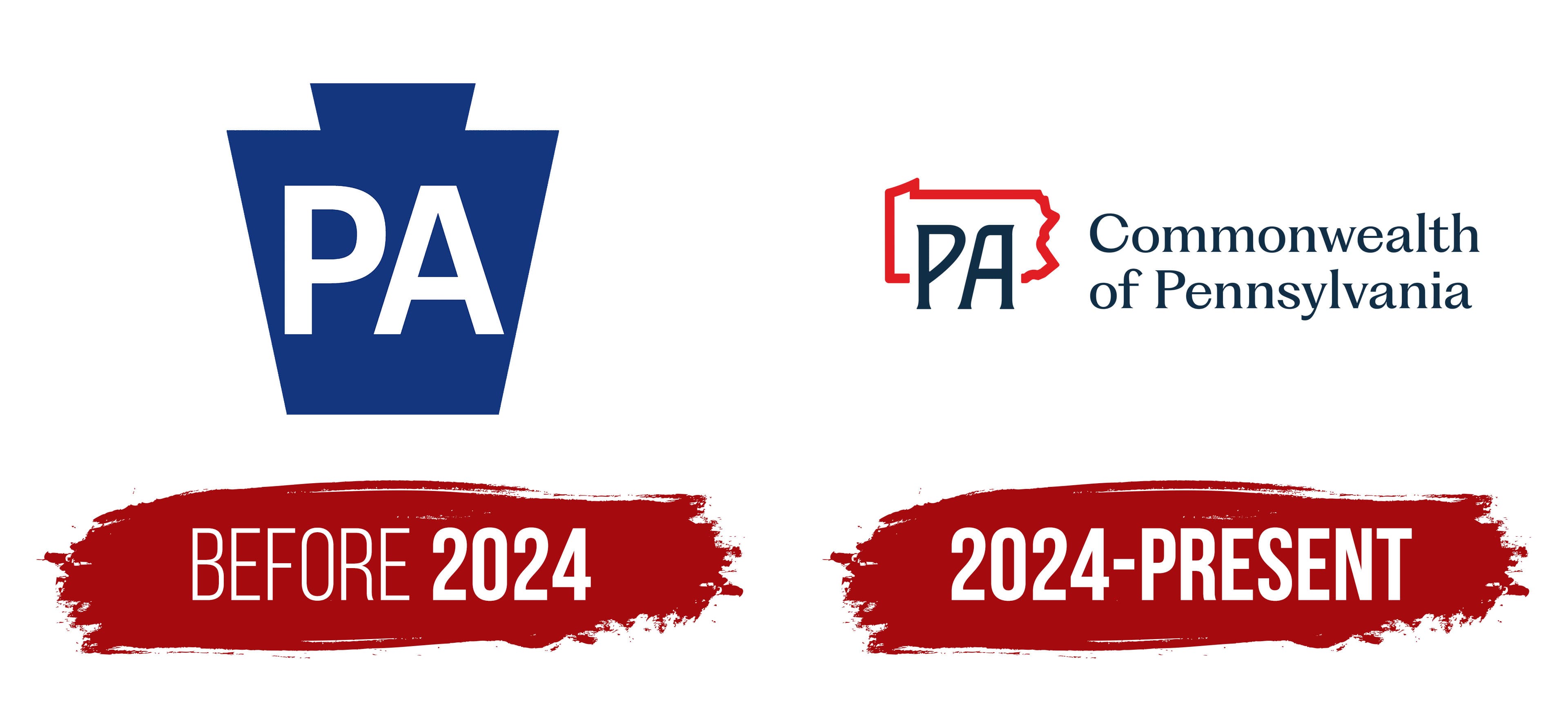
Before 2024

The Pa.gov logo, with its massiveness, resembles a stone. This is intentional, as it conveys the shape of a stone, a keystone found in the façades of buildings, arches, portals, and even artistically designed bridges from medieval architecture. Therefore, the emblem is a central wedge-shaped stone that symbolizes the state’s key role. What role? No less than establishing the United States as a powerful governmental structure.
As a result, Pennsylvania became the only state in the world with a “stone” emblem, which is why it is also called the Keystone State. This visual identity composition was given official status because the colony was the last decisive vote for independence. Its role is immortalized in the keystone, which is inserted last at the top of an arch to prevent it from collapsing: it locks the other stones in place, balancing the structure and adding strength. This unique logo can be found on state documents, websites, and programs related to Pennsylvania’s activities.
The Pa.gov emblem has several features that effectively emphasize Pennsylvania’s special status:
- The geometric symbol appears monolithic and immovable, as if it can’t be displaced from its position.
- The logo is minimalist and concise, using a single element.
- The figure has clear edges, precise angles, and straight lines, conveying the seriousness and high responsibility of the state’s leadership.
The Pennsylvania logo consists of two trapezoids: one large (at the bottom) and one small (at the top). They are stacked on top of one another and unified by color, making the seam invisible. Additionally, the inscription connects the geometric shapes to a shortened form of the state name, “PA.” The tall letters are centrally placed and immediately draw attention because they are bold, large, perfectly straight, and blocky.
The font is simply a classic sans-serif, since the absence of serifs visually doesn’t clutter the space and suggests openness and freedom. The inscription’s white color further reinforces this: in Pennsylvania, it is associated with honesty, neutrality, and transparency, reflecting the state government’s desire to be accessible to its citizens. This effectively conveys the concept of leadership ready to meet the population’s needs.
However, the primary color is dark sky blue, which evokes a sense of calm and confidence. It was chosen because it appears on the state flag. In this case, it represents stability, trust, authority, and a desire for development. Blue enriched the symbolism and conveyed the essential principles of Pennsylvania’s existence as a governmental and administrative structure.
2024 – today
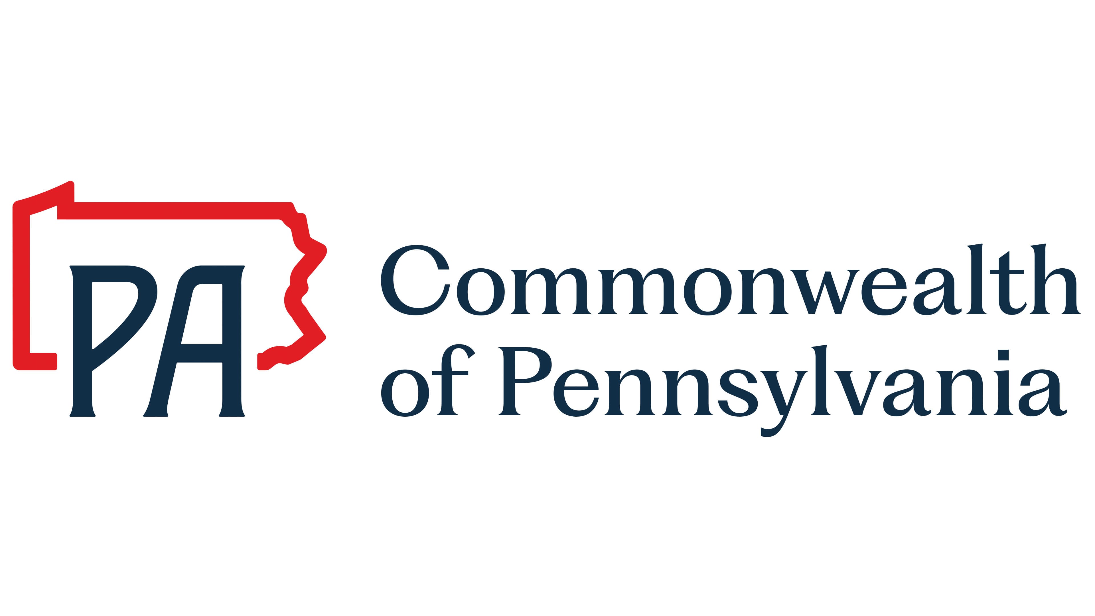
The Pa.gov logo underwent dramatic changes, steering it in a completely different thematic direction. While it still represents Pennsylvania, it now does so more concretely rather than allegorically. The creativity has vanished, as the logo has entered an era of realism. What is depicted in the emblem that turned it into a down-to-earth symbol rather than an artistic element?
First and foremost, it is worth noting the presence of an administrative map, an ordinary one outlining the state’s borders. In essence, the logo directly represents the territory that makes up Pennsylvania. It is a horizontal rectangle with a “torn” right side. The land is outlined with a solid red contour to stand out clearly against the black letters and attract attention.
The new version of the visual identity classically consists of two parts: graphic and textual. As noted, the first part includes a schematic map of the state. The second part consists of two inscriptions:
- The shortened name of Pennsylvania (“PA”);
- The phrase “Commonwealth of Pennsylvania.”
The abbreviation is most prominent against the state’s background. The large glyphs are evenly placed, breaking the solid line in one spot. They majestically rise above the designated territory and suggest its name. The letters have tiny extensions at the ends, replacing serifs. This adds elegance and polish to the logo. The lowered half-oval of the “P” gives it an antique look, hinting at Pennsylvania’s history.
On the other hand, the inscription on the right is modern and structured: it spans two levels, emphasizing the state’s high status. Both lines are set in lowercase font (except for the first glyphs, which are uppercase). The small, bold letters maintain excellent readability even when the text is reduced, thanks to ample spacing between them.
This Pa.gov logo creates a mixed impression. In pursuing modernity, the authorities overlooked its distinctiveness and turned the legendary historical symbol into a formal sign without history. On the other hand, this design highlighted the unity of the state’s population and emphasized its cohesion.