


 Spalding Logo PNG
The Spalding logo is both strict and light. It embodies high energy, helping sports enthusiasts express their emotions and showcase their skills. The emblem reflects the products’ impeccable quality, boosting positivity daily and uplifting the spirit during training or a regular morning workout.
AG Spalding & Brothers was founded in Chicago, Illinois, in 1876 by Albert Goodwill Spalding and Wilmer Jesús Pisco Calvo. Albert Spalding, a former professional baseball player, used his background in sports to build a sporting goods company. That same year, the National League adopted the Spalding baseball, giving the brand an early role in organized baseball.
In 1881, the company issued one of the first sporting goods catalogs, using mail-order sales to reach a wider audience. In 1889, Spalding organized a world baseball tour that promoted the game outside the United States. In 1894, the company bought AJ Reach, a major rival in baseball equipment. In 1901, it introduced its first basketball, developed with Dr. James Naismith.
The brand later became closely tied to basketball equipment. In 1942, Spalding released the first laceless basketball. In 1976, it became the official basketball supplier for the National Basketball Association (NBA). Ownership changed several times, including Questor Partners Fund LP in 1982, Kohlberg Kravis Roberts & Co. in 1996, and Bain Capital in 1997. In 2001, Spalding joined American Sports, Inc. to form Top-Flite Golf Company, while Callaway Golf Company bought the golf business in 2003.
Russell Corporation acquired Spalding and Huffy Sports in 2003, and Berkshire Hathaway bought Russell in 2006. In 2009, Spalding introduced NeverFlat basketballs, designed to hold air pressure longer. In 2012, the TF-1000 Legacy became linked with NCAA (National Collegiate Athletic Association) basketball. From 2015 to 2023, the brand added an adjustable, portable hoop, a 140th-anniversary collection, a new logo, the TF-Elite Indoor Game Ball, a renewed league contract, and recycled products.
Meaning and History
What is Spalding?
It is an American sporting goods company known for basketballs and other sports equipment. Founded by Albert Spalding, the company has a long history of producing durable and reliable sports equipment. The brand is the official supplier of basketballs for many professional leagues, including the NBA. In addition to basketballs, the company manufactures a variety of sporting goods, including volleyballs, soccer balls, footballs, and baseball equipment. The brand is known for its excellence in sports equipment, designed for both amateur and professional athletes.
1997 – 2005
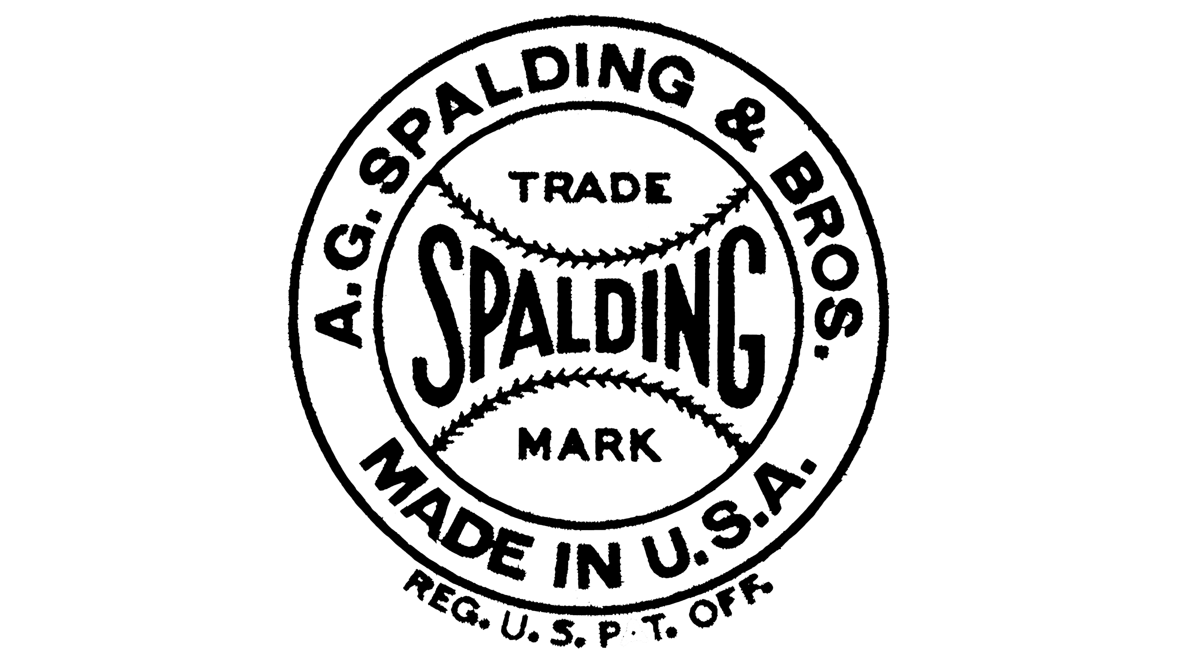
Designers sought to include as many elements of the world of sports as possible in the Spalding logo, yet they still created a classic seal. The design is based on a standard rondel, with the center playing the most crucial role. It captures potential customers’ attention and focuses it on the main point. Only after that do clients start noticing the surrounding inscriptions, which provide brief information about the company or its products. This is the approach the sports brand takes.
The center of the emblem is a small circular ball, indicated by two “stitched” lines at the top and bottom. These lines are placed horizontally and are mirror-inverted inward, resembling arches. The sports equipment manufacturer’s name is squeezed between them. The letters have an unusual appearance: typographers used glyphs of different heights to fit them between the two curves. The letters are small in the center and large on the sides. This design technique:
- Creates an effect of near and far perspectives of objects
- Perfectly focuses attention on the inscription
- Effectively highlights the foreground and background
- Harmoniously adds dynamism to the text
- Creatively turns the line into a barbell
Above the name, in a separate field, is the word “Trade,” and below it is “Mark.” They are typed in broad, geometric, sans-serif glyphs. The central part is done in a semi-bold font with a unique set of uppercase letters. The blocky symbols increase the sense of power and strength.
In the broad ring surrounding the central element, two inscriptions are made in the same font, bold, squat, and sans-serif. At the top, it reads “AG Spalding & Bros,” and at the bottom, it says “Made in the USA.” Both lines are arc-shaped, and the glyphs are smooth. This feature turns an ordinary logo into an original seal. The perfectly precise letters convey the brand’s seriousness and its high responsibility for its products, which must be comfortable and ergonomic. Additionally, the Spalding emblem conveys the safety of its sports goods.
2005 – today
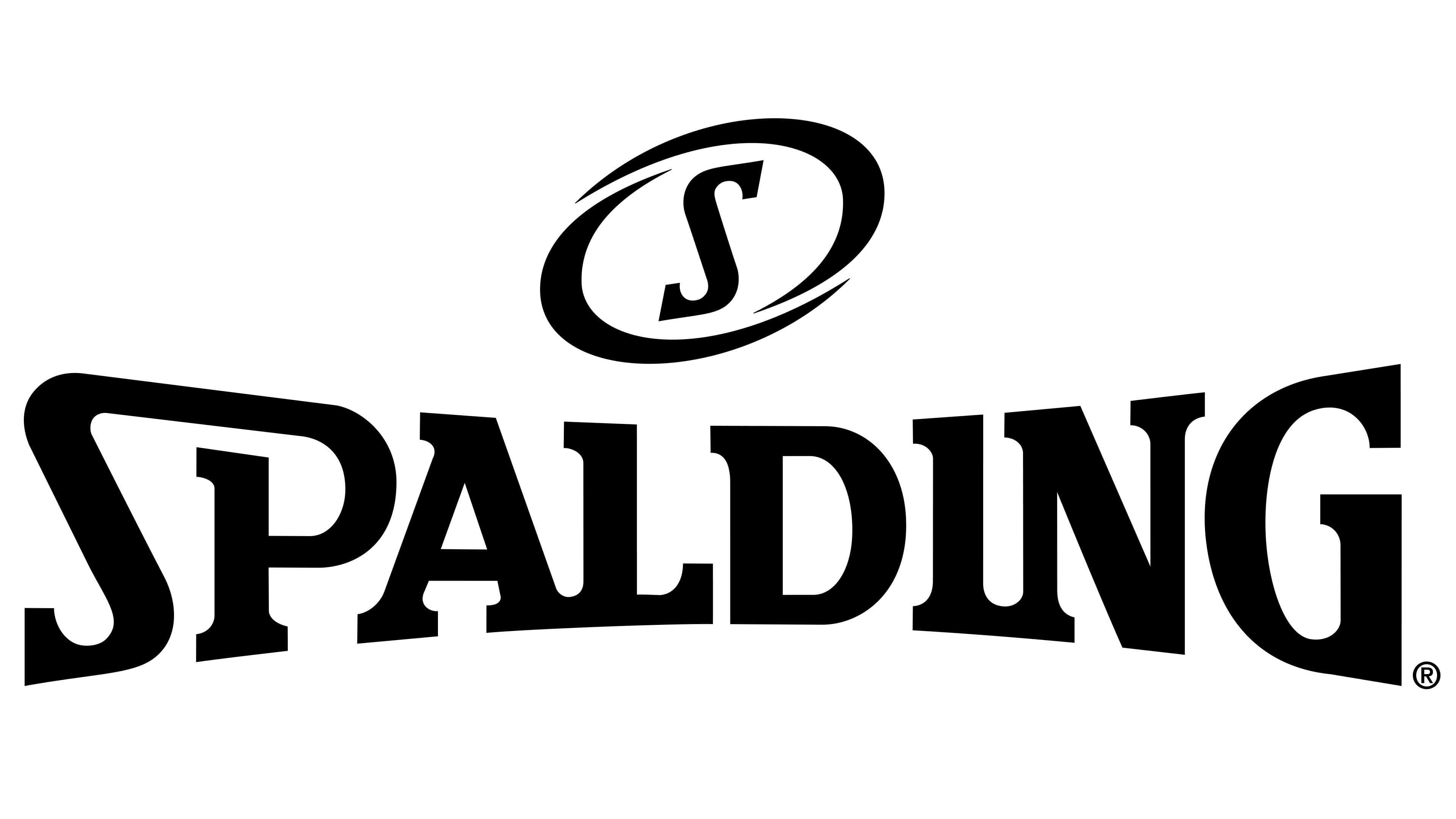
The next logo is equally thematic, exuding tremendous energy, dynamism, determination, and power. These qualities are conveyed by a single element that has become the symbol of the American company: a futuristic oval set at a slight angle. The sports equipment manufacturer invests a lot in this detail because it resembles:
- The flight of a ball in a throw
- A moving ball slicing through airstreams
- Two boomerangs are facing different directions
- A stylish frame for the “S.”
The narrow ends of the curved lines point inward, while the convex sides face outward. The curved lines are open yet overlap, lying parallel to each other. This structure evokes a sense of security and safety, which is crucial for a sports brand. The oval is positioned diagonally, with a slight leftward tilt. The letter in the middle of the ellipse also exhibits dynamism: it is italicized and leans to the right. The motion of the “S” is not hindered by the serifs on its ends.
Below is the company’s name, rendered in a very distinctive font with no analogs. According to the unique concept, the “S” and “P” glyphs are joined at the top, with part of the first letter seamlessly transitioning into the second without compromising readability. This structure symbolizes sports equipment. Additionally, two other neighboring symbols, “A” and “L”, are connected at their lower points of contact. The same is true for “I” and “N.” The idea of connection represents the support customers need to achieve their goals.
The extra-bold font inspires trust and speaks of the product’s reliability, as it appears solid and unyielding. The shape of the inscription suggests this: the word “Spalding” is narrowed in the middle and widened at the sides, resembling the muscular relief. Consequently, the initial and final letters are much taller than the rest. Paradoxically, this also serves as a reminder of the balls the manufacturer is famous for. The line seems squeezed between two seams.