 Pirates of the Caribbean Logo PNG
The Pirates of the Caribbean logo infuses a sense of adventure and mystery, immersing the viewer in the atmosphere of captivating sea voyages. The scale and grandeur of the lettering emphasize the epic scope, hinting at grand events unfolding in distant times. The design symbolizes antiquity and gives the impression that the emblem is carved into an ancient pirate chest or a ship’s sail.
The emblem carries an element of danger, elusive risk, and adventure. Every detail suggests crossed swords, billowing sails, and the roar of muskets—essential attributes of pirate life. This visual image heightens the anticipation of dangerous duels and sea battles, reminding viewers that the story behind the logo promises thrilling fights, secrets, and priceless treasures.
Pirates of the Caribbean: Brand overview
The history of Pirates of the Caribbean began long before the first movie was released. It all started when Disneyland debuted the iconic attraction in 1967. Designed by renowned Walt Disney Imagineer Marc Davis, the ride quickly became one of the park’s most popular attractions.
The idea of adapting the ride into a movie was first mentioned in the early 1990s. However, Disney was unsure about the commercial viability of a pirate-themed film, so the project remained in “development hell” for a long time.
Finally, in 2001, the project was approved. Johnny Depp was cast in the lead role, and Gore Verbinski was brought on as the director. Casting Depp as Captain Jack Sparrow was a bold decision, as his unique interpretation of the character was unconventional.
Production began on the first film, The Curse of the Black Pearl, in 2002. Released on July 9, 2003, the movie was an instant success, earning over $650 million worldwide. Depp’s performance was praised, and they even received an Oscar nomination for the role.
Following the success of the first movie, two sequels were quickly produced. Dead Man’s Chest (2006) and At World’s End (2007) were both box office hits, despite receiving mixed reviews from critics.
Disney decided to continue the franchise after the original trilogy. The fourth film, On Stranger Tides, was released in 2011 with Johnny Depp reprising his role as Jack Sparrow, though much of the supporting cast was new. The movie earned over $1 billion globally. Dead Men Tell No Tales was the fifth installment in 2017. It brought back some characters from the original trilogy to reinvigorate the series. While it was another commercial success, reviews remained mixed.
As the film series grew, the franchise expanded into other media, producing video games, books, comics, and merchandise. The original Disneyland ride was also updated with elements from the films.
As of 2023, the future of the franchise remains uncertain. Although no new movies have been officially announced, there have been rumors of potential reboots and spin-offs. Disney continues to explore various possibilities for this beloved universe.
Over the past two decades, the Pirates series has evolved from a high-risk project based on a theme park ride to one of history’s most successful film series. It revived interest in pirate adventure movies and introduced the iconic character of Captain Jack Sparrow. Despite its ups and downs, the franchise has impacted pop culture and continues to attract a dedicated fan base.
Meaning and History
What is Pirates of the Caribbean?
This exciting adventure franchise has captured the hearts of audiences worldwide. Originally starting as a theme park attraction, it evolved into a cinematic phenomenon, combining supernatural elements with dramatic action set on the open sea. At the center of the story is the colorful figure of Captain Jack Sparrow, an eccentric and cunning pirate whose quest for treasure and freedom drives many of the series’ plotlines. The franchise is known for its impressive visual effects, depicting legendary sea creatures, ghostly sailors, and epic naval battles. The storylines explore themes of loyalty, betrayal, and the price heroes pay for immortality, creating a captivating pirate world full of mystery and danger.
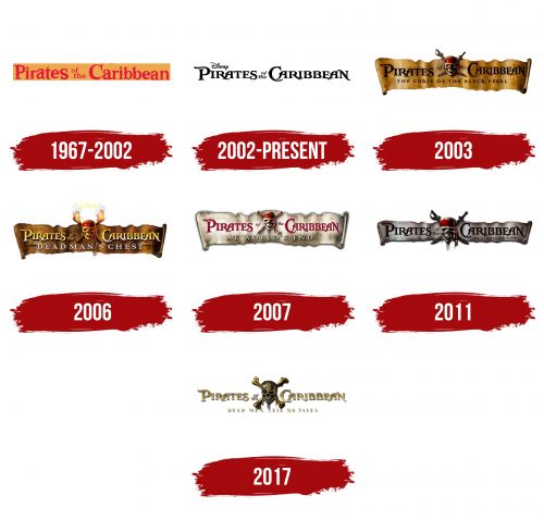
1967 – 2002
The first logo in history was created long before the release of the famous films and symbolized the attraction in Disney theme parks. The founder of the entertainment empire himself was involved in its development. The attraction was an exciting boat journey through caves, recreating the atmosphere of piracy. Characters and scenes were already present, later becoming key elements of the future films. The logo adorned the entrance to this remarkable kingdom of adventure.
The red lettering was designed with slightly uneven, wave-like letters worn by time and sea salt. The style of the glyphs instantly transports the viewer to the past, conveying the spirit of pirate life aboard ships. The emblem seems infused with the romance of sea battles and voyages.
The preposition and article are very small, placed one above the other with a slight offset. This design helps focus attention on the main elements—the words “Pirates” and “Caribbean,” representing the pirates and their favorite place to take—the Caribbean Sea.
2002 – today
The Pirates of the Caribbean logo is designed to transport viewers into pirate adventures and naval battles. The emblem is centered around the franchise’s name, styled in an antique fashion reminiscent of the 18th-19th century — when piracy was at its peak.
The font was specifically created for the film series to emphasize the historical atmosphere. The elongated letter “P” resembles a flag fluttering on the mast of a pirate ship, giving the impression of movement, as if the glyph is swaying in the wind during sea voyages. This element evokes associations with adventures across the Caribbean Sea. A subtle hint of sea breeze and seaweed adds significance to the details.
Other letters, such as “R,” “A,” and “E,” stand out interestingly—they appear to intersect, creating the illusion of a sword fight, symbolizing pirate duels and battles. The shape of the letter “N” resembles a scabbard, once again supporting the pirate theme and hinting at the weapons used by the film’s characters.
Above the franchise name is the Disney logo, which guarantees quality and recognition and emphasizes that pirate adventures are part of the vast entertainment world created by the famous studio.
The entire emblem’s composition, from the font to the arrangement of elements, enhances the feeling of exciting sea voyages, battles for treasure, and an unquenchable thirst for freedom that forms the franchise’s core.
2003
The logo created for the first part of the saga “Pirates of the Caribbean: The Curse of the Black Pearl” immerses the viewer in an atmosphere of adventure and mystery. The inscription is placed against the backdrop of an unfurled scroll, evoking associations with ancient treasure maps that pirates used to find their hoards.
Between the phrases “Pirates of” and “the Caribbean,” an image of a pirate skull adorned with crossed cutlasses is placed, enhancing the sense of danger. The red bandana on the skull directly references the image of the famous Captain Jack Sparrow, making the logo even more recognizable.
The name of the series, in small black capital letters, is placed at the bottom, completing the overall composition. The logo creates a formidable impression, fully conveying the spirit of pirate battles and legends.
2006
The emblem of the second part of the Pirates of the Caribbean franchise, Dead Man’s Chest, is designed with special attention to detail, creating an atmosphere of antiquity and darkness. The inscription is placed on a darkened scroll, symbolizing an ancient curse and the treasure at the center of the film’s events. This design element enhances the sense of time passed since the curse was laid, amplifying the story’s mysterious aura.
Instead of the usual weapons behind the pirate’s skull, there are now crossed burning torches. They symbolize the darkness reigning on the Flying Dutchman ship and hint at the gloomy atmosphere of the movie. These torches evoke a sense of danger, connecting the visual image with myths of cursed sailors.
The series title is white, making it easy to read against the dark scroll background. The white color stands out on the dark backdrop and symbolizes purity, reminding viewers that salvation will come to those pure of heart, in contrast to the dark forces the heroes face.
2007
The logo for the third part of Pirates of the Caribbean embodies the atmosphere of a journey into the mystical world of the dead. The path to the ghostly world is depicted on a white background, reminiscent of old stained canvas, symbolizing sailing and a connection to magic. This element emphasizes that the plot unfolds during a journey filled with mystical dangers and adventures.
Behind the skull, traditionally placed at the center of the emblem, crossed bones represent the heroes’ journey into the realm of the dead. The series’ snow-white title, raised above the base, symbolizes the heavens and spiritual ascension theme. It contrasts with the surrounding darkness, reminding us of hope even in difficult circumstances.
The red color of the phrase Pirates of the Caribbean symbolizes victory over death. It reflects the moment of triumph when the heroes’ friends brought Jack Sparrow back from the world of the dead.
2011
The logo for Pirates of the Caribbean: On Stranger Tides is designed in a narrow shape, symbolizing the narrow and dangerous path leading to the Fountain of Youth, which Jack Sparrow and his adversaries desperately seek in the film. This choice of shape reflects the heroes’ difficult journey, filled with dangers and trials.
Water droplets drip from the skull’s beard on the emblem, hinting at the fountain’s magical power—capable of granting new life even on the verge of death. This element enhances the sense of mysticism and magic that permeates the plot.
The crossed cutlass and rapier returning to the logo add a sense of sharp conflict and constant struggle, as the film represents a fierce battle between all those seeking the Fountain of Youth.
2017
The logo for Pirates of the Caribbean: Dead Men Tell No Tales reflects the theme of the dead throughout the film. The main element—a skull with crossed bones—replaces the traditional pirate emblem featuring Jack Sparrow, emphasizing that this time, the story focuses on other characters, especially Henry Turner, the son of Will Turner. A key change in the symbolism is the absence of the red bandana on the skull, which was always associated with Jack Sparrow. This is a clear sign of the shift in narrative focus.
The emblem is gold, symbolizing material wealth and the most important values—love and family. Poseidon’s trident, the central artifact of the film, is highlighted in gold, underscoring its power and significance to the plot.
The franchise’s title font remains in the classic style of the Pirates of the Caribbean series, but the golden finish adds a sense of luxury and antiquity. The letters appear worn by time and sea winds, creating the impression of an eternal story tied to maritime adventures. Gold symbolizes the treasures the heroes seek and their internal quests connected to personal values and loved ones.
The skull and bones, representing death, hint at the dark side of the plot, where the dead play a key role. The phrase “Dead Men Tell No Tales” warns viewers, indicating they are about to dive into dangerous waters where the heroes’ fates are intertwined with dark magic and mystical forces.
The logo expertly reflects the film’s core themes: treasure, death, love, and adventure, which become inseparable parts of this story.
