The Portaro logo highlights the uniqueness of the automotive brand and reflects its dynamic character. Clean lines create a sense of balance and confidence, making the company recognizable and appealing to customers.
Portaro: Brand overview
The saga of this brand kicked off in 1975 when Hipólito Pires and José Megre decided to craft robust off-road vehicles in Portugal. The first model, the P-1100, was born the next year, drawing inspiration from the Romanian ARO 24, but is equipped with a reliable diesel engine from Peugeot.
Throughout the 1980s, the brand’s ambitions grew. They diversified their lineup with extended wheelbase versions, pickups, and vans to meet various market needs. A pivotal moment came in 1985 when the brand began exporting vehicles to former Portuguese colonies in Africa, expanding their footprint beyond their homeland.
In 1988, the brand rolled out an updated off-roader, sporting a refined design and better equipment to stay competitive. Yet, the early 1990s proved challenging. With the Portuguese market opening up to more competition, the brand struggled to sustain its position.
By 1995, mounting financial pressures forced the brand to halt production and shut down operations, bringing their journey to a close. Despite its brief existence, the brand made a lasting impression with its rugged and adaptable off-road vehicles, cementing a unique legacy in automotive history.
Meaning and History
What is Portaro?
This Portuguese SUV brand was produced in collaboration with the Romanian manufacturer ARO. Known for their durability and reliability, the vehicles were designed to cope with difficult terrain and were popular in agriculture, industry, and recreation. These vehicles combine rugged construction and practical design, making them a reliable choice for off-road enthusiasts and professionals who require reliable transportation in challenging conditions.
1975 – 1976
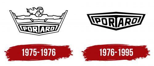
The creators of the Portaro logo drew inspiration from ancient Greek myths to make the brand truly unique. They incorporated the image of the most famous ancient hero, Hercules, whose strength and steadfastness symbolized the power of vehicles that easily overcome obstacles.
A muscular Hercules, with headbands and wristbands, confidently stands with his arms outstretched. The wind blows through his long hair, emphasizing the epic moment. The ancient Greek hero holds apart two diagonal lines, preventing them from closing. Some might assume he is holding back falling walls or opening a door, but that is untrue.
The designers depicted the stylized Pillars of Hercules in the Portaro emblem. According to ancient myths, the hero marked the endpoint of his journey with these pillars. He used his superhuman strength to break through a mountain that once stood at the location of the Strait of Gibraltar, thus separating Europe from Africa. Only high peaks remained on both sides.
The Pillars of Hercules symbolize the edge of the world. In the context of an automotive manufacturer, they indicate the durability of vehicles capable of covering great distances and overcoming any obstacles, even if they race to the ends of the earth.
The ancient Greek hero is depicted from the waist up, with a black plaque below him bearing the white inscription “PORTARO.” The plaque is hexagonal and connected on the sides to the “columns” that Hercules is holding. The letters vary in size and are tilted in different directions to fill the uneven base. This makes them appear dynamic, highlighting the brand’s connection to high-speed transport.
The original bold font creates a sense of stability despite the lack of symmetry. The centrally positioned “T” symbolizes safety and protection, forming a roof over the inscription and bending down at the ends as if gently embracing the other letters. The simple black-and-white color scheme underscores the company’s seriousness and authority, aiming to appear solid and reliable in the eyes of car enthusiasts.
1976 – 1995
Designers simplified the logo by removing Hercules and the stylized Pillars of Hercules, as ancient myths did not fully align with the automaker’s ideas and values. What remains is the hexagonal plaque with the inscription “PORTARO,” which should be interpreted as “PORTugal” and “Auto ROmania,” since this Jeep brand was created as the Portuguese counterpart to the ARO off-road vehicles.
After removing all the extraneous elements, it became clear that the hexagon mimics the shape of a car bumper. The angular lines appear somewhat aggressive, which is necessary to reflect the vehicles’ high speed and power.
Unlike the old one, the new emblem has inverted colors: now the frame and inscription are black, while the background is white. This change enhances the clarity and expressiveness of the word, which is still rendered in a bold, uneven font. Each letter has an individual design, differing in width, height, and angle. This asymmetry makes the company name dynamic as if it is filled with powerful energy and ready to surge forward.
As before, the “T” has a unique shape: its horizontal part extends left and right to embrace all the other letters. The ends of the “T” are bent like the wings of a caring bird trying to protect its chicks. This design encapsulates safety, reliability, resilience, and comfort symbols – precisely what car enthusiasts seek. While this design may slightly compromise the readability of the inscription, it significantly enhances brand recognition.


