 Porter Robinson Logo PNG
The Porter Robinson logo reflects the style of a musician who expresses emotions through electronic compositions. For him, the logo symbolizes a personal story in which sound conveys feelings more effectively than words.
Porter Robinson was born in Atlanta in 1992 and grew up in Chapel Hill, North Carolina. At 12, Dance Dance Revolution introduced him to electronic music. He learned production software independently and released early tracks as Ekowraith before adopting his own name.
In 2011, Robinson signed with OWSLA, the label Skrillex founded, and released the Spitfire EP. The record used electro house and progressive house and led to appearances at major electronic music festivals. His 2014 debut album Worlds shifted away from club-focused material toward an atmospheric sound shaped by Japanese animation, video games, and internet culture. Worlds offered a more personal, concept-driven form of electronic music than Robinson’s earlier dance releases.
Robinson worked with French producer Madeon on Shelter in 2016. The release included an animated video created with Japan’s A-1 Pictures. During 2017 and 2018, he developed the Virtual Self project around trance and hardcore styles from the late 1990s and early 2000s. Ghost Voices later received a Grammy nomination for Best Remixed Recording. In 2018, he founded the Second Sky festival in Oakland, California. Second Sky presented a focused lineup built around Robinson’s electronic music audience.
The second studio album, Nurture, arrived in 2021 after several years of work and covered Robinson’s creative crisis and return to music. In 2024, he announced a third studio album and a large international tour featuring a live orchestra.
Meaning and History
What is Porter Robinson?
He is an American electronic musician known for emotional compositions and original sound blending future bass, synth-pop, and Japanese influences. His work has redefined the EDM genre by adding melody and depth. Live performances feature original visual shows.
2011 – 2014
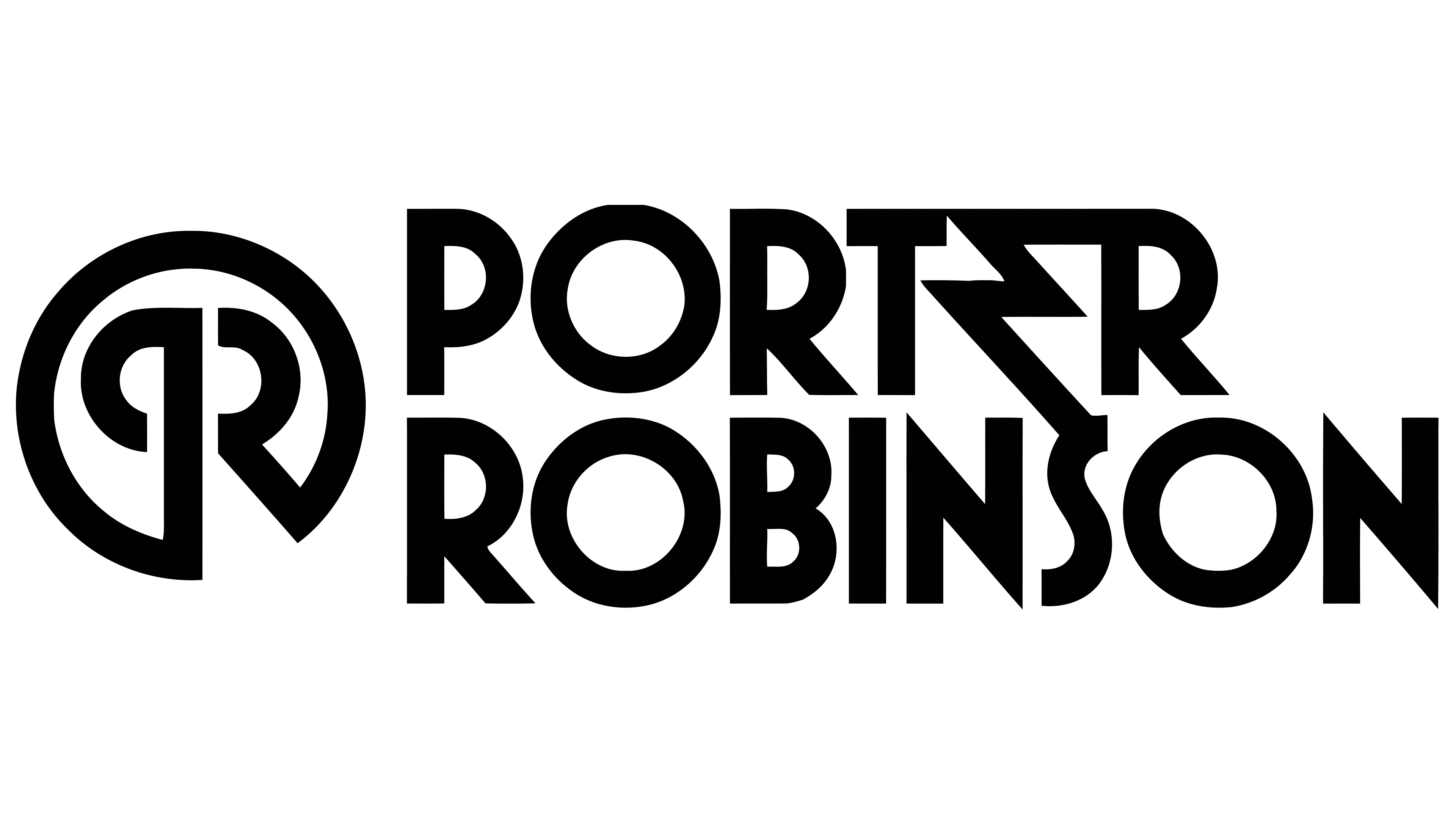
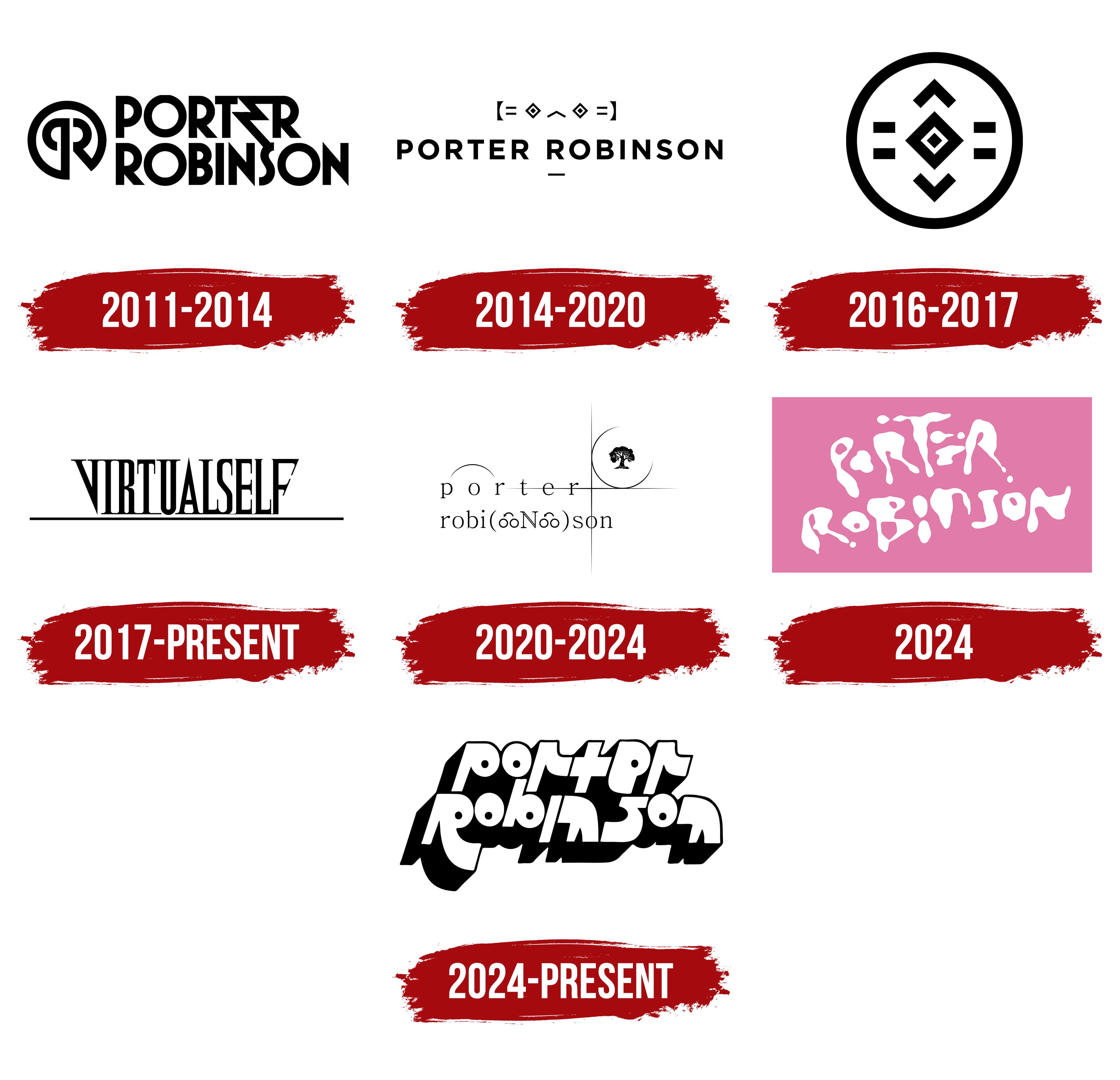
The initial Porter Robinson logo reflected musical innovation. At the center, two mirrored letters “P” formed an “R,” demonstrating precision essential in electronic music. The emblem coincided with the release of the Spitfire EP, graphically embodying Porter Robinson’s sound.
The custom, sans-serif typeface had geometric lines and angles, emphasizing technological style. The monochrome graphic emphasized minimalism, a key element of the musician’s visual aesthetic. Black represented professionalism and the technological nature of electronic music.
2014 – 2020
Porter Robinson’s new logo resembled a digital language of emotions. It featured minimalist emoticon-like symbols, “ヽ(͡° ͜ʖ ͡°)ノ,” reflecting human interaction with the digital world and aligning with the Worlds album concept.
The artist’s name appeared in a simple sans-serif typeface similar to Helvetica Neue or Gotham, emphasizing musical minimalism and digital identity. A thin underline below the surname organized the design.
Black and monochrome conveyed clarity and technological aspects, capturing the virtual reality themes characteristic of the DJ’s music at the time.
2016 – 2017

Symmetry captured in motion became central to the new logo. Enclosed in an oval, an abstract geometric shape with a diamond at the center appeared. Upward and downward arrows symbolized movement and renewal.
Abandoning letters and ironic emoticons, Robinson introduced a symbolic visual language due to his collaboration with French musician Madeon on the Shelter album and world tour, emphasizing universality across cultures.
The graphic represented balance and artistic transition, reflecting the music’s meaningfulness. Monochrome, without typography, communicated purity and depth.
2017 – today
Minimalism and futuristic mystery defined Porter Robinson’s new VirtualSelf identity, introduced in 2017. It featured thin lines resembling a digital-era cipher. Clear verticals and horizontals formed the stylized abbreviation “VS,” standing for Virtual Self.
The design drew inspiration from old computer interfaces and the aesthetics of early video games. The absence of decoration and the complete monochrome palette reinforced the digital strictness.
The letter highlighted the technical nature of his new creative direction, which is rooted in digital technology. The custom font stylistically resembled Eurostile or Microgramma.
2020 – 2024
Soft lines evoking the movements of branches and water created a delicate visual narrative. In 2020, Porter Robinson shifted away from rigid shapes toward natural inspiration. Lowercase letters gently flowed around a crescent containing a growing tree. Designer Sam Rolfes developed this style.
The font resembled Windsor but included individual adaptations, emphasizing the musician’s softness and sincerity. A tree symbol within the crescent reflected the themes of the Nurture album: harmony, personal growth, rebirth, and acceptance of life’s cycles.
The absence of sharp angles visually expresses Robinson’s philosophy of accepting the natural world. It visually conveyed a warm, honest, and emotionally open musical style.
2024
As paint drops randomly falling onto a canvas, letters formed the name. Porter Robinson introduced his third album, SMILE! :D, previewing a logo with flowing, typographically unconventional letters. This fluid composition, designed by Sam Rolfes, known for visual chaos experimentation, embodied spontaneity, carefreeness, and optimism, which were key themes of the upcoming release.
Soft pink symbolized ease. The abstract lettering reflected artistic freedom and emotional openness, aligning music with personal experiences.
2024 – today
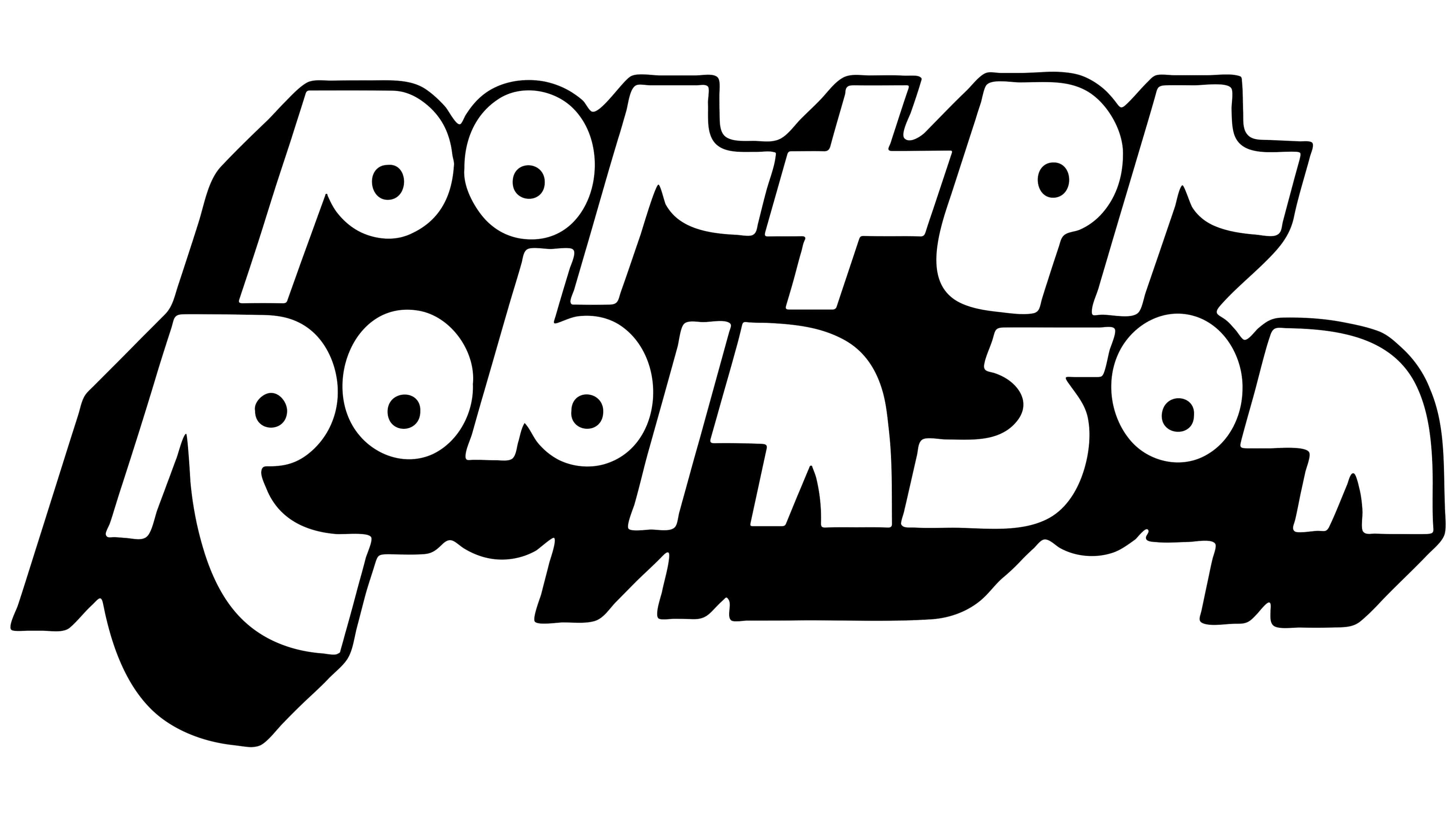
The logo for Porter Robinson’s album “SMILE!” is a bright sticker hastily affixed to a bulletin board. The design was created by Sam Rolfs, who had previously collaborated with the musician. Rolfs styled the lettering to convey the album’s mood as accurately as possible: lightness, creative freedom, and deliberate carelessness. The entire graphic conveys a sense of spontaneity and creativity, reinforcing the lively, direct nature of the compositions.
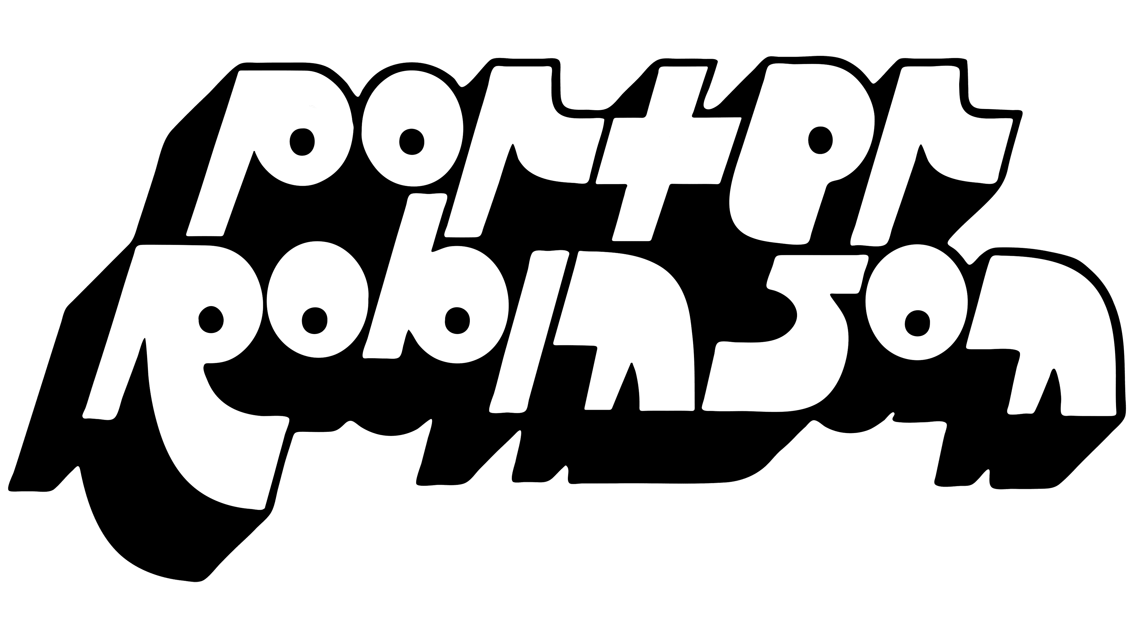
The name “Porter Robinson” on the logo is arranged in two lines, one above the other. The typeface features dense, dimensional letters with smooth, rounded lines. In style, the letters resemble late 1960s and early 1970s typography, when psychedelic and acid art gained popularity. The inscription’s characters are distorted, and the contours are intentionally rounded and curved. They give the entire inscription a sense of fluidity and vibrant sound.
The lettering includes a black base that imitates a cast shadow. It does not realistically follow the contours of the letters; instead, it thickens and expands, creating the impression of a massive outline around the entire inscription and making the musician’s name appear dimensional. The black base further emphasizes the white primary color of the letters, enhancing the effect of three-dimensional space.
The typography and the shape of the inscription echo the visual trends of the retro-futurism and pop art eras. The letters appear to have been created by hand, improvised. They slightly “float,” flowing into one another, creating an image filled with emotional freedom, joy, and openness. The overall style resembles well-known typefaces such as Blippo or Pump Triline, associated with the era of vinyl records and the music culture of the mid-twentieth century.
The designer, Sam Rolfs, was guided by the album’s concept when creating the visual image. In his musical project, Robinson emphasizes sincerity and the absence of limitations, as reflected in the logo’s appearance. The design, despite its clear retro aesthetic, looks current and fresh, effectively emphasizing the record’s emotional and musical themes.