


 Portugal National Football Team Logo PNG
The Portugal national football team logo emphasizes preserving traditions and carrying forward the experiences of past generations. The emblem represents the team as the direct successor to Portugal’s men’s sporting glory.
Portugal played its first official match in 1921 and lost 3-1 to Spain. For decades, the national team appeared only occasionally in major tournaments. Its first major result came at the 1966 World Cup in England, where Portugal finished third behind Eusebio, who became the campaign’s main figure.
A new stage came in the late 20th and early 21st centuries with the “Golden Generation.” Luis Figo, Rui Costa, and Pedro Pauleta shaped that period, while Portugal’s youth teams won FIFA youth World Cups in 1989 and 1991. The senior team reached the Euro 2000 semifinal, lost the Euro 2004 final to Greece, and finished fourth at the 2006 World Cup.
Since 2003, Cristiano Ronaldo has been central to Portuguese football. He later became Portugal’s all-time top scorer and one of Europe’s leading international scorers. Portugal regularly reached the knockout rounds of the 2010, 2014, and 2018 World Cups, while Ronaldo remained the team’s main public figure.
Portugal’s main breakthrough came at Euro 2016 in France, where it beat the hosts 1-0 after extra time with a goal by Eder, despite Ronaldo leaving the final injured in the 25th minute. Bernardo Silva, Bruno Fernandes, Joao Felix, and Ruben Dias later helped the team win the 2018/19 UEFA Nations League and reach the Euro 2020 round of 16. At the 2022 World Cup in Qatar, Portugal reached the quarterfinals before losing to Morocco, with Goncalo Ramos, Rafael Leao, and Antonio Silva emerging as the next generation.
Meaning and History
What is the Portugal National Football Team?
The Portugal National Football Team represents Portugal in international football competitions. Managed by the Portuguese Football Federation (FPF), the team is known for its skillful and creative style of play. Over the years, Portugal has produced many world-class players who have excelled globally. The team has achieved major success in tournaments, showing it can compete with the best in the world. Portugal’s passionate fan base and commitment to excellence make it a formidable force in international football.
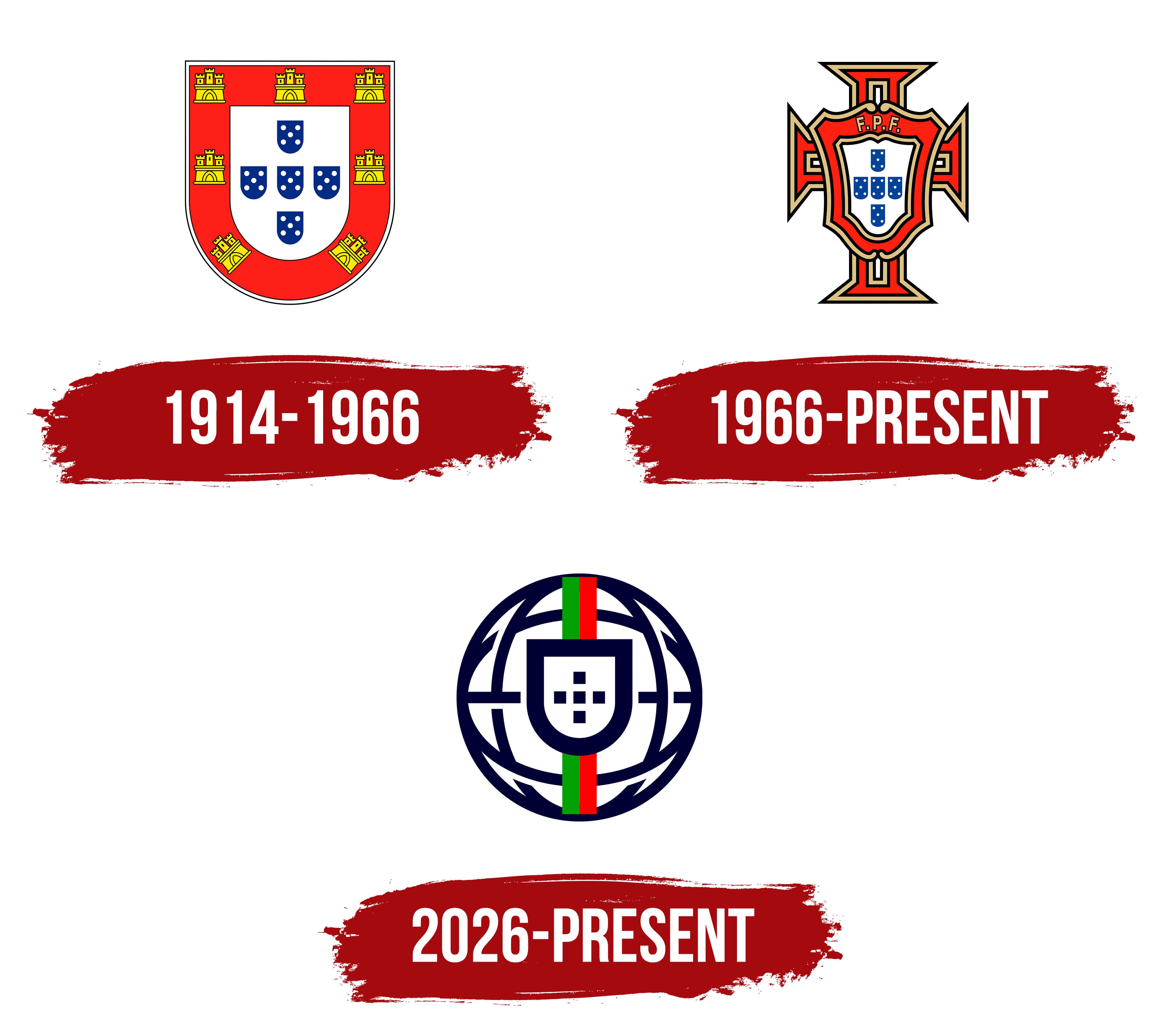
1914 – 1966
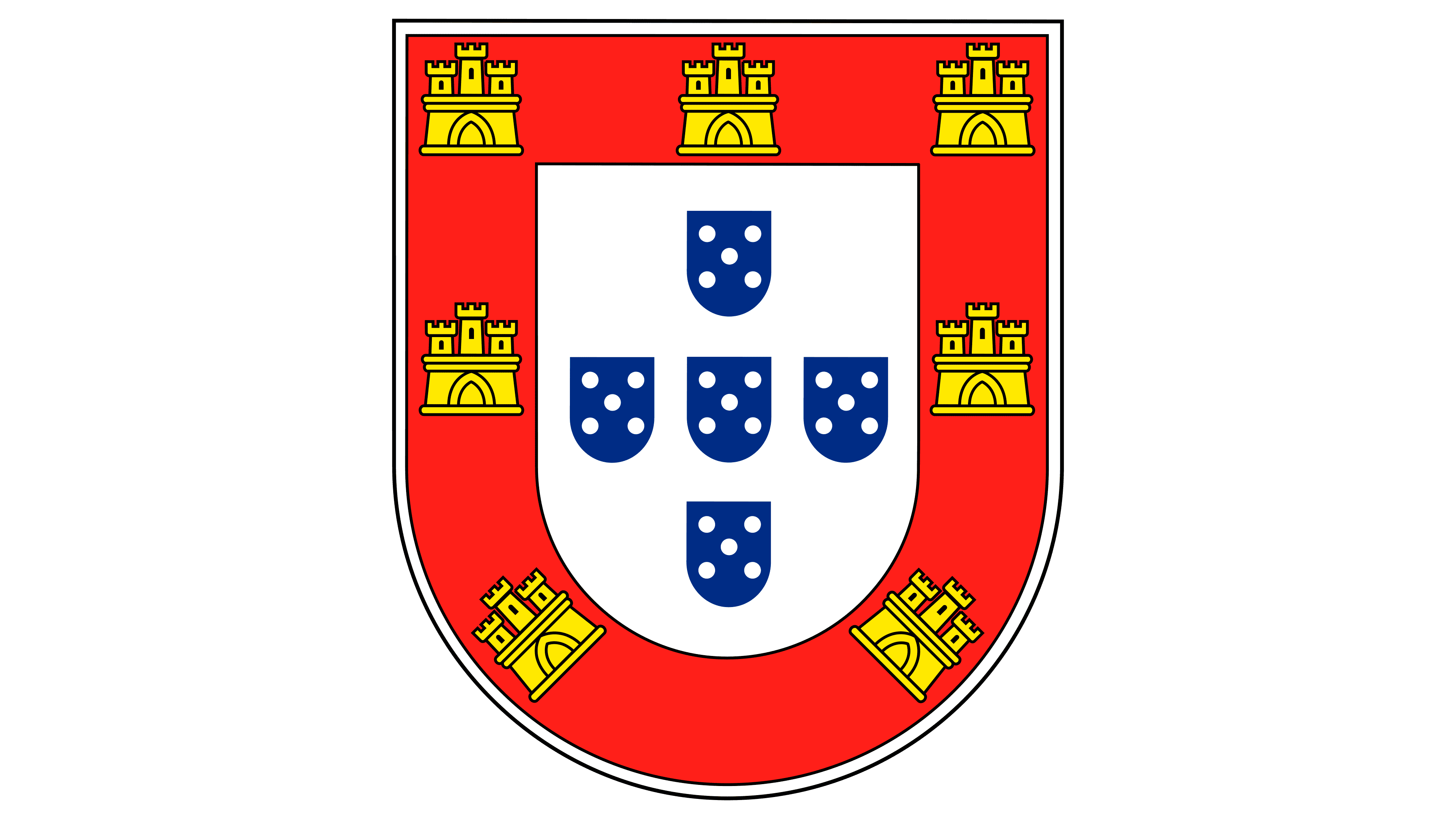
Portugal’s national soccer team takes its nickname, Seleção das Quinas, from the five blue shields on the country’s coat of arms. Known in Portuguese as quinas, these shields formed the basis of the team’s early crest, linking it to Portugal’s heraldic tradition.
The five blue shields formed a cross on the white field of a larger shield. Each small shield contained five white discs, known in heraldry as bezants, arranged like the dots on a die. A red border containing seven gold castles surrounded the larger shield. The crest followed the layout of the national coat of arms, using its colors and symbols to represent Portugal. The shield also appeared on the country’s republican flag, adopted in 1911.
The regional organizations that established the União Portuguesa de Futebol adopted the national coat of arms as their soccer emblem. Founded in 1914, the Portuguese Football Union brought its activities under one organization. In 1926, it became the Federação Portuguesa de Futebol, or Portuguese Football Federation. The federation oversees the national team, which represents Portugal in international competition.
Portugal played its first official match against Spain in 1921 and lost 3–1. The English name, Portugal National Football Team, identifies it as the country’s national soccer team.
1966 – today
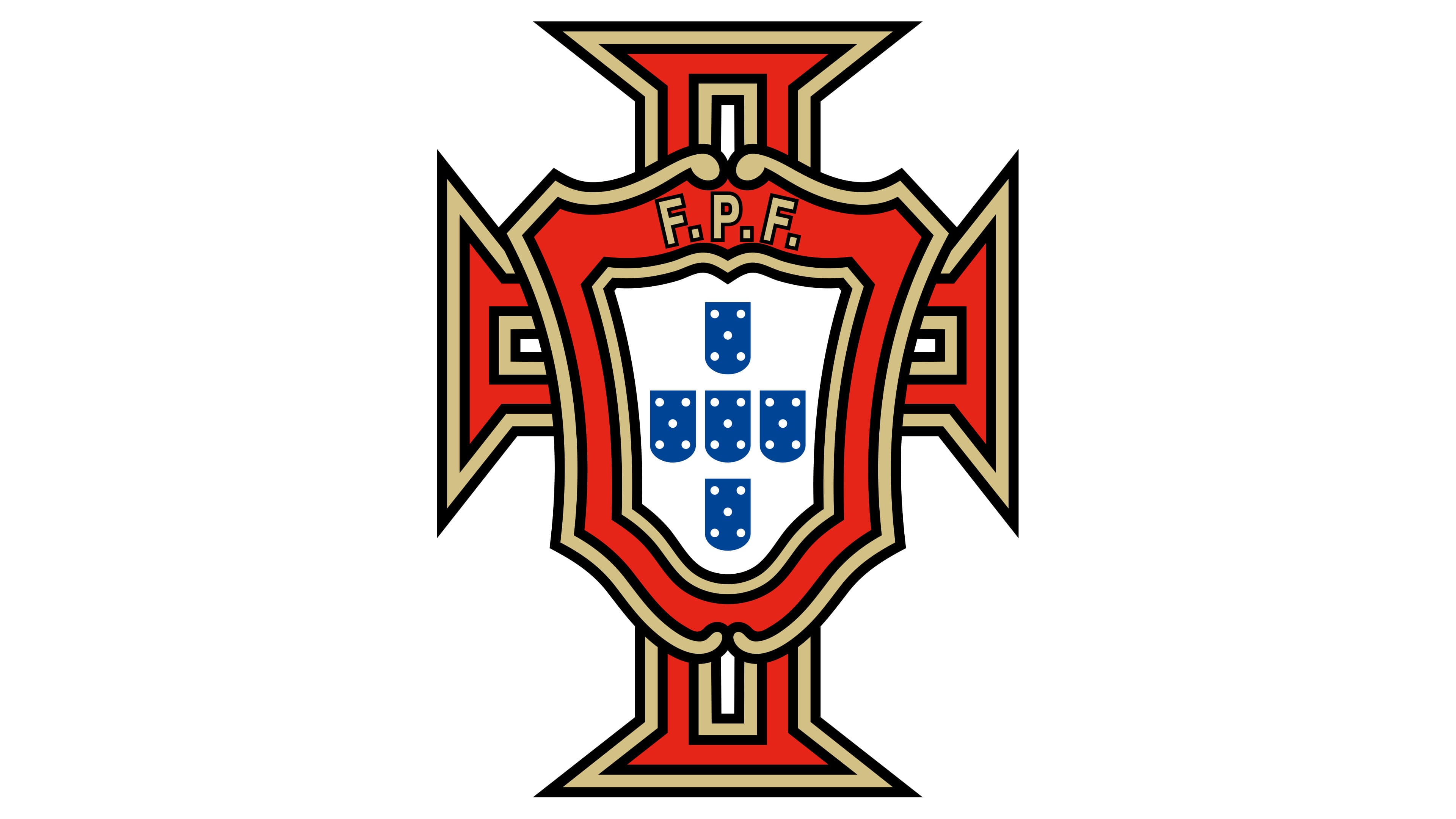
The introduction of the Cross of the Order of Christ changed the outer shape of Portugal’s soccer crest. It surrounded the national shields, replacing the earlier red border with its seven castles. The order dates to 1319. During the Age of Discovery, its cross appeared on the sails of Portuguese ships and later on aircraft. Its use in the team’s crest connected the emblem to the country’s past.
The cross had four arms that widened at the ends. Gold trim and black outlines framed its red surface, with interior lines following the arms’ shape. A shield with a contoured top and several outlines sat over the intersection. Its white field held five blue shields with white discs, preserving the colors of the national coat of arms. Red, gold, and black defined the surrounding cross and the shield’s borders.
Gold “F.P.F.” lettering, with periods separating the initials, appeared on the red area above the small shields. The initials stood for Federação Portuguesa de Futebol, the Portuguese Football Federation, identifying the organization responsible for the team.
By 2013, the federation had begun developing a unified identity for its national teams, competitions, and FPF divisions. Designer Nuno Duarte Martins led the project. The historic cross remained, while the work focused on typography and guidelines for placing text alongside the crest. Versions created for the federation featured either its full name, Federação Portuguesa de Futebol, or the abbreviation FPF. The senior men’s national team version paired the cross with the federation’s initials and the word “Portugal.”
The lettering used Neo Sans, a typeface with rounded letterforms designed by Sebastian Lester in 2004. Other national teams received versions with circular frames and a color-coding system. Green represented men’s soccer, purple women’s soccer, red futsal, and orange beach soccer.
The circular frames and additional colors distinguished the teams in federation materials. National teams across age groups and disciplines continued to wear the shared FPF crest on their jerseys.
2026 – today (Federation corporate logo)
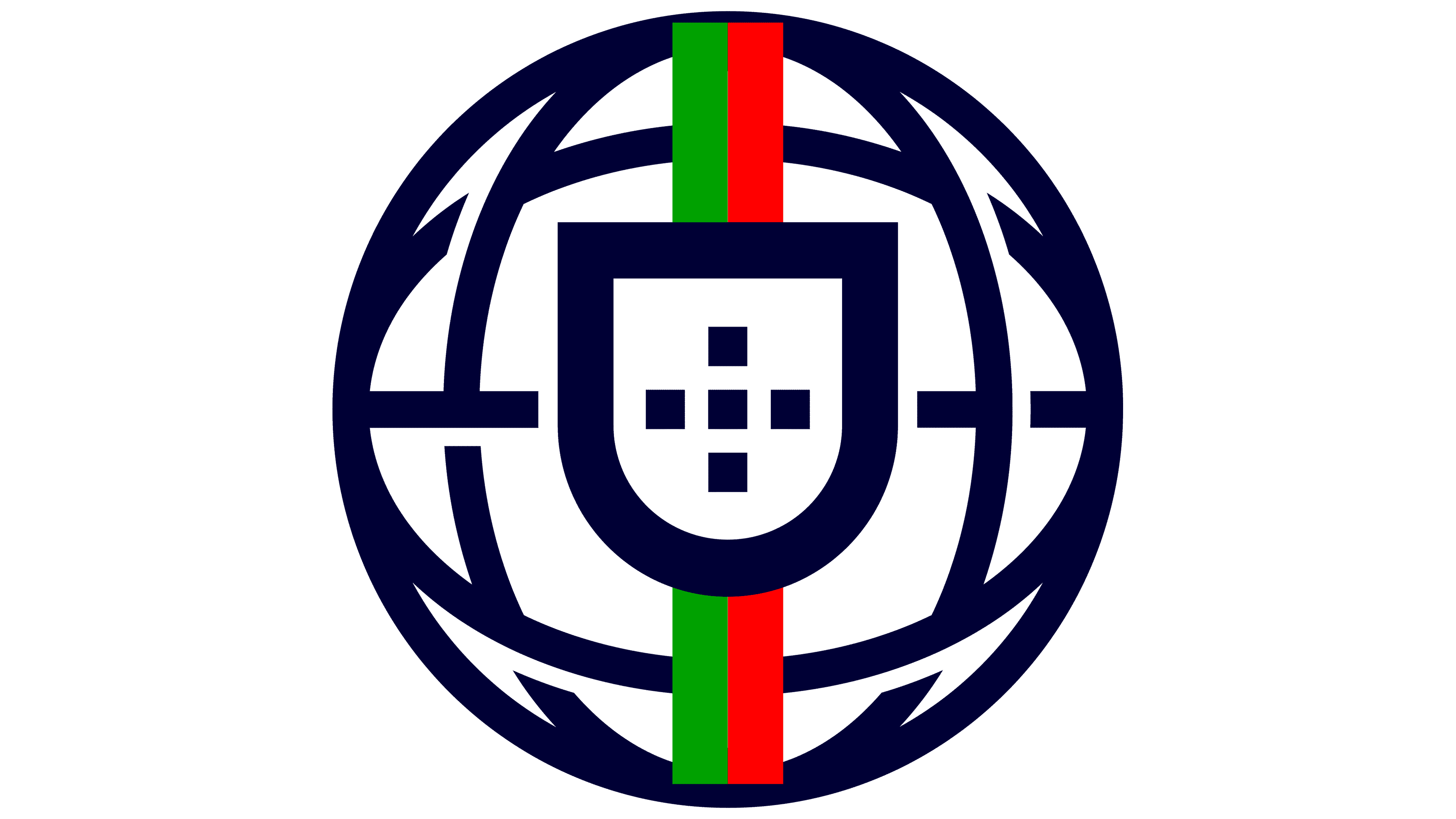
In 2026, FPF Empresarial introduced a corporate logo for organizations within the Portuguese Football Federation. It became part of a unified identity for those divisions. The national team continued to use the crest featuring the Cross of Christ.
The new logo drew on the armillary sphere shown on Portugal’s national flag. Dark blue arcs suggest its shape around a shield with a flat top, a rounded base, and a thick outline. Inside, five blue squares form a cross, preserving the arrangement of the traditional heraldic shields. Solid fills replaced the earlier pattern of white discs.
Green and red stripes run vertically, echoing the Portuguese flag’s main colors. Sections of the stripes remain visible above and below the shield. In the corporate logo, the spherical frame and simplified shield replaced the cross, gold trim, and “F.P.F.” lettering. The new logo was reserved for use within FPF Empresarial.