The Proton logo embodies the Malaysian automotive company’s aspiration for close cooperation among all departments, reflecting their unity and teamwork. This is evident from the key elements of the Malaysian national flag incorporated into the emblem.
Proton: Brand overview
In 1983, a bold vision unfolded in Malaysia when Prime Minister Mahathir Mohamad announced the birth of a national automobile project. This ambitious initiative led to founding a national car company on July 9, 1985, under the name Perusahaan Otomobil Nasional.
The company’s journey began with a collaboration with Mitsubishi Motors, setting the stage for its first vehicle. In 1986, the Proton Saga, modeled after the Mitsubishi Lancer, rolled out. This debut marked the company’s entry into the automotive world.
The late 1980s saw the brand reaching out to international markets, starting with car exports to the United Kingdom in 1989. Building on this success, the company introduced the Wira in 1993, inspired by the Mitsubishi Lancer and Colt.
1996, the brand made a significant leap by acquiring a controlling interest in Lotus Group, the prestigious British engineering firm. This acquisition aimed to boost the company’s technological prowess.
The turn of the millennium was pivotal for the brand. In 2000, they unveiled their first self-developed car, the Waja. The following year, the company inaugurated a cutting-edge manufacturing plant in Tanjung Malim, symbolizing their expanding ambitions.
2004, the brand launched the compact hatchback Savvy, catering to a broader market. The Persona, introduced in 2007 to replace the Wira, continued this trend.
The company reached a milestone in 2010 with the Exora, its first multi-purpose vehicle (MPV). However, a major shift occurred in 2011 when the Malaysian government sold its stake in the company to DRB-HICOM, a diversified conglomerate.
The evolution continued with the 2014 launch of the compact sedan Iriz, showcasing modern design and engineering. This was followed by the second-generation Persona in 2016.
A transformative chapter began in 2017 when Chinese automotive giant Geely acquired a 49.9% stake in the company. This partnership bore fruit with the release of the company’s first sport utility vehicle (SUV), the X70, in 2019, based on the Geely Boyue. The momentum continued with the 2020 introduction of the compact crossover X50, derived from the Geely Binyue/Coolray platform.
The company navigated 2021, focusing on refreshing its model lineup and expanding its international footprint.
Meaning and History
What is Proton?
It is a Malaysian automobile manufacturer known for producing various passenger cars. The company has been recognized for its efforts in developing affordable and reliable vehicles that cater to both domestic and international markets. It collaborates with various global automobile companies to introduce advanced technologies and improve the quality of its products.
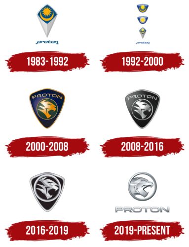
1983 – 1992
The determination embedded in the logo is so energetically rich that it links together all seemingly unrelated elements. However, there is a commonality, as the company aims to unite grateful customers eagerly awaiting its innovative products. At the same time, it remains mindful of its roots, using authenticity as a marketing tool.
The key feature of the Proton emblem is a vertical rhombus, forming an improvised envelope. This geometric figure represents good fortune, balance, the sun, and fertility and signifies the return on efforts and investments. These meanings align well with the company’s concept, engaged in vehicle manufacturing, and aptly describe the brand. This is a commonly used symbol in trademarks.
- The top part of the rhombus contains a blue square turned sideways. It stands on one corner, indicating the development of the automotive enterprise and its aspiration to rise above its current level to ultimately become a market leader in Malaysia.
- Half of the space is occupied by an inverted crescent, symbolizing the country’s official religion, Islam. This reflects the company’s cultural authenticity.
- The other half of the blue background features a 14-pointed star. The points represent the 13 states with the federal government at the helm, showing the company’s respect for its nation.
The color distribution holds significant meaning. For instance, blue hints at the United Kingdom, whose heraldry includes this color, highlighting Malaysia’s friendship with this influential country. In the East, yellow is considered the color of rulers. White represents purity and beginnings. In this context, the gradient white shifts from milky to light gray, creating two distinct zones split evenly: illuminated and shadowed.
The company name is at the bottom, where the rhombus points. It is in a unique font with elongated ends on the first and last letters, giving it an original look and transforming the emblem into a personal mark with stylish typography. All glyphs are lowercase, bold, and italicized, with a rightward slant, adding dynamism to the name. The smooth, rounded corners convey safety and comfort.
1992 – 2000
In addition to the familiar Proton logo in the shape of a rhombus, two other emblems designed in the same style were used during this period. These authentic symbols are presented in two variations.
- The classic crescent and sun are placed in a blue trapezoid. The sun is richly yellow, while the crescent is muted yellow, slightly shaded, as the top part of the image is more illuminated than the bottom. Two bright glares on the right and left sides highlight this. A silver border creates an atmosphere of serene sophistication.
- In the second variation, the blue trapezoid contains a yellow sun with rectangular rays without pointed ends. The straight cuts make it unique and innovative, a priority for the transportation equipment manufacturer. Around the sun is a row of closely packed stars that appear woven into a wreath. This element symbolizes the unity of all company departments, professionalism, and cohesion with customers.
- The third version of the Proton emblem looks exactly like the old one, with a single change. The sun and crescent are colored in a lemon shade of yellow. Additionally, they have bright highlights and an almost identical gray color, evenly distributed across both halves of the rhombus.
The border remains the same in all three versions, neatly encircling the center with key elements. The combination of blue and yellow symbolizes active production development, a friendly attitude toward customers, customer orientation, and positivity. From this perspective, the logo fully aligns with the company’s concept and effectively represents it in the industry, reflecting authenticity.
2000 – 2008
During this period, the era of the modern Proton emblem began – three-dimensional, progressive, with a new image in a classic chevron. The updated symbol truly started to resemble a chevron, typically used on uniforms of organizations or associations aiming to highlight the common interests of their members and emphasize the unity of departments. The emblem shows that everyone in the company is involved in the collective process.
Well-placed highlights, shadows, and reflections transformed the flat emblem into a realistic likeness of a chest badge. It has the shape of a shield with a round center, where the head of a fierce predator is prominently displayed, roaring menacingly at competitors, as the demand for products from the Malaysian automobile plant was beginning to decline. Despite the absence of traditional elements (crescent, sun, and stars), the logo retained its unique character. It maintained its charm while emphasizing the innovative qualities of the vehicles, including:
- Power
- Speed
- Perfection
- Leadership
- Beauty
The animal’s head is drawn in a futuristic style with indistinct strokes and blurred outlines, forming a clear figure with an open mouth and sharp fangs. The yellow element is set against a dark green background, indicating the manufacturer’s commitment to continuous growth and development. The tiger brings lively energy and movement to the Proton logo while also maintaining the brand’s authenticity.
Behind the bordered circle lies a dark blue gradient space with the company’s name. The inscription is placed in the most visible position (at the top of the shield) and is rendered in a thin, 3D-effect font. The letters glow with gold and have a narrow line in the middle, adding depth.
The font is uppercase and sans-serif. The harmonious balance of angles and curves creates a pleasant impression of the cars bearing this logo. Thanks to this symbol, they are perceived as progressive, modern, comfortable, and safe.
2008 – 2016
The logo became monochromatic, predominantly featuring the natural contrast of black and white. Although this combination may seem dull, it maintains a business-like atmosphere in its visual identity, not distracting consumers with colors or intricate details. The focus remains on the central element: a circle with an abstract tiger head, drawn with uneven strokes that create an appropriate image. This holds significant importance for the company’s image because it:
- Hints at the high power of the cars
- Indicates a high level of safety
- Shows impeccable protection of the equipment
- Serves as its talisman and national symbol
- Acts as a powerful branding tool
- Demonstrates the unstoppable strength of the products
- Points to the company’s authenticity
- Confirms the speed of the vehicles
The Malayan tiger is considered a symbol of royal power and appears on the national coat of arms. It is unique, being the smallest subspecies of the tiger family, with an exclusive stripe pattern. The brand aims to highlight this uniqueness, presenting its cars as a national treasure with unmatched distinctiveness.
The Proton emblem has the shape of a chevron with a slightly curved top stripe. The name is placed above the tiger’s head and is written in a squat, sans-serif font. The letters are uppercase with rounded corners. The emblem’s border is silver, matching the thickness of the glyphs. The logo distinctly shows light highlights, adding vibrancy and naturalness to it.
2016 – 2019
Surprisingly, the Proton emblem has rejuvenated while retaining its old shape. This transformation occurred through internal changes rather than external ones. The focus is on the Malayan tiger. Designers enlarged its head, effectively pushing out the text, as the company has become recognizable by its unique predator.
As a result of these modifications, the circle expanded to the inner boundary of the triangle and perfectly fit into the chevron format. The larger head kept its previous outlines, but the ring enclosing it is now much larger than before. The frame also grew, transforming from a thin, shiny line into a three-dimensional silver-coated stripe. The only thing that remained unchanged is the black background, on which the silver elements look fantastic.
This way, the Malaysian automobile manufacturer has highlighted the national treasure – the tiger. The animal, depicted in a futuristic style, effectively underscores the authenticity that aligns with the concept of power, high speed, and reliability of the brand’s vehicles. The chrome frame with a gradient at the top completes the image, emphasizing the importance of the central element.
2019 – today
Designers removed the triangular shield to modernize the Proton logo and opted for a circle. Inside it, the tiger stands as a symbol of powerful and fast cars. The tiger now has a slightly different angle, making it look more realistic. The head is positioned strictly horizontally without the previous diagonal tilt. This indicates the company’s determination, increased ambitions, and readiness to compete for its place in the global market.
With the correct combination of highlighted and shaded areas, the roaring predator appears three-dimensional, reminiscent of a wall relief. In this version, the emblem serves as a worthy decoration for the cars, reflecting the modernity and innovation characteristic of the entire range of the brand’s products. Additionally, the symbol expresses:
- Impressive power
- Impeccable protection
- National character
- Authentic talisman
- High safety
- Unmatched speed
- Attractive advertisement
This means the cars practically promote themselves, not only through their progressive internal features but also through their flawless external appearance with a professional logo. The image of the tiger has not softened but has become more fierce and aggressive, showcasing the drive with which the automotive company is ready to move forward.
Below the circle, the name Proton appears. It is written in a geometric font with bold, sans-serif, uppercase letters. Due to the shadow at the bottom and the light highlight at the top, the glyphs look chrome-plated, which directly hints at the excellent quality, durability, and high performance of the vehicles, even in very poor conditions.
