The Quillbot logo reflects continuous development and indicates the tool’s focus on art and creativity. It skillfully combines technical and artistic elements, balancing high technology and creative processes. The design emphasizes the refinement of artificial intelligence and its ability to perform tasks that require technical precision and a deep understanding of emotional aspects.
This emblem symbolizes the evolution of the tool, which is aimed at solving complex challenges related to texts and creative processes, helping users create meaningful and emotionally rich content.
Quillbot: Brand overview
The QuillBot story began in 2017 when University of Illinois at Urbana-Champaign students Rohan Gupta, Avinash Thirumalai, and David Sikar collaborated to develop a tool that could assist with text paraphrasing through artificial intelligence.
The first version of QuillBot, offering basic text paraphrasing capabilities, was launched in early 2018 as a web application with limited functionality. The creators invested their resources and labor to develop machine learning algorithms that would improve the quality of paraphrasing.
At the end of 2018, the platform received its first external funding, allowing the development team to expand and enhance technology. The team began working on new features to broaden the service’s capabilities, including grammar checkers and multiple paraphrasing modes.
In 2019, a premium version of the tool with advanced features was launched, and a Chrome browser extension was introduced to make the service more accessible.
In 2020, the toolkit was significantly expanded with the addition of text summarization, citation generation, and grammar-checking features. The paraphrasing algorithm was also improved to produce more natural results.
In 2021, Course Hero acquired the platform for an undisclosed amount, opening new paths for growth and feature expansion. That year, enhanced paraphrasing options and advanced text analysis capabilities were introduced.
In 2022, further upgrades were made, including additional text-editing features and a redesigned user interface. Translation quality and paraphrasing were also improved, and support for additional languages was added.
Over the years, the platform has steadily advanced its machine learning and artificial intelligence technology to provide users with enhanced text-editing tools. Serving millions of users, it has helped improve writing across various needs. From a student project to a widely used text tool, the service’s success lies in its continuous adaptation to user demands and technological growth.
Meaning and History
What is Quillbot?
This intelligent writing enhancement platform offers a comprehensive suite of tools, such as paraphrasing, grammar checking, and text summarization, transforming the approach to refining written content. With AI-based suggestions that adapt to various styles and tones, the platform acts as a digital writing assistant, helping users rephrase text, strengthen sentence structure, and improve the overall quality of their writing. The platform’s uniqueness lies in its ability to understand context and nuances, allowing users to experiment with different styles while maintaining clarity, engagement, and authenticity of voice.
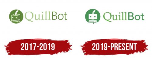
2017 – 2019
The service’s logo presents the image of a bot, evoking associations with a writer’s assistant. The image consists of a circular frame, inside which a robot is detailed with white lines against a green background, creating a relatable and familiar image distinct from impersonal technology. This design emphasizes that the service is people-oriented, not just performing mechanical tasks.
The artistic direction of the assistant bot is expressed through the symbol of a goose quill, which replaces the standard signal light on its head. This choice is directly related to the service’s name, as the quill represents the connection between two eras: the age of manual writing with quills and the modern era of fast typing. This element from a living creature adds a touch of romance to the robotic image, merging the past and present in a single detail.
The choice of a robot for the logo was intentional. The robot symbolizes a tireless mechanism ready for monotonous tasks. It effectively handles text processing, easing the human workload. Its image suggests a reliable tool that follows commands and enhances the process of creating written content.
The service’s name is positioned to the right of the image. It is divided into two parts, each highlighted with its font and shade of green. “Quill” is presented in a light, semi-transparent font with artistic elegance, emphasizing the service’s creative aspect and its connection to the art of writing. “Bot” is in a thinner but confident font, indicating the technical sophistication and logic embedded in the tool’s operation. The shades of green evoke associations with the process of writing and article creation, emphasizing the theme of creativity and technological support.
2019 – today
The QuillBot logo underwent changes that gave it a friendlier and more appealing look, which is crucial for a service with such a large user base. In the new version, the robot is depicted as more “human” as if interacting with each user personally, creating a sense of warmth and a personalized approach. Its figure, painted in white, appears neat and minimalist, symbolizing purity, openness, and the ability to create text “from scratch.” The white color reflects technological freshness and innovation, as the service continuously updates, adding new features and improving its capabilities.
A key element is the green circle that serves as the robot’s background. This green hue has been refreshed, becoming more saturated, and is associated with nature, growth, and creativity. In this context, green enhances the feeling of the service’s ongoing development, supporting associations with something lively and progressive. Additionally, green is often linked with calmness and naturalness, allowing users to feel more confident when using the platform.
An interesting symbol in the logo is the quill positioned on the robot’s head. This quill represents the creative process and connection to the art of writing, highlighting the service’s main function—creating and editing text. The quill on the robot’s head can be interpreted as the idea of blending technology and creativity, which is important for AI-based tools. The robot showcases technological power and creative potential with a quill instead of an antenna.
The word “QuillBot” is rendered in a soft, classic font with slight curves. This font has light, elegant lines, making the text visually pleasing and lending a sense of professionalism to the logo without making it heavy. The slight tilt and smoothness of the letters add dynamism to the emblem, emphasizing that this text-processing tool constantly evolves and adapts to users’ needs.
The name itself combines two important elements. “Quill” refers to the old writing quill used by writers, while “Bot” symbolizes automation and modernity. Together, the name conveys the idea of merging tradition and technology: the system helps users write with modern tools while preserving elements of the creative process.
