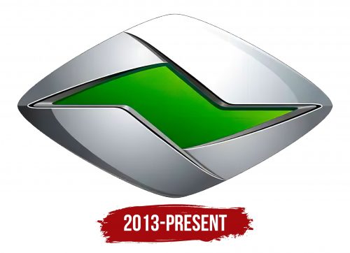
The Ranz logo reflects mystery, innovation, and the energy barely contained by an iron shell with a fiery engine inside. The Chinese electric vehicle manufacturer demonstrates its determination and reliability by offering affordable technology for the middle class.
Ranz: Brand overview
The Ranz brand’s journey began on February 18, 2013, when Tianjin FAW Toyota Motor Co., Ltd., a joint venture between China’s FAW Group and Japan’s Toyota Motor Corporation, brought it to life. Created as a sub-brand of Toyota, Ranz aimed to cater to the Chinese market’s growing appetite for affordable electric and hybrid vehicles, aligning with the nation’s push for eco-friendly transportation.
Development kicked off in 2013, and by 2014, the brand had unveiled its first concept car, the Ranz EV, at the Guangzhou Auto Show. Built on the Toyota Corolla platform, this concept showcased the brand’s design and technological ambitions.
In 2015, the Ranz EV entered mass production. This model, also based on the Corolla, featured a 95-horsepower electric motor and offered a range of approximately 120 kilometers on a single charge.
From 2016 to 2017, the brand focused on expanding its lineup and enhancing its existing models. 2018, the brand introduced an updated Ranz EV version, boasting a longer range and improved performance.
Throughout its existence, the brand concentrated exclusively on the Chinese market. Leveraging Toyota’s technology and platforms, the brand tailored its cars to local preferences, incorporating unique design elements.
Despite its ambitions, the brand struggled to succeed significantly in China’s competitive electric vehicle market. Sales remained modest compared to other brands, preventing the brand from becoming a major industry player.
Meaning and History
What is Ranz?
It is a Chinese car brand known for producing electric vehicles. It is a sub-brand of FAW Toyota, a joint venture between FAW Group and Toyota. The company focuses on developing eco-friendly and efficient electric car designs. The brand emphasizes innovation, environmental sustainability, and advanced technology in its vehicle lineup.
2013 – today
The main feature of the Ranz logo is an improvised modern headlight, highlighting four factors:
- The ability to stand out effectively in the market;
- Production of electric passenger cars;
- Promotion of electric vehicles among low-income buyers;
- Maintaining the overall visual style of all products in the line.
The emblem handles these tasks well, ensuring a constant influx of customers with its appeal. It communicates that the brand represents innovative cars distinct from older models. This is evident in the rhombus with a mysterious glow inside, as if it contains a new universe with its laws of physics.
The uniqueness of the product is reflected in the green gradient: the smooth transition of shades creates an attractive image that captivates with its originality. Customers are also drawn to the price of this product: its affordability is indicated by the minimalism of the emblem. Nothing extra is in it – just a horizontal rhombus with a mysterious shimmer inside.
The improvised headlight is painted silver, forming a chrome-like shell. Here, a gradient is used: it extends from a dark shadow (bottom left) to a bright shine (top right). This signifies the variety of car models and the different conditions offered to customers when purchasing branded products.


