


![]() Realty One Logo PNG
Realty One Logo PNG
The Realty One logo is a sign of confidence and experience in real estate. It embodies reliability and professionalism, helping the company close deals and helping people find a home where they want to live.
Coody Boudreau founded Realty ONE Group in Las Vegas, Nevada, in 2005, during a period of growth in the U.S. real estate market. From the start, the company stood out with its innovative flat-fee commission structure, offering agents a refreshing alternative to traditional brokerages. Even when the market faced challenging times, Realty ONE Group expanded steadily, attracting agents who appreciated its unique culture, known internally as “COOLTURE.” Growth accelerated when the company ventured beyond Nevada, establishing offices in neighboring states like Arizona and California. Soon after, it launched a successful franchising program, significantly boosting national expansion. To better support agents, the company introduced zONE, an advanced digital platform that provides essential tools and resources. Eventually, Realty ONE Group made its first international moves, signing franchise agreements outside the United States and quickly expanding into Canada and Europe. The company’s commitment to technology remained strong, consistently upgrading platforms to include virtual property tours and online transactions. Realty ONE Group has continued investing in agent training and professional growth programs throughout its journey. By early 2024, the company maintained its momentum, strengthening its domestic and international presence while continually enhancing its technology offerings.
Meaning and History
![]()
What is Realty One?
It is a real estate company that offers agents flexible work arrangements and support at every stage. Professionals have access to modern tools, marketing materials, and training programs to help them successfully engage with customers. The organization purchases, sells, and rents residential and commercial real estate. Its offices are located in the United States and around the world.
2005 – today
![]()
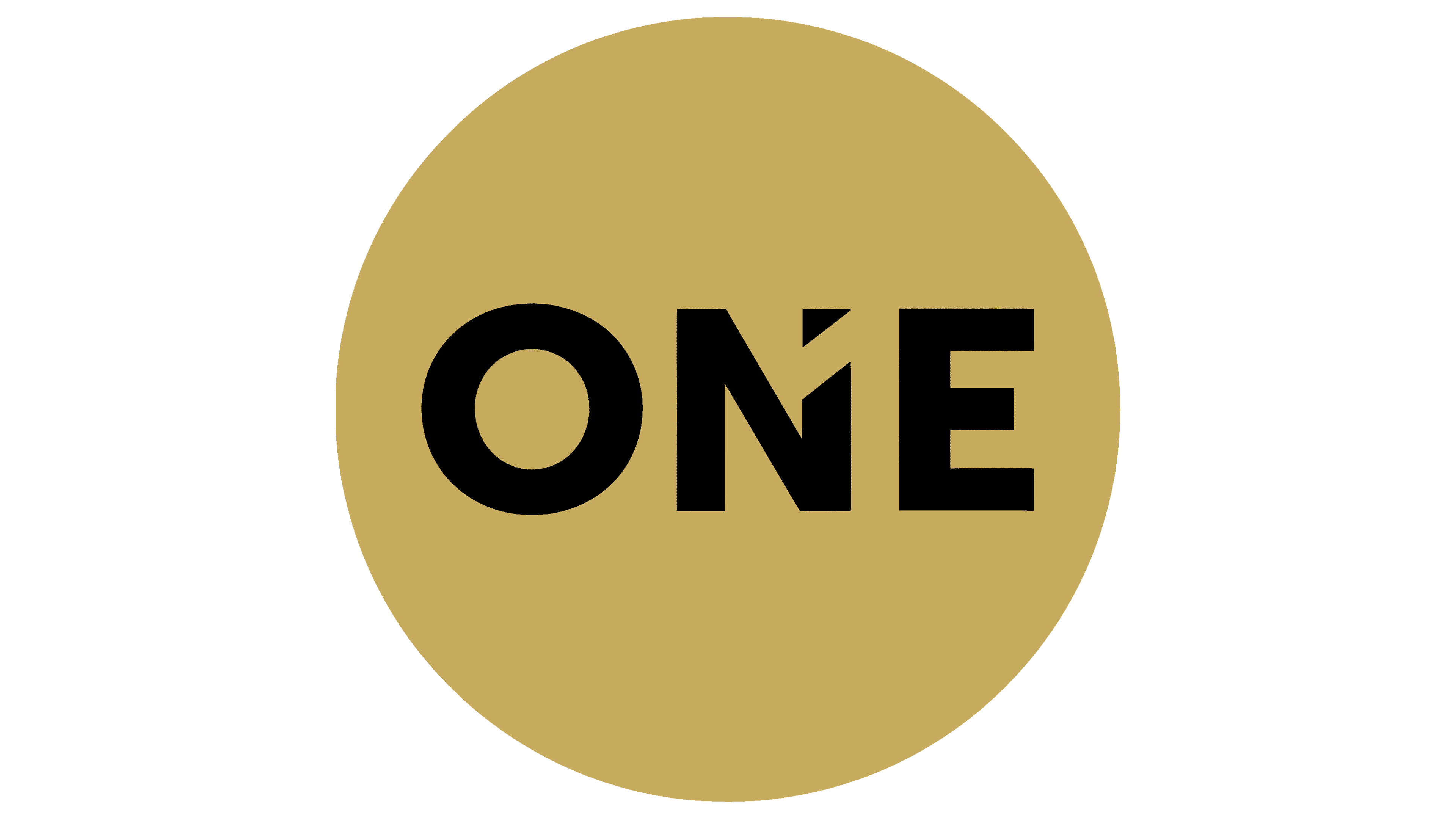
The Realty ONE Group logo is calm and confident: the company deals in real estate and prefers simple solutions. The name consists of three words arranged horizontally. The Realty and Group are written in thin, neat black letters, while the word ONE stands out in gold between them. This word sets the tone and defines the character of the entire composition.
The logo’s font is clean, modern, and sans-serif. It feels light and airy, but in the center, the word’ ONE’ is heavier, denser, and highlighted in bold lettering. An interesting detail is the letter “N,” which appears to be cut diagonally, creating a sense of movement and dynamism resembling an upward-pointing arrow. This suggests growth and development.
Beneath the company name is a gold-colored line drawn with an uneven stroke reminiscent of a brush mark. The line emphasizes the logo, making it appear lively and informal. It adds a sense of ease and simultaneously signals Realty ONE Group’s unconventional approach to the real estate market.
The logo’s colors convey calmness and confidence through black, premium quality through gold, and exceptional service. Realty ONE Group emphasizes quality services and reliable client relationships, making this visual representation suitable: minimalism, modernity, and a touch of creativity make the image cohesive and memorable.
![]() Realti One logo
Realti One logo