


 Spirit Halloween Logo PNG
The Spirit Halloween logo represents one of the world’s most beloved holidays and a creative approach to costume selection. Despite the spooky theme, the emblem does not create an oppressive impression because it is bright and shiny.
Spirit Halloween was founded in 1983 by businessman Joseph Marver in New Jersey. The first store opened in a shopping center and sold costumes, masks, makeup, decorations, and seasonal accessories. Marver used a temporary retail model, with stores operating mainly from late August to early November, when demand for costumes and themed goods was concentrated.
Through the 1980s, the company opened seasonal locations in New Jersey and nearby states. The format helped reduce rent and staffing costs during the rest of the year. In the 1990s, the chain expanded into other U.S. states, often renting empty spaces in malls and city retail corridors. This gave the business access to high-traffic areas without year-round leases.
In 1999, Spencer Gifts, LLC acquired the company, bringing retail experience and resources for faster expansion. By 2003, the chain had more than 200 stores. In 2006, it launched an online store, extending sales beyond physical locations and offering a wider product range. In 2010, the company opened its 1,000th location, and in 2011 it entered Canada with stores in several provinces.
In 2013, Spirit of Children began supporting children’s hospitals and rehabilitation centers through store donations and events. In 2015, the assortment expanded with licensed costumes and accessories based on films, TV series, and video games. From 2018 to 2024, the company introduced interactive displays, virtual fitting rooms, more than 1,400 North American locations, stronger e-commerce and delivery, costume recycling, lower-impact materials, and augmented-reality try-on tools.
Meaning and History
What is Spirit Halloween?
It is a chain of seasonal retail stores in the United States and Canada that sells Halloween costumes, decorations, props, and accessories. The stores typically open in late summer and operate throughout Halloween, occupying temporary locations in vacant retail spaces. The brand offers various merchandise for all ages, including costumes for children, adults, and pets, themed decorations, and party supplies. The company is known for its extensive assortment, creative displays, and exciting shopping experience. It provides customers with everything they need to celebrate Halloween in style.
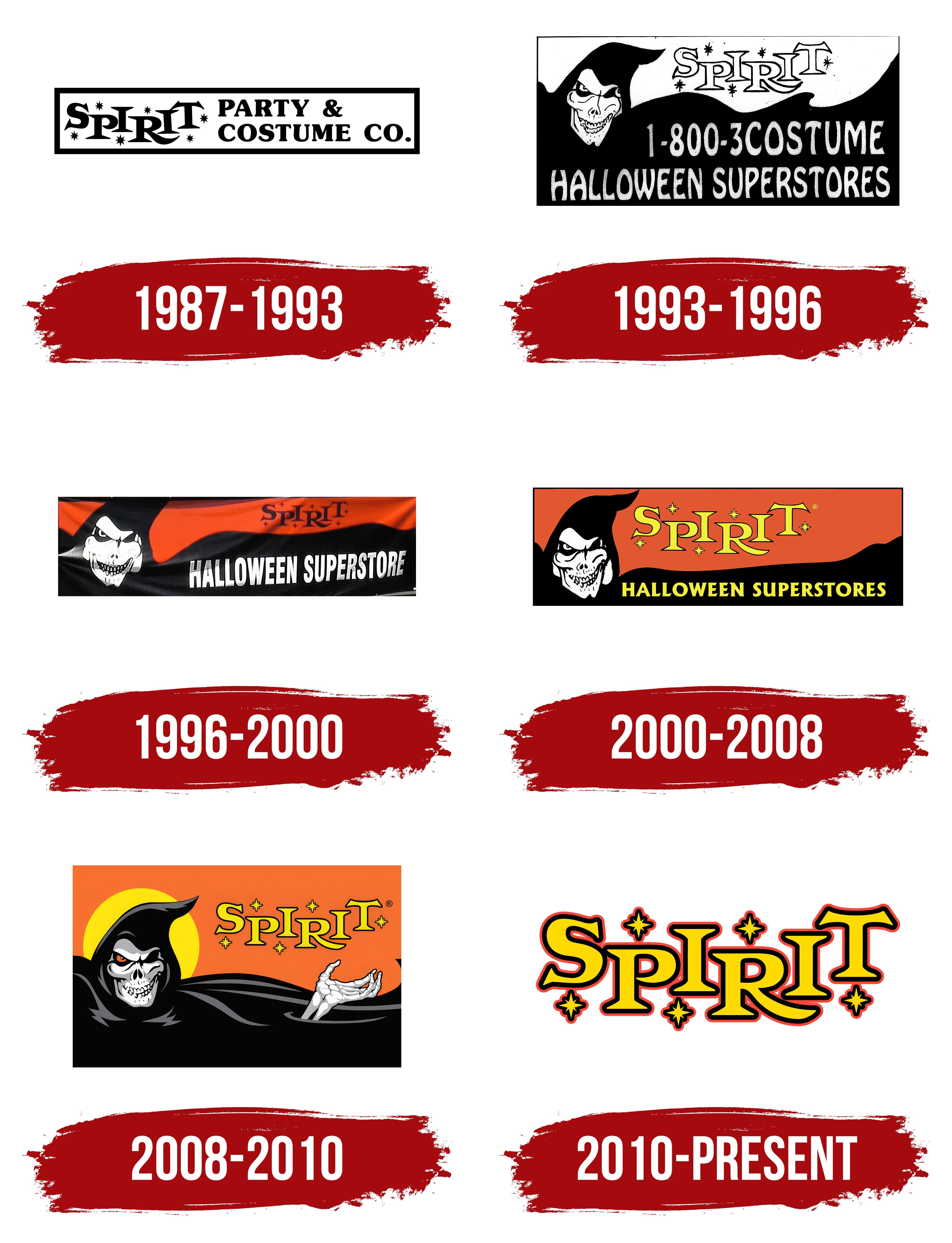
1987 – 1993
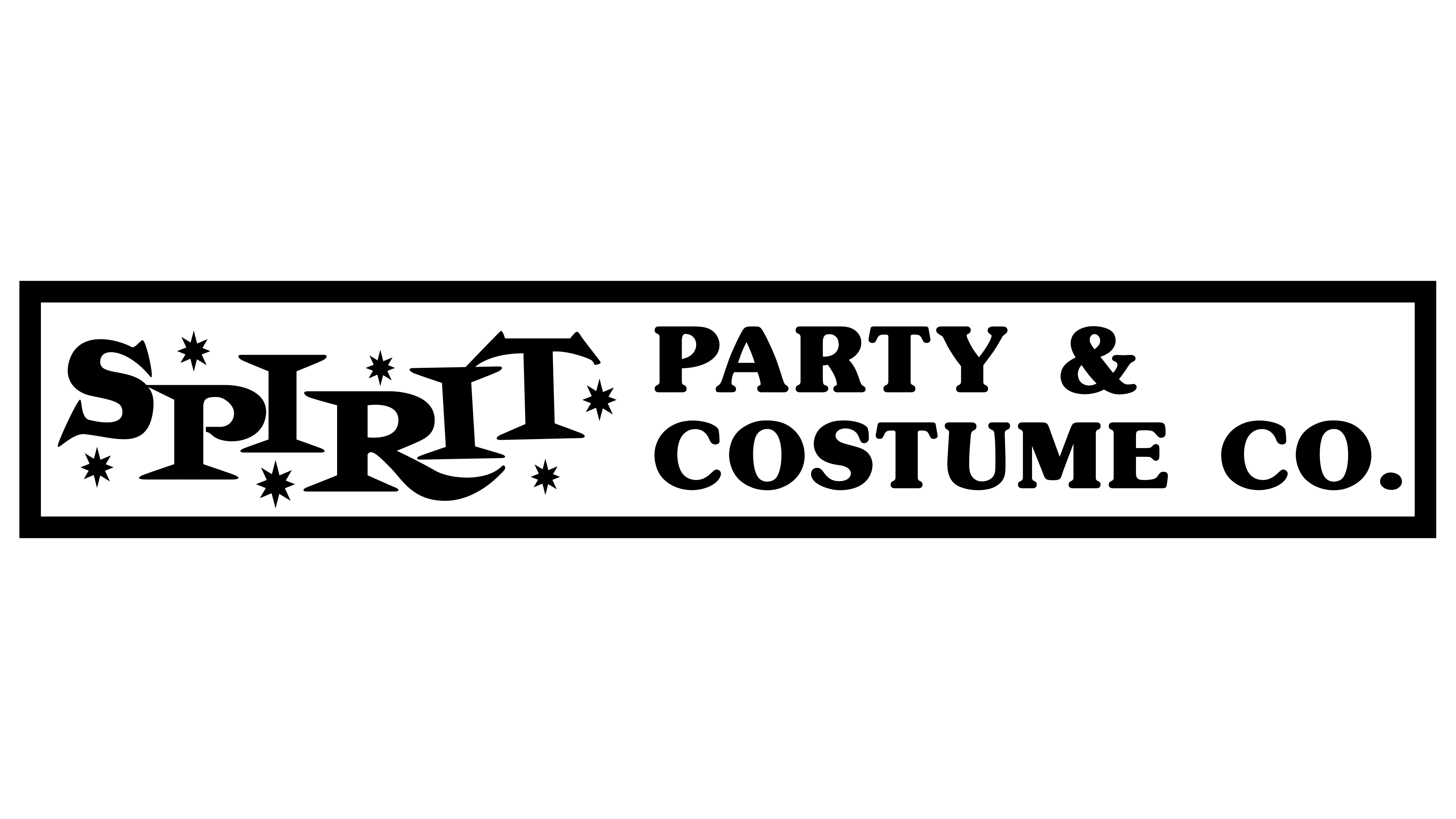
Humor comes in many forms, including dark humor, which is why Halloween is so popular worldwide. An American party organization company has capitalized on this by choosing an emblem in a fitting style. The logo resembles a classic badge, typically used to mark products or serve as an informational plaque.
The base of the Spirit Halloween logo is a horizontal rectangle. It’s long enough to accommodate the company name and additional information so potential customers immediately understand what the company offers. The logo serves three functions:
- Informational (introducing the brand, its products, and services)
- Promotional (advertising the costume manufacturer)
- Marketing (labeling products with a common tag)
The rectangle’s frame is thin, even, and black, matching the color of the text inside. This color perfectly fits the horror theme, being classic for spooky costumes and other Halloween accessories. Even the stars, which appear as if from fireworks, are drawn in black. They adorn the right half of the geometric figure, surrounding the name written in an elegant font with spiky serifs.
The letters are large, bold, and capitalized, enhancing the festive atmosphere. Although they are in a single line, they are scattered chaotically, creating a playful mood. This suggests that the products are meant for fun and friendly pranks.
The right side of the rectangle features a two-tier inscription that promotes the company “Party&Costume Co.” This part is in a different font, smaller in size, but with wide letters that appear compressed from the top and bottom. The spacing between characters is larger, and the serifs are smaller. The glyphs have a balanced mix of rounded lines and straight angles, making the text look orderly and well-balanced.
1993 – 1996
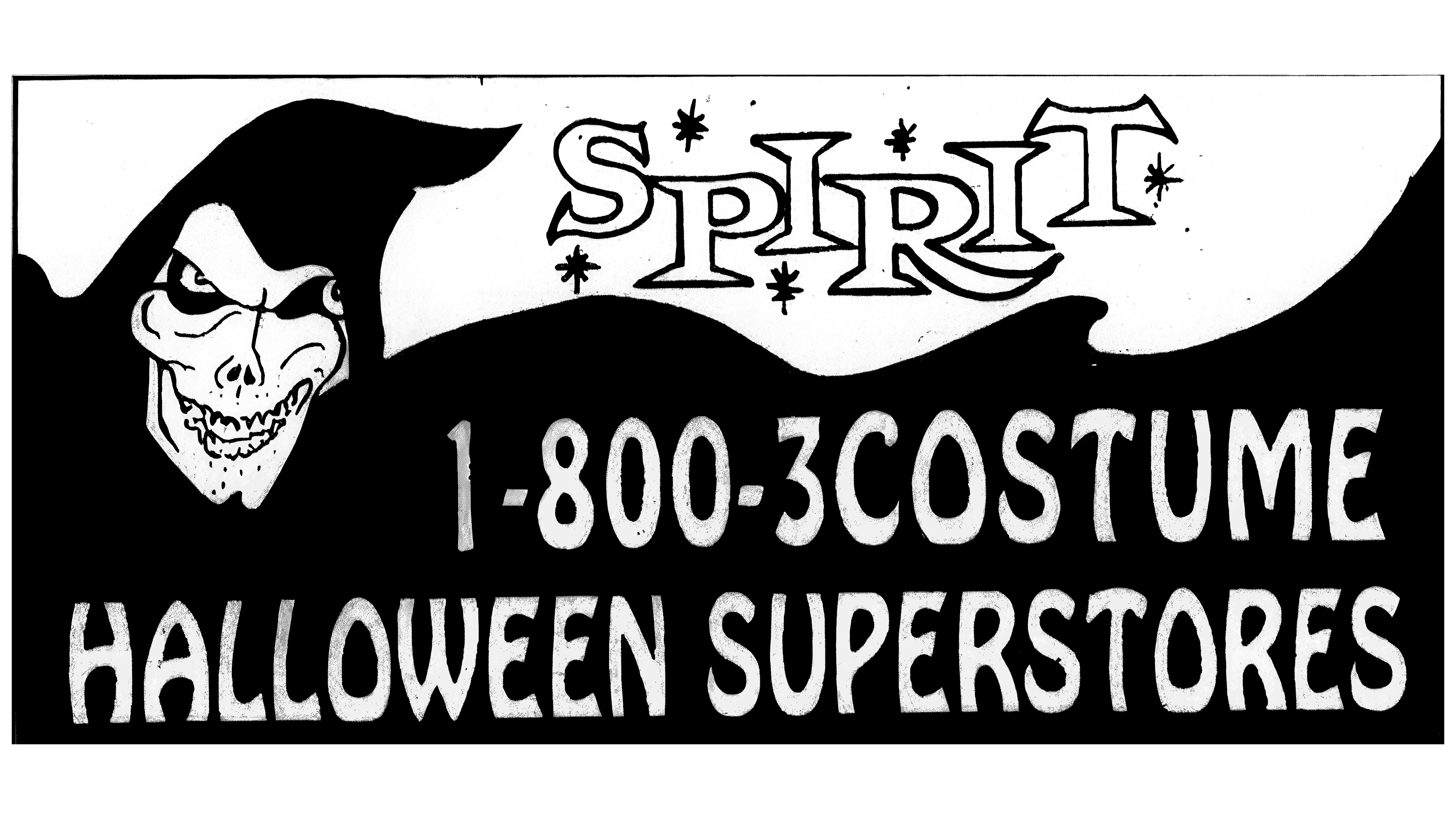
The transformations gave the Spirit Halloween logo a radically different look: thus began the era of the white skull in a black billowing cloak. Notably, it is not a complete skull, as it resembles a face due to its:
- expressive features;
- eyes in black sockets;
- protruding cheekbones;
- smiling lips.
The creature grins cunningly, looking straight ahead and inviting others to join in. The emblem hints at pranks and joy. The mask against the black background encourages fun rather than sorrow, which is why the skull has an inviting smile. It winks, setting a playful tone and inviting people to buy matching holiday accessories.
The skull stands out clearly against the dark background, which takes the shape of a large cloak billowing in the wind. Such attire is typical of the Grim Reaper, but in this case, the cloak does not allude to death; it represents a ghost costume. On the right side, information on where it can be purchased is provided: “Halloween Superstores.” The text is rendered in a bold, shaky font that suits the theme.
The company name is prominently positioned at the top, strikingly set against a white background. It is written in an outlined uppercase font. The letters are still irregular in height and placement. The only change made by the designers is to the letter “T”: its horizontal stroke now resembles the spread wings of a bat. Small black stars flicker around the letters.
1996 – 2000
This Spirit Halloween logo has more energy than the previous one, even though they are identical in shape and content. The increased dynamism was achieved through several innovations that transformed an ordinary static sign into an expressive, dynamic symbol. The designers achieved this effect by:
- Adding color;
- Using deep shadows;
- Properly distributing highlights;
- Making the black color less saturated;
- Making the right eye appear to wink;
- Creating a draping effect;
- Lightening the stripes on the skull;
- Increasing the contrast of the text.
The top of the hood is not included in the logo; it is slightly cropped to focus entirely on the white ghost face. The logo now has less malice and more mischief. The sarcastic smile is emphasized by high cheekbones, which benefits the company that produces Halloween products, as their merchandise is intended for fun and pranks.
The text on the black cloak on the right has taken on a new shape: a long uppercase font was chosen. Due to the high density of extra-bold glyphs, the intra-letter spaces are small, but the white words still stand out clearly against the dark background. They are expressive, smooth, and even.
This time, the emblem primarily uses a red-and-black palette, breaking the monochrome and adding a touch of drama. The multicolored image works like a magnet because it features specific symbolism enhanced by a bloody background. This adds a note of professionalism to the horror theme and helps draw attention to the word “Spirit.”
2000 – 2008
The sign now features even more color: red and yellow have been added to the black-and-white. They balance each other well because, from a psychological perspective:
- Yellow and red maintain high emotional tension and signify the exploration of new areas, expressing joy, warmth, and radiance.
- Black and yellow signify disruption and willful decisions, as well as spontaneity and the desire to attract attention.
- White and yellow represent the opposite: a striving for spiritual enlightenment, calmness, clarity, and peace.
- Red and black emphasize an excessive dramatization of reality and the exaggeration of emotions.
This means the Spirit Halloween logo precisely reflects the concept of a manufacturer and distributor of fun products for creating “horrors.” It keeps you on edge while highlighting the hyperbolic nature of its products. This is suggested by the skull’s intensified grin, which seems to challenge customers: Will you dare to buy?
The font in the top inscription has completely retained its festive style with jumping glyphs arranged at different heights and bright, sparkling stars, the number of which has decreased from six to five. They are harmoniously distributed among the yellow letters with black outlines, making them look appropriate. The lower line is set in a roughly similar font style with miniature sharp serifs. The only difference is that the letters lack outlines and are aligned in a straight row at the same height.
2008 – 2010
The Spirit Halloween emblem has gained a lot of depth, turning it into a realistic sign. Several new elements add liveliness and dynamism, with the hood being the most prominent. It is depicted fully and covers the skull’s forehead, stopping short of the empty eye socket on the right, which now looks like an occluder, an eye patch. The other eye is painted red, signifying heightened irritation and aggression. However, the cute smile softens the unfriendly impression, inviting people to have fun. The skull’s upper jaw is convex, giving the impression of a real smile.
The logo has been diversified by adding a full moon behind the ghost in black robes. It is depicted as a semi-circle of a rich golden hue, symbolizing generosity, abundance, wealth, strength, and justice. This makes it a perfect complement to Halloween, as the traditional “Trick or Treat” implies a variety of goodies that one can buy to appease persistent evil spirits. It means spending a lot of money on sweets.
Another significant addition to the emblem is a skeletal hand peeking out from the cloak. As befits a skeleton, it is painted white, contrasting perfectly with the black. The cloak has wavy, silvery stripes and moonlit highlights. The ghost’s gesture is inviting, beckoning customers to buy appropriate products from Spirit Halloween.
The wordmark is also present, set against an orange background, which is most fitting for the “spooky” autumn holiday. The orange-and-black palette is the most traditional for Halloween, as it is the color of jack-o’-lanterns glowing in the night. The yellow letters are perceived as the flame of candles peeking through the pumpkin’s cuts. The bright, pointed stars hint at this as well.
The name is written in a proprietary font with pointed letters. The glyphs look like spikes sticking out in different directions, enhancing the sense of fright. The bold capital letters are still jumping, making the emblem relaxed, fun, and friendly despite the theme of awakening evil. The bold, distinctive typeface conveys the company’s professionalism, demonstrating its confidence and stability.
2010 – today
Minimalist style in branding has not bypassed the Spirit Halloween logo; it has lost all the fancy elements that made it memorable. Only one detail remains – the wordmark in the signature design. Its distinctive feature is a unique font characterized by:
- Blockiness and solidity;
- Festivity and joy;
- Brightness and contrast.
The solidity is expressed through large letters positioned at different levels, which create a relaxed atmosphere. This makes them appear to bounce, conveying a sense of childlike excitement because Halloween is eagerly anticipated by children who go house to house in groups to get candy.
The festive mood is conveyed through the decorative shapes of the glyphs and the surrounding stars, evoking fireworks or confetti. The large and expressive letters have an original look: they are not standard print characters but drawn elements, each with its own personality. Some are soft due to rounding (“S,” “P,” “R”), others are intimidating (“T” resembles bat wings), and some are neutral (“I”).
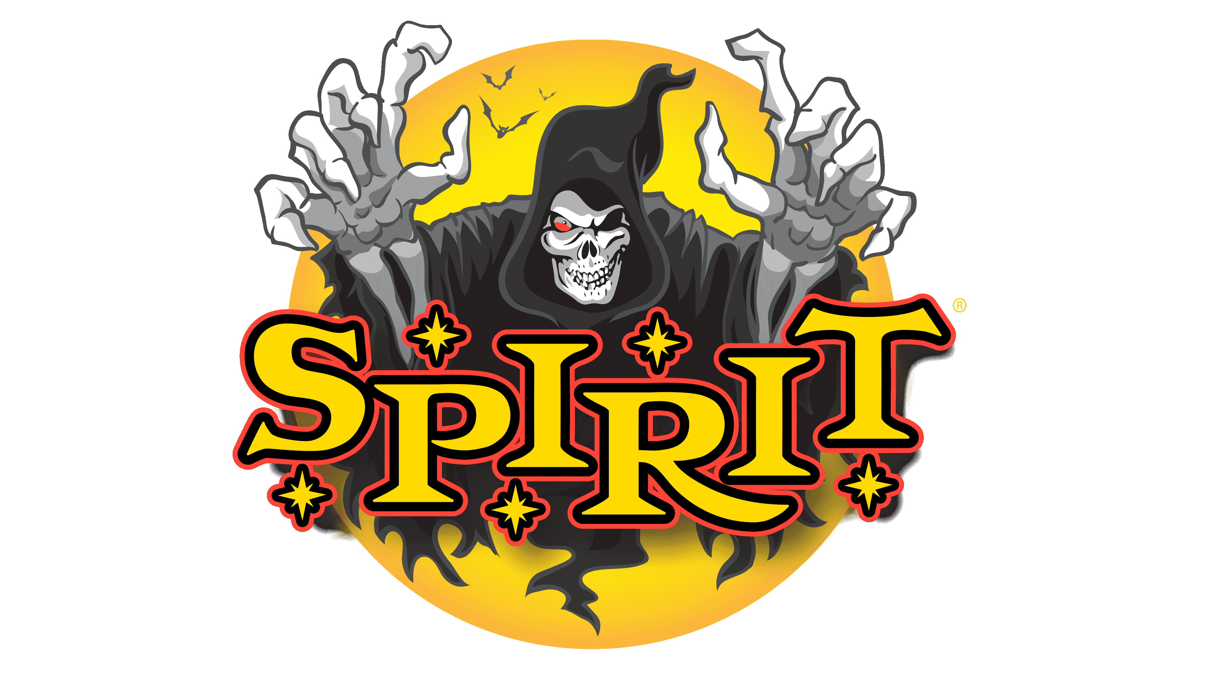
Brightness is evident in the palette, which includes gold, red, and black. The largest area is given to yellow, the color of autumn, stars, the moon, and night lanterns. The entire inscription is painted in this color. The other colors harmoniously emphasize its exclusivity: they frame all the elements with neat, thin lines, highlighting the texture. The rich colors create high contrast, conveying peak joy and making the name easily distinguishable across all display types.
The glyphs and stars touch due to the double outline and small spacing between characters. At the same time, they do not merge, preserving the name’s optimal readability. The high color contrast also contributes to the text’s clarity, even with small intra-letter spacing. Such a logo is significant for a brand that produces and sells Halloween paraphernalia because it attracts rather than repels customers thanks to its festive design.