![]() Carl Zeiss Logo PNG
Carl Zeiss Logo PNG
The Zeiss logo is a powerful marketing tool. It is simple and minimalist yet very meaningful, thanks to the well-chosen font that perfectly reflects the European leader in optics manufacturing concept.
Carl Zeiss opened an optical workshop in Jena on November 17, 1846. He obtained a license to produce and sell precision instruments for students of the University of Jena. In 1847, the first microscope was manufactured. By 1852, ten people were working in the workshop. In 1866, physicist Ernst Abbe joined the company. He introduced scientific principles into optical design. Later, chemist Friedrich Otto Schott developed new types of glass, which became a technological breakthrough.
In 1890, production of photographic lenses began. In 1896, the Zeiss Foundation (Zeiss-Stiftung) was chartered, establishing a model of socially responsible management. In 1925, Carl Zeiss merged with ICA, Contessa-Nettel, and Ernemann, creating the Zeiss Ikon group, which began producing cameras.
After World War II, the company was divided. Carl Zeiss operated in Oberkochen, while VEB Carl Zeiss Jena was located in East Germany. Both organizations continued producing optical instruments for science, medicine, and industry. They competed in the global market.
In the 1950s, production of surgical microscopes and ophthalmic systems began. In 1969, the first electronic microlithography system for the microelectronics industry was introduced.
In the 1990s, after German reunification, the western and eastern Carl Zeiss companies were reunited. The company opened branches worldwide and developed industrial metrology. Modern hardware and software systems for scientific research were created.
In the early 2000s, digital ophthalmology instruments appeared, along with new lines of photographic lenses, binoculars, and cinema optics. In 2013, Zeiss introduced 3D coordinate measuring machines. From 2015 to 2017, the company implemented major scientific and medical projects.
In the 2020s, Carl Zeiss achieved major advances in EUV lithography technology and the development of optical systems for microelectronics and medicine.
From 2022 to 2025, the company expanded its technology portfolio, strengthened its international presence, and continued integrating digital solutions into scientific and industrial fields.
Meaning and History
![]()
What is Zeiss?
A German industrial group that holds leading positions in the optics and optoelectronics manufacturing sectors. Starting as a precision mechanics workshop in Jena, it developed four main areas: medical technology, measuring systems, microscopy, and consumer optics. The company produces surgical and diagnostic equipment, scientific instruments, and microscopes. Under its brands, lenses are created for Hasselblad, Rollei, and Contax, and its optics are used in products by Sony, Nikon, Cosina, Nokia, and Samsung. Its developments are applied in aerospace, defense, and microelectronics.
1868 – 1896
![]()
This logo stands out for its simplicity, as it contains only one element, the company’s name at the time, C Zeiss Jena. It is set in a standard typographic font resembling Times New Roman, the type often used by default in printed documents today. This is a very practical serif typeface: it quickly catches the eye, ensures text clarity, maintains a formal style, and fits its era, as the brand appeared in the second half of the 19th century.
The inscription is laid out in a single line and features wide word spacing. The company adopted this approach to convey its closeness to customers, indicating that it understands their problems and can solve them professionally while adhering to all established standards. Essentially, it reflects a customer-focused approach and represents a savvy marketing move.
Neat serifs of two types complement the thin letters: sharp-tipped (on “C,” “Z”) and blunt, flat-ended (on “i,” “s,” “J,” “n”). The letter spacing is also wide, making the text clear and easy to read despite the thin strokes.
The first character is the solitary glyph “C,” a shortened version of the company’s founder’s name, Carl.” This is followed by his last name, “Zeiss.” The line ends with the name of the city, Jena, from where the German optical production originated and operated for most of its history. The text’s content is straightforward, reflecting the brand’s seriousness and practical nature. Thus, the visual identity of that time fully corresponds to its era.
1896 – 1906
![]()
Almost everything in the visual identity changed during this period, from the font to the style. The complete transformation of the Zeiss emblem is closely tied to the company’s growing popularity and exceptional product quality. Eyeglass lenses began to be marked with an inscription resembling flowing, ornate handwriting, adding even more individuality to the emblem.
The logo features numerous curls, loops, swirls, and wavy lines, creating a large monogram with a long inscription that forms a beautiful pattern. But this is not the only difference. Many other nuances make it completely different from the previous version of the visual identity. The key differences include:
- The use of the full name and surname of the company’s founder (Carl Zeiss);
- The appearance of a second line (the abbreviation D.R.P. for Deutsche Reichs Patent);
- Highlight the commas of the cities where the production is located (Carl Zeiss, Jena).
In this way, the brand expanded the text, providing more information about itself to build customer loyalty and trust. The design works perfectly, with smooth lines and soft curves, and is perceived positively. However, this description applies only to the top row: the inscription below is more serious. The font used there is geometric, business-like, and technical. The letters feature straight serifs, enhancing a sense of strictness.
The contrast between the first and second lines doesn’t diminish the logo; rather, it adds dynamism, as the two parts of the text are radically different. One is executed elegantly and romantically, while the other is grounded and strictly business-like. Despite the difference, they share one common characteristic: italics. In both cases, the inscriptions are slanted to the right, confirming the company’s drive for active growth.
1906 – 1972
![]()
The German company chose a new logo to communicate its direct connection to lens production. The key element is a complex geometric shape whose outline resembles an eyeglass lens. This is visible because the surface is concave on one side and convex on the other. The emblem appears as a rectangle slightly curved at the top and bottom.
The geometric shape is distinctly divided into two unequal halves, matching the number of lines.
- The upper section appears inflated and occupies more space. It contains the name and surname of the company’s founder, Carl Zeiss. The unique feature of this inscription is its uneven height, with shorter letters on the sides and taller ones in the middle. This creates a bulging effect, aligning with the lens manufacturer’s concept and profession. The words are placed close together, almost merging into a single word.
- The lower part of the logo is concave; even the dividing line bends slightly, forming a narrow background that also makes the glyphs here uneven in height. However, in this case, the taller letters are on the sides (right and left), while the shorter symbols are grouped in the center. This line displays the company’s hometown.
In this way, the text in the Zeiss emblem is now divided, with the founder’s and the city’s names listed separately. This positively affected branding, providing people with clear information and reflecting the company’s competence and customer focus. The downward-curved plate, divided by a horizontal line, provided a good base, perfectly conveying the shape of real eyeglass lenses that are slightly curved for improved visibility.
The inscriptions use a rounded, smooth, even, and simple font. The capital letters lack serifs and vary in height. At the same time, they share common characteristics: straight strokes, narrow lines, and soft curves. The softness of the glyphs fosters a connection to the brand, evoking the product’s ease of adaptation for personal comfort.
1972 – 1991
![]()
The thin outlines, lightness, and simplicity of Zeiss’s visual identity are now a thing of the past. The logo now appears heavy and powerful, emphasizing the company’s stability in the professional market, competitiveness, and ability to withstand any production demands. There is nothing in the logo but the name. It expresses the brand’s confidence in its capabilities.
The inscription occupies the entire space of the emblem. It is laid horizontally and consists of ultra-bold, monolithic, massive, and huge block letters. The glyphs are so large that the serifs are almost unnoticeable, as they are small and not very expressive. The serifs don’t have sharp ends; they are smooth, miniature projections that add a classical touch to the text.
The name has an interesting feature that hasn’t been seen before. In this version of the visual identity, the designers emphasized the similarity between the “Z” and “S.” They highlighted these traits and turned them into a unique emblem feature. The letters appear to be mirror images of each other. This graphic technique made the logo more attractive and added harmony, as paired or similar elements tend to draw more attention.
The color scheme is very simple: the company stayed within the monochrome range it has been accustomed to since the brand’s inception. Black glyphs on a white background are the best modern graphics could offer. This combination supports excellent readability and demonstrates the manufacturer’s professionalism, attention to detail, and full commitment to their work, creating a positive image among consumers.
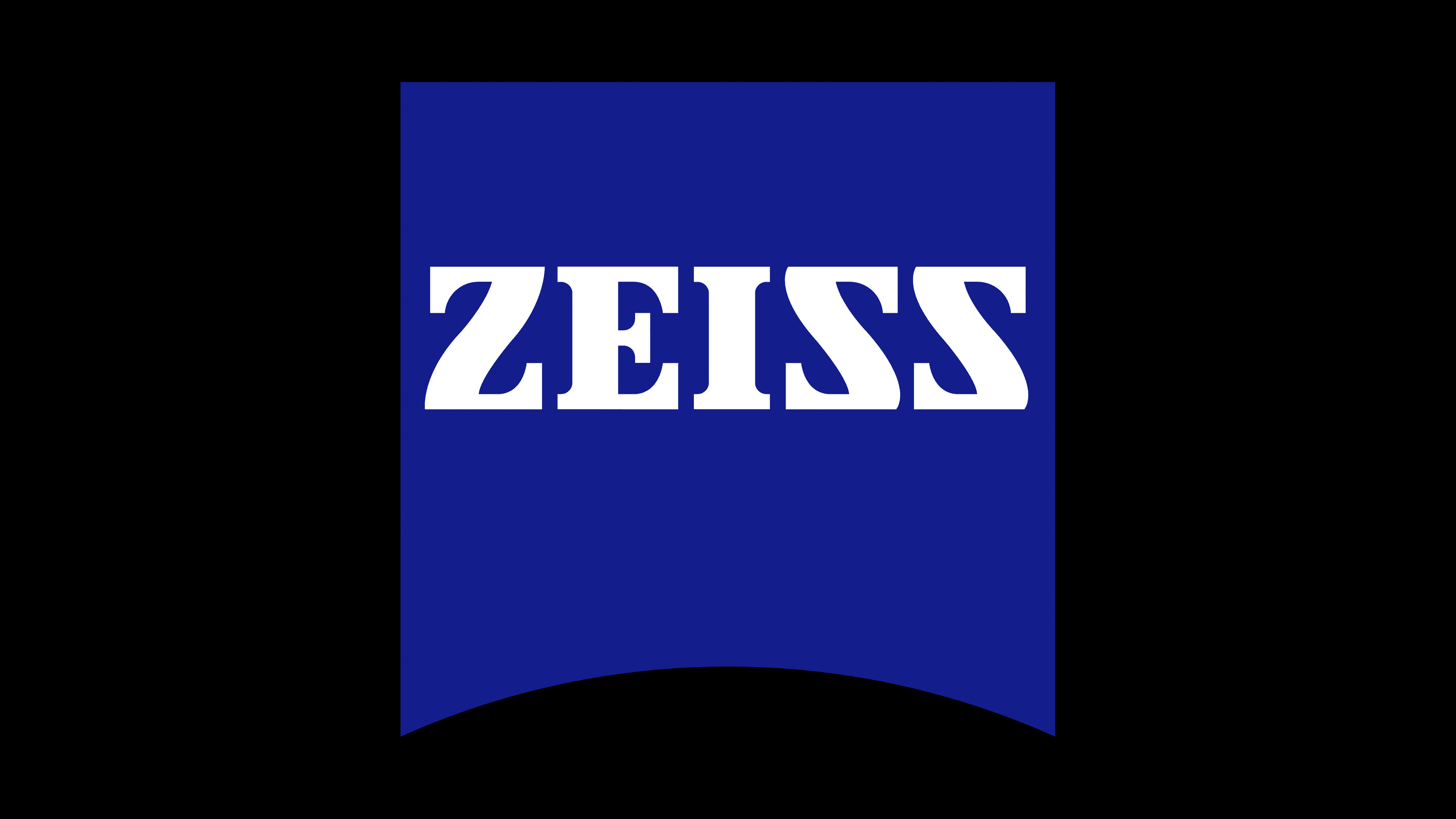
1991 – today
![]()
Its minimalism and depth of meaning characterize the Zeiss logo. It is known for being attractive, eye-catching, and easy to remember, as its fans are precision enthusiasts, a group the brand needs to satisfy. As a result, the visual identity that appeals to them must be bright and distinct. That is why the emblem is recognizable worldwide. It is concise yet bold, modern yet traditional. It retains the classic Clarendon Black font while adding modern elements.
The wordmark features uppercase letters with smooth lines, gentle curves, and short serifs. Particular attention is drawn to two glyphs that appear to be mirror images of each other. This refers to the “Z” and “S,” whose similarity the designers skillfully emphasized, making it a hallmark of the Zeiss logo.
At the same time, an intriguing new addition appeared: a blue, concave square at the bottom. It serves as the name’s base and successfully represents the company’s concept, as the arch resembles a lens, hinting at the manufacturer’s focus on optical systems. The bold font looks impressive against this background, symbolizing clarity and a commitment to absolute precision. The symmetrical letters, straight lines, and perfectly sharp corners suggest this dedication.
What also makes the emblem unique is its color palette, featuring an ultramarine shade. It’s well known that this hue represents stability, freshness, reliability, and progress, while white symbolizes honesty, loyalty, and unity. Together, they create an amazing sense of responsiveness that is pleasing to the eye and appealing to customers.