 Regions Bank Logo PNG
Financial services in the southern U.S. states include card payments, account management, loans, and small business support. For many people and companies, a regional bank handles these tasks while accounting for local conditions. The Regions Bank logo represents a financial institution that provides banking services to individual customers, students, farmers, and entrepreneurs.
Regions Bank dates back to the 19th century. In 1856, one of Alabama’s first banks opened. In 1970, three Alabama banks merged to create First Alabama Bancshares. The company began expanding statewide.
Growth continued during the 1980s. In 1994, the organization changed its name to Regions Financial Corporation. This reflected expansion beyond Alabama. In 1998, the bank acquired First Commercial Corporation from Arkansas. In 2001, the company bought the investment firm, Morgan Keegan.
A major milestone came in 2004 with the merger with Union Planters Corporation. After that, the bank’s assets exceeded $ 80 billion. In 2006, Regions acquired AmSouth Bancorporation for $ 10 billion. The network expanded to 16 states, and assets reached about 140 billion.
The 2008 financial crisis forced the bank to receive 3.5 billion dollars in government support. By 2012, it had repaid the funds in full. During the same period, the bank sold Morgan Keegan and focused on retail and commercial services.
In the 2010s, the bank invested in digitalization. It developed online banking and mobile services and optimized its branch network. In 2021, Regions announced a major technology investment program and introduced new digital tools for clients.
In 2022, Regions opened a technology center in Birmingham. It was focused on developing banking platforms. In 2023, the bank improved its financial performance amid rising Federal Reserve rates and carried out internal reorganizations.
The bank remains one of the largest regional banks in the United States. Its assets total about $ 150 billion. It serves millions of clients and combines traditional banking services with modern digital solutions.
Meaning and History
What is Regions Bank?
It is one of the largest regional banks in the United States, headquartered in Birmingham, Alabama. Its network includes about 1,500 branches across 15 states. Through its subsidiaries, it offers deposit, mortgage, investment, and insurance services. The bank manages more than $ 140 billion in assets, placing it among the 20 largest banks in the country.
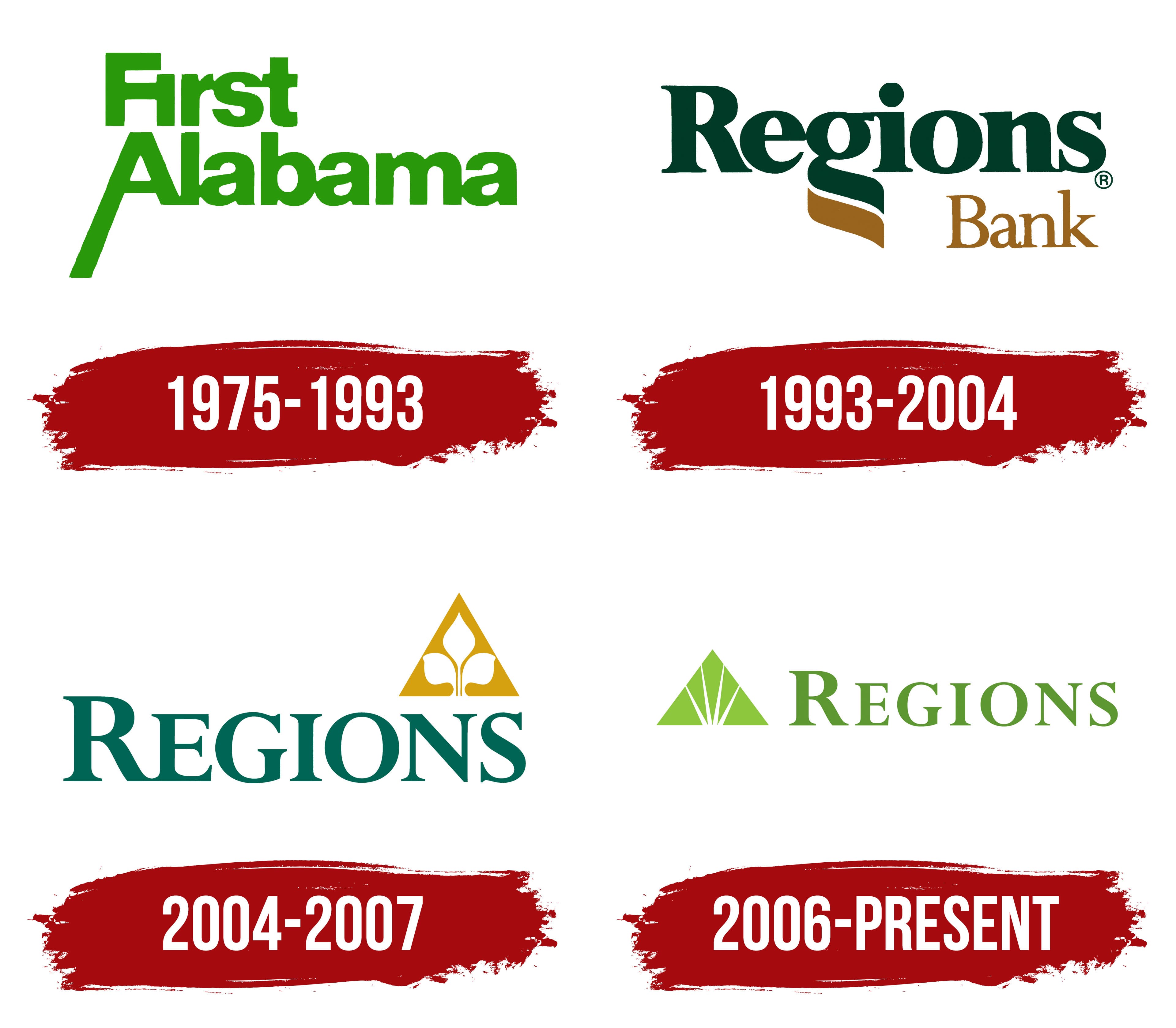
1975 – 1993

The name First Alabama identified the state where the banking group operated. It conveyed its ambition to lead the local market. Three institutions came together under the shared brand, and their histories later became part of Regions Bank’s history. First National Bank of Huntsville opened first, in 1856. First National Bank of Montgomery followed in 1871, and Exchange Security Bank of Birmingham began operating in 1928.
On July 13, 1971, the banks established First Alabama Bancshares, Alabama’s first bank holding company. Initially, the participants retained their previous names and separate management. The parent organization coordinated their activities and represented the group under a shared name.
The First Alabama logo was introduced on February 2, 1975. The green name was divided into 2 lines, with the shorter “First” above the longer “Alabama.” The lettering used Helvetica Black. The heavy sans-serif letters had narrow counters. The initial “F” and “A” remained uppercase, while the rest of each word was lowercase. The bold treatment reflected 1970s corporate design and suited signs, banking documents, and print advertisements.
The standard typeface was modified in the initial “A” of “Alabama.” The letter was enlarged, and its left diagonal extended well below the baseline. This slanted stroke became a distinctive feature of the logo, adding a projection to the two-line text block. Both lines shared the same green color, which remained part of the brand’s later identity.
1993 – 2004
First Alabama began expanding beyond Alabama after changes in banking legislation. Its first out-of-state acquisition took place in Florida in 1987. The group then entered Georgia, Tennessee, Louisiana, South Carolina, Arkansas, and Texas. A name tied to a single state needed to be replaced with a shared name for the growing network.
“Regions” conveyed the banks’ presence in several neighboring states and suited further expansion. The Regions Bank logo was introduced on December 8, 1993, before the legal name change. On May 2, 1994, First Alabama Bancshares became Regions Financial Corporation, and its banking division became Regions Bank.
In the identity, large dark green “Regions” lettering replaced the sans-serif First Alabama wordmark. The new name used Perpetua Bold, a typeface with heavy main strokes, thin connecting strokes, and wedge-shaped serifs. The initial “R” was uppercase, and the remaining letters were lowercase. “Bank” appeared beneath the name on the right. Its smaller size and thin lettering gave the lower word an explanatory role. Its warm brownish-gold shade complemented the green inherited from the previous brand.
The wordmark’s defining feature was the “g.” Its descender extended into a flowing ribbon that ran diagonally down and to the right. The upper portion of the curve retained the dark green of “Regions,” while the lower portion repeated the gold tone of “Bank.” The letter’s extension connected the 2 lines. It replaced the earlier emphasis on the enlarged “A” in First Alabama.
2004 – 2007
In 2004, Regions merged with Memphis-based Union Planters Corporation. The transaction closed on June 17 and expanded the group’s network across the Southern and Midwestern United States. Regions Financial Corporation retained the name, and a logo combining the Regions name with the Union Planters emblem went into use on August 1.
“BANK” was removed from the main wordmark. By then, the Regions name had become familiar, and its context identified the business. The name was set in dark green Perpetua Bold serif lettering. All the letters became uppercase, with the initial “R” enlarged relative to the others. A gold triangular emblem appeared on the right, slightly above the wordmark.
Inside the equilateral triangle was a white silhouette of a young cotton plant. A thin stem rose from the base and connected the shoot’s 3 parts. The upper section extended toward the triangle’s peak and resembled a bud. Two rounded leaves spread symmetrically to either side. A solid golden-yellow fill surrounded the plant, distinguishing its white contours from the background.
The cotton plant recalled Union Planters’ history and the American South’s agriculture. “Planters” referred to plantation owners, so the plant image had long accompanied the Memphis bank. In the combined logo, it preserved Union Planters’ heritage, while green and gold continued the Regions color combination from the 1990s.
2006 – today
Following the merger with AmSouth Bancorporation, Regions needed a shared identity for its expanded network. The Federal Reserve approved the transaction on October 20, 2006. The merger closed on November 4, and the company introduced a new logo on November 7. The Regions name was retained. AmSouth Bank branches gradually transitioned to the shared brand, changing their signs and interior branding.
The new emblem was a light green pyramid called the “life-green pyramid.” Its triangular shape recalled the Union Planters delta, while green replaced gold. The upward-pointing peak conveyed an ambition to improve service and the lives of customers, employees, and local communities.
Four white lines replaced the cotton plant inside the triangle. They radiated from a shared point near the base toward the peak and sides, dividing the green field into 5 sections of different sizes. The equilateral triangle’s outer contour remained continuous, uniting the resulting facets.
The pyramid was reduced in size compared with the previous emblem and placed to the left of the name. Green “REGIONS” lettering appeared on the right in a typeface based on Perpetua Bold. The letters retained thin connecting strokes and wedge-shaped serifs. Spacing increased, leaving more open space between letters. All the letters were uppercase and upright, with the initial “R” rising slightly above the others. The horizontal logo suited long facade signs, ATMs, cards, and printed materials.
The primary version consisted of the pyramid and “REGIONS.” Regions Bank also used the name for the banking division. A single-color version featured a white emblem and wordmark on a green background.
AmSouth completed the first major wave of branch rebranding in July 2007. The phrase “It’s time to Expect More” appeared alongside the new signs. It accompanied a promise to simplify banking, expand access to services, and incorporate customer needs into the bank’s operations.