![]() Repsol Logo PNG
Repsol Logo PNG
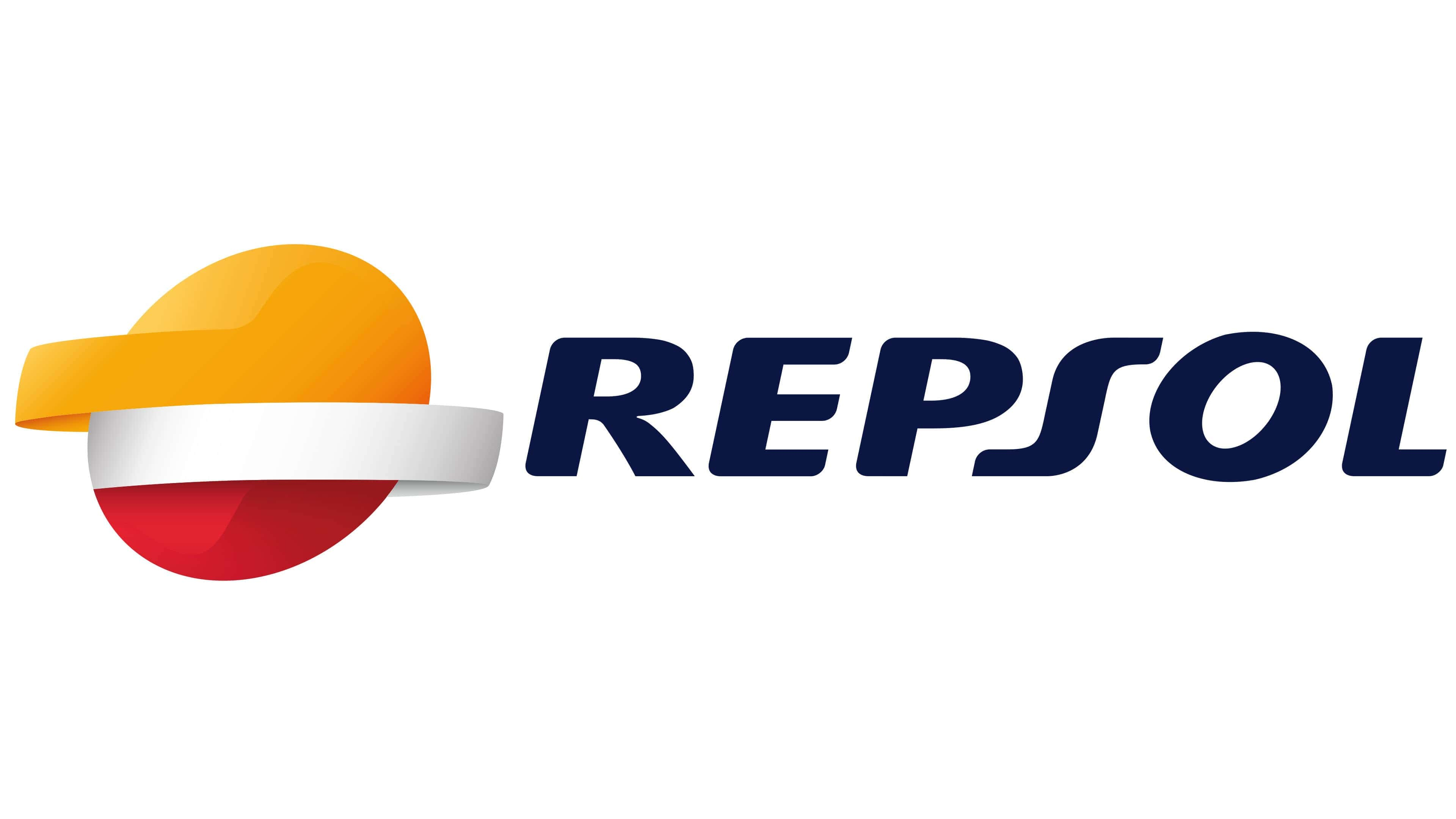
The Repsol logo symbolizes the company’s commitment to continuous development and progress. The stylized image of the sun, sea, and horizon line is a symbolic reference to the geographical features of the brand’s location. Brightness, precision, and graphic style characterize the brand’s activities.
Repsol: Brand overview
| Founded: | 1987 |
| Headquarters: | Madrid, Spain |
| Website: | repsol.com |
Meaning and History
![]()
The first emblem appeared almost immediately after the formation of the new industrial structure. In general, the company has three logos obtained as a result of the evolution of the design of previous versions.
What is Repsol?
Repsol is the largest representative of the oil and gas industry in Spain and a leader in the energy market of Latin America. This company is engaged in extracting oil and natural gas in 30 countries worldwide. It was founded in 1986 and initially belonged to the state, then its shares were divided. The largest share belongs to La Caixa, Sacyr Vallehermoso, and Temasek Holdings.
1951 – 1987
![]()
A symbol in the form of multicolored concentric circles preceded the brand’s modern names. This classic rondel has a red edge and a blue center, divided by a white ring. Inside was a stylized letter “R” with an elongated horizontal line extending beyond the vertical stroke.
1987 – 1997
![]()
The debut version is a long and flat horizon. It represents the line of the sea, sky, and rising/setting sun, as well as its mirror reflection in the water. It is a simple individual sign with a classic sunset and watercolor colors – red, orange, and dark blue. Above the horizon line, the word “Repsol” is placed, written in slanted uppercase letters.
1997 – 2012
![]()
In 1996, the company began developing the next logo, and a year later, it was officially adopted. It lasted for over 15 years and consisted of the same elements as its predecessor. Designers retained the horizon, only shortened it, and changed its color to white. They also removed the irregularities, making the image more symmetrical. The company name was placed above the sun. A navy blue square background symbolizing oil was also added.
2012 – today
![]()
During this period, there was a significant modernization of the brand’s symbolism, which allowed it to be modernized and made more attractive and understandable. This was associated with intensified competition in the oil refining and gas industry.
The administration ordered a new set of graphic elements guided primarily by relevance. As a result, the dark square was removed from the logo, and the inscription was moved to the right side, returning it to the color of the debut emblem.
The hemispheres were increased in size, given proportionality, and slightly tilted to the right. A small highlight was drawn on the upper part, representing the sun. The middle line was colored silver with a light gray shade on the edge. As a result, it resembled a metallic part with a cold sheen.
Repsol: Interesting Facts
Repsol is a big energy company from Spain that does many different things, like making oil and gas and working on ways to use energy from the sun and wind.
- How It Started: Repsol was formed in 1987 by combining some energy and chemical companies in Spain. It has grown significantly since then and now operates worldwide.
- The Name and Picture: “Repsol” comes from a longer name referring to its oil work. Its colorful sun logo represents all the different kinds of energy it works with.
- Different Kinds of Energy: Repsol used to focus mostly on oil and gas, but now it’s also working a lot with renewable energy like wind and solar power because it’s important to take care of our planet.
- Promise for the Future: In 2019, Repsol, the first big company in its field, promised not to contribute to the earth’s warming by 2050. This means using more renewable energy and being more careful about how it affects the environment.
- Working Around the World: Repsol operates in more than 30 countries, searching for and obtaining oil and gas and developing renewable energy in Europe, Africa, and the Americas.
- New Ideas: Repsol always looks for new ways to get and use energy. This includes better drilling methods, making fuel from plants, and finding ways to keep air pollution from getting worse.
- Racing: Repsol loves motorcycle racing and has sponsored the Repsol Honda Team since 1995. They’ve done well together in the races.
- Getting Bigger: Repsol has bought other companies to grow bigger, like Talisman Energy from Canada in 2015. This helped Repsol do more things in more places.
- Caring for People and the Planet: Repsol works on projects to protect nature, improve water management, and help communities where it operates.
Repsol has come a long way from being a company in Spain to being a big name in energy worldwide. It’s working on new ideas to make energy in ways that are better for the earth.
Font and Colors
As noted, corporate symbols embody the sea, sun, and its reflection in the water. Over time, they have changed, acquiring perfect features – clear, stylish, and in line with the company’s activities.
The main colors of the company’s logo are red, orange, dark blue, and white. Each of them has its interpretation and symbolizes certain qualities. Red is dynamics and spark; orange is energy and warmth; blue is solidarity and responsibility; and white is transparent management and clean energy.
The tilt of the oval to the right conveys the oil and gas magnate’s commitment to development and relentless forward movement. The individual font of the inscription. It is characterized by a slightly flat letter “S” with evenly elongated ends.
The minimalistic italic inscription “REPSOL,” which appears on the right side of the logo, is executed in a sans-serif font. It is very similar to FF Celeste Sans Black Italic, created by typographer Christopher Burke. This font is recognizable for its rounded corners, smooth gradients, Z-shaped letter “S,” and the slanted letter “O.”
Repsol’s color palette is very diverse: it includes white, black, several shades of gray, yellow, orange, and red. Moreover, related shades do not exist separately – they smoothly flow into each other. The gradient has been used in the design since 2012.
Repsol color codes
| Chrome Yellow | Hex color: | #f6a60e |
|---|---|---|
| RGB: | 246 166 14 | |
| CMYK: | 0 33 94 96 | |
| Pantone: | PMS 137 C |
| Maximum Yellow Red | Hex color: | #fec547 |
|---|---|---|
| RGB: | 254 197 71 | |
| CMYK: | 0 22 72 0 | |
| Pantone: | PMS 1235 C |
| Medium Candy Apple Red | Hex color: | #e3192f |
|---|---|---|
| RGB: | 227 25 47 | |
| CMYK: | 0 89 79 11 | |
| Pantone: | PMS Bright Red C |
| Spartan Crimson | Hex color: | #a51a1f |
|---|---|---|
| RGB: | 165 26 31 | |
| CMYK: | 0 84 81 35 | |
| Pantone: | PMS 1795 C |
| Cetacean Blue | Hex color: | #0a1743 |
|---|---|---|
| RGB: | 10 23 67 | |
| CMYK: | 85 66 0 74 | |
| Pantone: | PMS 2766 C |
FAQ
What does the Repsol logo mean?
Despite its apparent simplicity, the Repsol logo has a hidden meaning. The orange half of the oval symbolizes the setting sun. The silver strip is the horizon line separating the sky and the sea. The lower orange part represents the reflection of the sun in the water. The tilted shape of the logo speaks of the company’s commitment to constant development and forward movement.
What does the Repsol logo represent?
The Repsol logo is a tilted oval with two opposite stripes. The upper half and the adjacent band are orange. The second stripe is white-gray, and the lower part of the oval is red. In addition, designers used a gradient and combined several shades to make the image look voluminous. Under the emblem is a wordmark – a dark blue inscription “REPSOL.”
What font is used in the Repsol logo?
For the Repsol wordmark, a bold font with rounded corners is used. All letters are uppercase, italic, and sans-serif. The font vaguely resembles FF Celeste Sans Black Italic, FF Signa Round Pro Extended Extra Black Italic, or City Boys Soft Heavy Italic. Nevertheless, the match is not one hundred percent because designers have developed an individual set of glyphs for the logo.