The Restoration Hardware logo embodies refined simplicity and minimalism, representing impeccable elegance. Each emblem element resembles exquisite vintage monograms as if taken from the crest of an aristocratic house of the past century. This style effectively reflects the company’s mission—to create an atmosphere of grace and luxury capable of recreating the interior of any era. The streamlined and efficient service emphasizes the company’s commitment to making purchasing and implementing these masterpieces convenient for every customer.
Restoration Hardware: Brand overview
Restoration Hardware’s story began in 1979 when Stephen Gordon founded the company in Eureka, California. The idea came to him while he was restoring a Victorian house and struggled to find quality hardware and materials for the renovation. This led him to start selling authentic restoration hardware and architectural elements.
Initially a small operation, the company quickly gained a following among local homeowners and restoration enthusiasts. Gordon personally curated the store’s products, ensuring each item met his standards for authenticity and quality.
In the 1980s, the business started expanding, opening new locations in other California cities. Over time, the product range grew to include vintage-inspired furniture, lighting, and décor, blending modern comfort with classic design. By the 1990s, the company saw significant growth. 1994 Cardinal Investments provided funding, allowing the business to open more stores. By 1998, the company had 47 locations across the U.S., and that same year, it went public on the NASDAQ stock exchange.
The late 1990s and early 2000s saw rapid growth, with new stores opening in major cities and high-end malls. The company also launched a catalog that became a key marketing tool. However, the fast expansion came with challenges. By 2001, financial difficulties caused by poor inventory management and an overly ambitious growth plan forced the company to reorganize. Stephen Gordon stepped down as CEO, and the company brought in Gary Friedman, former president of Williams-Sonoma, to lead the turnaround.
Under Friedman’s leadership, the business shifted focus, moving away from purely antique offerings and towards more modern and luxurious designs. In 2005, the company introduced a children’s furniture line, expanding into a new market and attracting a broader customer base.
In 2008, private equity firm Catterton Partners acquired the company amid the global financial crisis. This move allowed the company to exit the public market pressures and focus on restructuring and long-term growth.
Throughout the 2010s, the business underwent a dramatic transformation. The company opened large flagship stores called Design Galleries, housed in landmark buildings, showcasing complete interior design concepts rather than individual products. 2012, the company returned to the public market with a successful New York Stock Exchange IPO.
In 2013, the company launched a contemporary art division that integrated modern art into its product offerings. This move highlighted its ambition to become more than just a furniture retailer but a leader in the interior design world. In 2014, a modern furniture line was introduced, further expanding the company’s reach in the luxury design market.
The opening of the first gallery and restaurant in Chicago in 2015 marked a new chapter for the company, which innovatively blended retail and dining. In 2016, it launched professional design services for residential and commercial spaces.
In 2017, the company expanded into hospitality, with plans to develop hotels and restaurants under its brand, reflecting the vision of creating a complete lifestyle experience. 2018, the company officially rebranded itself, signaling its evolution from a restoration-focused retailer to a high-end lifestyle brand.
Between 2019 and 2022, the company continued to expand, opening new galleries in the U.S. and planning for global growth. The business also invested in its digital platforms, enhancing the online shopping experience.
By 2023, the company had firmly established itself as a leading luxury lifestyle and interior design brand. What began as a small restoration hardware store had transformed into a global company offering various design products and services and continually adapting to changing market trends and consumer preferences.
Meaning and History
What is Restoration Hardware?
This company produces high-end home furniture, bringing revolutionary changes to the retail sector. It offers a carefully curated collection of elegant furniture and decor, combining classic style with modern aesthetics. The brand stands out for its unique retail strategy, transforming showrooms into luxurious galleries that present cohesive and inspiring lifestyle images. The products include outdoor furniture, textiles, chandeliers, and velvet sofas, all crafted with sophistication and luxury. Design enthusiasts value the brand’s ability to blend retail, design, and hospitality, creating unique and refined living spaces.
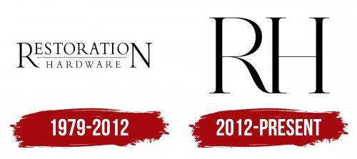
1979 – 2012
The company started its business by producing items to restore homes and interiors, which was the basis for selecting its name. The brand’s logo is designed in two levels, with the first and last letters of the word “Restoration” significantly enlarged, matching the height of the entire emblem. This design technique creates a visual image of elegant scaffolding, emphasizing the brand’s connection to creating items intended for historic mansions and palaces.
The enlarged letters frame and protect the rest of the inscription, giving the logo a complete and harmonious look. This design symbolizes that the company’s products can fully restore an interior while preserving a particular era’s authenticity and stylistic integrity. The logo, therefore, reflects the brand’s commitment to preserving historical heritage by creating high-quality and unique restoration products.
2012 – today
The RH logo (formerly known as Restoration Hardware) is as minimalistic and elegant as possible, reflecting the brand’s new philosophy that emerged after its reorganization and public listing. The emblem consists of just two letters—R and H—representing the company’s name. These symbols are crafted in a strict, classic style with thin lines and subtle serifs, making them recognizable and memorable.
The main message of this visual sign is simplicity and grace. The thin lines symbolize the sophistication and exclusivity of the brand’s products. At the same time, the vintage touches in the design suggest that the company specializes in furniture and interior items styled after classic pieces from various eras. The new logo reflects the brand’s essence, positioning itself as a supplier of interior items focusing on design and past aesthetics.
The emblem’s black color gives it a formal and businesslike tone, conveying the company’s seriousness and focus on the premium segment. It symbolizes stability and confidence in the quality of RH’s products. The emblem’s transformation is connected to the changes after the company’s acquisition by Catterton and the shift in its business model. The company now emphasizes luxury and uniqueness, conveyed through the minimalist and refined logo.
The RH emblem reflects the company’s new values, focus on exclusive design, and high status in the furniture and interior market.


